imparting the wisdom of awesome.
So, trekchic requested a couple of tuts from my latest batch of icons, and, taking a break from my brain numbing assignments, I thought it was time to get my photoshop on.
This is my first tutorial attempt, and it's more 'look, a fun way of making and icon' than 'look, let's c + p this effect on every single icon ever!'. Made in PS CS, but is pretty translatable, I hope.
We are going from
to
1. First what we need to do is, with this texture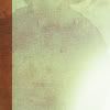
by lostluck_icons, Edit > Define pattern. The icon doesn't work without that. Well, it might, but this way is much easier and saves you a lot of grief later.
2. Prepare your base. I used this photo of Eva Green, though for the life of me can't remember where I snagged it from. hires_hotties, maybe. Anyway.
I cropped it so:
It looked a little flat to me, so (and this is one of my favourite methods of making bases not-so-dull) I Duplicate the layer > set it to soft light. Sharpen and/or blur to taste.
is what I ended up with.
Of course, me being me, I had to do something more to it, and so I fiddled a little with curves. herdestiny has a wonderful tut on curves here*; it practically introduced me to curves, and I have never looked back since.
is post-curve, and that is where the hint of green in the end product comes from.
*the images seem to be down on that tut, but... the text is still there! >.>
3. Merge the layers (Layer > Merge Visible/Flatten Image, they're fundamentally the same thing), duplicate your base. Double click your duplicated base (or Right click > Blending options). Select Pattern Overlay, then go to the drop down box to find the pattern that was uploaded earlier.
Now for the fun part, for this icon I used, I put the blend mode on Pin Light, but play around with it a little, you never know, it might just look better.
Now, set the Scale to 1%. I've tried this method on different percentages, and they usually turn out looking like crap.
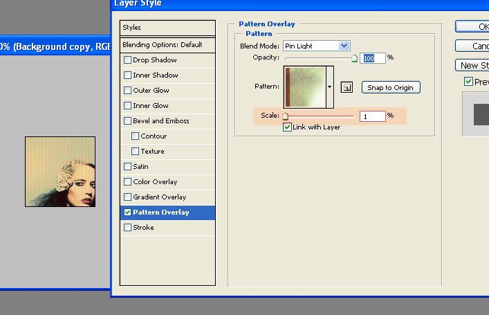
a helpful little screenshot!
Click okay, and voila! Icon!
4. Optional! You can leave the icon as it, or you could always play around with it a little! Be adventurous, try out different blend modes, play with opacity, fiddle with satuation. There are a million things you can do with this.
Some examples -




Okay, the last three was me playing around with the blend mode of the texture. They're a bit more subtle, and some people might like that. For the William Moseley icon I used a texture by gender; specifially this one.
And that's pretty much it! Oh, yes, you will need to watch out for the base picture as well as the texture you're using, because some textures just does not work with this method. I've found the best to use for this are the ones that have two contrasting colours, but not too busy.
Yep. I'd love to see any finished products inspired by this tut! Feel free to post them here!
This is my first tutorial attempt, and it's more 'look, a fun way of making and icon' than 'look, let's c + p this effect on every single icon ever!'. Made in PS CS, but is pretty translatable, I hope.
We are going from

to

1. First what we need to do is, with this texture

by lostluck_icons, Edit > Define pattern. The icon doesn't work without that. Well, it might, but this way is much easier and saves you a lot of grief later.
2. Prepare your base. I used this photo of Eva Green, though for the life of me can't remember where I snagged it from. hires_hotties, maybe. Anyway.
I cropped it so:

It looked a little flat to me, so (and this is one of my favourite methods of making bases not-so-dull) I Duplicate the layer > set it to soft light. Sharpen and/or blur to taste.

is what I ended up with.
Of course, me being me, I had to do something more to it, and so I fiddled a little with curves. herdestiny has a wonderful tut on curves here*; it practically introduced me to curves, and I have never looked back since.

is post-curve, and that is where the hint of green in the end product comes from.
*the images seem to be down on that tut, but... the text is still there! >.>
3. Merge the layers (Layer > Merge Visible/Flatten Image, they're fundamentally the same thing), duplicate your base. Double click your duplicated base (or Right click > Blending options). Select Pattern Overlay, then go to the drop down box to find the pattern that was uploaded earlier.
Now for the fun part, for this icon I used, I put the blend mode on Pin Light, but play around with it a little, you never know, it might just look better.
Now, set the Scale to 1%. I've tried this method on different percentages, and they usually turn out looking like crap.

a helpful little screenshot!
Click okay, and voila! Icon!

4. Optional! You can leave the icon as it, or you could always play around with it a little! Be adventurous, try out different blend modes, play with opacity, fiddle with satuation. There are a million things you can do with this.
Some examples -


Okay, the last three was me playing around with the blend mode of the texture. They're a bit more subtle, and some people might like that. For the William Moseley icon I used a texture by gender; specifially this one.
And that's pretty much it! Oh, yes, you will need to watch out for the base picture as well as the texture you're using, because some textures just does not work with this method. I've found the best to use for this are the ones that have two contrasting colours, but not too busy.
Yep. I'd love to see any finished products inspired by this tut! Feel free to post them here!