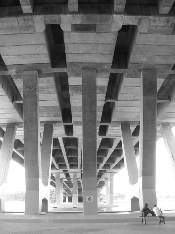
ben sheares revisited
I know I posted a photo of the Sheares Bridge circa 2003. But that photo has long since been lost, most of you didn't see it anyway - and most importantly, I probably wouldn't have taken it the same way today. So let's see how our old friend's doing.
I'm quite pleased with how this one turned out:
( Read more... )
I'm quite pleased with how this one turned out:
( Read more... )
Comments 14
Reply
Er, no. I like black and white!
The previous photo I took of it was in colour, and it didn't turn out half bad either. But I thought the first picture in particular worked nicely in monochrome, with all the texture and shade and geometricity going on. Oh, and they were originally taken in B & W, which isn't the same as draining colour out after taking a photo, because a lot of nuances tend to get lost in the conversion from colour to B & W.
Reply
Reply
But it isn't as if colour is always reproduced accurately or naturally by most cameras anyway, digital or otherwise. Besides liking the aesthetics of it, black and white photography is challenging - one needs a far better understanding of light, tone and contrast to pull it off, and a lot of things that work in colour cannot be pulled off in black and white.
they should equally frequently also go around taking pictures in color-negative, and color-shifted, and dramatically increased saturation,
But all these other variations typically only involve a spot of photoshopping or gimping, unless we're talking about lomography, or really going back to the darkroom. Black and white photography is probably the most accessible and versatile of all these variations.
Reply
Anyhow, that's actually a nice peaceful stretch.
Reply
Anyway, here's an alternative take which I briefly considered posting instead - a little darker, tonally more similar to my usual photos, but I kinda like the silvery light of the first. I thought the bike would be nice at first, but decided in the end there were too many things going on in there.
( ... )
Reply
Reply
Yeah, I was going for composition with the first one. I did think the tones on the second pic were a bit too heavy-handed, but it might be that our monitors are calibrated differently or something.
Reply
Yeah, agree on the monitors thing... I'm sure if I view it in school, on one of the Macs, things might be a bit different.
Reply
Ok, if you can distinguish X, Y and Z, and ideally A, B and C as well, you shouldn't be missing anything:
( ... )
Reply
Leave a comment