011; ask the maker 6.0 tutorial.
I finally started working on the tutorials for Ask the Maker and just finished the first one for setentpet. As you might see, I'm not working on the tutorials in order of the requests, but started with one that was easy for me to write as I had the PSD saved. I'm going to work on the other tutorials and guides in the next few days and hope to have them all done by the end of August.
Anyway, enjoy this first tutorial.

from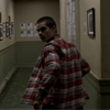
to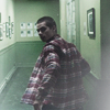
requested by setentpet
STEP ONE.
original cap
I made this icon for the 7 genres challenge at the7days and basically used the same screencap from a Stiles icon that I had made for an earlier challenge at the same community (yeah, that's how lazy I am). For that challenge I decided to go for seven different subgenres of 'drama' and so I wanted the Teen Wolf icon to represent the dramatic aspect - I had a feeling that the cap represented this genre very nicely because it always gives me a feeling of being rushed and running out of time, which I think is a rather negative feeling that puts you under a lot of pressure. I decided to go for a dark coloring to portray that feeling (and because the other icons in the set were already kinda dark and muted anyway).
Okay, enough blah, blah about my choice for this particular screencap and on to the actual tutorial: I didn't want the police man to be in the icon and yet Stiles had to be shown with as much of the corridor as possible to show how he's running, so I decided to go for a very basic center crop.

After resizing the base, I duplicated and rasterized it (I always drag the original image onto the canvas - that way I can resize it very nicely and make it smaller or bigger how I like it until I'm happy with the crop). I adjusted the duplicated layer and used auto color to correct the colours a bit. Set that layer to screen and lower the opacity to 30%.
STEP TWO.
The image is still very dark, so I added a curves layer (output: 163, input: 97) to brighten it up a little. Then I added a gradient map ranging from a nice grey (not too dark) to white and lowered the opacity to about 34% in order to mute the coloring. Afterwards I added another curves layer (output: 105, input: 143) to darken the image again.
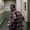
STEP THREE.
On a new layer I colored the space around Stiles with a nice green (#598454) and then set it to soft light. On another new layer I only colored the bottom part around Stiles in blue (#131646) with a brush. I wanted it to look like a gradient, so I used a different painty brush to erase the top part of what I had just colored.
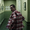
STEP FOUR.
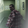
Then I added this texture and set it to soft light. I added a mask layer and used a grey brush on the left bottom part because I felt it made the icon too bright in the left bottom corner. Afterwards I added another texture and set it to soft light at 65%. Then I added this texture by mm3butterfly and set it to soft light at 31%. I duplicated it and set it to screen at 100%. Then I used the gaussian blur filter on the duplicate with a radius of about 26 pixels.
STEP FIVE.
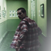
I wanted to brighten up the image a teeny tiny bit, so I added another curves layer (output: 112, input: 101; output: 201, input: 183). For me, the next step was to bring out the greens a little more, so I added a selective color layer with these settings.
STEP SIX.
I added another texture by midnight_road and set it to hue at 20%. Afterwards I added a vibrance layer and set the vibrance to +30.

STEP SEVEN.
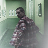
Afterwards I added another texture by cb_janey and duplicated it, then I set both textures to screen. Since the original cap was a bit blurry, the icon needed sharpening, especially because I had just added some blurry grungy textures. I pressed STRG and selected two or three layers, then pressed STRG+SHIFT+C and pasted the copied layers (I usually select only two or three layers this way to copy and paste all of the layers). I sharpened the new layer and reduced the opacity to 15%. Sometimes I only reduce the opacity only a little and then erase lines which are too sharp. I usually play around with the opacity until I like the outcome, especially on the face.
STEP EIGHT.
As the final two steps, I added this texture by scoobyatemysnax and set it to screen at about 40%. I erased the right half of it and then added a levels layer with these settings.
AND WE'RE DONE.

I hope you found this tutorial useful. If you have any questions about any of the steps above, please don't hestitate to ask. I'd be happy to answer any questions.

ask the maker 6.0 - my thread
Anyway, enjoy this first tutorial.

from

to

requested by setentpet
STEP ONE.
original cap
I made this icon for the 7 genres challenge at the7days and basically used the same screencap from a Stiles icon that I had made for an earlier challenge at the same community (yeah, that's how lazy I am). For that challenge I decided to go for seven different subgenres of 'drama' and so I wanted the Teen Wolf icon to represent the dramatic aspect - I had a feeling that the cap represented this genre very nicely because it always gives me a feeling of being rushed and running out of time, which I think is a rather negative feeling that puts you under a lot of pressure. I decided to go for a dark coloring to portray that feeling (and because the other icons in the set were already kinda dark and muted anyway).
Okay, enough blah, blah about my choice for this particular screencap and on to the actual tutorial: I didn't want the police man to be in the icon and yet Stiles had to be shown with as much of the corridor as possible to show how he's running, so I decided to go for a very basic center crop.

After resizing the base, I duplicated and rasterized it (I always drag the original image onto the canvas - that way I can resize it very nicely and make it smaller or bigger how I like it until I'm happy with the crop). I adjusted the duplicated layer and used auto color to correct the colours a bit. Set that layer to screen and lower the opacity to 30%.
STEP TWO.
The image is still very dark, so I added a curves layer (output: 163, input: 97) to brighten it up a little. Then I added a gradient map ranging from a nice grey (not too dark) to white and lowered the opacity to about 34% in order to mute the coloring. Afterwards I added another curves layer (output: 105, input: 143) to darken the image again.

STEP THREE.
On a new layer I colored the space around Stiles with a nice green (#598454) and then set it to soft light. On another new layer I only colored the bottom part around Stiles in blue (#131646) with a brush. I wanted it to look like a gradient, so I used a different painty brush to erase the top part of what I had just colored.

STEP FOUR.
Then I added this texture and set it to soft light. I added a mask layer and used a grey brush on the left bottom part because I felt it made the icon too bright in the left bottom corner. Afterwards I added another texture and set it to soft light at 65%. Then I added this texture by mm3butterfly and set it to soft light at 31%. I duplicated it and set it to screen at 100%. Then I used the gaussian blur filter on the duplicate with a radius of about 26 pixels.

STEP FIVE.
I wanted to brighten up the image a teeny tiny bit, so I added another curves layer (output: 112, input: 101; output: 201, input: 183). For me, the next step was to bring out the greens a little more, so I added a selective color layer with these settings.

STEP SIX.
I added another texture by midnight_road and set it to hue at 20%. Afterwards I added a vibrance layer and set the vibrance to +30.

STEP SEVEN.
Afterwards I added another texture by cb_janey and duplicated it, then I set both textures to screen. Since the original cap was a bit blurry, the icon needed sharpening, especially because I had just added some blurry grungy textures. I pressed STRG and selected two or three layers, then pressed STRG+SHIFT+C and pasted the copied layers (I usually select only two or three layers this way to copy and paste all of the layers). I sharpened the new layer and reduced the opacity to 15%. Sometimes I only reduce the opacity only a little and then erase lines which are too sharp. I usually play around with the opacity until I like the outcome, especially on the face.

STEP EIGHT.
As the final two steps, I added this texture by scoobyatemysnax and set it to screen at about 40%. I erased the right half of it and then added a levels layer with these settings.
AND WE'RE DONE.

I hope you found this tutorial useful. If you have any questions about any of the steps above, please don't hestitate to ask. I'd be happy to answer any questions.

ask the maker 6.0 - my thread