017; ask the maker 6.0 tutorial.
Here's another of those long-long-ago-promised tutorials for Ask the Maker activity. This one is for the lovely reebeecaa. It was such an honor to have her request a tutorial from me because usually it's the other way round because her icons are so amazing.
Enjoy the tutorial. I hope it will be helpful.

from
to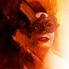
requested by reebeecaa
STEP ONE.
original cap
I made this icon for a round at once20in20 for which we were only allowed to icon minor characters. I'm not really a fan of Cora but the screencap was just too good not to use. Honestly, I can't remember what I was going for with the icon but during the process I found some nice textures et voilà, this is how it turned out and now you are going to learn how to make it.

We will start out with the basic screencap which I placed on a 100x100px canvas. Then I duplicated the base twice and set the first copy to screen at 100% and the second one to soft light at 48%. You might want to play around with these settings until you're happy with the result.

STEP TWO.
For the next step I simply added a color fill layer (#a56c34) and then changed the setting to soft light at 100% opacity.

STEP THREE.
Next I added a black-and-white gradient fill layer with a 14° angle (just play around with it until you're happy with how it looks) and set it to soft light at 100% because I wanted to add some contrast (since I made this icon to match the contrast theme of the 20in20 round). I usually set my gradient fill layers to soft light before adjusting the angle, so I can see what it will do to the icon.
I wasn't happy with the contrast yet, so I duplicated the gradient fill layer.

STEP FOUR.
I still wasn't happy with the contrast, so I added a black-and-white gradient map and set it to soft light at 73% opacity.

STEP FIVE.
I copied and merged all of the previous layers and placed it on top of them. Then I ran Topaz to make everything look very smooth. I kept the layer at 100% but erased the parts over her face.
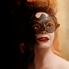
STEP SIX.
Now I added this texture by lumsx, set it to overlay and reduced the opacity to 49%. Afterwards, I rotated the texture by 180° to match the darker and brighter sides of the icon. I didn't really like the pattern on the texture for this icon, so I used gaussian blur at 10 pixels to soften the texture and just get the colours as you would in a gradient.
Then I added a new layer and used a soft round brush (like one from the preset brushes) and painted the right border of the icon white because the texture had made it too red.

Then I copied and merged everything again and placed the new layer on top of the others.
STEP SEVEN.
I added a vibrance layer (vibrance: +90, saturation: +2) and then copied and merged everything again sharpened that layer. I reduced the opacity to 48% and removed the lines around her face and everything that looked oversharpened, so that only the lips and eyes would look sharpened.
Then I copied and merged everyhing again and just left the layer on top of everything else. We will just leave it there for now as we will need it for the final step.
STEP EIGHT.
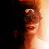
For the final step I added this texture by tinebrella, set it to screen and rotated it by 90° clockwise.

Then I dragged the copied and merged layer from step seven to the top and set it to soft light at 39%. This way I could add some more contrast and at the same time keep the nice painted look of the texture.
AND THIS IS THE FINAL RESULT:

I hope this tutorial was understandable and will be useful for you. If you happen to have any questions just drop a line and let me know. I'd be more than happy to answer any questions.
Enjoy the tutorial. I hope it will be helpful.

from

to

requested by reebeecaa
STEP ONE.
original cap
I made this icon for a round at once20in20 for which we were only allowed to icon minor characters. I'm not really a fan of Cora but the screencap was just too good not to use. Honestly, I can't remember what I was going for with the icon but during the process I found some nice textures et voilà, this is how it turned out and now you are going to learn how to make it.

We will start out with the basic screencap which I placed on a 100x100px canvas. Then I duplicated the base twice and set the first copy to screen at 100% and the second one to soft light at 48%. You might want to play around with these settings until you're happy with the result.

STEP TWO.
For the next step I simply added a color fill layer (#a56c34) and then changed the setting to soft light at 100% opacity.

STEP THREE.
Next I added a black-and-white gradient fill layer with a 14° angle (just play around with it until you're happy with how it looks) and set it to soft light at 100% because I wanted to add some contrast (since I made this icon to match the contrast theme of the 20in20 round). I usually set my gradient fill layers to soft light before adjusting the angle, so I can see what it will do to the icon.
I wasn't happy with the contrast yet, so I duplicated the gradient fill layer.

STEP FOUR.
I still wasn't happy with the contrast, so I added a black-and-white gradient map and set it to soft light at 73% opacity.

STEP FIVE.
I copied and merged all of the previous layers and placed it on top of them. Then I ran Topaz to make everything look very smooth. I kept the layer at 100% but erased the parts over her face.

STEP SIX.
Now I added this texture by lumsx, set it to overlay and reduced the opacity to 49%. Afterwards, I rotated the texture by 180° to match the darker and brighter sides of the icon. I didn't really like the pattern on the texture for this icon, so I used gaussian blur at 10 pixels to soften the texture and just get the colours as you would in a gradient.
Then I added a new layer and used a soft round brush (like one from the preset brushes) and painted the right border of the icon white because the texture had made it too red.

Then I copied and merged everything again and placed the new layer on top of the others.
STEP SEVEN.
I added a vibrance layer (vibrance: +90, saturation: +2) and then copied and merged everything again sharpened that layer. I reduced the opacity to 48% and removed the lines around her face and everything that looked oversharpened, so that only the lips and eyes would look sharpened.
Then I copied and merged everyhing again and just left the layer on top of everything else. We will just leave it there for now as we will need it for the final step.

STEP EIGHT.
For the final step I added this texture by tinebrella, set it to screen and rotated it by 90° clockwise.

Then I dragged the copied and merged layer from step seven to the top and set it to soft light at 39%. This way I could add some more contrast and at the same time keep the nice painted look of the texture.
AND THIS IS THE FINAL RESULT:

I hope this tutorial was understandable and will be useful for you. If you happen to have any questions just drop a line and let me know. I'd be more than happy to answer any questions.