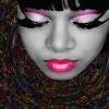
connect the dots
Made some textures. Lots of happy accidents, heyyo!
#1-4: Left Eye (TLC)
#5-6: Imogen Heap
#7: YUKI (Bennie K)
#8-10: Des'ree
#11: Tomer Yosef
#12-&: Yunho (DBSK)
#14-19: Guy-Manuel de Homem-Christo (Daft Punk)
#20-30: Min-chul (T-max)

( Read more... )
#1-4: Left Eye (TLC)
#5-6: Imogen Heap
#7: YUKI (Bennie K)
#8-10: Des'ree
#11: Tomer Yosef
#12-&: Yunho (DBSK)
#14-19: Guy-Manuel de Homem-Christo (Daft Punk)
#20-30: Min-chul (T-max)

( Read more... )
Comments 7
I especially love the first four - the make-up on the otherwise grey skin looks awesome. Seven is gorgeous as well, I really like the contrast between her face and the dark background. I think I'm going to snag 7 :D
That said, I really wouldn't say your icons so far were boring at all. I love how clean they always are and I don't think adding too much would have had a great effect. It really depends on the motives, I think! :}
Reply
So I never mentioned to you, but I get a kick out of checking people's icons when they comment about taking any. And I really think your icon notes are too kind. ♥
Thank you for this as well. :} I really like to let the art speak for itself most of the time, and I'm glad you don't think it's boring that way! I guess I was getting a little paranoid looking at all these icon communities with people doing lots of different things to their icons and making them really stand out. I didn't want mine to be so plain anyone could make them, and that's what kind of seemed to be in my mind at the time, I think.
Reply
Haha, but well deserved! ♥
I see what you mean, but as I said, I think your icons so far have been absolutely lovely, too. Sometimes it's true what they say - less is more ;) And you always pick great motives; that's a talent, too.
Reply
Psssh. ♥
! Considering how brilliantly talented you are, I will take your words as law around here. :}
Reply
Leave a comment