two tutorials!
Both requested by coldprey, from this batch. Both for PSCS2, not translatable I'm afraid. Both include curves and selective coloring.
1) From
to
;
2) From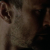
to
;
Premise: I was fooling around with both. Which means quite some layers.
1) So, we have Frank, cropped and pasted into an icon, from a cap by phoenixothon. This is the base:

Which is kinda ugly. And dark. Since I usually use the curves to lighten the image, it gives me better results, I went with a new Curves adjustment layer. Just to lighten it some, I didn't put any settings in, then set the layer to screen, 100% opacity. Result:

Then I duplicated the screen layer and put it at 52% opacity.

Then, it looked a bit too yellow-greenish for what I wanted to do with it. So I went with a selective color adjustment layer, with the following settings:
Reds: -88, 0, 73, 0
Yellows: -20, 0, -14, 0
Greens: 100, 100, -100, 100
Cyans: 100, 0, 0, 100;
Blues: 100, 0, 0, 0;
Whites: 0, 0, 0, -34
Neutrals: 8, 0, -5, -9
Blacks: 0, 0, 0, 6
Result:

Better, right? But still too flat. So I duplicated the selective color layer and put it on soft light, 45% opacity. Result:

It looks fine like this, but I wanted it brighter and so finished with another curves adjustment layer, with the following settings:
RGB: Point 1 Input 26, Output 0; Point 2, Input 106, Output 134
Result:

And you're done.
2) This one is actually a bit more messed up. But anyways. This is our base, cropped and whatnot:

Like, you can't see anything. Now, I was trying stuff with the high pass filter so don't ask me why I went and used it now, but I did. So, I duplicated the layer, then went on filters-other-high pass and put it at 77 pixels or 80, something around that value. Then dropped the opacity to 30%. Result:
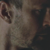
So now it really was too dark, so I did the same of step 1 in the previous tutorials, aka a curves adjustment layer set on screen. At 67% opacity, this time. Result:
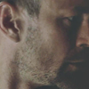
Flat and grey-ish, right? So I went with another curves layer in order to give it more depth and possibly a decent coloring. The settings were the following.
RGB: four points:
1) Input 36, Output 0
2) Input 100, Output 114
3) Input 143, Output 184
4) Input 208, Output 219
Result:
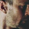
Now that's more like it, y/y? But it still was too flat, so I duplicated the layer and put it on soft light, 21%. Result:

I didn't like how the black parts looked grey-ish, so I adjusted it with a selective color layer.
Blacks: 0, 0, 0, 9
Result:
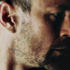
Then I wanted it more contrasted, so new curves layer.
RGB: three points
1: Input 15, Output 0
2: Input 110, Output 132
3: Input 228, Output 253

Almost done! It was a biit too yellowish, so another selective color layer:
Yellows: 0, 0, 0, -20
Then, since it was a bit too blurred, I selected it all (ctrl+d), then went on edit -> copy merged, then edit -> paste and had a new layer on top of everything else. Then I went on filters-> sharpen -> sharpen edges once.
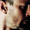
Done!
I'm here for any questions whatsoever. And I'd love to see any results! ;)
1) From

to

;
2) From

to

;
Premise: I was fooling around with both. Which means quite some layers.
1) So, we have Frank, cropped and pasted into an icon, from a cap by phoenixothon. This is the base:

Which is kinda ugly. And dark. Since I usually use the curves to lighten the image, it gives me better results, I went with a new Curves adjustment layer. Just to lighten it some, I didn't put any settings in, then set the layer to screen, 100% opacity. Result:

Then I duplicated the screen layer and put it at 52% opacity.

Then, it looked a bit too yellow-greenish for what I wanted to do with it. So I went with a selective color adjustment layer, with the following settings:
Reds: -88, 0, 73, 0
Yellows: -20, 0, -14, 0
Greens: 100, 100, -100, 100
Cyans: 100, 0, 0, 100;
Blues: 100, 0, 0, 0;
Whites: 0, 0, 0, -34
Neutrals: 8, 0, -5, -9
Blacks: 0, 0, 0, 6
Result:

Better, right? But still too flat. So I duplicated the selective color layer and put it on soft light, 45% opacity. Result:

It looks fine like this, but I wanted it brighter and so finished with another curves adjustment layer, with the following settings:
RGB: Point 1 Input 26, Output 0; Point 2, Input 106, Output 134
Result:

And you're done.
2) This one is actually a bit more messed up. But anyways. This is our base, cropped and whatnot:

Like, you can't see anything. Now, I was trying stuff with the high pass filter so don't ask me why I went and used it now, but I did. So, I duplicated the layer, then went on filters-other-high pass and put it at 77 pixels or 80, something around that value. Then dropped the opacity to 30%. Result:

So now it really was too dark, so I did the same of step 1 in the previous tutorials, aka a curves adjustment layer set on screen. At 67% opacity, this time. Result:

Flat and grey-ish, right? So I went with another curves layer in order to give it more depth and possibly a decent coloring. The settings were the following.
RGB: four points:
1) Input 36, Output 0
2) Input 100, Output 114
3) Input 143, Output 184
4) Input 208, Output 219
Result:

Now that's more like it, y/y? But it still was too flat, so I duplicated the layer and put it on soft light, 21%. Result:

I didn't like how the black parts looked grey-ish, so I adjusted it with a selective color layer.
Blacks: 0, 0, 0, 9
Result:

Then I wanted it more contrasted, so new curves layer.
RGB: three points
1: Input 15, Output 0
2: Input 110, Output 132
3: Input 228, Output 253

Almost done! It was a biit too yellowish, so another selective color layer:
Yellows: 0, 0, 0, -20
Then, since it was a bit too blurred, I selected it all (ctrl+d), then went on edit -> copy merged, then edit -> paste and had a new layer on top of everything else. Then I went on filters-> sharpen -> sharpen edges once.

Done!
I'm here for any questions whatsoever. And I'd love to see any results! ;)