tutorials for library_of_sex and lostfaith13
I had a tutorial asked for a while and another the last day so I figured I'd do them both at once ;) the first isn't exactly the icon I was asked it for, but the technique was the same and I didn't have the PSD for that one ;)
For library_of_sex, from

to
The actual icon I was asked for was this one
, but I guess that since the basic procedure is the same one it would have been fine. On that one I just worked on the blues in the selective color part of the tutorial but it's pretty much the same thing.
Premise: I do a lot of probably not really useful layers and I can't live without curves. That said, we're starting from this one, which is thankfully a light enough cap.

Not enough though, so, first curves adjustment layer: set just one point on RGB, input 98 and output 159.

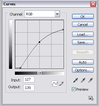
Then, let's do the gray background thing, which it's also from a Curves adjustment layer; open a new one and put the following settings:
Three points on RGB, the first input 26 and output 2, the second input 255 and output 207 and the third input 127 and output 139. The layer should look like this:
And the result:

Then I duplicated that layer and set it on 25%. It gives the image a bit more depth even if you can barely see it.

At this point go to the FIRST Curves layer you did, the one that was supposed to make the image brighter; duplicate it, drag it at the top and set it on Color Burn, 26%.

Done? Then start with another Selective Color later, set on normal, with the following settings:
Reds -36, +10, -27, +19
Yellows -35, 0, +53, 0
Whites 0, 0, 0, -14
Neutrals +17, 0, 3, -7
Blacks 0, 0, 0, +30

Duplicate the last selective color layer and set it on Soft Light, 24%.

Duplicate the copy of the second curves layer and drag it over the top, on Screen, at 4% opacity.

In case the explanation was too confused, this is the psd:
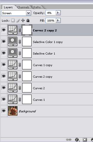
and it's done! ;)
While, for lostfaith13, from
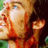
to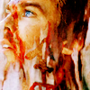
Okay, so, for this one, my bases were two caps from Deus Ex Machina, which I'll link in order to save ourselves space and bandwidth: one and two.
I took the first one, the close up, and tried to find a suitable coloring. I won't make all the steps here because it's subjective and since I didn't have the PSD I kind of re-did it by scratch so it wouldn't probably be exact, but anyway, let's say it went like this:
1) A Curves adjustment layer set on Normal, just one point on RGB, input 90 and output 155; then set the whole layer at 75% opacity.
2) Duplicate said layer and set it on Soft Light, 100%; then go back on it clicking the square I covered in red

and change the settings like this:
a) leave the RGB as it is;
b) one point on Red, input 143 and output 110;
c) one point on Green, input 145 and output 123;
d) one point on Blue, inpur 145 and output 136.
At this point you'll have a pretty nicely colored image, but his eyes will probably look almost white; so I selected the area around his left eye (I used the lasso tool but you can use whatever you find better) and did a Selective Color adjustment layer with the following settings:
Cyans +100, + 75, -96, +100;
Blues +100, +76, +36, +100;
Neutrals +17;
At this point his eye should look blue enough. Then drag all the layers on the other image, the one where you can see the t-shirt (not the one for the eye, you won't need it) so that both the pictures have the same coloring. Then resize them, the first to 351x200 and the second to 500x281. Results:
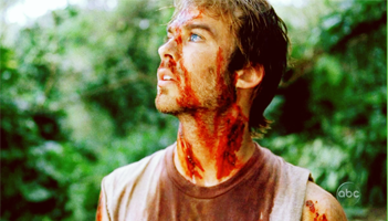
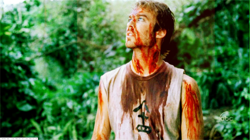
Now, time to get on the real icon. Drag the first pic on a 100x100 blank canvas:

Then drag the second over the first, in order that only the bloody shirt shows up:
Then set this last later on lighten:
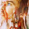
Nicer, right? At this point you can either keep on like this or sharpen the layer a bit. I did the sharpening at this point by selecting the whole canvas (ctrl+a), copying the merged layers (edit -> copy merged, edit -> paste), then went to filters -> other -> high pass, put it on 0,5 and then set the whole layer on soft light.

Then I did another Curves adjustment layer, set on Normal, with the following settings:
RGB, two points: a) input 53, output 2 b) input 140, output 116
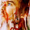
Better, right? Then I went with a Selective Color layer, set on Color (makes the colors kind of warmer and a bit more saturated) and did one with these settings:
Reds -70, -22, +41, +36
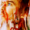
Then, in order to adjust the blacks, I did another Selective Color layer set on normal, with the following setting:
Blacks 0, 0, 0, +56

And you're done.
If something was obscure or needs further explaining I'm here for both of them. I don't upload the psd files though and well, as everyone says, use these as starting points ;)
For library_of_sex, from

to

The actual icon I was asked for was this one

, but I guess that since the basic procedure is the same one it would have been fine. On that one I just worked on the blues in the selective color part of the tutorial but it's pretty much the same thing.
Premise: I do a lot of probably not really useful layers and I can't live without curves. That said, we're starting from this one, which is thankfully a light enough cap.

Not enough though, so, first curves adjustment layer: set just one point on RGB, input 98 and output 159.

Then, let's do the gray background thing, which it's also from a Curves adjustment layer; open a new one and put the following settings:
Three points on RGB, the first input 26 and output 2, the second input 255 and output 207 and the third input 127 and output 139. The layer should look like this:

And the result:

Then I duplicated that layer and set it on 25%. It gives the image a bit more depth even if you can barely see it.

At this point go to the FIRST Curves layer you did, the one that was supposed to make the image brighter; duplicate it, drag it at the top and set it on Color Burn, 26%.

Done? Then start with another Selective Color later, set on normal, with the following settings:
Reds -36, +10, -27, +19
Yellows -35, 0, +53, 0
Whites 0, 0, 0, -14
Neutrals +17, 0, 3, -7
Blacks 0, 0, 0, +30

Duplicate the last selective color layer and set it on Soft Light, 24%.

Duplicate the copy of the second curves layer and drag it over the top, on Screen, at 4% opacity.

In case the explanation was too confused, this is the psd:

and it's done! ;)
While, for lostfaith13, from

to

Okay, so, for this one, my bases were two caps from Deus Ex Machina, which I'll link in order to save ourselves space and bandwidth: one and two.
I took the first one, the close up, and tried to find a suitable coloring. I won't make all the steps here because it's subjective and since I didn't have the PSD I kind of re-did it by scratch so it wouldn't probably be exact, but anyway, let's say it went like this:
1) A Curves adjustment layer set on Normal, just one point on RGB, input 90 and output 155; then set the whole layer at 75% opacity.
2) Duplicate said layer and set it on Soft Light, 100%; then go back on it clicking the square I covered in red

and change the settings like this:
a) leave the RGB as it is;
b) one point on Red, input 143 and output 110;
c) one point on Green, input 145 and output 123;
d) one point on Blue, inpur 145 and output 136.
At this point you'll have a pretty nicely colored image, but his eyes will probably look almost white; so I selected the area around his left eye (I used the lasso tool but you can use whatever you find better) and did a Selective Color adjustment layer with the following settings:
Cyans +100, + 75, -96, +100;
Blues +100, +76, +36, +100;
Neutrals +17;
At this point his eye should look blue enough. Then drag all the layers on the other image, the one where you can see the t-shirt (not the one for the eye, you won't need it) so that both the pictures have the same coloring. Then resize them, the first to 351x200 and the second to 500x281. Results:


Now, time to get on the real icon. Drag the first pic on a 100x100 blank canvas:

Then drag the second over the first, in order that only the bloody shirt shows up:

Then set this last later on lighten:

Nicer, right? At this point you can either keep on like this or sharpen the layer a bit. I did the sharpening at this point by selecting the whole canvas (ctrl+a), copying the merged layers (edit -> copy merged, edit -> paste), then went to filters -> other -> high pass, put it on 0,5 and then set the whole layer on soft light.

Then I did another Curves adjustment layer, set on Normal, with the following settings:
RGB, two points: a) input 53, output 2 b) input 140, output 116

Better, right? Then I went with a Selective Color layer, set on Color (makes the colors kind of warmer and a bit more saturated) and did one with these settings:
Reds -70, -22, +41, +36

Then, in order to adjust the blacks, I did another Selective Color layer set on normal, with the following setting:
Blacks 0, 0, 0, +56

And you're done.
If something was obscure or needs further explaining I'm here for both of them. I don't upload the psd files though and well, as everyone says, use these as starting points ;)