My icons are hideous! I got all the colouring wrong and the text placement and things. Number eight is the only one I'm remotely happy with, and that's not even that great.
Oh, and I wanted to ask you...I love all your icons SO much, would you maybe be interesting in being an affiliate with my icon journal, whore_? Let me know. :)
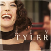
Wow, those are really pretty icons. All the Liv Tyler ones are beautiful. Especially #3, she reminds of a classic movie star in that picture. Lol.
Also I know this may be annoying since this is my second time asking you a question, but how did you get the Marilyn photo in icon #6 to look that glossy? It looks great.
I'm relatively proud of my Liv ones. They're not great, but they're considerably better than most of the icons I make =)
Well, I can actually rememeber vaguely what I did with that one. I followed this tutorial, but I changed the colours and brushes slightly, otherwise the icon would have come out too dark and overcrowded. Other than that, I think it's the picture that enhanced how the final result looked =)
Comments 16
by the way, i'm taking number 9.
<3
Reply
Anyways, enjoy!
Reply
Reply
Oh, and I wanted to ask you...I love all your icons SO much, would you maybe be interesting in being an affiliate with my icon journal, whore_? Let me know. :)
Reply
Sure, I'll add you to my userinfo. =)
Reply
anyway, i'll put you in whore_'s info as well, thanks. :)
Reply
Reply
Reply
Reply
Also I know this may be annoying since this is my second time asking you a question, but how did you get the Marilyn photo in icon #6 to look that glossy? It looks great.
Reply
Well, I can actually rememeber vaguely what I did with that one. I followed this tutorial, but I changed the colours and brushes slightly, otherwise the icon would have come out too dark and overcrowded. Other than that, I think it's the picture that enhanced how the final result looked =)
Reply
Reply
Reply
Leave a comment