Tutorial #03, #04 and #05
As all those icons are done in a very similar way and in 4 or 5 steps, I post all of them in one entry. Those icons are, in my opinion, the perfect examples of how easy it is to do icons from a colorful movie capped in blu-ray.
from
to
Tools used on Photoshop CS5:
- Color balance
- Vibrance
- Brightness/contrast
Layer list HERE. The name of the layer is written in each step.
How to:
1/Layer 3: Resize the picture (Image -> Image size). Open a new file, size 100*100 pixels. Slide the image you just resized to the 100*100 base.
2/Brightness/Contrast 1: We will begin by brighten the image. As it is a blu-ray cap and this movie is already very colorful, not a lot has to be made to have a beautiful result (call me lazy!).
Layer ->New adjustements layer -> Brightness/Contrast
Brightness: 101
Contrast: 58
Always be careful with the brightness/contrast layer to not brighten too much. The contrast make areas looking darker and other really bright so move the brightness and the contrast in the mean time to be sure the picture stays balanced.
3/Color Balance 1: We won't brighten the image too much because I want to work on the coloring before and add some yellow (to avoid the icon to look too pink). I decided to use a color balance layer to control a bit all the colors in the picture.
Layer -> New adjustments layer -> Color balance layer
Midtones: +17, -1, -31
4/Vibrance 1: The colors are here but look faded. So I decided to use a vibrance layer in order to make them pimp a bit!
Layer -> New adjustments layer -> Vibrance
Vibrance: +57
Saturation: -1
I lowered the saturation because I want the icon to be full of light so I don't want the dark colors to be too visible.
Result so far

4/Brightness/contrast 2: And now guess what? Light!
Layer ->New adjustements layer -> Brightness/Contrast
Brightness: 35
Contrast: 20
5/Color balance 2: ho gosh, have you seen how yellowish/green it is? We need other colors, like more red. So we will open a color balance layer again:
Layer -> New adjustments layer -> Color balance layer
Midtones: +27, 0, +52
And then you realize that actually, if you haven't retouched the coloring at first, you would have made the icon in only 2 steps instead of 5. Oh the joys of coloring xd But I always do like this, I mean I don't really plan anything while I'm working on icons, it is just the heat of the moment :p
6/Final: Merge all the layers. Go to
Filter -> Sharpen -> Sharpen
Then, click on
Edit -> Fade sharpen
And fade the sharpeness. I don't like oversharpened icons (with a few exceptions) but I don't like blurry ones either so I always spend a bit of time playing with the "fade sharpen". Usually, I fade it between 5 and 20. It really depends on the icon.
Final result

from
to
Tools used on Photoshop CS5:
- Color balance
- Vibrance
- Brightness/contrast
Layer list HERE. The name of the layer is written in each step.
How to:
1/Layer 3: Resize the picture (Image -> Image size). Open a new file, size 100*100 pixels. Slide the image you just resized to the 100*100 base.
2/Color balance 1: Let's be a bit original and begin by slightly color this icon. As I said above, not a lot has to be done to have a good icon with those caps and to be sure to not do the same mistake than above, we will color first.
Layer -> New adjustments layer -> Color balance layer
Midtones: +8, +2, +6
Highlights: 0, 0, -1
3/Brightness/contrast 1: We will now highlight the icon. Though, we will do it in 2 steps to be sure to avoid the over brightness/over contrasts.
Layer ->New adjustements layer -> Brightness/Contrast
Brightness: 23
Contrast: 19
Result so far

4/Brightness/contrast 2: Second step of the brightness/contrast step. You may be able to do it in only one step, but I prefer to do it in 2 because it is easier to balance and I'm a control freak.
Layer ->New adjustements layer -> Brightness/Contrast
Brightness: 71
Contrast: 80
5/Color Balance layer: As the icon looks a bit too pink/red, I want to add a little yellow touch (it seems I can't do an icon without yellow, don't ask why I have no idea)
Layer -> New adjustments layer -> Color balance layer
Midtones: 0, 0, -6
Merge everything, sharpen and then fade the sharpen just like above and you're done!
Final result

from
to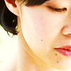
Tools used on Photoshop CS5:
- Color balance
- Vibrance
- Brightness/contrast
Layer list HERE. The name of the layer is written in each step.
How to:
1/Layer 3: Resize the picture (Image -> Image size). Open a new file, size 100*100 pixels. Slide the image you just resized to the 100*100 base.
2/Brightness/Contrast 1: Because doing the same way all the time is boring, we will begin by highlight the icon. Actually, the real reason is that I don't really want to touch the coloring. As you have seen in the icon just before, just a little kick on the light and the icon looks nearly perfect.
Layer ->New adjustements layer -> Brightness/Contrast
Brightness: 111
Contrast: 59
3/Vibrance: See? The natural coloring is beautiful. But it needs to be pimped a bit. So I decided to use a vibrance layer.
Layer -> New adjustments layer -> Vibrance
Vibrance: +32
Saturation: +10
Result so far
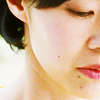
4/Color Balance 2: It now needs more yellow and a bit of brightness. We will do all this in using only one tool: the color balance. The thing is that with this tool, when you use the "highlight" part, you can brighten an icon in adding some colors.
Layer -> New adjustments layer -> Color balance layer
Midtones: +16, 0, +9
Highlights: 0, 0, -13
Then merge, sharpen, edit the sharpen and *drums roll*
Final result

- Tutorials masterlist
- Don't even try to ask for a .PSD.
- Fell free to ask all the questions you want!
- You can ask a tutorial of everything posting in that comm.
- Sorry for any spelling mistakes, no existant grammar in some sentences.
- Keep in mind those settings may not work on your pictures!
from

to

Tools used on Photoshop CS5:
- Color balance
- Vibrance
- Brightness/contrast
Layer list HERE. The name of the layer is written in each step.
How to:
1/Layer 3: Resize the picture (Image -> Image size). Open a new file, size 100*100 pixels. Slide the image you just resized to the 100*100 base.
2/Brightness/Contrast 1: We will begin by brighten the image. As it is a blu-ray cap and this movie is already very colorful, not a lot has to be made to have a beautiful result (call me lazy!).
Layer ->New adjustements layer -> Brightness/Contrast
Brightness: 101
Contrast: 58
Always be careful with the brightness/contrast layer to not brighten too much. The contrast make areas looking darker and other really bright so move the brightness and the contrast in the mean time to be sure the picture stays balanced.
3/Color Balance 1: We won't brighten the image too much because I want to work on the coloring before and add some yellow (to avoid the icon to look too pink). I decided to use a color balance layer to control a bit all the colors in the picture.
Layer -> New adjustments layer -> Color balance layer
Midtones: +17, -1, -31
4/Vibrance 1: The colors are here but look faded. So I decided to use a vibrance layer in order to make them pimp a bit!
Layer -> New adjustments layer -> Vibrance
Vibrance: +57
Saturation: -1
I lowered the saturation because I want the icon to be full of light so I don't want the dark colors to be too visible.
Result so far

4/Brightness/contrast 2: And now guess what? Light!
Layer ->New adjustements layer -> Brightness/Contrast
Brightness: 35
Contrast: 20
5/Color balance 2: ho gosh, have you seen how yellowish/green it is? We need other colors, like more red. So we will open a color balance layer again:
Layer -> New adjustments layer -> Color balance layer
Midtones: +27, 0, +52
And then you realize that actually, if you haven't retouched the coloring at first, you would have made the icon in only 2 steps instead of 5. Oh the joys of coloring xd But I always do like this, I mean I don't really plan anything while I'm working on icons, it is just the heat of the moment :p
6/Final: Merge all the layers. Go to
Filter -> Sharpen -> Sharpen
Then, click on
Edit -> Fade sharpen
And fade the sharpeness. I don't like oversharpened icons (with a few exceptions) but I don't like blurry ones either so I always spend a bit of time playing with the "fade sharpen". Usually, I fade it between 5 and 20. It really depends on the icon.
Final result

from

to

Tools used on Photoshop CS5:
- Color balance
- Vibrance
- Brightness/contrast
Layer list HERE. The name of the layer is written in each step.
How to:
1/Layer 3: Resize the picture (Image -> Image size). Open a new file, size 100*100 pixels. Slide the image you just resized to the 100*100 base.
2/Color balance 1: Let's be a bit original and begin by slightly color this icon. As I said above, not a lot has to be done to have a good icon with those caps and to be sure to not do the same mistake than above, we will color first.
Layer -> New adjustments layer -> Color balance layer
Midtones: +8, +2, +6
Highlights: 0, 0, -1
3/Brightness/contrast 1: We will now highlight the icon. Though, we will do it in 2 steps to be sure to avoid the over brightness/over contrasts.
Layer ->New adjustements layer -> Brightness/Contrast
Brightness: 23
Contrast: 19
Result so far

4/Brightness/contrast 2: Second step of the brightness/contrast step. You may be able to do it in only one step, but I prefer to do it in 2 because it is easier to balance and I'm a control freak.
Layer ->New adjustements layer -> Brightness/Contrast
Brightness: 71
Contrast: 80
5/Color Balance layer: As the icon looks a bit too pink/red, I want to add a little yellow touch (it seems I can't do an icon without yellow, don't ask why I have no idea)
Layer -> New adjustments layer -> Color balance layer
Midtones: 0, 0, -6
Merge everything, sharpen and then fade the sharpen just like above and you're done!
Final result

from

to

Tools used on Photoshop CS5:
- Color balance
- Vibrance
- Brightness/contrast
Layer list HERE. The name of the layer is written in each step.
How to:
1/Layer 3: Resize the picture (Image -> Image size). Open a new file, size 100*100 pixels. Slide the image you just resized to the 100*100 base.
2/Brightness/Contrast 1: Because doing the same way all the time is boring, we will begin by highlight the icon. Actually, the real reason is that I don't really want to touch the coloring. As you have seen in the icon just before, just a little kick on the light and the icon looks nearly perfect.
Layer ->New adjustements layer -> Brightness/Contrast
Brightness: 111
Contrast: 59
3/Vibrance: See? The natural coloring is beautiful. But it needs to be pimped a bit. So I decided to use a vibrance layer.
Layer -> New adjustments layer -> Vibrance
Vibrance: +32
Saturation: +10
Result so far

4/Color Balance 2: It now needs more yellow and a bit of brightness. We will do all this in using only one tool: the color balance. The thing is that with this tool, when you use the "highlight" part, you can brighten an icon in adding some colors.
Layer -> New adjustments layer -> Color balance layer
Midtones: +16, 0, +9
Highlights: 0, 0, -13
Then merge, sharpen, edit the sharpen and *drums roll*
Final result

- Tutorials masterlist
- Don't even try to ask for a .PSD.
- Fell free to ask all the questions you want!
- You can ask a tutorial of everything posting in that comm.
- Sorry for any spelling mistakes, no existant grammar in some sentences.
- Keep in mind those settings may not work on your pictures!