Icon Tutorial #5 - Princess Sakura (TRC)
All right my 5th Tutorial! ^^; This was, in a way, requested by ttrulytt. She wanted to see how I color my icons/how I make it so vivid and bright. It's a simple to get the coloring, but I'll make a whole icon tutorial with the coloring and everything else. Just remember that results will and or might vary. The character that's featuring is Princess Sakura from TSUBASA RESERVoir CHRoNiCLE ♥
We'll be going from this to this ->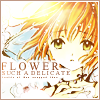
The program used was Adobe Photoshop Elements 3.0 because I can totally handle that better than 7.0. But I'm sure it can be translated to other editing programs, like Adobe CS2, Adobe 7.0, and Paintshop.
Click the cut and let's begin. :]
Step: 1 Let's take our awfully huge image and crop it down to size. The size would be 100x100 px. Make sure you crop an image where the "main" thing could be seen. In this case, I'm cropping her face. From there we get this:
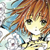
Now we have our base, but we also have to color and fix the image.
Step: 2 Duplicate the base two times and set the first duplicate to Screen; 50% Opacity. Then the second duplicate to Soft Light; 100% Opacity. Make sure the base is in normal. Then click CTRL + SHIFT + E to merge the layers down. From there we get this:
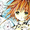
Now we have a vivid bright icon, but we'll have to make it look pretty. :)
Step: 3 Make a new layer and paste this brush by ewanism and resize it 101 px size. Place it to the left side of the icon twice so that there's a big space enough for text. We get:
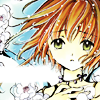
Now we have a place for text. =]
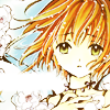
Step: 4 Now we'll make the icon look nice and bright. Let's take this gradient by 77words and set it to Screen; 70% Opacity With that in place let's take our merged base and duplicate it. Then take the duplicate and drag it all the way to the top and set it to Soft Light; 75% Opacity. From there we have this:
If you'd like to see how the layers are supposed to be, then click. =]
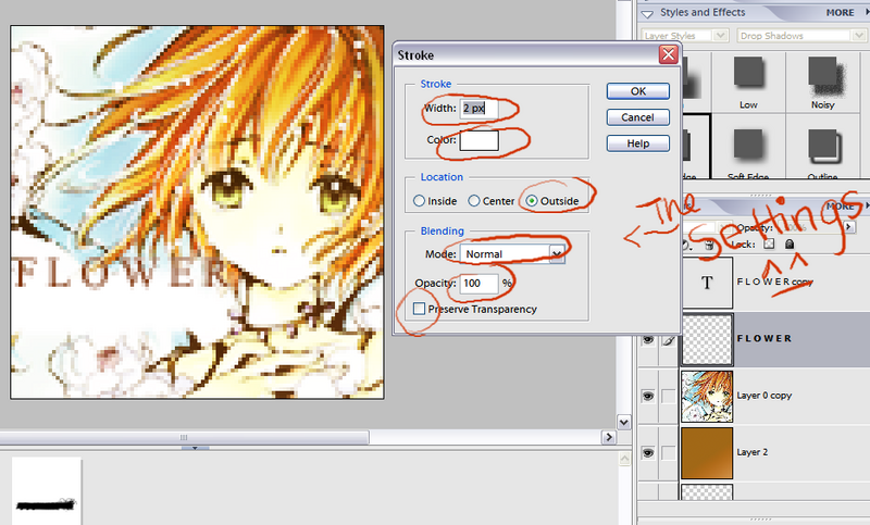
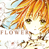
Step: 5 Now we'll add text some text to make it look at least a bit decent. Take the color #82360D and the font Times New Roman and type "F L O W E R" in size 11 pt. Duplicate that text layer and then change the color of the original text layer to white then simplify the original layer. We'll be stroking the original layer. :D Go to Edit -> Stroke (Outline) Selection. A window will pop-up. Your settings should look like this:
Then press ok. Then from there we get this:
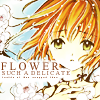
Step: 6 Now we'll add more of the text. Take the same color font as before and the same font, as well and type "S U C H A D E L I C A T E" in 6 pt. Add that under "F L O W E R" and if a part of the text is unreadable go back to the same layer with the white space and add a white space under the unreadable text so now it's readable. Then make a new layer and take a tiny text brush from 77words and place it under the whole text. We get this:
Step: 7 Now that we have our text down we're going to add a shiny texture. Take this texture by ??? (if anyone could tell me, please say so! :D) and put it to Screen; 100% Opacity. From there we know have this:
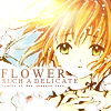
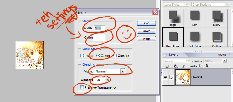
Step: 8 And now we're going to add the finishing touches! Merge your layers by pressing CTRL + SHIFT + E and then go to EDIT -> STROKE (OUTLINE) SELECTION. The settings for it should look like this:
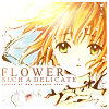
Then press ok. You get this:
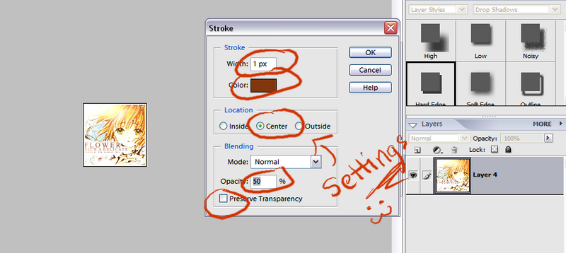
But we're going to add another stroke. Go to the same section but your setting should look like this (the color for the border is #82360D):
Then press okay and the final product should look like this:

And you're done. (: Yes, I know that tutorial was very confusing but it's such a simple icon. o_o If you can't understand anything please ask. Feedbacks? Comments? Questions? Whatever, just state them. :) Hope you enjoyed it. ♥
We'll be going from this to this ->

The program used was Adobe Photoshop Elements 3.0 because I can totally handle that better than 7.0. But I'm sure it can be translated to other editing programs, like Adobe CS2, Adobe 7.0, and Paintshop.
Click the cut and let's begin. :]
Step: 1 Let's take our awfully huge image and crop it down to size. The size would be 100x100 px. Make sure you crop an image where the "main" thing could be seen. In this case, I'm cropping her face. From there we get this:

Now we have our base, but we also have to color and fix the image.
Step: 2 Duplicate the base two times and set the first duplicate to Screen; 50% Opacity. Then the second duplicate to Soft Light; 100% Opacity. Make sure the base is in normal. Then click CTRL + SHIFT + E to merge the layers down. From there we get this:

Now we have a vivid bright icon, but we'll have to make it look pretty. :)
Step: 3 Make a new layer and paste this brush by ewanism and resize it 101 px size. Place it to the left side of the icon twice so that there's a big space enough for text. We get:

Now we have a place for text. =]
Step: 4 Now we'll make the icon look nice and bright. Let's take this gradient by 77words and set it to Screen; 70% Opacity With that in place let's take our merged base and duplicate it. Then take the duplicate and drag it all the way to the top and set it to Soft Light; 75% Opacity. From there we have this:

If you'd like to see how the layers are supposed to be, then click. =]
Step: 5 Now we'll add text some text to make it look at least a bit decent. Take the color #82360D and the font Times New Roman and type "F L O W E R" in size 11 pt. Duplicate that text layer and then change the color of the original text layer to white then simplify the original layer. We'll be stroking the original layer. :D Go to Edit -> Stroke (Outline) Selection. A window will pop-up. Your settings should look like this:

Then press ok. Then from there we get this:

Step: 6 Now we'll add more of the text. Take the same color font as before and the same font, as well and type "S U C H A D E L I C A T E" in 6 pt. Add that under "F L O W E R" and if a part of the text is unreadable go back to the same layer with the white space and add a white space under the unreadable text so now it's readable. Then make a new layer and take a tiny text brush from 77words and place it under the whole text. We get this:

Step: 7 Now that we have our text down we're going to add a shiny texture. Take this texture by ??? (if anyone could tell me, please say so! :D) and put it to Screen; 100% Opacity. From there we know have this:

Step: 8 And now we're going to add the finishing touches! Merge your layers by pressing CTRL + SHIFT + E and then go to EDIT -> STROKE (OUTLINE) SELECTION. The settings for it should look like this:

Then press ok. You get this:

But we're going to add another stroke. Go to the same section but your setting should look like this (the color for the border is #82360D):

Then press okay and the final product should look like this:

And you're done. (: Yes, I know that tutorial was very confusing but it's such a simple icon. o_o If you can't understand anything please ask. Feedbacks? Comments? Questions? Whatever, just state them. :) Hope you enjoyed it. ♥