(001) Tutorial #1 and #2: Sapphire and Naruto!
Being in Arizona doesn't mean I have given up graphic making. I realized I was bored and haven't made a lot of tutorials so far so here are 2 (both are a bit similar). I used Adobe Photoshop 6.0 on both but you can be able to translate it to other programs. You must know the basics of blending, text placement, coloring and cropping.
Both image heavy and written by a newbie. Have fun :)
Take this to
1. Take this picture of Sapphire

2. Crop it so there is no picture of the wall. :)

3. Duplicate the base and set to overlay 100%

4. Take this texture
(by triedtoholdonto and slap it on the base, set to screen 100%

5. Messy, so I'll erase the light textures on his face.

6. Yay, I take this hot pink color and fill it on a new layer and set it to softlight 50%

7. Doesn't look scary enough. I duplicate the base layer and set it on the top and set it to softlight 100%

8. Too blurry. I'll sharpen the layer. Sharpen it once or twice is good enough.
9. Looks nice enough, but too plain. I've decide to add text, so make a new layer.

10. Font is Century Gothic size 11. I type in 'know no'.

11. New layer and type 'F E A R', size 14.
12. New layer and add tiny text
13. Add a border (by titan_girl) and you are done!
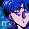
Similar Icon: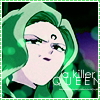
Take this to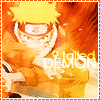

1. Take your picture and crop it to 100x100.

2. Duplicate your base and set it to Overlay 100%

3. A bit too blurry, so I sharpen it once.
4. Okay, we are going to make a gradient. W00t!!! First select a color from your base using the eyedropper tool. I chose a nice orangy color. Select your second color by clicking your background color on your pallet. I chose a yellowish color. what it looks like
5. Make a new layer.
6. Go to your gradient toolbar and click on the gradient (foreground to background). what it looks like
7. Click anywhere on your picture to and end with another click. Feel free to change as much as you want. :)
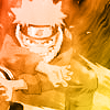
8. Set it to color.

9. Horrible, ne? Don't worry. Duplicate your base and drag it on the top. Set it to softlight 100% and blur it with Gaussian Blur anywhere between 3.0 pixels to 5.0 pixels.
10. Go back to your gradient layer and change the opacity so that the gradient is there, but not very effective. I put it around 50%

11. Now, some text. Both colors of the text are white. I used Century Gothic size 9 and typed in '9 tailed'. Set it to overlay 100% and at least duplicate the text layer 3 times.

12. New layer. Same font, size 14 and I typed in 'demon'. Set it to overlay 100% and at least duplicate the layer 3 times.
13. Add a border and you are done!:)

Layer Order
Well...any questions?
Both image heavy and written by a newbie. Have fun :)
Take this to

1. Take this picture of Sapphire

2. Crop it so there is no picture of the wall. :)

3. Duplicate the base and set to overlay 100%

4. Take this texture

(by triedtoholdonto and slap it on the base, set to screen 100%

5. Messy, so I'll erase the light textures on his face.

6. Yay, I take this hot pink color and fill it on a new layer and set it to softlight 50%

7. Doesn't look scary enough. I duplicate the base layer and set it on the top and set it to softlight 100%

8. Too blurry. I'll sharpen the layer. Sharpen it once or twice is good enough.
9. Looks nice enough, but too plain. I've decide to add text, so make a new layer.

10. Font is Century Gothic size 11. I type in 'know no'.

11. New layer and type 'F E A R', size 14.
12. New layer and add tiny text
13. Add a border (by titan_girl) and you are done!

Similar Icon:

Take this to


1. Take your picture and crop it to 100x100.

2. Duplicate your base and set it to Overlay 100%

3. A bit too blurry, so I sharpen it once.
4. Okay, we are going to make a gradient. W00t!!! First select a color from your base using the eyedropper tool. I chose a nice orangy color. Select your second color by clicking your background color on your pallet. I chose a yellowish color. what it looks like
5. Make a new layer.
6. Go to your gradient toolbar and click on the gradient (foreground to background). what it looks like
7. Click anywhere on your picture to and end with another click. Feel free to change as much as you want. :)

8. Set it to color.

9. Horrible, ne? Don't worry. Duplicate your base and drag it on the top. Set it to softlight 100% and blur it with Gaussian Blur anywhere between 3.0 pixels to 5.0 pixels.
10. Go back to your gradient layer and change the opacity so that the gradient is there, but not very effective. I put it around 50%

11. Now, some text. Both colors of the text are white. I used Century Gothic size 9 and typed in '9 tailed'. Set it to overlay 100% and at least duplicate the text layer 3 times.

12. New layer. Same font, size 14 and I typed in 'demon'. Set it to overlay 100% and at least duplicate the layer 3 times.
13. Add a border and you are done!:)

Layer Order
Well...any questions?