Happy July: Free Books! Cover Competition!
So six of my friends and I were discussing US and UK covers one day, and we compared and constrasted and generally came to very few conclusions about the difference between US and UK covers. We were focusing on young adult covers, as we're all young adult authors, and I thought it might be interesting to share some of our waffling here. Possibly even enlightening!
Okay, it was all Saundra Mitchell's idea and anything enlightening was probably said by her, and definitely not by me.
But as a reward for listening to my babbling, we thought we could give away seven books at once.
In the US, I think young adult fiction is seen as slanted more towards adults, whereas in the UK young adult fiction is seen as slanted more towards kids: with the landslide success of Twilight everywhere this is changing as we speak, but for now I've noticed that in the US teen sections are kept quite separate from and sometimes far away from the children's section, and in the UK they tend to be together and quite often to blend.
So, there's the question of different audiences for the US and UK people.
There's also the question of different sensibilities: I know a couple of US covers that were changed because 'that's too sexy for the UK market.' This overlaps with the question of audience, but might also have something to do with notions of propriety this side of the pond. ;)
And there's the question of timing. Some of us have always loved young adult fiction - for instance, you can try prying my copy of Margaret Mahy's The Changeover out of my cold, dead hands - but it cannot be denied it's exploded in recent years, and especially since Twilight, though there were signs of its rising popularity well before that. And Twilight had a much slower start in the UK than the US - possibly due to their very different covers. So I think the UK is less certain of young adult fiction: it has lots of experiments in style.
One example of such experimentation is a book I know of that was sold as straight-up YA fantasy in the US, was sold as YA fantasy with a different UK cover, and at the same time as adult fantasy with yet another different UK cover and a different title. This was deeply confusing for me. I very nearly bought the same book twice.


Uglies by Scott Westerfeld, published in 2005
Here is the first piece of proof that US covers favour photographs of people. It is a Thing. I think this may be the biggest difference between US and UK covers: it's fairly usual for a UK cover for young adults to have an illustrated cover, whereas I've seen few US covers with illustrated people on them, and those that have them tend to trend young.
The UK Uglies cover isn't illustrated, but it is experimental: in a way they're both 'What the heck!' covers. (In my head there are two kinds of covers - covers trying for the reaction of 'Oooh pretty, I shall pick it up!' and covers trying for 'What is that about...? I shall pick it up!' Some covers do both, but I see those as the Two Main Aims.) The US cover makes you go 'What the heck' because of the way the title works with the cover - it's a picture of a girl who as far as we can see is pretty, and yet the title says Uglies. 'What the heck,' we say, and pick it up. The UK cover is of doll parts and medical equipment. Surgery on Barbies? A torture manual for doll haters? 'What the heck' we say, and pick it up.
The system works!

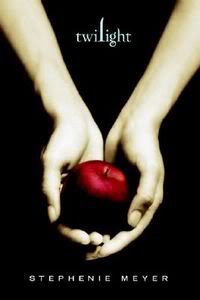
Twilight by Stephenie Meyer, published 2006
The US cover for Twilight is pretty well-known, and I have gone on about how it is genius for both being iconic and having a person on it as well.
The UK cover is less well known, as it was rejacketed with the US cover in paperback and has thence rocketed to success. I read it with the UK hardcover, and I showed it around to all my friends and swore it was selling like Harry Potter in the States. 'But we've never even HEARD of it!' they exclaimed. (Now, they have.)
I see the UK cover as an experiment: a photographic cover of a person, yes, but altered to suggest the supernatural. She is all flat (as if someone had taken a rolling pin to her, I am not commenting on Bella Swan's womanly endowments) and ghostly looking: she's near some lockers. The UK cover trends young, too, as it makes it clear the character is going to school.
After realising the US cover does so well, though, the UK publishing industry said to themselves 'Black and red!' As we shall see...


City of Bones by Cassandra Clare, published 2007
Both photographic covers, but the US versus UK sensibility is a factor here: the boy on the US cover is foxy, whereas the girl on the UK cover is moody. The US cover has the 'Oooh, someone's shirt is off, LET'S GO! pretty' and the UK cover has the 'what the heck is on that girl's face? Ah, runes!'
Interestingly enough, with the release of the third book the series is being rejacketed in the UK with the US covers.


City of Ashes by Cassandra Clare, published 2008
I thought it might be cool to see how series progress when on a different track: the US cover keeps it up with the 'oooh, pretty' this time with sparkling waters and flaming hair rather than shirtlessness (Probably for the best, I for one would be rather startled by Clary's womanly endowments on display). And the UK cover this time is working the attractive guy, in an understated way, and the cover is also a little black and red. Remember those colours!
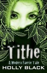
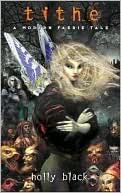
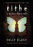
Tithe by Holly Black, published 2002
'Sarah' you might well say. 'Why is this all the way down here when it's the earliest? Also why are there THREE COVERS explain yourself!'
So the middle cover is the US hardcover of Tithe, which was rejacketed into the last cover for the US paperback. (This happens, and in fact one day I may do a post on the changes of some books from hardcover to paperback. But not today!) But since we in the UK are suckers for our illustration, the middle cover was what was used as the first paperback edition over here. (That's the one I own, incidentally. If it is rare and coveted by others, I shall be much pleased.)
Then the UK cover was changed to reflect the US cover, and then in 2008 the first cover in the line-up, and the first original UK cover, was put on UK bookshelves.
This one is a little tricky, I realise. But the US paperback is one of the Very First YA iconic covers against a dark background, and we can see how it had babies like Twilight.
The UK cover isn't illustrated (as we'd already had an illustrated Tithe) but it does have a fairytalesque quality I think, and it also has masses and masses of foil.
(And if you think three covers is tricky, I could have shown you the new UK adult editions, and the new US covers coming out soon: I had mercy and did not complicate things further.)

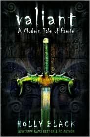
Valiant by Holly Black, published 2005
But same deal as with the first book in the series: the first original UK cover was published in 2008. Remember I told you guys to watch for black and red? Here it is, accompanied by tons of foil (in an iron fretwork pattern, which fits nicely with the book). And the US: icon against dark background, much more obviously fitting in with a series than the UK cover does - different views on companion novels? Who can tell.

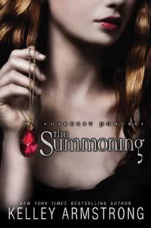
The Summoning by Kelley Armstrong, published 2008
Illustrated UK cover, photographic with person US cover, and the UK cover has a lighter background: if moodiness is to be had, it's in the rather Gothic-looking house. The look of the UK cover also fits in with the UK covers for Kelley Armstrong's adult series, and in fact I often see it shelved in the adult section.
Also interestingly, the sequel The Awakening has the same cover in the UK as in the US - girl in moody light, holding a necklace, as on the first book's US cover.


The Devouring by Simon Holt, published 2008.
This UK cover is experimental too - I have to say, it kind of gives me nightmares! And it's a huge contrast with the mellow US one, as well as being another example of illustrated and photographic covers. I have one theory about this book, which is that since the author's got a boy's name and boys are statistically more likely to read books by boys, the UK cover and its horror edge is designed to appeal most to boys. Whereas girls statistically read more full stop, and the US cover is designed to appeal to them. Different audiences in two senses of the world!
Plus an example of the pretty cover (US) versus the 'What the heck' cover, as in 'What the heck is up with that guy's face? Pick it up!' (Oh my God his faaaaace ohhhh myyyyy Gooooood.)


The Hunger Games by Suzanne Collins, published 2008
The UK cover, as we can see, illustrated person, and black and red! And the US cover, iconic against a dark background.
Early versions of the UK cover folded out to show another character against a blue background, and I own that version: cool diversifying extra feature, also possibly giving a younger impression than the US cover.


Ash by Malinda Lo, published 2009 (not yet)
And spot the UK cover: trending younger, and distinctly fairytalesque: in this case very appropriately, as the book is about Cinderella. The UK cover highlights that by the edge-of-Disney but atmospheric illustration and the telling glass slipper, and the US one does something different but very clever: the icon against the dark moody background is a person! Curled up to look like a cinder. Very well played.
And to examine those of the seven participants who have US and UK covers to examine:


Knife or Spell Hunter by R.J. Anderson, published 2009
Both of these books are illustrated, which is rare! And the US one looks designed for a younger audience to me: in fact I was signing in Harrods a couple of weeks ago, and the bookseller there had ordered in the US copy because she thought it'd fly off her shelves. So I think this is a US cover with a lot of UK sensibility.
But the moodier, iconic UK cover has specific art on it: it has art by Brian Froud, a UK artist who a lot of people in the UK are going to recognise. (Other people too, but tons of UK people.) So it's a clever cover for over here because the feeling of familiarity will make people stop and pick it up. And it's very pretty, with lots of foil: the UK does undoubtedly like its foil. More on that...


Wings by Aprilynne Pike, published 2009
Both of these covers are iconic and both are photographic, but the UK cover (as UK covers do) trends a little younger to me - bright colours, snazzy font, lots of foil. Whereas the US cover has a moodier, darker look, fitting in with iconic covers like Twilight, Tithe and Hunger Games. Note the foil thing: see, I told you the UK seems to really like foil. I can take out Knife and Wings and tilt them up to the light and be entertained for hours and - minutes. Yep, minutes. Very few of them. I'm a grown-up. Swear.


The Forest of Hands and Teeth by Carrie Ryan, published 2009
Iconic and photographic cover: the photographic cover is the US cover, natch, and the UK cover is black and red.
An interesting thing about UK and US sensibilities here: several of the seven discussing this were halted by the UK cover, going 'Yes but what IS that image?' Whereas I, the one used to UK covers, said 'Naturally it is a skeleton hand beckoning/skeletal leaf thing!' I don't know whether this means my side of the pond likes something convoluted, but thinking about some European movies, signs could point to yes...


The Demon's Lexicon by Sarah Rees Brennan, published 2009
Analysing your own covers is the very hardest, as one is tempted to go 'OH MY BABY FLAIL!' but see how the pattern continues. My UK cover is illustrated, and my US cover is photographic: they both have the pretty cover thing going on (as hello, attractive young men) and though it cannot be seen here, the title of the UK cover is foil.
And the UK cover is black and red: to which, no objection in life. Good colours, and good company!
Now, having seen so many US versus UK covers, you probably have opinions. You probably have favourites.
I cannot hear them. (NO. SERIOUSLY. PLEASE DO NOT TELL ME. SERIOUSLY, PLEASE DO NOT.) Books are not significantly like our children, as selling one's children in the marketplace is frowned on by many. But book covers are like our children's faces in a way - they mean a lot to us, and we don't have control over them. They're also marketing tools, so people should feel free to express their opinions on them: but doing it to the author is liable to just make the author collapse in a tragic heap of smelling salts and brandy. (Medicinal, of course!)
I would like to hear anyone's thoughts on the trends in covers on both sides of the pond, possibly how US covers sometimes get new covers in paperback but never adopt the UK ones, and how the UK industry often changes to the US covers to see what will happen. I'd also like to hear guesses on what the UK covers of the other three of the seven debaters - Saundra Mitchell of Shadowed Summer, Sarah MacLean of The Season and Sarah Cross of Dull Boy - would look like.
But if you want to pick favourites, good news, that's how you win seven books at once!

Go here to vote for Team US or Team UK, and possibly win either the seven books in the UK package complete with UK covers, or the seven books in the US package complete with US covers.
Okay, it was all Saundra Mitchell's idea and anything enlightening was probably said by her, and definitely not by me.
But as a reward for listening to my babbling, we thought we could give away seven books at once.
In the US, I think young adult fiction is seen as slanted more towards adults, whereas in the UK young adult fiction is seen as slanted more towards kids: with the landslide success of Twilight everywhere this is changing as we speak, but for now I've noticed that in the US teen sections are kept quite separate from and sometimes far away from the children's section, and in the UK they tend to be together and quite often to blend.
So, there's the question of different audiences for the US and UK people.
There's also the question of different sensibilities: I know a couple of US covers that were changed because 'that's too sexy for the UK market.' This overlaps with the question of audience, but might also have something to do with notions of propriety this side of the pond. ;)
And there's the question of timing. Some of us have always loved young adult fiction - for instance, you can try prying my copy of Margaret Mahy's The Changeover out of my cold, dead hands - but it cannot be denied it's exploded in recent years, and especially since Twilight, though there were signs of its rising popularity well before that. And Twilight had a much slower start in the UK than the US - possibly due to their very different covers. So I think the UK is less certain of young adult fiction: it has lots of experiments in style.
One example of such experimentation is a book I know of that was sold as straight-up YA fantasy in the US, was sold as YA fantasy with a different UK cover, and at the same time as adult fantasy with yet another different UK cover and a different title. This was deeply confusing for me. I very nearly bought the same book twice.


Uglies by Scott Westerfeld, published in 2005
Here is the first piece of proof that US covers favour photographs of people. It is a Thing. I think this may be the biggest difference between US and UK covers: it's fairly usual for a UK cover for young adults to have an illustrated cover, whereas I've seen few US covers with illustrated people on them, and those that have them tend to trend young.
The UK Uglies cover isn't illustrated, but it is experimental: in a way they're both 'What the heck!' covers. (In my head there are two kinds of covers - covers trying for the reaction of 'Oooh pretty, I shall pick it up!' and covers trying for 'What is that about...? I shall pick it up!' Some covers do both, but I see those as the Two Main Aims.) The US cover makes you go 'What the heck' because of the way the title works with the cover - it's a picture of a girl who as far as we can see is pretty, and yet the title says Uglies. 'What the heck,' we say, and pick it up. The UK cover is of doll parts and medical equipment. Surgery on Barbies? A torture manual for doll haters? 'What the heck' we say, and pick it up.
The system works!


Twilight by Stephenie Meyer, published 2006
The US cover for Twilight is pretty well-known, and I have gone on about how it is genius for both being iconic and having a person on it as well.
The UK cover is less well known, as it was rejacketed with the US cover in paperback and has thence rocketed to success. I read it with the UK hardcover, and I showed it around to all my friends and swore it was selling like Harry Potter in the States. 'But we've never even HEARD of it!' they exclaimed. (Now, they have.)
I see the UK cover as an experiment: a photographic cover of a person, yes, but altered to suggest the supernatural. She is all flat (as if someone had taken a rolling pin to her, I am not commenting on Bella Swan's womanly endowments) and ghostly looking: she's near some lockers. The UK cover trends young, too, as it makes it clear the character is going to school.
After realising the US cover does so well, though, the UK publishing industry said to themselves 'Black and red!' As we shall see...


City of Bones by Cassandra Clare, published 2007
Both photographic covers, but the US versus UK sensibility is a factor here: the boy on the US cover is foxy, whereas the girl on the UK cover is moody. The US cover has the 'Oooh, someone's shirt is off, LET'S GO! pretty' and the UK cover has the 'what the heck is on that girl's face? Ah, runes!'
Interestingly enough, with the release of the third book the series is being rejacketed in the UK with the US covers.


City of Ashes by Cassandra Clare, published 2008
I thought it might be cool to see how series progress when on a different track: the US cover keeps it up with the 'oooh, pretty' this time with sparkling waters and flaming hair rather than shirtlessness (Probably for the best, I for one would be rather startled by Clary's womanly endowments on display). And the UK cover this time is working the attractive guy, in an understated way, and the cover is also a little black and red. Remember those colours!


Tithe by Holly Black, published 2002
'Sarah' you might well say. 'Why is this all the way down here when it's the earliest? Also why are there THREE COVERS explain yourself!'
So the middle cover is the US hardcover of Tithe, which was rejacketed into the last cover for the US paperback. (This happens, and in fact one day I may do a post on the changes of some books from hardcover to paperback. But not today!) But since we in the UK are suckers for our illustration, the middle cover was what was used as the first paperback edition over here. (That's the one I own, incidentally. If it is rare and coveted by others, I shall be much pleased.)
Then the UK cover was changed to reflect the US cover, and then in 2008 the first cover in the line-up, and the first original UK cover, was put on UK bookshelves.
This one is a little tricky, I realise. But the US paperback is one of the Very First YA iconic covers against a dark background, and we can see how it had babies like Twilight.
The UK cover isn't illustrated (as we'd already had an illustrated Tithe) but it does have a fairytalesque quality I think, and it also has masses and masses of foil.
(And if you think three covers is tricky, I could have shown you the new UK adult editions, and the new US covers coming out soon: I had mercy and did not complicate things further.)


Valiant by Holly Black, published 2005
But same deal as with the first book in the series: the first original UK cover was published in 2008. Remember I told you guys to watch for black and red? Here it is, accompanied by tons of foil (in an iron fretwork pattern, which fits nicely with the book). And the US: icon against dark background, much more obviously fitting in with a series than the UK cover does - different views on companion novels? Who can tell.


The Summoning by Kelley Armstrong, published 2008
Illustrated UK cover, photographic with person US cover, and the UK cover has a lighter background: if moodiness is to be had, it's in the rather Gothic-looking house. The look of the UK cover also fits in with the UK covers for Kelley Armstrong's adult series, and in fact I often see it shelved in the adult section.
Also interestingly, the sequel The Awakening has the same cover in the UK as in the US - girl in moody light, holding a necklace, as on the first book's US cover.


The Devouring by Simon Holt, published 2008.
This UK cover is experimental too - I have to say, it kind of gives me nightmares! And it's a huge contrast with the mellow US one, as well as being another example of illustrated and photographic covers. I have one theory about this book, which is that since the author's got a boy's name and boys are statistically more likely to read books by boys, the UK cover and its horror edge is designed to appeal most to boys. Whereas girls statistically read more full stop, and the US cover is designed to appeal to them. Different audiences in two senses of the world!
Plus an example of the pretty cover (US) versus the 'What the heck' cover, as in 'What the heck is up with that guy's face? Pick it up!' (Oh my God his faaaaace ohhhh myyyyy Gooooood.)


The Hunger Games by Suzanne Collins, published 2008
The UK cover, as we can see, illustrated person, and black and red! And the US cover, iconic against a dark background.
Early versions of the UK cover folded out to show another character against a blue background, and I own that version: cool diversifying extra feature, also possibly giving a younger impression than the US cover.


Ash by Malinda Lo, published 2009 (not yet)
And spot the UK cover: trending younger, and distinctly fairytalesque: in this case very appropriately, as the book is about Cinderella. The UK cover highlights that by the edge-of-Disney but atmospheric illustration and the telling glass slipper, and the US one does something different but very clever: the icon against the dark moody background is a person! Curled up to look like a cinder. Very well played.
And to examine those of the seven participants who have US and UK covers to examine:


Knife or Spell Hunter by R.J. Anderson, published 2009
Both of these books are illustrated, which is rare! And the US one looks designed for a younger audience to me: in fact I was signing in Harrods a couple of weeks ago, and the bookseller there had ordered in the US copy because she thought it'd fly off her shelves. So I think this is a US cover with a lot of UK sensibility.
But the moodier, iconic UK cover has specific art on it: it has art by Brian Froud, a UK artist who a lot of people in the UK are going to recognise. (Other people too, but tons of UK people.) So it's a clever cover for over here because the feeling of familiarity will make people stop and pick it up. And it's very pretty, with lots of foil: the UK does undoubtedly like its foil. More on that...


Wings by Aprilynne Pike, published 2009
Both of these covers are iconic and both are photographic, but the UK cover (as UK covers do) trends a little younger to me - bright colours, snazzy font, lots of foil. Whereas the US cover has a moodier, darker look, fitting in with iconic covers like Twilight, Tithe and Hunger Games. Note the foil thing: see, I told you the UK seems to really like foil. I can take out Knife and Wings and tilt them up to the light and be entertained for hours and - minutes. Yep, minutes. Very few of them. I'm a grown-up. Swear.


The Forest of Hands and Teeth by Carrie Ryan, published 2009
Iconic and photographic cover: the photographic cover is the US cover, natch, and the UK cover is black and red.
An interesting thing about UK and US sensibilities here: several of the seven discussing this were halted by the UK cover, going 'Yes but what IS that image?' Whereas I, the one used to UK covers, said 'Naturally it is a skeleton hand beckoning/skeletal leaf thing!' I don't know whether this means my side of the pond likes something convoluted, but thinking about some European movies, signs could point to yes...


The Demon's Lexicon by Sarah Rees Brennan, published 2009
Analysing your own covers is the very hardest, as one is tempted to go 'OH MY BABY FLAIL!' but see how the pattern continues. My UK cover is illustrated, and my US cover is photographic: they both have the pretty cover thing going on (as hello, attractive young men) and though it cannot be seen here, the title of the UK cover is foil.
And the UK cover is black and red: to which, no objection in life. Good colours, and good company!
Now, having seen so many US versus UK covers, you probably have opinions. You probably have favourites.
I cannot hear them. (NO. SERIOUSLY. PLEASE DO NOT TELL ME. SERIOUSLY, PLEASE DO NOT.) Books are not significantly like our children, as selling one's children in the marketplace is frowned on by many. But book covers are like our children's faces in a way - they mean a lot to us, and we don't have control over them. They're also marketing tools, so people should feel free to express their opinions on them: but doing it to the author is liable to just make the author collapse in a tragic heap of smelling salts and brandy. (Medicinal, of course!)
I would like to hear anyone's thoughts on the trends in covers on both sides of the pond, possibly how US covers sometimes get new covers in paperback but never adopt the UK ones, and how the UK industry often changes to the US covers to see what will happen. I'd also like to hear guesses on what the UK covers of the other three of the seven debaters - Saundra Mitchell of Shadowed Summer, Sarah MacLean of The Season and Sarah Cross of Dull Boy - would look like.
But if you want to pick favourites, good news, that's how you win seven books at once!

Go here to vote for Team US or Team UK, and possibly win either the seven books in the UK package complete with UK covers, or the seven books in the US package complete with US covers.