007: ICON TUTORIAL.
Recently I've been playing around with coloring to try to achieve the ever-elusive "exclusion layer" in The Gimp. I think I found something fairly comparable, so I present to you my first Icon Tutorial.
From this to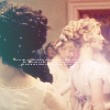
.
We begin with this cap by jfran2258. Crop it.
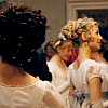
For this cap, I sharpened using Unsharp Mask (Filters>Enhance>Unsharp Mask); you'll have to tweak the settings according to your image. Using the Blur tool, skim over Jane's skin so it's smooth. Then Sharpen again (Filters>Enhance>Sharpen) at 20 or 30. Scale the image to 100x100, then Sharpen once more.
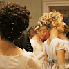
Duplicate the base and set the new layer to Screen.

Now create a new layer with a light blue (#c0d6f6) and set it to Burn at 100% opacity.
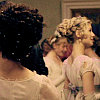
Create another new layer filled with a grapey purple (#7e427c). Set this one to Saturation at 60%.
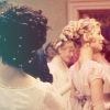
Go Edit>Copy Visible, and paste into a new layer. Blur this (Filters>Blur>Gaussian Blur) at 3. Set the layer to Screen at 60%.
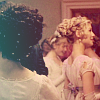
New layer with this gradient thing: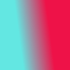
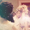
With white as the Foreground Color, select the Gradient tool. Use the pulldown menu to pick the Foreground to Transparent option, and change the Shape to Radial. The layer opacity is 90%. I put it over her shoulder, but you can be creative with the placement.

Finally, add some Tiny Text in 2pt Georgia, and you're done!
From this to

.
We begin with this cap by jfran2258. Crop it.

For this cap, I sharpened using Unsharp Mask (Filters>Enhance>Unsharp Mask); you'll have to tweak the settings according to your image. Using the Blur tool, skim over Jane's skin so it's smooth. Then Sharpen again (Filters>Enhance>Sharpen) at 20 or 30. Scale the image to 100x100, then Sharpen once more.

Duplicate the base and set the new layer to Screen.

Now create a new layer with a light blue (#c0d6f6) and set it to Burn at 100% opacity.

Create another new layer filled with a grapey purple (#7e427c). Set this one to Saturation at 60%.

Go Edit>Copy Visible, and paste into a new layer. Blur this (Filters>Blur>Gaussian Blur) at 3. Set the layer to Screen at 60%.

New layer with this gradient thing:


With white as the Foreground Color, select the Gradient tool. Use the pulldown menu to pick the Foreground to Transparent option, and change the Shape to Radial. The layer opacity is 90%. I put it over her shoulder, but you can be creative with the placement.

Finally, add some Tiny Text in 2pt Georgia, and you're done!