♔ christina ( 017 ★ text tutorial)
This is going to be more of general idea guide rather than a tutorial. I'm assuming everyone reading this has basic knowledge of their text tool in their chosen graphics program. I use Photoshop so the examples I show are going to be from there.
i.
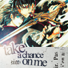
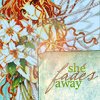
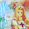
Rotation is my bff. No joke. That is seriously my favorite text tool. I use it a lot, and really it's not that hard to place text once it's rotated. As seen in this icon. I used the negative space around Lightning's head to place rotated text. Fun fact I once received a critique in a LIMS contest about placing text around a character. It was pretty negative as in it said text looked awkward and I should have placed it in a paragraph form. I say BORING. Why wouldn't I rotated it around the character? It's way more fun to look at in my opinion. :) Here is another example of using rotation with text.
ii.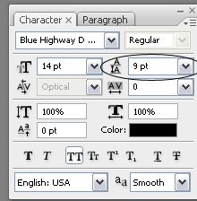
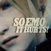
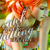
Another type tool I like to play with is the type leading. I use it a lot with big text as shown in this icon. I wanted the "so emo" and "it hurts" to be really close together. It varies from font to font but fooling around with it usually gives great results.
iii.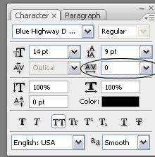
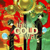
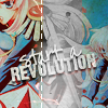
Tracking is really good when I want to put a lot of text in a small area. this icon is a good example of that. I knew I wanted the text between the two characters but I didn't want it to overlap them too much. In this particular one I set the tracking to -100. Which normally doesn't look very nice with script fonts.
iv.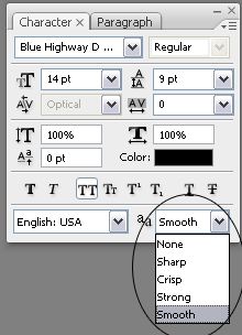
For the love of all that is holy PLEASE use the anti-alias tool. It'll make your text instantly look 110% better. Different fonts look good with different settings but no fonts look good without it. D:
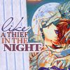
v. Mixing fonts is something I love to do. I think it adds a lot of interest. These three icons all mix different fonts. I tend to lean toward mixing script fonts with nonscript fonts, just becasue I don't like using all script on one icon unless it's only one word. Script fonts tend to get to scribbly for me.
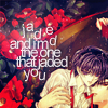
vi. This is an example of jumbling letters. The word "jaded" is all jumbled up and every single letter is on a different layer. It's kind of time consuming to place each letter and rotate some but I think the outcome is worth it.
vii. I'm not too keen on text textures. I would rather make my own text. But I do like text textures that have subtle text. endelyn makes awesome subtle text textures. As seen in this icon. I thought the text was small enough to be considered tiny text but big enough that it added to the mood of the icon. Another example of a text texture, this one is a bit bigger but the text resembles scribbles and that' a-ok in my book.
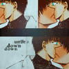
viii. A lot of the time I'll set the font to a different setting like "soft light" or "screen" or place it under a texture. This icon is a good example of that. All of the text is set to "soft light" and it's underneath a texture.
ix. Lastly, just generally have fun with text. Try something stupid and go all out. Text to me doesn't have to make sense, I like text to set the mood for an icon. I mean yeah if it's a person running the obvious thing to type is "running away" or something referring to running. I always think "is there something else I could put here? Is the character sad or happy?"
That whole text has to make perfect sense has always bothered me. Push the envelope I say. ;)
If you read all of this, I really hope you have more ideas for text and it helped somewhat. Just don't be afraid of text, it's mostly trial and error. If you have any questions feel free to ask and I'll be happy to answer them. :D ♥
i.
Rotation is my bff. No joke. That is seriously my favorite text tool. I use it a lot, and really it's not that hard to place text once it's rotated. As seen in this icon. I used the negative space around Lightning's head to place rotated text. Fun fact I once received a critique in a LIMS contest about placing text around a character. It was pretty negative as in it said text looked awkward and I should have placed it in a paragraph form. I say BORING. Why wouldn't I rotated it around the character? It's way more fun to look at in my opinion. :) Here is another example of using rotation with text.
ii.
Another type tool I like to play with is the type leading. I use it a lot with big text as shown in this icon. I wanted the "so emo" and "it hurts" to be really close together. It varies from font to font but fooling around with it usually gives great results.
iii.
Tracking is really good when I want to put a lot of text in a small area. this icon is a good example of that. I knew I wanted the text between the two characters but I didn't want it to overlap them too much. In this particular one I set the tracking to -100. Which normally doesn't look very nice with script fonts.
iv.
For the love of all that is holy PLEASE use the anti-alias tool. It'll make your text instantly look 110% better. Different fonts look good with different settings but no fonts look good without it. D:
v. Mixing fonts is something I love to do. I think it adds a lot of interest. These three icons all mix different fonts. I tend to lean toward mixing script fonts with nonscript fonts, just becasue I don't like using all script on one icon unless it's only one word. Script fonts tend to get to scribbly for me.
vi. This is an example of jumbling letters. The word "jaded" is all jumbled up and every single letter is on a different layer. It's kind of time consuming to place each letter and rotate some but I think the outcome is worth it.
vii. I'm not too keen on text textures. I would rather make my own text. But I do like text textures that have subtle text. endelyn makes awesome subtle text textures. As seen in this icon. I thought the text was small enough to be considered tiny text but big enough that it added to the mood of the icon. Another example of a text texture, this one is a bit bigger but the text resembles scribbles and that' a-ok in my book.
viii. A lot of the time I'll set the font to a different setting like "soft light" or "screen" or place it under a texture. This icon is a good example of that. All of the text is set to "soft light" and it's underneath a texture.
ix. Lastly, just generally have fun with text. Try something stupid and go all out. Text to me doesn't have to make sense, I like text to set the mood for an icon. I mean yeah if it's a person running the obvious thing to type is "running away" or something referring to running. I always think "is there something else I could put here? Is the character sad or happy?"
That whole text has to make perfect sense has always bothered me. Push the envelope I say. ;)
If you read all of this, I really hope you have more ideas for text and it helped somewhat. Just don't be afraid of text, it's mostly trial and error. If you have any questions feel free to ask and I'll be happy to answer them. :D ♥