Round 6 Results
Kinda obvious who's leaving this round, eh? Anyway, results were CLOSE because not many people voted, but there was enough for elimination.

Thank you so much for participating!! Please make sure to stick around and keep voting in future rounds!
1-Little to blank and bare there. Sort of Solid. Nice with the red spot but the icon still looks the same.
#1 - It seems a bit oversharpened. I guess you could soften it up a bit more.
1) The part on the left is a bit blurry when you compare it to Lacus
1 - A very nice splash of red gave a wonderful contrast and the texture effect is nicely done. However, the image of Lacus was sharpened a tad too much.
1. I think it's pretty, but it's basically a copy of the icons in the example icons. The right side of the icon would look better with either more fading or something that made the icon flow from one side to another. Right now you can see the picture sitting on top of the background.
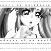
#2 because it seems that it was cut out a bit too badly. A part of Lacus' right shoulder is missing. Also, it looks really plain. Some more textures/brushes could've been used.
2) The tiny text that frames Lacus' face is not tiny enough ; it makes me believe I can read it, but I can't, so I'm frustrated.
Icon #2 - The icon's design is nice, however it's very unbalanced. The white background drains the focus away from the image, and the large spacing of the tiny text is very distracting. Grouping the text better would've balanced out the icon.
2. The picture and crop is not the best choice for the icon. If you would have moved the picture over to the right or the left and not had Lacus in the middle, it would look better.
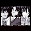
3-Try different kinds of tiny text if you're going to do something like that on that icon. Using just one single line is kind of boring
#3 - You could use some light texture to spruce the picture up a bit more. Too black is sometimes not good. :)
#3 - The tiny text seems a bit strange (bold?), and I'd say you could have done more to the icon.
3) You could have added some light texture to decorate the black.
3 - The icon's design is simple and nice, but the black blends way too much into the hair of the 3 boys.
4-Try a different icon style besides using polygon lasso all the time. It may be a great on some icons but using it all the time isn't a good style.
#4 - I don't see much wrong with this. Maybe a little text could be put in the background? :D
4) The pink sparkles on her hair bothers me : too pink while the whole icon is gray and it doesn't look very nice on her hair. But what really bother me is that the icon ressembles too much a style that was OVERUSED in other icons, especially icontests. Same texture (only desaturated) once again used with same character in chibi form. The white destructured stroke was already used in lots of icons.
To resume, that icon is pretty, but it's unoriginal and copies everyone's style. I think if you could make that icon, you have the abilities to do icons with your own style, not only for winning.
4. It's not a bad icon, but it seems this icon has been done before in this contest. Part of doing something like this to me is trying new things, don't rely on icons you have made in the past.
Best Icon Overall:

//teletha
Congratulations, if you would like a banner, please let us know!Next week you will have 1 vote subtracted during voting.
So we're up to the final three! I'll have your next theme momentarily.

Thank you so much for participating!! Please make sure to stick around and keep voting in future rounds!
1-Little to blank and bare there. Sort of Solid. Nice with the red spot but the icon still looks the same.
#1 - It seems a bit oversharpened. I guess you could soften it up a bit more.
1) The part on the left is a bit blurry when you compare it to Lacus
1 - A very nice splash of red gave a wonderful contrast and the texture effect is nicely done. However, the image of Lacus was sharpened a tad too much.
1. I think it's pretty, but it's basically a copy of the icons in the example icons. The right side of the icon would look better with either more fading or something that made the icon flow from one side to another. Right now you can see the picture sitting on top of the background.
#2 because it seems that it was cut out a bit too badly. A part of Lacus' right shoulder is missing. Also, it looks really plain. Some more textures/brushes could've been used.
2) The tiny text that frames Lacus' face is not tiny enough ; it makes me believe I can read it, but I can't, so I'm frustrated.
Icon #2 - The icon's design is nice, however it's very unbalanced. The white background drains the focus away from the image, and the large spacing of the tiny text is very distracting. Grouping the text better would've balanced out the icon.
2. The picture and crop is not the best choice for the icon. If you would have moved the picture over to the right or the left and not had Lacus in the middle, it would look better.
3-Try different kinds of tiny text if you're going to do something like that on that icon. Using just one single line is kind of boring
#3 - You could use some light texture to spruce the picture up a bit more. Too black is sometimes not good. :)
#3 - The tiny text seems a bit strange (bold?), and I'd say you could have done more to the icon.
3) You could have added some light texture to decorate the black.
3 - The icon's design is simple and nice, but the black blends way too much into the hair of the 3 boys.
4-Try a different icon style besides using polygon lasso all the time. It may be a great on some icons but using it all the time isn't a good style.
#4 - I don't see much wrong with this. Maybe a little text could be put in the background? :D
4) The pink sparkles on her hair bothers me : too pink while the whole icon is gray and it doesn't look very nice on her hair. But what really bother me is that the icon ressembles too much a style that was OVERUSED in other icons, especially icontests. Same texture (only desaturated) once again used with same character in chibi form. The white destructured stroke was already used in lots of icons.
To resume, that icon is pretty, but it's unoriginal and copies everyone's style. I think if you could make that icon, you have the abilities to do icons with your own style, not only for winning.
4. It's not a bad icon, but it seems this icon has been done before in this contest. Part of doing something like this to me is trying new things, don't rely on icons you have made in the past.
Best Icon Overall:

//teletha
Congratulations, if you would like a banner, please let us know!Next week you will have 1 vote subtracted during voting.
So we're up to the final three! I'll have your next theme momentarily.