Greece Tutorial
Go from this: 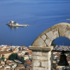
to this: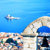
in 6 steps.
Program Used: Paint Shop Pro 8
Translatable: Yes, if you have Levels
Involves: Color Balance, Hue/Saturation, Levels
*1. duplicate twice > bottom one: screen 100%; top one: soft light 50%
*if your final product is too bright, adjust the screen level.
2. color balance > midtones: -40, -10, 40
3. hue/saturation > saturation: 40
4. levels > I: 0, 0.88, 221; O: 0, 232
5. set levels layer to soft light 50%
6. [optional] duplicate base and drag to top > soft light 50%
with softlight: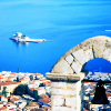
without softlight:
not much of a difference.
--------------------------------
this works much better with stock photographs than others.
but if you DO want to use it with like people or something, here's what I suggest you do.
1. do step 1
2. hue/saturation > saturation -30
3. flatten image
4. follow steps 3-5
the reason i added the -30 saturation layer is because the icon is gonna be too bright and colorful. like a bad bright and colorful.
and i really think you should disregard the optional layer because the icon will be all POW! in your face, and it wouldn't look good.
so the negative saturation really helps, if your image isn't already desaturated.
(if that made any sense...)
BUT that's your call. You can choose to do it or not. Whatever floats your boat.
Other icons made using this tutorial:
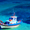
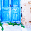
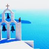
Comments would be nice. I'd love to see your results. :)
If you use example icons, please credit either heymadeline or shadyavenue. Thanks.

to this:

in 6 steps.
Program Used: Paint Shop Pro 8
Translatable: Yes, if you have Levels
Involves: Color Balance, Hue/Saturation, Levels
*1. duplicate twice > bottom one: screen 100%; top one: soft light 50%
*if your final product is too bright, adjust the screen level.
2. color balance > midtones: -40, -10, 40
3. hue/saturation > saturation: 40
4. levels > I: 0, 0.88, 221; O: 0, 232
5. set levels layer to soft light 50%
6. [optional] duplicate base and drag to top > soft light 50%
with softlight:

without softlight:

not much of a difference.
--------------------------------
this works much better with stock photographs than others.
but if you DO want to use it with like people or something, here's what I suggest you do.
1. do step 1
2. hue/saturation > saturation -30
3. flatten image
4. follow steps 3-5
the reason i added the -30 saturation layer is because the icon is gonna be too bright and colorful. like a bad bright and colorful.
and i really think you should disregard the optional layer because the icon will be all POW! in your face, and it wouldn't look good.
so the negative saturation really helps, if your image isn't already desaturated.
(if that made any sense...)
BUT that's your call. You can choose to do it or not. Whatever floats your boat.
Other icons made using this tutorial:


Comments would be nice. I'd love to see your results. :)
If you use example icons, please credit either heymadeline or shadyavenue. Thanks.