Can you believe it? It's an icon tutorial!
Wow. I'm absolutely floored that I was asked to do a tutorial, but most certainly glad that my icons are loved enough for people to desire one. ;D But without further shocked!mumbling from me, I give you the tutorial.
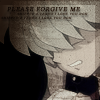
We will be working to create the icon below. Remember, never copy a tutorial directly - this is meant as a guide, not to be copied exactly.
First thing first is to crop your image. I started out with a screencap from Inuyasha World and resized my image to 200 x 150 pixels. A size around 200 usually works for screencaps, but depending on how small your subject is in the picture, you will need to adjust accordingly. Also, as my lovely mentor is constantly reminding, you should never crop your focus in the center. In this icon, Inuyasha is to be the subject and he is put slightly to the right. This adds a more artistic element to your icons, and keeps them from looking too boring or bland.
Right, so now we have our base. Now for the fun stuff.
Step One - Basic Sprucing.
Filter -> Sharpen -> Sharpen. Sharpening icons is extremely important because it brings out the image and just makes it look better. However, too much sharpen is even worse than a blurry icon - so we fix this by going to Edit -> Fade Sharpen. For this image I faded the sharpen to about 63, and for most images between 50 - 70 is pretty good.
Next, I adjust the image's brightness/contrast by going to Image -> Adjustments -> Brightness/Contrast. I set this one's brightness to 1 and its contrast to 19. Usually, brightness shouldn't exceed ten and contrast shouldn't exceed forty-five or so.
Now its time to add some colour. Create a new layer and fill it with a colour similar to #F3F165 (that's a light yellow), then set the layer to Multiply. I usually keep this layer's opacity around 70-90%; for this icon I put it at 83%. Make another new layer, and this time fill it with something like #8FC6EC (light blue). Set to Color and put the opacity around 40-50% (for this one I put it at 52%). Is that enough for one step, or what?
Step Two - Softening.
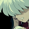
In my opinion, this icon is in some desperate need of some softening. Right now it looks a bit too scritchy-scratchy (a common problem with animation icons), so its time to blur it a bit. First, merge your layers (Layer -> Merge Visible). Next, duplicate your remaining layer by going to Layer -> Duplicate Layer. Once you've got this new layer, make sure its highlighted on your layer palette and go to Filter -> Blur -> Gaussian Blur. I set this at a 2.1 radius, and you probably shouldn't go any higher. A tad too blurry, right? Set the blurry layer to Screen and make the opacity somewhere around 75%. Not perfect, but almost.
Step Three - Adding Colour.
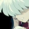
Still a bit blurry and looking QUITE dull colour-wise. Time to break out the gradients! I usually make my own gradients by selecting colours from the palette or even by hovering around the image; it's rather rare I'll use a downloaded one. When you make your own gradients, however, it's important to keep in mind that a gradient is meant to be a mixing of two slightly similar but different colours - never make a gradient that is almost uniform in colour ... and always put your gradient on a new layer! For this particular icon, I made a gradient that mixed a light blue with a soft green. Feel free to snag it, I don't really care if you do.

Set your gradient layer to Color and fade the opacity in. For gradients the opacity of the layer will vary tremendously, but I usually stay within the 30-60% range. For this icon, I faded it to 53%.
Now time to balance out the colours. Merge your layers as before so that you have only one layer. Then, go to Image -> Adjustments -> Color Balance. The window that will pop up may look a bit tricky, but it's actually pretty easy to figure out. Start by selecting Shadows under "Tone Balance" and then fiddling with the lines. Click on the line or actually drag the marker to move it where you want, and in doing so you'll notice that (depending on which way you go), your icon's colour will become more and more similar to where you put the marker. I'm just going to give you the numbers that I used - play around for different variations.
Shadows:
Cyan - -37
Magenta - 0
Blue - +35
Midtones:
Cyan - +52
Magenta - 0
Yellow - -18
Highlights
Cyan - 0
Magenta - +9
Yellow - 0
With my adjustments I get something a little sharper, a bit crisper, and a tad more blue.

Step Four - More COLOUR!
For some reason, usually all my icons start off looking like they're going to be a variation of blue - though few of them actually end that way. For some reason, blue seems to be the foundation/unifying colour for most of my icons. This icon, like so many others before it, was not destined to be blue.
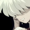
I have made another gradient (new layer), and it's on the reddish/brownish side. I set the layer to Color and fade the opacity to 55%. Now, my icon is finally starting to look the way I'd like it to.
Step Five - Brushes.
My favourite part. After digging through my brush collection and making a new layer, I decide on a brush by callmefreak.

I choose a colour from the icon (#351C0C") and apply the brush two or three times. As most brushes need to be blended in, I set the layer to Multiply at 71% opacity.
Staying on the brush layer, I click on the erase button and choose another texture brush (this time by prissywitch).

With one click I erase, not the full brush, but enough so that there is a relatively thick border still on the top and right sides of the icon. My next step is to go to Edit -> Fade Eraser and restore some of the icon by setting this to 76%. This leaves me with what I believe is a wonderful effect, and a commonly used trick of mine.
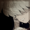
Step Six - Text.
For some icons, leaving them at this stage is fine - and sometimes it produces a much better icon. This icon seems to be able to work either way, and I'm equally fond of it both with text and without. For the text on this icon, I used the same colour as the brushes (#351C0C) and the fonts Times New Roman (larger text) and Arial Black for the smaller. Below are my settings.
please forgive me
Font: Times New Roman
Size: 6 pt
Text effects: Bold, italics
AV: 100
Look: Crisp
(random small text)
Font: Arial Black
Size: 3 pt
Text effects: Bold, italics
AV: 100
Look: Crisp
The text layers should each be seperate so that we can work with them individually. For the larger text, I set the layer to Multiply at full opacity. With the two sets of smaller text (I merely duplicated the first layer and reloacted it), I set them both at Multiply with opacities of 62% and 65%.
Now it is time for some drop shadow! With one of the text layers selected, find and click the little "f" on your Layer Palette. Select Drop Shadow and, when the box pops up, set Distance, Spread, and Size to 2. For the large text, set the opacity to 34%. For the smaller text, repeat the drop shadow effect on each and set the opacity of the shadow to around 52%.
You should (finally) come up with something like this ...

And that's it! If you are confused about anything on this tutorial, do not be afraid to leave a note and tell me so - I'd be glad to help you in any way I can. :D
We will be working to create the icon below. Remember, never copy a tutorial directly - this is meant as a guide, not to be copied exactly.
First thing first is to crop your image. I started out with a screencap from Inuyasha World and resized my image to 200 x 150 pixels. A size around 200 usually works for screencaps, but depending on how small your subject is in the picture, you will need to adjust accordingly. Also, as my lovely mentor is constantly reminding, you should never crop your focus in the center. In this icon, Inuyasha is to be the subject and he is put slightly to the right. This adds a more artistic element to your icons, and keeps them from looking too boring or bland.
Right, so now we have our base. Now for the fun stuff.
Step One - Basic Sprucing.
Filter -> Sharpen -> Sharpen. Sharpening icons is extremely important because it brings out the image and just makes it look better. However, too much sharpen is even worse than a blurry icon - so we fix this by going to Edit -> Fade Sharpen. For this image I faded the sharpen to about 63, and for most images between 50 - 70 is pretty good.
Next, I adjust the image's brightness/contrast by going to Image -> Adjustments -> Brightness/Contrast. I set this one's brightness to 1 and its contrast to 19. Usually, brightness shouldn't exceed ten and contrast shouldn't exceed forty-five or so.
Now its time to add some colour. Create a new layer and fill it with a colour similar to #F3F165 (that's a light yellow), then set the layer to Multiply. I usually keep this layer's opacity around 70-90%; for this icon I put it at 83%. Make another new layer, and this time fill it with something like #8FC6EC (light blue). Set to Color and put the opacity around 40-50% (for this one I put it at 52%). Is that enough for one step, or what?

Step Two - Softening.
In my opinion, this icon is in some desperate need of some softening. Right now it looks a bit too scritchy-scratchy (a common problem with animation icons), so its time to blur it a bit. First, merge your layers (Layer -> Merge Visible). Next, duplicate your remaining layer by going to Layer -> Duplicate Layer. Once you've got this new layer, make sure its highlighted on your layer palette and go to Filter -> Blur -> Gaussian Blur. I set this at a 2.1 radius, and you probably shouldn't go any higher. A tad too blurry, right? Set the blurry layer to Screen and make the opacity somewhere around 75%. Not perfect, but almost.

Step Three - Adding Colour.
Still a bit blurry and looking QUITE dull colour-wise. Time to break out the gradients! I usually make my own gradients by selecting colours from the palette or even by hovering around the image; it's rather rare I'll use a downloaded one. When you make your own gradients, however, it's important to keep in mind that a gradient is meant to be a mixing of two slightly similar but different colours - never make a gradient that is almost uniform in colour ... and always put your gradient on a new layer! For this particular icon, I made a gradient that mixed a light blue with a soft green. Feel free to snag it, I don't really care if you do.

Set your gradient layer to Color and fade the opacity in. For gradients the opacity of the layer will vary tremendously, but I usually stay within the 30-60% range. For this icon, I faded it to 53%.
Now time to balance out the colours. Merge your layers as before so that you have only one layer. Then, go to Image -> Adjustments -> Color Balance. The window that will pop up may look a bit tricky, but it's actually pretty easy to figure out. Start by selecting Shadows under "Tone Balance" and then fiddling with the lines. Click on the line or actually drag the marker to move it where you want, and in doing so you'll notice that (depending on which way you go), your icon's colour will become more and more similar to where you put the marker. I'm just going to give you the numbers that I used - play around for different variations.
Shadows:
Cyan - -37
Magenta - 0
Blue - +35
Midtones:
Cyan - +52
Magenta - 0
Yellow - -18
Highlights
Cyan - 0
Magenta - +9
Yellow - 0
With my adjustments I get something a little sharper, a bit crisper, and a tad more blue.

Step Four - More COLOUR!
For some reason, usually all my icons start off looking like they're going to be a variation of blue - though few of them actually end that way. For some reason, blue seems to be the foundation/unifying colour for most of my icons. This icon, like so many others before it, was not destined to be blue.
I have made another gradient (new layer), and it's on the reddish/brownish side. I set the layer to Color and fade the opacity to 55%. Now, my icon is finally starting to look the way I'd like it to.

Step Five - Brushes.
My favourite part. After digging through my brush collection and making a new layer, I decide on a brush by callmefreak.

I choose a colour from the icon (#351C0C") and apply the brush two or three times. As most brushes need to be blended in, I set the layer to Multiply at 71% opacity.
Staying on the brush layer, I click on the erase button and choose another texture brush (this time by prissywitch).

With one click I erase, not the full brush, but enough so that there is a relatively thick border still on the top and right sides of the icon. My next step is to go to Edit -> Fade Eraser and restore some of the icon by setting this to 76%. This leaves me with what I believe is a wonderful effect, and a commonly used trick of mine.
Step Six - Text.
For some icons, leaving them at this stage is fine - and sometimes it produces a much better icon. This icon seems to be able to work either way, and I'm equally fond of it both with text and without. For the text on this icon, I used the same colour as the brushes (#351C0C) and the fonts Times New Roman (larger text) and Arial Black for the smaller. Below are my settings.
please forgive me
Font: Times New Roman
Size: 6 pt
Text effects: Bold, italics
AV: 100
Look: Crisp
(random small text)
Font: Arial Black
Size: 3 pt
Text effects: Bold, italics
AV: 100
Look: Crisp
The text layers should each be seperate so that we can work with them individually. For the larger text, I set the layer to Multiply at full opacity. With the two sets of smaller text (I merely duplicated the first layer and reloacted it), I set them both at Multiply with opacities of 62% and 65%.
Now it is time for some drop shadow! With one of the text layers selected, find and click the little "f" on your Layer Palette. Select Drop Shadow and, when the box pops up, set Distance, Spread, and Size to 2. For the large text, set the opacity to 34%. For the smaller text, repeat the drop shadow effect on each and set the opacity of the shadow to around 52%.
You should (finally) come up with something like this ...
And that's it! If you are confused about anything on this tutorial, do not be afraid to leave a note and tell me so - I'd be glad to help you in any way I can. :D