Tutorial #2 -- Orihime
Hello! I bring you a tutorial requested by gabriela_gosden! It took a long time to write this up, and there are a lot of steps, but please bear with me. I've also had to use links instead of showing you right here what your current icon and textures should look like..this is because it would ruin the layout if I did. I'm sorry!! *bows*
Today, we will be going from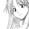
to
1) First off, we'll start with this base (made by me). I'll be referring to this as "base".
2) Make sure the white background is all cleared (transparent). You can do this by using a magic wand and selecting the parts you don't want, and then clearing it (Delete).
3) Next, make a new layer and set it to Multiply 100%
4) Start coloring in Orihime in the new layer. Make sure you use different colors for shading and highlighting! By doing this, it makes the image look more attractive and..advanced?
5) Slap this texture on a new layer and place it behind all of your current layers.
6) Now your icon should look something like this.
7) Now get this texture and place it right before the first texture. Set that to Screen 100%.
8) Because it didn't look very good, I duplicated the second texture and set it to Normal 41%. Now the texture covered up part of the floral pattern--and I didn't want that. So I erased part of it so the floral decoration stood out more. Current icon? Should look something like this.
9) I felt that the black lines were a little bit harsh on the icon, so I made a new layer and filled it with #7b0403. Settings at Screen 75%(With the paint bucket tool) It's amazing how much change that could do! Put that layer before all of your current layers.
10) Now comes the fun part! Get this texture and put it above all of your layers. Set it to Screen 100%. I erased a little bit of it and used the clone tool to change it around a bit. It really just depends on your icon.
11) Does your icon look something like this? Well, if you've seen some of my icon dumps already, you'd know that I'm a bright color freak. So (now comes my secret!) I use the Hue & Saturation layer to bump up the saturation. To do this go to: Layer > New adjustment layer > Hue & Saturation > OK. From there, just move the little arrow in the Saturation area to the right. It'll make the icon brighter, but this is totally optional. If you do decide to use it, make sure you put it before all of your layers.
12) Almost done! Stay with me! Your icon should look something like this. Am I right? I wanted to fill that empty space, so I decided on tiny text and a brush. I used a butterfly brush (that was part of a tiny text brush, but was erased by me :P) and a tiny text brush.
13) One more step! Your icon should currently look like this. Add this brush and put it behind the base. It kind of makes it look like the butterfly is in a flower garden, am I right? (lol, sorry if it doesn't.)
And that's it! Your icon should now look like this:
Adding a border or anything else is totally up to you.
Brush/Texture credits: I'm sorry, I seriously do not remember any of the names of the creators of the textures that I've used. (Wow, sorry if you can't understand that). I have them credited, of course, over here, but I can't pinpoint them down exactly. What I DO know is that this texture was made by chained_angel13.
If you do know where the proper credit for the textures should go to, feel free to tell me!
Ahh, I'm done! I'm sorry; I don't explain things well at all. Therefore, if you don't understand anything that I've just said, I apologize. ;____; But if you did, please share what you've made! I'd love to see what became of this tutorial!
Remember! Don't copy this tutorial step by step. Change some things around, be creative! Tutorials aren't meant to restrict you to just those steps. They're meant to inspire and introduce you to different methods of icon-making. Have fun! ^____^
Today, we will be going from

to

1) First off, we'll start with this base (made by me). I'll be referring to this as "base".
2) Make sure the white background is all cleared (transparent). You can do this by using a magic wand and selecting the parts you don't want, and then clearing it (Delete).
3) Next, make a new layer and set it to Multiply 100%
4) Start coloring in Orihime in the new layer. Make sure you use different colors for shading and highlighting! By doing this, it makes the image look more attractive and..advanced?
5) Slap this texture on a new layer and place it behind all of your current layers.
6) Now your icon should look something like this.
7) Now get this texture and place it right before the first texture. Set that to Screen 100%.
8) Because it didn't look very good, I duplicated the second texture and set it to Normal 41%. Now the texture covered up part of the floral pattern--and I didn't want that. So I erased part of it so the floral decoration stood out more. Current icon? Should look something like this.
9) I felt that the black lines were a little bit harsh on the icon, so I made a new layer and filled it with #7b0403. Settings at Screen 75%(With the paint bucket tool) It's amazing how much change that could do! Put that layer before all of your current layers.
10) Now comes the fun part! Get this texture and put it above all of your layers. Set it to Screen 100%. I erased a little bit of it and used the clone tool to change it around a bit. It really just depends on your icon.
11) Does your icon look something like this? Well, if you've seen some of my icon dumps already, you'd know that I'm a bright color freak. So (now comes my secret!) I use the Hue & Saturation layer to bump up the saturation. To do this go to: Layer > New adjustment layer > Hue & Saturation > OK. From there, just move the little arrow in the Saturation area to the right. It'll make the icon brighter, but this is totally optional. If you do decide to use it, make sure you put it before all of your layers.
12) Almost done! Stay with me! Your icon should look something like this. Am I right? I wanted to fill that empty space, so I decided on tiny text and a brush. I used a butterfly brush (that was part of a tiny text brush, but was erased by me :P) and a tiny text brush.
13) One more step! Your icon should currently look like this. Add this brush and put it behind the base. It kind of makes it look like the butterfly is in a flower garden, am I right? (lol, sorry if it doesn't.)
And that's it! Your icon should now look like this:

Adding a border or anything else is totally up to you.
Brush/Texture credits: I'm sorry, I seriously do not remember any of the names of the creators of the textures that I've used. (Wow, sorry if you can't understand that). I have them credited, of course, over here, but I can't pinpoint them down exactly. What I DO know is that this texture was made by chained_angel13.
If you do know where the proper credit for the textures should go to, feel free to tell me!
Ahh, I'm done! I'm sorry; I don't explain things well at all. Therefore, if you don't understand anything that I've just said, I apologize. ;____; But if you did, please share what you've made! I'd love to see what became of this tutorial!
Remember! Don't copy this tutorial step by step. Change some things around, be creative! Tutorials aren't meant to restrict you to just those steps. They're meant to inspire and introduce you to different methods of icon-making. Have fun! ^____^