Round 02 Challenge 08 Results
Good gosh she's finally posting the results! D:
As i mentioned before, onlyforsale gets third place by default.
07_cents with 08 points

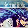
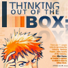
reggie_icons with 13 points
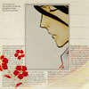
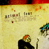
Congrats to all of you for making it this far! Hope you guiz enjoyed this round ♥
VOTING TABLE
Part I: Favorite
01: 03
02: 04
Part II: A Fight
03: 02
04: 05
Part III: Provided Image
05: 02
06: 05
Part I: Favorite
#01: Stunning coloring.
#01: The arrangement is effective, and the coloring is beautifully subtle. Much better executed.
#01: it has a sense of elegance and grace. it's really fitting for byakuya and is just simply a gorgeous icon! that's definitely one of my favourite icons ever for it's simple beauty and elegance.
#02: The image is gorgeous and the style flows very well with the choosen image.
#02: the monochrome look of the icon really enhances the image and emotional tone of the icon. the repeated circular theme is a nice counter to the square shape icon.
#02:
#02: Even though this icon uses many popular trends, they stand in a great harmony.
Part II: A Fight
#03: Nice flow of color scheme.
#03:
#04: Text is wonderful.
#04: Superior cropping and arrangement of icon elements. Even if it's blurry.
#04: zomg! the text use is fantastic 0.o lovely colouring and texture usage too.
#04: although the colouring job is rather minimalistic, the background texture really makes everything pop; although the background texture bleeds a bit into the b&w manga scan colouring. the red overlay on the top and text add just enough depth to the black areas. the slanted typography with the tiny text is gorgeously
#04: The cropping is very creative, and I love the message of the text and how it gains the most focus in the icon. The texture and the coloring goes well with the mood.
Part III: Provided Image
#05: LOL, that's quite inventive! :D
#05: while i love the other one, this one is definitely very creative and brilliant! in all honesty, if i was doing that round then i'd probably do something similar to icon 6 [whole image, textures, small text] so i think number 5 is definitely more creative ! and therefore, it gets my vote X]
#06: Great usage of the image and the coloring is very nice.
#06: The other icon has too much going on, it's very cluttered. This one is very understated and nicely done.
#06: perfect use of negative space and minimalistic composition.
#06:
#06: I really like the coloring, the cropping and how the text is in the center.
There you have it folks~ Banners will be up... uh soon, after that a feedback entery and finally Round three will start. ♥
Comments are unscreened and such.
As i mentioned before, onlyforsale gets third place by default.
07_cents with 08 points
reggie_icons with 13 points
Congrats to all of you for making it this far! Hope you guiz enjoyed this round ♥
VOTING TABLE
Part I: Favorite
01: 03
02: 04
Part II: A Fight
03: 02
04: 05
Part III: Provided Image
05: 02
06: 05
Part I: Favorite
#01: Stunning coloring.
#01: The arrangement is effective, and the coloring is beautifully subtle. Much better executed.
#01: it has a sense of elegance and grace. it's really fitting for byakuya and is just simply a gorgeous icon! that's definitely one of my favourite icons ever for it's simple beauty and elegance.
#02: The image is gorgeous and the style flows very well with the choosen image.
#02: the monochrome look of the icon really enhances the image and emotional tone of the icon. the repeated circular theme is a nice counter to the square shape icon.
#02:
#02: Even though this icon uses many popular trends, they stand in a great harmony.
Part II: A Fight
#03: Nice flow of color scheme.
#03:
#04: Text is wonderful.
#04: Superior cropping and arrangement of icon elements. Even if it's blurry.
#04: zomg! the text use is fantastic 0.o lovely colouring and texture usage too.
#04: although the colouring job is rather minimalistic, the background texture really makes everything pop; although the background texture bleeds a bit into the b&w manga scan colouring. the red overlay on the top and text add just enough depth to the black areas. the slanted typography with the tiny text is gorgeously
#04: The cropping is very creative, and I love the message of the text and how it gains the most focus in the icon. The texture and the coloring goes well with the mood.
Part III: Provided Image
#05: LOL, that's quite inventive! :D
#05: while i love the other one, this one is definitely very creative and brilliant! in all honesty, if i was doing that round then i'd probably do something similar to icon 6 [whole image, textures, small text] so i think number 5 is definitely more creative ! and therefore, it gets my vote X]
#06: Great usage of the image and the coloring is very nice.
#06: The other icon has too much going on, it's very cluttered. This one is very understated and nicely done.
#06: perfect use of negative space and minimalistic composition.
#06:
#06: I really like the coloring, the cropping and how the text is in the center.
There you have it folks~ Banners will be up... uh soon, after that a feedback entery and finally Round three will start. ♥
Comments are unscreened and such.