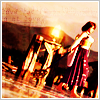
Final fantasy (x) Icons
Hmm, I think these game/series/fandom specific iconposts are easier on my eyes than those lump ones. XD. I'd like to think the quality of them is fairly good, but you're the judge of that :P
22 Final Fantasy X.

( Read more... )
22 Final Fantasy X.
( Read more... )
Comments 21
Reply
Reply
Reply
Reply
What font did you use on 7? It looks Times-y, but I don't think it's Times New Roman... :X
Reply
Reply
If it was Anti-alias on Crisp, I'll kill myself. That was my favourite part of CS2 ;_;
Reply
Reply
8's probably my fave because of text position and overall icon colour.
Reply
Leave a comment