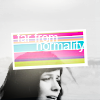
First Tute for the Comm y/n/bunneh?
Going from 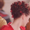
to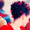
or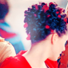
Cropping the original image (comes from Casanova the Miniseries), yes, once again, to 100x100. Like usual for me, that's all the prep I do, because I hate the sharpen tool, and anything like that can be done at the last minute. I like colouring raw material. However, there *is* a nasty little strip of green at the top. I blew the image to about 400% and used a 1pt clone stamp brush, pinpointing around it to mimic what should be there and just got rid of it. Remember, when using the clone stamp, KEEP TO THE IMAGE. Otherwise it looks cheap and fake.
This is now my base:
She's such a pretty lady, and I *love* how her hair looks with all those ribbons. So, this is a tut for how I tend to highlight reds, greens and blues and smoothen/soften/lighten creams/greys/whites using selective colouring.
New layer. Fill with #c7c67c, set to soft light 100% opacity
New Selective Colour layer.
Reds:
-100
+69
+100
0
Neutrals:
+69
-12
-56
0
New Brightness/Contrast Layer
Brightness: +5
Contrast: +30
New Selective Colour Layer
Reds:
-30
0
0
0
Yellows:
-100
0
-55
0
Cyans:
+100
-50
-70
-25
Magentas:
0
+100
0
0
Blacks:
0
0
0
+100
It should look like this:
with highlighted ribbons and dress, a creamier, cleaner, softer neck, and the jacket of the man in the background all aqua blue (it ads a nice tinge to the icon rather than it being all red, I think.) Henriette's hair is also blue/purple in places, which is unnatural colouring, but lifts the image a little anyway. (You don't notice it if it's not pointed out.)
Copy Merged (Edit > Copy Merged) and paste, set to Soft Light 100% opacity. And you're done!

!
If you want to continue to the second version either skip the last step (the soft light) or hide it at the top and go on below. Your base should still look like this:
Next I created a screen layer and dotted one round fuzzy edged brush (about 54pts) in white (#ffffff) near her head then used the Smudge Tool to wiggle it around. It's hard to explain, but just play. The light spreads around and lightens areas, so wherever you want to highlight something or give something some more light.
I put that on 80% opacity because I didn't want it too bright, and moved it around the contours of her neck (erasing here and there).
In the end, my light texture looked like this:
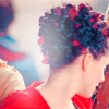
Hide that layer and Select All, Copy Merged (Edit > Copy Merged) and paste it above the light layer (or, if you've already done that, it should be at the top. Just show it.). Show the light layer and set the top layer (the duplication of what is now your base) to Soft Light 100% opacity.

Anyone starting out, please do note. This colouring works for the image because it is high in reds (mainly) with a little bit of blue and green here and there. If your base is mainly brown or mainly black (the Supernatural colouring for example) it won't work. This is simply for highlighting an already startling image (which is why Henriette is so gorgeous onscreen!!)
Other icons made with the prime colour brightened colouring:
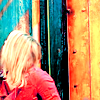
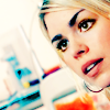
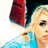
Other icons made with the light splodge:


to

or

Cropping the original image (comes from Casanova the Miniseries), yes, once again, to 100x100. Like usual for me, that's all the prep I do, because I hate the sharpen tool, and anything like that can be done at the last minute. I like colouring raw material. However, there *is* a nasty little strip of green at the top. I blew the image to about 400% and used a 1pt clone stamp brush, pinpointing around it to mimic what should be there and just got rid of it. Remember, when using the clone stamp, KEEP TO THE IMAGE. Otherwise it looks cheap and fake.
This is now my base:

She's such a pretty lady, and I *love* how her hair looks with all those ribbons. So, this is a tut for how I tend to highlight reds, greens and blues and smoothen/soften/lighten creams/greys/whites using selective colouring.
New layer. Fill with #c7c67c, set to soft light 100% opacity
New Selective Colour layer.
Reds:
-100
+69
+100
0
Neutrals:
+69
-12
-56
0
New Brightness/Contrast Layer
Brightness: +5
Contrast: +30
New Selective Colour Layer
Reds:
-30
0
0
0
Yellows:
-100
0
-55
0
Cyans:
+100
-50
-70
-25
Magentas:
0
+100
0
0
Blacks:
0
0
0
+100
It should look like this:

with highlighted ribbons and dress, a creamier, cleaner, softer neck, and the jacket of the man in the background all aqua blue (it ads a nice tinge to the icon rather than it being all red, I think.) Henriette's hair is also blue/purple in places, which is unnatural colouring, but lifts the image a little anyway. (You don't notice it if it's not pointed out.)
Copy Merged (Edit > Copy Merged) and paste, set to Soft Light 100% opacity. And you're done!

!
If you want to continue to the second version either skip the last step (the soft light) or hide it at the top and go on below. Your base should still look like this:

Next I created a screen layer and dotted one round fuzzy edged brush (about 54pts) in white (#ffffff) near her head then used the Smudge Tool to wiggle it around. It's hard to explain, but just play. The light spreads around and lightens areas, so wherever you want to highlight something or give something some more light.
I put that on 80% opacity because I didn't want it too bright, and moved it around the contours of her neck (erasing here and there).
In the end, my light texture looked like this:


Hide that layer and Select All, Copy Merged (Edit > Copy Merged) and paste it above the light layer (or, if you've already done that, it should be at the top. Just show it.). Show the light layer and set the top layer (the duplication of what is now your base) to Soft Light 100% opacity.

Anyone starting out, please do note. This colouring works for the image because it is high in reds (mainly) with a little bit of blue and green here and there. If your base is mainly brown or mainly black (the Supernatural colouring for example) it won't work. This is simply for highlighting an already startling image (which is why Henriette is so gorgeous onscreen!!)
Other icons made with the prime colour brightened colouring:


Other icons made with the light splodge:

