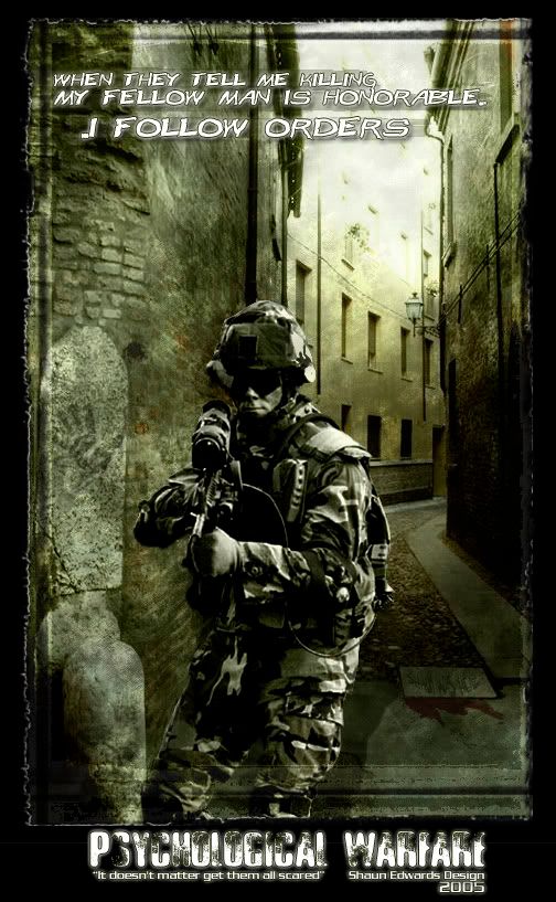
Umm there is too much dark grey brushing in the top-center/top-right area. The soldier looks kinda opaque near the top-right of his head, but maybe that me. The hand print seems outta place and the building in the background look to be in good condition for a war torn area. But I don't know if that was the feeling you were trying to give. And for some reason the line of text on the main part of the piece stands out too much, and that line of text under the title doesn't feel right for the piece.
Comments 3
Umm there is too much dark grey brushing in the top-center/top-right area. The soldier looks kinda opaque near the top-right of his head, but maybe that me. The hand print seems outta place and the building in the background look to be in good condition for a war torn area. But I don't know if that was the feeling you were trying to give. And for some reason the line of text on the main part of the piece stands out too much, and that line of text under the title doesn't feel right for the piece.
Reply
Reply
Reply
Leave a comment