Tutorial # 03 - The Rock (PSP7+)
This is my all time favorite icon. Because I think it looks pretty, and it has THE ROCK! BOOYAH.
Before
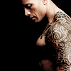
After
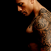

Obviously you guys will use different images, but part of the reason this icon looks so neat is the black background. This effect will work on any icon, but yeah.
01. Choose your image and crop it.

02. Next, go to Layers > New Adjustment Layer > Hue/Saturation/Lightness. Drag the small arrow towards Saturation, making it -100. Set the layer to screen. If you want to, you can mess around with layer opacity. For the time being, I set mine at 100%.
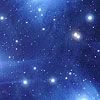
03. Next I used this texture by me. I set it to screen at 100%. This is also where you can mess around with opacity. In fact, you can do that with every single layer.
-->
04. And then you use another texture! This one is by ewanism. I also set this to screen at 100% and mirrored it, so that the blue light dots where on the opposite side. At the bottom of the tutorial you can see a variation where I lowered the opacity of this texture.

-->
This is what your layers should look like right about now.

05. Duplicate your Hue/Saturation/Lightness layer, drag it to the top and set it to multiply @ 100%.

And that is basically it! You can do whatever else you want with it, since it'll be your icon, not mine! Add text, go crazy. Whatever.
Let me know what you guys think, and I'd love to see what you make!
Before
After


Obviously you guys will use different images, but part of the reason this icon looks so neat is the black background. This effect will work on any icon, but yeah.
01. Choose your image and crop it.

02. Next, go to Layers > New Adjustment Layer > Hue/Saturation/Lightness. Drag the small arrow towards Saturation, making it -100. Set the layer to screen. If you want to, you can mess around with layer opacity. For the time being, I set mine at 100%.

03. Next I used this texture by me. I set it to screen at 100%. This is also where you can mess around with opacity. In fact, you can do that with every single layer.

-->

04. And then you use another texture! This one is by ewanism. I also set this to screen at 100% and mirrored it, so that the blue light dots where on the opposite side. At the bottom of the tutorial you can see a variation where I lowered the opacity of this texture.

-->

This is what your layers should look like right about now.

05. Duplicate your Hue/Saturation/Lightness layer, drag it to the top and set it to multiply @ 100%.

And that is basically it! You can do whatever else you want with it, since it'll be your icon, not mine! Add text, go crazy. Whatever.
Let me know what you guys think, and I'd love to see what you make!