Tutorial #3: Jonathan Creek - Jonathan/Maddy icon (three variations)
Because eryslash asked for a tutorial...here is one are three xD
Going from this:
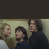
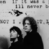
to
(1)
or (2)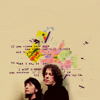
or (3)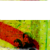
part one:
cropping + colouring + manipulating the image (Kate Isitt has to go + growing of curly!hair)
a. Choose your picture. I went with this image capped by me (Jonathan Creek, eeeeeehh!! You all have to watch it!). Crop it to 100x100 pixel (if you prefer to resize your original image later, don't crop it now).

b. Duplicate the image and set it to Screen (100% opacity/fill)
c. Fill layer: #280f03 - Difference (100% opacity/fill)
Duplicate that layer (still on Difference + 100%)
Add a curve layer to brighten the blue-ish image. RGB: Input: 47, Output: 36
Fill layer: #f9e1c4 - Multiply
Fill layer: #663a13 - Hard Light (76% opacity, 100% fill)
d. Copy your base, drag it on top and set it to Screen (100% opacity/fill)
e. Fill layer: #ebf2f4 - Colour Burn (100% opacity/fill)
Fill layer: #f4f1eb - Colour Burn (100% opacity/fill)
f. Copy your base, drag it on top and set it to Soft Light (100% opacity/fill). Sharpen it if you like (use Edit - Fade to fade the sharpening if it's too much!).
For your reference, the icon looks like this at the moment:
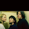
g. Choose Selective Colouring - you can probably skip this step, I only needed it to make the icon look a bit darker...you can probably use either Levels or Colour Balance to achieve the same effect
Reds: -21, 0, -23, +28
Yellows: +24, +26, -8, -13
Neutrals: +11, 0, +13, 0
Blacks: -12, +12, +17, +13
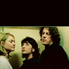
h. Flatten the image or stamp it visible (that's what I usually do). Adding more hair and getting rid of Jonathan Creek's ex.
I'm probably one of the few people who like to work on 100x100 squares all the time while making an icon. For this part I had to increase the size to 500% though.
Choose the smudge tool, take a round brush size 40, set the strength to 55% and start smudging the area around Jonathan and Maddy.
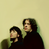
i. Now about the adding hair part. I probably should have used the original picture for this icon, since it's really small now...but I like it complicated, lol. Add a new layer, choosing a small (1 or 2 px) round brush, and pick a few colours you find in the hair (many green tones in this case). And then start painting. Use the smudge tool every now and then. I came up with this:
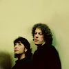
Drawing curly hair is not as easy as it looks... But since this pic is so small you don't even notice irregularities.
j. I love text brushes and textures, I really do. Open up this texture by dearest and drag it on top, set it to Multiply and erase all the text on their faces/bodies. Because it still looks a little bit naked, copy the texture, resize it a little bit and move the ink drop between the lines.
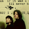
k. Add a white layer, set it to Hue to desaturate the icon. Flatten the image and you're done.

[Layers]
part two:
Texture work can be fun
i. Open a new canvas and copy your icon from step i. into it. Resize it about 70%, move the image a little bit down (so you don't see too much of their bodies). Smudge everything around Maddy and Jonathan again.
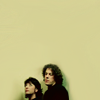
ii. Open the dearest (used to be gender by the way, in case you're wondering!) texture again from the previous tutorial and resize it too a really small size (around 20% or so). Set it to Multiply (100% opacity/fill) and erase the text from their faces/bodies.
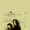
iii. Open this texture by dearest again. Use the cropping tool and crop it to 100x100 pixel; make sure your background colour is set to white. It's not important to actually see what is on the texture (I actually used one or two Blur Filter on it), it's just for colouring purposes. Center it behind Jonathan and Maddy and set it to darken.

iv. I do not really like the colouring, it's too yellow/green-ish. Add a Colour Balance layer:
Midtones: +22, -20, +15 / Highlights: -13, +1, -5 / Shadows: +1, -18, -7
Flatten the image again and you're finished. Nothing too fancy, but I like it.

[Layers]
part three:
MOAR Textures alias more experimenting with textures and just randomly putting layers on top of an already finished icon xD
1. OK, now the fun begins... Add this texture on top and set it to hard light. Use a soft brush to erase the texture over body/faces parts and then go to Fade (Edit -> Fade) and change the opacity back to 20%.
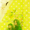
2. Use this blurred texture (I think it was a dearest before I smudged, blurred and erased parts of it), set it to colour burn to darken the image.
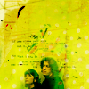
3. Open this texture by dearest and duplicate it. Put them on top like this and set them to multiply (100% opacity/fill).
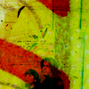
4. Change your forefront colour to white and draw a square with round edges (symbol) on the top part of the icon.
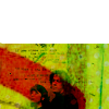
5. Rasterize the shape. Take your eraser tool, choose some brush with no clean edges (e.g. elli's or blimey_icons') and just delete 1 px on the upper half so you can see the green texture again.
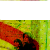
6. Add a resized smoke texture, but I don't really remember who made it. Set it to Screen (100% opacity/fill). Flatten the image and you're done.

[Layers]
Thanks for reading (congrats if you actually made it to the end, haha!). Comments are love and please show me your result(s)!
My Resources
Watch the Community
Affiliates Post
Going from this:

to
(1)

or (2)

or (3)

part one:
cropping + colouring + manipulating the image (Kate Isitt has to go + growing of curly!hair)
a. Choose your picture. I went with this image capped by me (Jonathan Creek, eeeeeehh!! You all have to watch it!). Crop it to 100x100 pixel (if you prefer to resize your original image later, don't crop it now).

b. Duplicate the image and set it to Screen (100% opacity/fill)
c. Fill layer: #280f03 - Difference (100% opacity/fill)
Duplicate that layer (still on Difference + 100%)
Add a curve layer to brighten the blue-ish image. RGB: Input: 47, Output: 36
Fill layer: #f9e1c4 - Multiply
Fill layer: #663a13 - Hard Light (76% opacity, 100% fill)
d. Copy your base, drag it on top and set it to Screen (100% opacity/fill)
e. Fill layer: #ebf2f4 - Colour Burn (100% opacity/fill)
Fill layer: #f4f1eb - Colour Burn (100% opacity/fill)
f. Copy your base, drag it on top and set it to Soft Light (100% opacity/fill). Sharpen it if you like (use Edit - Fade to fade the sharpening if it's too much!).
For your reference, the icon looks like this at the moment:

g. Choose Selective Colouring - you can probably skip this step, I only needed it to make the icon look a bit darker...you can probably use either Levels or Colour Balance to achieve the same effect
Reds: -21, 0, -23, +28
Yellows: +24, +26, -8, -13
Neutrals: +11, 0, +13, 0
Blacks: -12, +12, +17, +13

h. Flatten the image or stamp it visible (that's what I usually do). Adding more hair and getting rid of Jonathan Creek's ex.
I'm probably one of the few people who like to work on 100x100 squares all the time while making an icon. For this part I had to increase the size to 500% though.
Choose the smudge tool, take a round brush size 40, set the strength to 55% and start smudging the area around Jonathan and Maddy.

i. Now about the adding hair part. I probably should have used the original picture for this icon, since it's really small now...but I like it complicated, lol. Add a new layer, choosing a small (1 or 2 px) round brush, and pick a few colours you find in the hair (many green tones in this case). And then start painting. Use the smudge tool every now and then. I came up with this:

Drawing curly hair is not as easy as it looks... But since this pic is so small you don't even notice irregularities.
j. I love text brushes and textures, I really do. Open up this texture by dearest and drag it on top, set it to Multiply and erase all the text on their faces/bodies. Because it still looks a little bit naked, copy the texture, resize it a little bit and move the ink drop between the lines.

k. Add a white layer, set it to Hue to desaturate the icon. Flatten the image and you're done.

[Layers]
part two:
Texture work can be fun
i. Open a new canvas and copy your icon from step i. into it. Resize it about 70%, move the image a little bit down (so you don't see too much of their bodies). Smudge everything around Maddy and Jonathan again.

ii. Open the dearest (used to be gender by the way, in case you're wondering!) texture again from the previous tutorial and resize it too a really small size (around 20% or so). Set it to Multiply (100% opacity/fill) and erase the text from their faces/bodies.

iii. Open this texture by dearest again. Use the cropping tool and crop it to 100x100 pixel; make sure your background colour is set to white. It's not important to actually see what is on the texture (I actually used one or two Blur Filter on it), it's just for colouring purposes. Center it behind Jonathan and Maddy and set it to darken.

iv. I do not really like the colouring, it's too yellow/green-ish. Add a Colour Balance layer:
Midtones: +22, -20, +15 / Highlights: -13, +1, -5 / Shadows: +1, -18, -7
Flatten the image again and you're finished. Nothing too fancy, but I like it.

[Layers]
part three:
MOAR Textures alias more experimenting with textures and just randomly putting layers on top of an already finished icon xD
1. OK, now the fun begins... Add this texture on top and set it to hard light. Use a soft brush to erase the texture over body/faces parts and then go to Fade (Edit -> Fade) and change the opacity back to 20%.

2. Use this blurred texture (I think it was a dearest before I smudged, blurred and erased parts of it), set it to colour burn to darken the image.

3. Open this texture by dearest and duplicate it. Put them on top like this and set them to multiply (100% opacity/fill).

4. Change your forefront colour to white and draw a square with round edges (symbol) on the top part of the icon.

5. Rasterize the shape. Take your eraser tool, choose some brush with no clean edges (e.g. elli's or blimey_icons') and just delete 1 px on the upper half so you can see the green texture again.

6. Add a resized smoke texture, but I don't really remember who made it. Set it to Screen (100% opacity/fill). Flatten the image and you're done.

[Layers]
Thanks for reading (congrats if you actually made it to the end, haha!). Comments are love and please show me your result(s)!
My Resources
Watch the Community
Affiliates Post