Tutorial #4: Jonathan Creek (surprise surprise!), colouring + texture use
fashionfanatic9 requested another tutorial for an icon similar to this one:
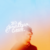
Since I don't save psd's and suck at recreating icons, I thought I make a new one using using a similar blending style.
Going from
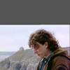
to
(1)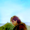
or (2)
part one:
a. Choose your picture (I decided to make another Jonathan Creek icon, haha). Crop it to 100x100 pixel (if you prefer to resize your original image later, don't crop it now or crop it to a higher resolution).

Prepare your image, so you have a nice looking base. I duplicated the layer, resized and shifted it to the middle of the canvas, then copied another layer which I moved under the resized one and flipped it horizontal (so the background is now on the other site as well). Then I chose the smudger tool to smudge the background behind Jonathan. I came up with this:
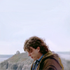
b. Starting on the colouring.
Fill layer on difference: #05031a (Opacity: 100%/Fill: 100%)
Curve layer:
RGB
1st Point: I: 6 / O: 1
2nd Point: I: 53 / O: 45
3rd Point: I: 94 / O: 95
Red
1st Point: I: 52 / O: 54
Green
2nd Point: I: 56 / O: 56
Blue
1st Point: I: 33 / O: 49
2nd Point: I: 100 / O: 91
Levels (great to bring out shadows/lights):
RGB: 12 / 1,18 / 255
Red: 7 / 1,13 / 255
Green: 0 / 0,94 / 255
Blue: 20 / 1,11 / 201
Result:
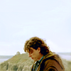
c. More colouring...
Selective Colouring (you can skip this skip or replace it, just used to it make the icon a little darker and to add green to the background)
Reds: -15 / 0 / -31 / -19
Yellows: +20 / 0 / -20 / +11
Neutrals: +12 / -6 / +11 / +5
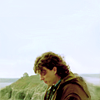
This looks not really different I know. To make the background more blueish, add:
Fill layer (blue) on exlusion: #2c0606 (77% opacity/100% fill)
Fill layer (light blue) on soft light: #aee3f4 (60% opacity/25% fill)
Fill layer (light green) on colour burn: #cdf4ae (60% opacity/25% fill)
Hue/Saturation to bring out the green even more: -1 / +20 / -5
Brightness/Contrast: +2 / +5
Result:
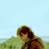
Eeh, lots of yellow :/
d. Lightening up Jonathan's face and hair.
Choose a brush, I went with this one by elli. Choose a light grey colour (#f8f8f8), resize the brush and put it on the icon. Smudge and/or blur it until you like it. I usually end up duplicating the texture and move it around. Try different blending (soft light, colour burn, hard light) and opacity/fill options etc. until you're content with the shadow/light on the picture. For my icon I ended up with 7 layers (2 x soft light, 2 x colour burn, 3 x normal).
Result:
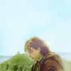
Now his face isn't that yellow anymore, yay. Sadly the background isn't that blue anymore either, but we will change that now.
e. Take one of _excentric_'s sky textures and crop it right over the dark shadow. Set it to colour burn, 100% opacity/fill.
Result:
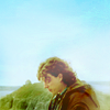
Now the blue sky is back! To bring it out more, add two more adjustment layers.
Colour Balance:
Midtones: +13 / -22 / +14
Shadows: -38 / -15 / -26
Highlights: -10 / -3 / +17
Levels:
RGB: 33 / 1,09 / 250
Green: 9 / 1,00 / 255

Finished! On to the blending tutorial!
part two
1. Duplicate (image - duplicate) your image. First of all, get rid of the three fill layers from step c (blue, light blue, light green). All the other layers you can keep. I had to lighten up Jonathan's face a little more again, so I added this texture and set it to 100% soft light. Then flatten your image. There you have your new base.
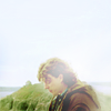
2. Prepare your texture.
New texture, this time made by inxsomniax. Go to Filter - Blur - Box Blur and set the Radius as big as you want. Mine was 15 and I used it twice on the texture. It looked like this in the end. Then crop it to 100x100.
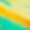
I'm not that much into the green, I decided to bring out the yellow/orange colour (smudge tool and Filter - Blur - Gaussian Blur).
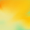
3. Drag and drop the texture on your flatten image. Set it to colour burn, 48% opacity/75% fill.
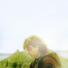
Doesn't look that different...
Duplicate the texture and set it to 100% multiply!
Result:
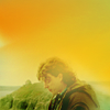
Duplicate the multiplied texture again, change the setting to colour burn.
Result:
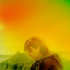
See the green spot in the right corner? I thought it looked a bit plain with only yellow, so I took smudge tool again to bring a little green back.
Take the original texture (the green/yellow one), and drag/drop it on to the image. Apply the Gaussian Blur filter and smudge around. Also I took a round size brush on low opacity and brushed over the edges.
Set the texture to colour burn.
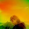
4. Decoration
This texture by indienotebook (love her stuff), set to colour burn.
Add some text, flatten the image and you're done.
(For the original requested icon, I used definitely a lighten layer in between...)
End result:

Similar icons using same blending technique:
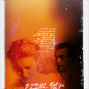
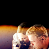
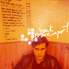
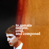
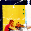
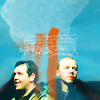
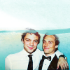
Thanks for reading. Sorry for the crappy explanations, it's just...I don't know, hard to explain ^^; Comments are love and please show me your result(s)!
My Resources
Watch the Community
Affiliates Post

Since I don't save psd's and suck at recreating icons, I thought I make a new one using using a similar blending style.
Going from

to
(1)

or (2)

part one:
a. Choose your picture (I decided to make another Jonathan Creek icon, haha). Crop it to 100x100 pixel (if you prefer to resize your original image later, don't crop it now or crop it to a higher resolution).

Prepare your image, so you have a nice looking base. I duplicated the layer, resized and shifted it to the middle of the canvas, then copied another layer which I moved under the resized one and flipped it horizontal (so the background is now on the other site as well). Then I chose the smudger tool to smudge the background behind Jonathan. I came up with this:

b. Starting on the colouring.
Fill layer on difference: #05031a (Opacity: 100%/Fill: 100%)
Curve layer:
RGB
1st Point: I: 6 / O: 1
2nd Point: I: 53 / O: 45
3rd Point: I: 94 / O: 95
Red
1st Point: I: 52 / O: 54
Green
2nd Point: I: 56 / O: 56
Blue
1st Point: I: 33 / O: 49
2nd Point: I: 100 / O: 91
Levels (great to bring out shadows/lights):
RGB: 12 / 1,18 / 255
Red: 7 / 1,13 / 255
Green: 0 / 0,94 / 255
Blue: 20 / 1,11 / 201
Result:

c. More colouring...
Selective Colouring (you can skip this skip or replace it, just used to it make the icon a little darker and to add green to the background)
Reds: -15 / 0 / -31 / -19
Yellows: +20 / 0 / -20 / +11
Neutrals: +12 / -6 / +11 / +5

This looks not really different I know. To make the background more blueish, add:
Fill layer (blue) on exlusion: #2c0606 (77% opacity/100% fill)
Fill layer (light blue) on soft light: #aee3f4 (60% opacity/25% fill)
Fill layer (light green) on colour burn: #cdf4ae (60% opacity/25% fill)
Hue/Saturation to bring out the green even more: -1 / +20 / -5
Brightness/Contrast: +2 / +5
Result:

Eeh, lots of yellow :/
d. Lightening up Jonathan's face and hair.
Choose a brush, I went with this one by elli. Choose a light grey colour (#f8f8f8), resize the brush and put it on the icon. Smudge and/or blur it until you like it. I usually end up duplicating the texture and move it around. Try different blending (soft light, colour burn, hard light) and opacity/fill options etc. until you're content with the shadow/light on the picture. For my icon I ended up with 7 layers (2 x soft light, 2 x colour burn, 3 x normal).
Result:

Now his face isn't that yellow anymore, yay. Sadly the background isn't that blue anymore either, but we will change that now.
e. Take one of _excentric_'s sky textures and crop it right over the dark shadow. Set it to colour burn, 100% opacity/fill.
Result:

Now the blue sky is back! To bring it out more, add two more adjustment layers.
Colour Balance:
Midtones: +13 / -22 / +14
Shadows: -38 / -15 / -26
Highlights: -10 / -3 / +17
Levels:
RGB: 33 / 1,09 / 250
Green: 9 / 1,00 / 255

Finished! On to the blending tutorial!
part two
1. Duplicate (image - duplicate) your image. First of all, get rid of the three fill layers from step c (blue, light blue, light green). All the other layers you can keep. I had to lighten up Jonathan's face a little more again, so I added this texture and set it to 100% soft light. Then flatten your image. There you have your new base.

2. Prepare your texture.
New texture, this time made by inxsomniax. Go to Filter - Blur - Box Blur and set the Radius as big as you want. Mine was 15 and I used it twice on the texture. It looked like this in the end. Then crop it to 100x100.

I'm not that much into the green, I decided to bring out the yellow/orange colour (smudge tool and Filter - Blur - Gaussian Blur).

3. Drag and drop the texture on your flatten image. Set it to colour burn, 48% opacity/75% fill.

Doesn't look that different...
Duplicate the texture and set it to 100% multiply!
Result:

Duplicate the multiplied texture again, change the setting to colour burn.
Result:

See the green spot in the right corner? I thought it looked a bit plain with only yellow, so I took smudge tool again to bring a little green back.
Take the original texture (the green/yellow one), and drag/drop it on to the image. Apply the Gaussian Blur filter and smudge around. Also I took a round size brush on low opacity and brushed over the edges.

Set the texture to colour burn.

4. Decoration
This texture by indienotebook (love her stuff), set to colour burn.
Add some text, flatten the image and you're done.
(For the original requested icon, I used definitely a lighten layer in between...)
End result:

Similar icons using same blending technique:


Thanks for reading. Sorry for the crappy explanations, it's just...I don't know, hard to explain ^^; Comments are love and please show me your result(s)!
My Resources
Watch the Community
Affiliates Post