tutorial: supernatural
>
or
Made using PSCS2.
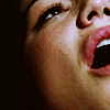
Prepare you base, this tutorial works mostly on not too bright caps. I used a cap of Ruby by marishna .
After I resize and crop the picture, I sharpen it. You can use any method you like, usually I duplicate the base, sharpen it once and change the opacity of the layer until I get a result I like.
The cap is dark and has very liitle color, I'm going to approach both issues with curves.
Layer>new adjustment layer>curves:
RGB: 33/44 ; 118/184
R: 115/140
G: 128/132
B: 62/59 ; 134/152
I want to make the icon brighter and more colored.
Fill a new layer with #cab08e and set it to soft light 50%.
If your image is bright enough you can lower the opacity or skip this step altogether. Of course, if your image is dark you can up the opacity.
Now I'm going to mute the image a bit and make it brownish, using my favorite-exclusion layer.
Fill a new layer with #1b0b00 and set to exclusion.
You can see this step make the pink of her lips softer.
Now I'm going to add the image contrast.
Layer>new adjustment layer>brightness/contrast:
50, 50.
Now set the layer to soft light 50%.
Now I'm going to add just a bit more contrast.
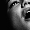
Layer>new adjustment layer>gardient map:
Make a black & white gardient and set the layer to soft light 30%.
To reach the b&w result, simply add a b&w gardient map layer.
PSD (comment if taking).