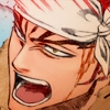
manga coloring tutorial
Going from this: 
to this:
When you have your base, magnify to 300% and pick your skin tone. I always pick the midtone first and do highlights and shadows later.
Make a new layer and set it to linear burn, and color within the lines for the skin.
Now lock the transparency on this layer.
Highlights and shadows will be on the same layer. Grab a slightly smaller brush (I'm using 3px, 100% hardness) and pick a shadow color. I used two: I didn't change the hue at all; the lighter shadow is just more saturated skintone, and the darker shadow is both darker and more saturated. A lot of this is knowing where shadows should fall, so I'll just show you where I put them:
I won't blend yet; first let's put in highlights (same layer). The darker highlight (cheekbones) is the skintone, just less saturated. The bright highlight (nose) is a very light yellow-gray, which is pretty much the same for all skintones.
If you want harder, more dramatic shading, you would use a brush on low opacity and paint, and use more shadows. However, I want subtle shading for this icon, so I'll use the smudge tool. I use a splatter brush that I made: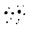
They're very easy to make; if you want to use that one, just select the black (Select > Color range) and go to Edit > Define brush preset. I put that brush on 4px and between 60 and 70% opacity
and blend.
Now I have this:
Make a new layer and set to linear burn. Pick a hair color, and color within the lines for the hair. Since Renji's hair is already shaded, I'll pick a lighter color.
Repeat for whatever else you want to color.
He has blood on his face, so let's color that: make a new layer and set it to screen, and go over the blood.
Next I set this texture from girlboheme to multiply:
And then I used gaussian blur on it so it was essentially just an interesting gradient. Now we have this:
I want some contrasting color, so I colored the top left with a bright cyan and set it to linear burn:
I also want those lines at the top to show up, so I go over them with a very bright red and set that layer to lighten and put it under the gradient layer. (This is so it doesn't show up if I color outside the lines.)
Now we have this:
I kind of like this now, but I want the icon to be brighter at the top, so I paint a bright red blob in the top left corner and use gaussian blur on it:
And set that layer to screen.
I want it to be a little brighter still, so as a final measure, I'll use selective color.
In neutrals, put cyan at -7.
In cyans, put cyan at +100, magenta at +20, and yellow at -30.
Done! :)

to this:

When you have your base, magnify to 300% and pick your skin tone. I always pick the midtone first and do highlights and shadows later.
Make a new layer and set it to linear burn, and color within the lines for the skin.

Now lock the transparency on this layer.

Highlights and shadows will be on the same layer. Grab a slightly smaller brush (I'm using 3px, 100% hardness) and pick a shadow color. I used two: I didn't change the hue at all; the lighter shadow is just more saturated skintone, and the darker shadow is both darker and more saturated. A lot of this is knowing where shadows should fall, so I'll just show you where I put them:

I won't blend yet; first let's put in highlights (same layer). The darker highlight (cheekbones) is the skintone, just less saturated. The bright highlight (nose) is a very light yellow-gray, which is pretty much the same for all skintones.

If you want harder, more dramatic shading, you would use a brush on low opacity and paint, and use more shadows. However, I want subtle shading for this icon, so I'll use the smudge tool. I use a splatter brush that I made:

They're very easy to make; if you want to use that one, just select the black (Select > Color range) and go to Edit > Define brush preset. I put that brush on 4px and between 60 and 70% opacity

and blend.
Now I have this:

Make a new layer and set to linear burn. Pick a hair color, and color within the lines for the hair. Since Renji's hair is already shaded, I'll pick a lighter color.
Repeat for whatever else you want to color.

He has blood on his face, so let's color that: make a new layer and set it to screen, and go over the blood.

Next I set this texture from girlboheme to multiply:

And then I used gaussian blur on it so it was essentially just an interesting gradient. Now we have this:

I want some contrasting color, so I colored the top left with a bright cyan and set it to linear burn:

I also want those lines at the top to show up, so I go over them with a very bright red and set that layer to lighten and put it under the gradient layer. (This is so it doesn't show up if I color outside the lines.)
Now we have this:

I kind of like this now, but I want the icon to be brighter at the top, so I paint a bright red blob in the top left corner and use gaussian blur on it:

And set that layer to screen.

I want it to be a little brighter still, so as a final measure, I'll use selective color.

In neutrals, put cyan at -7.
In cyans, put cyan at +100, magenta at +20, and yellow at -30.
Done! :)
