tutorial #3 - stock
I was asked to make a tutorial for the icon below a while back. Here it is at last and I hope it's helpful.
from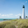
to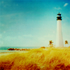
Made in PS7, but translatable with tweaking. Includes explanations on each step taken.

I started out with this image from gettyimages and cropped it to my liking.
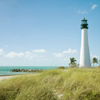
1. The image is a very cool one; there are lots of greens and blues in it. I wanted my icon to be warm though, so the first thing I did after cropping was using a Color Balance layer to remove some of the blue (i.e. adding some yellow).
Midtones 0 / 0 / -40
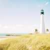
2. The next step is brightening. I used a Curves layer for that here. The RGB channel changes the overall brightness of the image, the Red, Green and Blue channels can be used to add or reduce colors of the respective channel, which is why the values will depend on the picture. Pulling the curve up will add the color of the channel you're working in, pulling it down will reduce this color by adding its opposite (when working in RGB, pulling up brightens, pulling down darkens). I added more red because I want the colors to be warm in the end, blue so the sky doesn't totally looses it, and green is needed to balance the red (I don't want a pink sky). My values are the following:
RGB: I: 106 O: 131
Red: I: 120 O: 188
Green: I: 118 O: 159
Blue: I: 132 O: 164
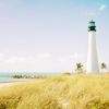
3. The image at this point has lost a lot of contrast so the next step is a Brightness/Contrast layer. Since only adding contrast makes the image even brighter in parts, I also reduced the brightness. My settings are:
-17 / +12
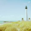
4. Time to give the sky its blue back. A Color Fill layer with dark red set to exclusion will do that. The actual color used will depend on your picture. I used #2B0904.
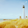
5. Since the exclusion layer turned the grass in the foreground green again, and I don't want it that way, it's time for a Selective Color layer. If you're using a program that doesn't have SC, you can also use Channel Mixer for a similar result (see below).
Using Selective Colors, I concentrated on those colors that I wanted to change or enhance (which is why the settings for another picture should differ... at the worst, using the same numbers will make your icon look completely horrible; play around and look at your icon). In the case of this icon, I wanted to change the grass from yellow/greenish to yellow/reddish and enhance the blue of the sky and sea as well as the white of the lighthouse and the clouds.
Method: Relative
Reds: There were none in the icon at this point, so I didn't touch them.
Yellows: The yellows were greenish, so I reduced cyan and added magenta and yellow.
my settings: -23 | +56 | +14 | 0
Greens: It sounds strange, but there are no greens to speak of in this icon either. Changing the Greens will have no visible results. If you're using a different picture, it may be different for you.
Cyans: This is the sky, which I want a darker blue. I added cyan and reduced yellow for more blue, then added magenta and black for a darker blue.
my settings: +72 | +100 | -67 | +25
Blues: Again, I added cyan and black to make the sky more blue.
my settings: +67 | 0 | 0 | +83
Magentas: No changes as there were none in the picture.
Whites: That's the lighthouse, the clouds, and the sand. I reduced yellow and black to make it more white.
my settings: 0 | 0 | -16 | -24
Neutrals: These will make changes on all colors that are in the icon, so I reduced cyan to make the icon warmer, and added magenta and yellow. I also lightened the image a bit by reducing black a tiny bit.
my settings: -21 | +13 | +39 | -9
Blacks: No changes again.
OR
If you're using Channel Mixer instead of Selective Colors
in the Red Channel: add some red and reduce blue.
in the Blue Channel: reduce red some and add some blue.
Then add a layer filled with grey on Color Burn to deepen the colors. If you want the grass to be a bit more reddish, pick an orange color from the grass and, on the grey layer, go with a brush over the parts of the grass. Reduce the opacity of the Color Burn layer until you're satisfied.
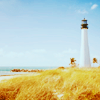
6. For some more contrast, I used a Levels layer, set to Overlay 24%. On the Levels directly, I didn't change any settings on the RGB channel, but on the Red, Green and Blue channels, I changed the first and last points of the Input Levels by dragging them to where the visible graph starts (first point) or ends (last point). If you're using Photoshop, you can alternatively simply use the Auto Button that does this for you, and then if you feel it still needs adjusting, fiddle some more with it. Paint Shop Pro users, I fear, will have to fiddle blindly (correct me if I'm wrong, I only have PSP7, and this version doesn't show a graph for the Levels).
TIP: Setting the layer to Overlay first, then changing the values for the Levels makes it easier to find the settings you want.
7. On to the textures, of which there are five in this icon. First, I used this texture by lookslikeicons, flipped it around so that the lighter part was at the bottom and the darker at the top. I set it to Soft Light 43%. This darkens the sky in the icon some more and adds some light to the bottom part.
8. Next texture is this dark turquoise one by discolore. Again, I flipped it so the darker parts are at the top, then I set it to Vivid Light 41%. Since there were some white specks from the texture, I blurred it, too. The sky is now a lovely blue color, but I don't want the grass and the lighthouse to be blueish. I added a layer mask to the texture and "erased" the beach with a soft round brush (doesn't have to be too precise), then zoomed in to "erase" the texture from the lighthouse as well with a much smaller brush.
9. I wanted it to look a bit more dreamy, so I added another texture that's predominantly a light yellow (#F3F3C9), and set it to Multiply 75%. Using a Color Fill layer with a light yellow instead of a texture will work for this step, too. I think it was also a texture by discolore, but I've blurred/smudged it so much that I can't really recognize it anymore *g*
10. Now it gets a tiny bit complicated, but I hope not too much to follow it. I liked the coloring at this point, but I decided to add some final touches.
I made a new layer and picked a very light yellow from the sand, and used a small soft brush to make a blob half on, half next to the lighthouse top. I set this layer to Overlay and reduced Opacity and Fill to my liking. I went for subtlety here, so the dot doesn't do more than lighten the sky right around the lighthouse top.
Then I made another new layer and picked a more orange/yellow color from the grass, and with the brush painted to the side of the lighthouse where I placed the dot. I set this layer to Soft Light and reduced the Opacity of this layer as well.
First blob: light pale yellow, Overlay, Opacity 36%, Fill 57%
Second blob: orange-yellow, Soft Light, Opacity 38%
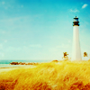
11. I wanted the colors to pop some more, so I copy-merged all visible layers (stamped) onto a new layer, set it to Soft Light and dragged this layer below the two layers with the blobs. This pronounced the blobs a bit more.
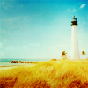
12. I was satisfied with the overall coloring, but it was a touch too bright for my taste at this point. I also wanted some more focus on the lighthouse. For these reasons, I added two textures below the Soft Light layer of step 11, desaturated them (so they didn't add any new colors), and set them to Soft Light and Color Burn (reduced Fill and Opacity) respectively. Which textures to use here depends very much on the picture.
I first used this one by pfefferminzchen, which I desaturated and I set to Soft Light (full Opacity). The lighter parts are over the lighthouse, the darker over the sky and grass; this adds focus on the lighthouse.

Next I used a texture that I blurred so much I don't recognize who it is by anymore. Overall, it's a medium gray color, and really, pretty much any grey texture will do (or a desaturated one). I blurred it using the blur brush, which I mostly do with textures, as it gives me control over which parts I blur and how much I do that. This texture is set to Color Burn 85% Opacity and 55% Fill and gives the icon the final muted touch.
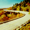
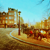
Other examples with slightly changed settings:
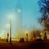
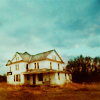
Ideas for variations:
- use different textures
- change the settings and/or blend modes of layers
- change the Selective Color settings according to your picture or leave it out completely; not every picture needs it
- Comments make me happy
- Feel free to ask any question about the tutorial.
- Don't ask me for a .psd. I think they're pretty useless since the settings of most layers have to be tweaked for different images.
- watch / join syncedaffairs if you like what you see
New icon post probably later this week :)
from
to
Made in PS7, but translatable with tweaking. Includes explanations on each step taken.
I started out with this image from gettyimages and cropped it to my liking.
1. The image is a very cool one; there are lots of greens and blues in it. I wanted my icon to be warm though, so the first thing I did after cropping was using a Color Balance layer to remove some of the blue (i.e. adding some yellow).
Midtones 0 / 0 / -40
2. The next step is brightening. I used a Curves layer for that here. The RGB channel changes the overall brightness of the image, the Red, Green and Blue channels can be used to add or reduce colors of the respective channel, which is why the values will depend on the picture. Pulling the curve up will add the color of the channel you're working in, pulling it down will reduce this color by adding its opposite (when working in RGB, pulling up brightens, pulling down darkens). I added more red because I want the colors to be warm in the end, blue so the sky doesn't totally looses it, and green is needed to balance the red (I don't want a pink sky). My values are the following:
RGB: I: 106 O: 131
Red: I: 120 O: 188
Green: I: 118 O: 159
Blue: I: 132 O: 164
3. The image at this point has lost a lot of contrast so the next step is a Brightness/Contrast layer. Since only adding contrast makes the image even brighter in parts, I also reduced the brightness. My settings are:
-17 / +12
4. Time to give the sky its blue back. A Color Fill layer with dark red set to exclusion will do that. The actual color used will depend on your picture. I used #2B0904.
5. Since the exclusion layer turned the grass in the foreground green again, and I don't want it that way, it's time for a Selective Color layer. If you're using a program that doesn't have SC, you can also use Channel Mixer for a similar result (see below).
Using Selective Colors, I concentrated on those colors that I wanted to change or enhance (which is why the settings for another picture should differ... at the worst, using the same numbers will make your icon look completely horrible; play around and look at your icon). In the case of this icon, I wanted to change the grass from yellow/greenish to yellow/reddish and enhance the blue of the sky and sea as well as the white of the lighthouse and the clouds.
Method: Relative
Reds: There were none in the icon at this point, so I didn't touch them.
Yellows: The yellows were greenish, so I reduced cyan and added magenta and yellow.
my settings: -23 | +56 | +14 | 0
Greens: It sounds strange, but there are no greens to speak of in this icon either. Changing the Greens will have no visible results. If you're using a different picture, it may be different for you.
Cyans: This is the sky, which I want a darker blue. I added cyan and reduced yellow for more blue, then added magenta and black for a darker blue.
my settings: +72 | +100 | -67 | +25
Blues: Again, I added cyan and black to make the sky more blue.
my settings: +67 | 0 | 0 | +83
Magentas: No changes as there were none in the picture.
Whites: That's the lighthouse, the clouds, and the sand. I reduced yellow and black to make it more white.
my settings: 0 | 0 | -16 | -24
Neutrals: These will make changes on all colors that are in the icon, so I reduced cyan to make the icon warmer, and added magenta and yellow. I also lightened the image a bit by reducing black a tiny bit.
my settings: -21 | +13 | +39 | -9
Blacks: No changes again.
OR
If you're using Channel Mixer instead of Selective Colors
in the Red Channel: add some red and reduce blue.
in the Blue Channel: reduce red some and add some blue.
Then add a layer filled with grey on Color Burn to deepen the colors. If you want the grass to be a bit more reddish, pick an orange color from the grass and, on the grey layer, go with a brush over the parts of the grass. Reduce the opacity of the Color Burn layer until you're satisfied.
6. For some more contrast, I used a Levels layer, set to Overlay 24%. On the Levels directly, I didn't change any settings on the RGB channel, but on the Red, Green and Blue channels, I changed the first and last points of the Input Levels by dragging them to where the visible graph starts (first point) or ends (last point). If you're using Photoshop, you can alternatively simply use the Auto Button that does this for you, and then if you feel it still needs adjusting, fiddle some more with it. Paint Shop Pro users, I fear, will have to fiddle blindly (correct me if I'm wrong, I only have PSP7, and this version doesn't show a graph for the Levels).
TIP: Setting the layer to Overlay first, then changing the values for the Levels makes it easier to find the settings you want.
7. On to the textures, of which there are five in this icon. First, I used this texture by lookslikeicons, flipped it around so that the lighter part was at the bottom and the darker at the top. I set it to Soft Light 43%. This darkens the sky in the icon some more and adds some light to the bottom part.
8. Next texture is this dark turquoise one by discolore. Again, I flipped it so the darker parts are at the top, then I set it to Vivid Light 41%. Since there were some white specks from the texture, I blurred it, too. The sky is now a lovely blue color, but I don't want the grass and the lighthouse to be blueish. I added a layer mask to the texture and "erased" the beach with a soft round brush (doesn't have to be too precise), then zoomed in to "erase" the texture from the lighthouse as well with a much smaller brush.
9. I wanted it to look a bit more dreamy, so I added another texture that's predominantly a light yellow (#F3F3C9), and set it to Multiply 75%. Using a Color Fill layer with a light yellow instead of a texture will work for this step, too. I think it was also a texture by discolore, but I've blurred/smudged it so much that I can't really recognize it anymore *g*
10. Now it gets a tiny bit complicated, but I hope not too much to follow it. I liked the coloring at this point, but I decided to add some final touches.
I made a new layer and picked a very light yellow from the sand, and used a small soft brush to make a blob half on, half next to the lighthouse top. I set this layer to Overlay and reduced Opacity and Fill to my liking. I went for subtlety here, so the dot doesn't do more than lighten the sky right around the lighthouse top.
Then I made another new layer and picked a more orange/yellow color from the grass, and with the brush painted to the side of the lighthouse where I placed the dot. I set this layer to Soft Light and reduced the Opacity of this layer as well.
First blob: light pale yellow, Overlay, Opacity 36%, Fill 57%
Second blob: orange-yellow, Soft Light, Opacity 38%
11. I wanted the colors to pop some more, so I copy-merged all visible layers (stamped) onto a new layer, set it to Soft Light and dragged this layer below the two layers with the blobs. This pronounced the blobs a bit more.
12. I was satisfied with the overall coloring, but it was a touch too bright for my taste at this point. I also wanted some more focus on the lighthouse. For these reasons, I added two textures below the Soft Light layer of step 11, desaturated them (so they didn't add any new colors), and set them to Soft Light and Color Burn (reduced Fill and Opacity) respectively. Which textures to use here depends very much on the picture.
I first used this one by pfefferminzchen, which I desaturated and I set to Soft Light (full Opacity). The lighter parts are over the lighthouse, the darker over the sky and grass; this adds focus on the lighthouse.
Next I used a texture that I blurred so much I don't recognize who it is by anymore. Overall, it's a medium gray color, and really, pretty much any grey texture will do (or a desaturated one). I blurred it using the blur brush, which I mostly do with textures, as it gives me control over which parts I blur and how much I do that. This texture is set to Color Burn 85% Opacity and 55% Fill and gives the icon the final muted touch.
Other examples with slightly changed settings:
Ideas for variations:
- use different textures
- change the settings and/or blend modes of layers
- change the Selective Color settings according to your picture or leave it out completely; not every picture needs it
- Comments make me happy
- Feel free to ask any question about the tutorial.
- Don't ask me for a .psd. I think they're pretty useless since the settings of most layers have to be tweaked for different images.
- watch / join syncedaffairs if you like what you see
New icon post probably later this week :)