tutorial #4
graven_rose asked for a tutorial on an icon of my latest post. Not all, but many, of these icons are using the same basic coloring, with alterations of course, so a tutorial on them makes a lot of sense.
We'll be going from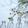
to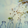
Made in PS, but fully translatable to PSP. Includes explanations on each step taken.

I started out with this image from gettyimages and cropped it to my liking. In the case of this image, the crop I'd chosen included the gettyimage watermark, so I smudged it away, as well.
1. The image is already pretty bright, but as I will be adding layers on multiply and color burn later on, it needs additional brightening.
Curves work very well for that, as they allow me to tinker with the coloring, too. I didn't touch the RGB curve at all, but changed the input value of the top right point (the one already given, I did NOT make a new point) of the red, green and blue curve by sliding the point somewhat to the left.
My values were the following: [screenshot]
Red: I 235 / O 255
Green: I 235 / O 255
Blue: I 251 / O 255
This is the result at the moment. But I want it brighter than that, and I don't want to use the RGB curve to brighten. Let's simply set the Curves layer to Screen, as this gives a softer overall lightening. Since the picture was pretty light to begin with, full opacity is too much, so I lower the opacity until I end up with 31% Screen.
2. The next step is the much loved (and often overmisused) dark red exclusion layer. Be careful with this one when working on icons that have people on them. (I often end up masking out the parts of this layer that turn skin or objects a too unnatural color.)
Here, since this is a stock icon, I don't have to be this careful. Color fill layer with a dark red/brown (#291102 here), then set it to Exclusion.
3. Let's give the colors a bit more definition. I like to do this with a Hue/Saturation layer that I set to Soft Light.
Increase the Saturation on the Master channel until it's almost too much; I end up at +37. Then set the layer to Soft Light.
This adds contrast at the same time as the colors get more definition, but if you end up with too much contrast, simply lower the opacity of this layer. You might have to fiddle with the Saturation again then.
4. Another color fill layer. Light blue (#D4EAF1) on Color Burn.
This gives a bit more contrast, and brings out the blues and greens some more.
5. Yet another color fill layer, this time with a light orange (#EBD4B8). I don't want the icon to be too cool in the end, and the orange gives the light parts of the icon some warmth back. I've set it to Vivid Light 25% Opacity 29% Fill.
For PSP users: setting this layer to Overlay 20% will give you a very similar result.
6. Color Balance layer next, to enhance the colors (or fix some discoloration if there are any). I mainly added blue in the midtones and highlights, and reduced blue in the shadows, but the settings of this layer depend strongly on your picture.
My settings here are the following (preserve luminosity is checked)
Midtones: -13 / -14 / +11
Highlights: +3 / +12 / +23
Shadows: +10 / +1 / -11
7. Texture time. For the muted look, I like to use textures on multiply instead of color layers, as they have lighter and darker parts, and those add some more dimension to the icon than using simple color fill layers.
I first used this texture by discolore, which I rotated and colorized until it was mainly orange (and looked like this). Any orange texture will work here though. I put it to Multiply 28 %.
8. Next texture, again by discolore. Again I rotated it, and I blurred it, too (so it looked like this). Set to Linear Burn 32%. I also masked out some part of this layer.
9. Third texture, this one's so twisted that I seriously can't say which it was to begin with. Probably one of discolore's too, because I'm lazy and keep taking textures out of one maker's folder if there's enough different kinds.
Set it to Multiply 50% to finish off that muted look.
10. I want the focus to be on the flowers in the two bottles, so with a light yellow/orange, I place a blob on them and blur it a bit so it's somewhat softer. Set this layer to Screen and lower the opacity to 50%.
Then I duplicated this layer and set it to Color Burn 67%.

11. To finish it off, I've added this light texture by soaked, and set it to Screen 50%.
And last, I added this texture, which I mutilated (blurred, erased parts) so much I can't at all say who it's from, and set it to Overlay 21%.
Layer palette
Other examples with changed settings and/or additional layers:
more examples can be found in my two latest icon posts and that means it's way beyond time for me to find a new favourite coloring *g*
Ideas for variations:
- use different textures
- change the settings and/or blend modes of layers
- leave layers out or add others
- Comments make me happy
- Feel free to ask any question about the tutorial.
- Don't ask me for a .psd. If you really want one, go through the tutorial and save your result as one!
- watch / join syncedaffairs if you like what you see
We'll be going from
to
Made in PS, but fully translatable to PSP. Includes explanations on each step taken.
I started out with this image from gettyimages and cropped it to my liking. In the case of this image, the crop I'd chosen included the gettyimage watermark, so I smudged it away, as well.
1. The image is already pretty bright, but as I will be adding layers on multiply and color burn later on, it needs additional brightening.
Curves work very well for that, as they allow me to tinker with the coloring, too. I didn't touch the RGB curve at all, but changed the input value of the top right point (the one already given, I did NOT make a new point) of the red, green and blue curve by sliding the point somewhat to the left.
My values were the following: [screenshot]
Red: I 235 / O 255
Green: I 235 / O 255
Blue: I 251 / O 255
This is the result at the moment. But I want it brighter than that, and I don't want to use the RGB curve to brighten. Let's simply set the Curves layer to Screen, as this gives a softer overall lightening. Since the picture was pretty light to begin with, full opacity is too much, so I lower the opacity until I end up with 31% Screen.
2. The next step is the much loved (and often overmisused) dark red exclusion layer. Be careful with this one when working on icons that have people on them. (I often end up masking out the parts of this layer that turn skin or objects a too unnatural color.)
Here, since this is a stock icon, I don't have to be this careful. Color fill layer with a dark red/brown (#291102 here), then set it to Exclusion.
3. Let's give the colors a bit more definition. I like to do this with a Hue/Saturation layer that I set to Soft Light.
Increase the Saturation on the Master channel until it's almost too much; I end up at +37. Then set the layer to Soft Light.
This adds contrast at the same time as the colors get more definition, but if you end up with too much contrast, simply lower the opacity of this layer. You might have to fiddle with the Saturation again then.
4. Another color fill layer. Light blue (#D4EAF1) on Color Burn.
This gives a bit more contrast, and brings out the blues and greens some more.
5. Yet another color fill layer, this time with a light orange (#EBD4B8). I don't want the icon to be too cool in the end, and the orange gives the light parts of the icon some warmth back. I've set it to Vivid Light 25% Opacity 29% Fill.
For PSP users: setting this layer to Overlay 20% will give you a very similar result.
6. Color Balance layer next, to enhance the colors (or fix some discoloration if there are any). I mainly added blue in the midtones and highlights, and reduced blue in the shadows, but the settings of this layer depend strongly on your picture.
My settings here are the following (preserve luminosity is checked)
Midtones: -13 / -14 / +11
Highlights: +3 / +12 / +23
Shadows: +10 / +1 / -11
7. Texture time. For the muted look, I like to use textures on multiply instead of color layers, as they have lighter and darker parts, and those add some more dimension to the icon than using simple color fill layers.
I first used this texture by discolore, which I rotated and colorized until it was mainly orange (and looked like this). Any orange texture will work here though. I put it to Multiply 28 %.
8. Next texture, again by discolore. Again I rotated it, and I blurred it, too (so it looked like this). Set to Linear Burn 32%. I also masked out some part of this layer.
9. Third texture, this one's so twisted that I seriously can't say which it was to begin with. Probably one of discolore's too, because I'm lazy and keep taking textures out of one maker's folder if there's enough different kinds.
Set it to Multiply 50% to finish off that muted look.
10. I want the focus to be on the flowers in the two bottles, so with a light yellow/orange, I place a blob on them and blur it a bit so it's somewhat softer. Set this layer to Screen and lower the opacity to 50%.
Then I duplicated this layer and set it to Color Burn 67%.
11. To finish it off, I've added this light texture by soaked, and set it to Screen 50%.
And last, I added this texture, which I mutilated (blurred, erased parts) so much I can't at all say who it's from, and set it to Overlay 21%.
Layer palette
Other examples with changed settings and/or additional layers:
more examples can be found in my two latest icon posts and that means it's way beyond time for me to find a new favourite coloring *g*
Ideas for variations:
- use different textures
- change the settings and/or blend modes of layers
- leave layers out or add others
- Comments make me happy
- Feel free to ask any question about the tutorial.
- Don't ask me for a .psd. If you really want one, go through the tutorial and save your result as one!
- watch / join syncedaffairs if you like what you see