& born to multiply, born to gaze into night skies
HAY GUYS LET'S HAVE ANOTHER TUTORIAL %D Sixth one, whoo!
First though, a couple more announcements:
☆ tacticons has 75+ watchers! Aww, you guys... *tears up* T__T
☆ I very recently started an internet fads blog crew, so if you're interested in claiming anything from an emoticon to Darth Vader's "NOOOOOOO", that's where you can go~
And now, tutorial! Today, we're going from this to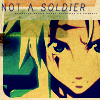
as requested by almateria :D
So here is our 100x100 base~
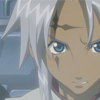
I recommend using a base that's dark with little to no contrast like this, because of how many layers we're going to use to whip the icon into shape %D Anyway, let's get started! First, duplicate the base and set it to Color Burn, 70%.
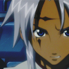
Next, duplicate the base twice and set both layers to Overlay at 100%.
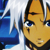
Now we're getting somewhere, amirite? But what's missing? The obligatory exclusion layer, duh~ So fill a layer with #040C5A and set it to Exclusion, 100%.
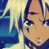
Take another Overlay and 100% duplicate layer and move it to the top so it looks like this, then duplicate your exclusion layer and move that above the overlay layer. I hope that makes sense xD It should come out like this:
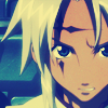
Now we're going to go in a completely unprecedented direction, folks - hang on to your seats, fasten your seatbelts, whatever! Take #F3B760 at Darken, 100%.
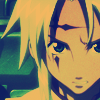
Now fill a new layer with #C9FBFE and set it to Luminosity, 20%.

Then duplicate the Luminosity layer. BUT! You want to change the mode to Color Burn and the opacity to 40%. This is important~
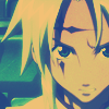
It's looking a bit stale now, so let's make a Hue/Saturation... adjustment layer and set saturation to 30. It's usually a good number if you're unsure, I use it a lot.
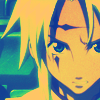
Follow the sixth step of this tutorial at mirrormasks, and set the layer to Soft Light, 100%. This will serve to bring out the colour a bit more.
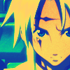
Next, make a Color Balance... adjustment layer with the following settings:
Midtones: +19, -23, +20
Shadows: +40, -27, -22
Highlights: +29, -18, +11
Set this one to Soft Light and 100% as well. From that, we get this monstrosity:
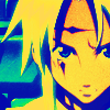
AHHHHHH
HIDE YOUR CHILDREN
Yeah, I'm not entirely happy with this one so far :')!! Let's subdue the beast by setting #FEE1C9 to Multiply at 100%.
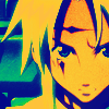
To tone it down even more, set #FEEEE0 to Saturation and 55%.
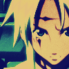
We can start to breathe a little easier, yes? But what was lost in the transition was that shiny contrast. Therefore, we should make a Brightness/Contrast... adjustment layer, and set brightness to +1 and contrast to +19. In retrospect, I guess the +1 wouldn't make much of a difference, but w/e!!!!!

FINALLY! Wow, that was looking pretty ugly for a bit, huh? Now, head over to this gem of a tutorial to make your border. I filled mine with the same colour as a few steps back, but it wouldn't really change much if yours was white. And the shape will depend on your image, of course.
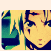
To add a little interest on the top of the icon, set this texture (by 77words, rest of the set here) to Multiply at 100%. As I did, you may need to rotate it and/or adjust the Brightness/Contrast until you're happy with it. Actually, any one of the textures in that set would look just super with this icon, as most of them are focused to one side of the icon and have lots of depth.
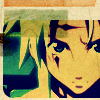
Now all that's left is some text~ I used the font Print Clearly in the same blue as the exclusion, and I italicized the "soldier" text. It looks like this:
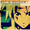
And to fill up the space between the text and the image, why not have some tinytext? 8D Again, the solution to everything. As usual, it's a line of gibberish with Arial in caps, font size 1.2, spacing reeeeally far apart, and anti-aliasing on Crisp. To make it stand out a bit more, duplicate the tinytext layer and change the opacity to 40%.

And there we have it! Certainly took long enough %D Hope you learned a few things! ♥
Now that you have more of Mumpo's secrets, lawl, I encourage you to go play around and show me your finished icons! DOOO IIIIIIT, I really really wanna see what you guys come up with~
If you like what you see, why not friend tacticons for future updates?
First though, a couple more announcements:
☆ tacticons has 75+ watchers! Aww, you guys... *tears up* T__T
☆ I very recently started an internet fads blog crew, so if you're interested in claiming anything from an emoticon to Darth Vader's "NOOOOOOO", that's where you can go~
And now, tutorial! Today, we're going from this to

as requested by almateria :D
So here is our 100x100 base~

I recommend using a base that's dark with little to no contrast like this, because of how many layers we're going to use to whip the icon into shape %D Anyway, let's get started! First, duplicate the base and set it to Color Burn, 70%.

Next, duplicate the base twice and set both layers to Overlay at 100%.

Now we're getting somewhere, amirite? But what's missing? The obligatory exclusion layer, duh~ So fill a layer with #040C5A and set it to Exclusion, 100%.

Take another Overlay and 100% duplicate layer and move it to the top so it looks like this, then duplicate your exclusion layer and move that above the overlay layer. I hope that makes sense xD It should come out like this:

Now we're going to go in a completely unprecedented direction, folks - hang on to your seats, fasten your seatbelts, whatever! Take #F3B760 at Darken, 100%.

Now fill a new layer with #C9FBFE and set it to Luminosity, 20%.

Then duplicate the Luminosity layer. BUT! You want to change the mode to Color Burn and the opacity to 40%. This is important~

It's looking a bit stale now, so let's make a Hue/Saturation... adjustment layer and set saturation to 30. It's usually a good number if you're unsure, I use it a lot.

Follow the sixth step of this tutorial at mirrormasks, and set the layer to Soft Light, 100%. This will serve to bring out the colour a bit more.

Next, make a Color Balance... adjustment layer with the following settings:
Midtones: +19, -23, +20
Shadows: +40, -27, -22
Highlights: +29, -18, +11
Set this one to Soft Light and 100% as well. From that, we get this monstrosity:

AHHHHHH
HIDE YOUR CHILDREN
Yeah, I'm not entirely happy with this one so far :')!! Let's subdue the beast by setting #FEE1C9 to Multiply at 100%.

To tone it down even more, set #FEEEE0 to Saturation and 55%.

We can start to breathe a little easier, yes? But what was lost in the transition was that shiny contrast. Therefore, we should make a Brightness/Contrast... adjustment layer, and set brightness to +1 and contrast to +19. In retrospect, I guess the +1 wouldn't make much of a difference, but w/e!!!!!

FINALLY! Wow, that was looking pretty ugly for a bit, huh? Now, head over to this gem of a tutorial to make your border. I filled mine with the same colour as a few steps back, but it wouldn't really change much if yours was white. And the shape will depend on your image, of course.

To add a little interest on the top of the icon, set this texture (by 77words, rest of the set here) to Multiply at 100%. As I did, you may need to rotate it and/or adjust the Brightness/Contrast until you're happy with it. Actually, any one of the textures in that set would look just super with this icon, as most of them are focused to one side of the icon and have lots of depth.

Now all that's left is some text~ I used the font Print Clearly in the same blue as the exclusion, and I italicized the "soldier" text. It looks like this:

And to fill up the space between the text and the image, why not have some tinytext? 8D Again, the solution to everything. As usual, it's a line of gibberish with Arial in caps, font size 1.2, spacing reeeeally far apart, and anti-aliasing on Crisp. To make it stand out a bit more, duplicate the tinytext layer and change the opacity to 40%.

And there we have it! Certainly took long enough %D Hope you learned a few things! ♥
Now that you have more of Mumpo's secrets, lawl, I encourage you to go play around and show me your finished icons! DOOO IIIIIIT, I really really wanna see what you guys come up with~
If you like what you see, why not friend tacticons for future updates?