Pages 1-7
First entry on this community. These pages have been previously posted in my own journal, so if you have been following this there thus far there's nothing new to be seen here. Unless you're interested in reading my commenting my own work.
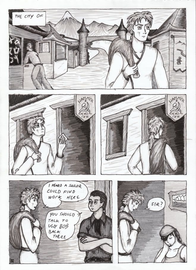
First page, second version. no you can't see the first version, it sucked. The city is left unnamed in the first panel as I haven't thought it up yet.
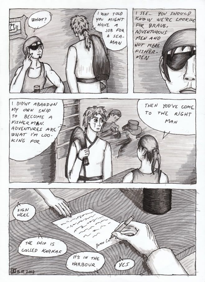
Third panel looks like crap, shouldn't try to draw people from so far away. At least not A4 size paper.
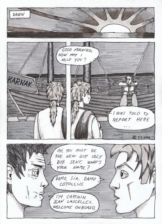
Couldn't be bothered to colour the sky in the first panel. I thought I'd photoshop in some sky from one of my photographs, but haven't been bothered. And speaking of not bothering...
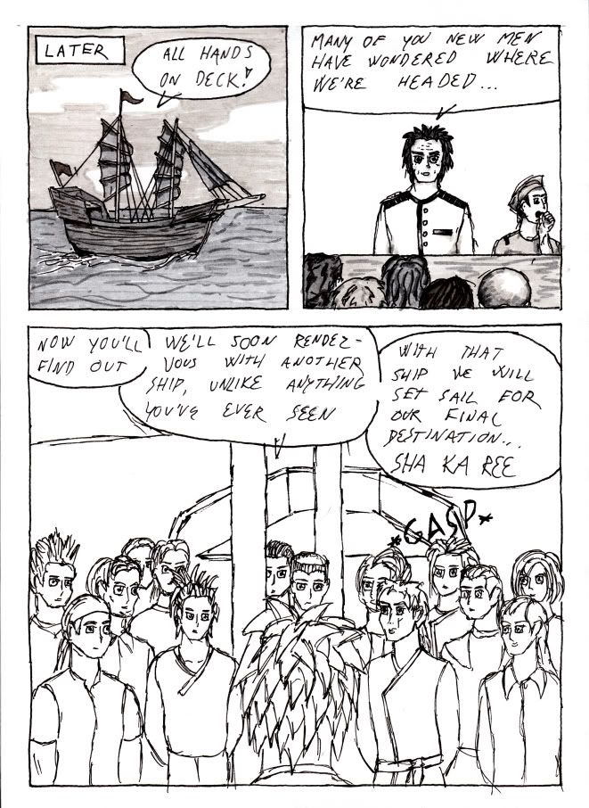
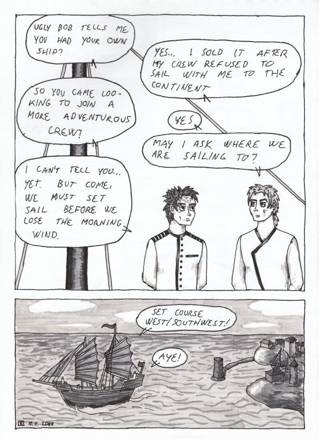
Hopefully this'll remain as the worst TA page ever. I'm planning on redrawing at least the last panel at some point, but for the time being I decided to let it be in order to progress with the story.
by this time I was also somewhat displeased with the general colour scheme of the characters and the abundant use of light shades. As a result a number of charas were redesigned to a smaller or larger degree. Most of them haven't appeared in the story yet so there's difference from the point of view of the reader. Damo however was amongst the redesigned and therefore looks somewhat different in the following pages.
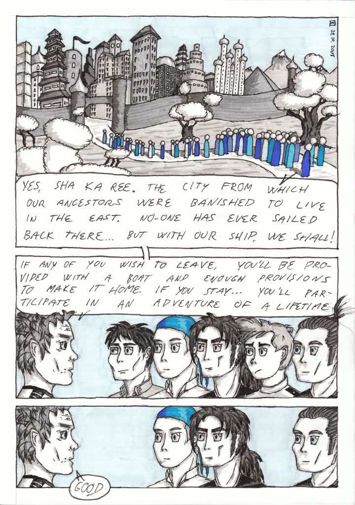
At this time I also decided to incorporate an additional colour to the comic for improved visuals. Choice fell on blue as it's a comic about ships and therefore largely set on sea. We might see about other colours later on.
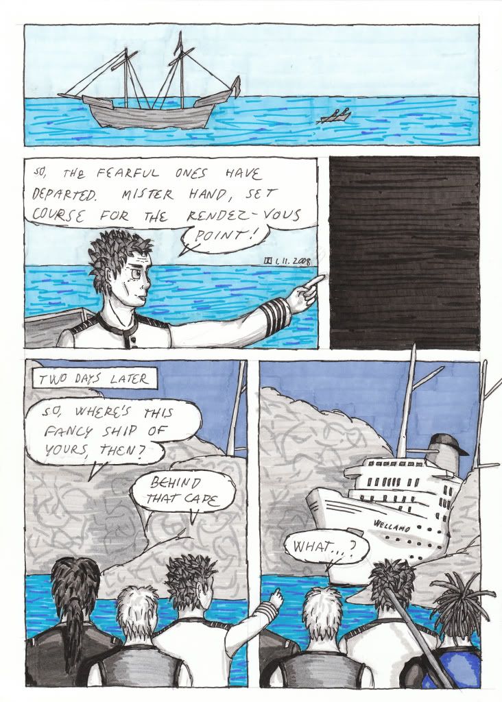
Lots of pointy fingers and some too small heads. Also some poor shading choices.
Next (pages 8 & 9)

First page, second version. no you can't see the first version, it sucked. The city is left unnamed in the first panel as I haven't thought it up yet.


Third panel looks like crap, shouldn't try to draw people from so far away. At least not A4 size paper.

Couldn't be bothered to colour the sky in the first panel. I thought I'd photoshop in some sky from one of my photographs, but haven't been bothered. And speaking of not bothering...

Hopefully this'll remain as the worst TA page ever. I'm planning on redrawing at least the last panel at some point, but for the time being I decided to let it be in order to progress with the story.
by this time I was also somewhat displeased with the general colour scheme of the characters and the abundant use of light shades. As a result a number of charas were redesigned to a smaller or larger degree. Most of them haven't appeared in the story yet so there's difference from the point of view of the reader. Damo however was amongst the redesigned and therefore looks somewhat different in the following pages.

At this time I also decided to incorporate an additional colour to the comic for improved visuals. Choice fell on blue as it's a comic about ships and therefore largely set on sea. We might see about other colours later on.

Lots of pointy fingers and some too small heads. Also some poor shading choices.
Next (pages 8 & 9)