ingame caps: tataroo valley
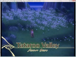
the size of the caps has been increased, yay! but...
...well, we'll get to that in a bit. here they are first... you'll probably notice the changes anyway.
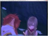
1066x800, 60 jpgs, 6.2mb - luke and teeeeeear. lots of dialogue, actually, but i picked out pretty caps hehe.


1066x800, 47 jpgs, 4.35mb - luke and tear and the backside of some monsters. not a lot of dialogue... and there's a problem in the later pictures, idk if you'll notice it.


1600x900, 70 jpgs, 4.67mb
after the first batch i'm sure y'all noticed an annoying little glow following the characters around (or maybe not, since it's not that bad... yet. just wait till astor's mansion), sort of like a ghost layer. so i tried fixing that but towards the end of the second batch i noticed it getting extremely pixelly and super!bright because the ingame resolution had been lowered. so i tried fixing THAT and so the third batch is smooth and glow-free... but very very dark. it takes about 6 or 7 screen layers to get it to normal in photoshop.
samples: glowy1 | glowy2 | pixelly | dark | dark (with brightness mask layer +150)
so as it is, i think i'll continue to cap them smooth/dark instead of jagged/bright or smooth/glowy... because i figure if you're using the caps for icons, you can fix the brightness but maybe not the ghostiness or the pixel...ness. lol idk, what would suit your purposes the most? (and perfect isn't an option unfortunately :<)