First Tut here at the3witches, but it's my third time.
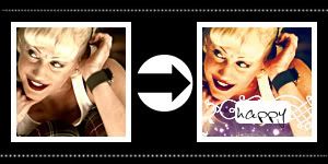
Original Image
For Photoshop Elements 3.0, you might get away with using in Corel Photo-Paint and probably other programs.
Easy as pie. Except you can't eat your icon it doesn't have enough fiber. :/
12 Steps, and long winded talking.
Basically, I had made this for competition so I'll try my best to explain why I did what I did and what each layer does. But don't expect much of an answer beyond, "I thought I'd do this just to see what happens".
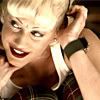
Step 1: Make your base.
Open your image. I used a screen shot of Gwen Stefani of No Doubt from the Spider Webs music video.
Credit goes to indilime who capped it.
Then create a new image; 100x100px; 72 dpi; white background.
Shrink your image, and Sharpen.
If you have no idea how to crop or shrink you image: dtissagirl: icon making guide has links to tutorials for that sort of thing. It's very helpful when using screen shots.

Step 2: Duplicate your base.
Set to: Screen
Opacity: 50%
Note: I had placed the Opacity at 50% because 100% brightened it too much.
Depending on what you like and your image you may have to change the opacity.
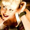
Step 3: Hue/Saturation; Master:
Hue: 0
Saturation: +36*
Lightness: 0
Note: It was used to enhance the colors.
*Saturation levels depending on the image will need to be changed
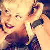
Step 4: Create New Layer.
Fill: 001B70
Set to: Exclusion
Opacity: 70%
Note: This layer is based on a layer in a tutorial by sheld0n. It's opacity caused the layer not to be too over bearing.
If you do not have Exclusion layer this post with hopefully be helpful to you: http://community.livejournal.com/icon_tutorial/5726449.html
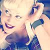
Step 5: Create New Layer.
Fill: 8FE1FF
Set to: Soft Light
Opacity: 100%
Note: This layer is based on a layer in the same tutorial by sheld0n. At the bottom of this page will be a link to said tutorial. Why I choose these colors to use for both fill layers, I am uncertain. Same for the reason why I even went down this road to begin with.
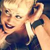
Step 6: Duplicate Base, bring it to the top.
Set to: Linear Burn
Opacity: 50%
Note: Linear Burn made it too dark so that's why the Opacity is at 50%. Again to you likes and image, the Opacity will need to be changed.
The reason for this layer is so the fill layers wouldn't wash out the shadows too much.
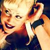
Step 7: Hue/Saturation; Master:
Hue: 0
Saturation: +50*
Lightness: 0
Set to: Soft Light
Opacity: 100%
Note: Again to enhance the colors, but in fear I would need to tone it down I had experimented with the settings. Setting it to Soft Light toned it down, darkening the shadows, and making it look less dull.
*Saturation levels depending on the image will need to be changed

Step 8: Add Texture
Texture: Icon Texture Mix Pack #001-065 by colorfilter
Set to: Screen
Opacity: 100%
Note: I had rotated it around so the sparkles would be on the bottom and would not get in the way of her face.

Step 9: Create New Layer
Brush: Ardenwood Swirls by ohpaintbrush
Note: In the remaking of that part, I accidentally brushed it too much so that's why it looks like I did it with 'pencil' not 'brush'.
I had combined the brush with the box.
The reason for the swirl was to be pretty and help me compete. I'm awful at text icons and this was the first to really be successful.

Step 10: Create New Object or Layer
See This tutorial: http://bunnymix.livejournal.com/198449.html For more information on creating round corners, please check the comments of left in the tutorial as well.
The reason for this box is due to the swirl being so naked and the text not showing up properly. I have seen many icons that used boxes. In a way I was killing two birds with one stone. Giving the text a background and making the swirl a second note to the text.
Step 11: Add Text.
Font: Bert
Size: 14
Note: It was a relatively new font to me and it worked a whole lot better than any other font that looked hand written and it wasn't plain like Times New Roman and Arial.
Step 12: Finished. All that's left is to check out what each layer does, and adjust to the image you choose.
-----------------------
Image Adjusting.
Again depending on your image you will want to adjust some of the settings.
Here are two examples. The image quality does effect the out come.
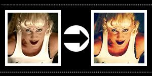
Notice: The image is from the same Music Video, capped by the same person, is of the same person and is relative of the same scene. YET, I had to adjust my settings.
Original Image
This icon I had to change the following:
Step 2: Duplicate base; Set to Screen; Opacity: 100%
While it's relative and alike to the other image it was much darker and needed it's Screen layer's Opacity at 100%
Step 7: Hue/Saturation; Opacity 80%
All of this layer's setting had stayed the same but was still to much for the image it's self, so I changed the Opacity. I'm stubborn and had refused to change it's saturation setting.
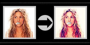
Shakira. A brighter and higher quality image.
Original Image
For this icon I had to change the following:
Step 2: Duplicate base; Set to Soft Light; Opacity: 100%
This time the image was brighter. In order to keep details of the image I had set the duplicate to Soft Light.
Step 3: Step 3: Hue/Saturation; Saturation: +16
It was an HQ image and I didn't have to do much enhancing of the colors. So I tone it down.
Step 6: Duplicate Base; Set to: Soft Light; Opacity: 100%
The linear Burn did too much and make her skin look orange. Setting it to Soft Light was gentile.
See?
Have fun making those icons.
DO NOT HOTLINK MY IMAGES PLEASE.
Any questions, just ask?
Oh! If you like you can comment with your results. ^.^ Love to see 'em.
The Tutorial I mentioned
Comments are always nice. ^.^
My Resources
Join the3witches if you like. :D
-Bunny