I support Bob's Solo Project!

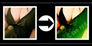
Original Image
For Photoshop Elements 3.0
Can be used in other programs.
7 Steps.
I'll try my best to explain why I did what I did and what each layer does. But don't expect much of an answer beyond, "I thought I'd do this just to see what happens".

Step 1: Make your base.
Open your image. I used a image of Bob Bryar of My Chemical Romance.
Create a new image; 100x100px; 72 dpi; white background.
How I create my base is by selecting the whole image, pasting it in the new image, then I click the edge of the image and using the corner dots/squares to shrink it. I move it around and potion the image and apply/ok the size when I'm done. Then I sharpen.
You can do it however you want. Here's a tutorial if you have no idea how to crop or shrink you image: dtissagirl: icon making guide has links to tutorials for that sort of thing.

Step 2: Duplicate your base.
Set to: Soft Light
Opacity: 100%
Note: This was to create contrast.

Step 3: Create New Layer.
Fill: #114168
Set to: Exclusion
Opacity: 100%
Note: I use this exclusion layer in a lot of my icons and one thing I've noticed is that the opacity of this layer is best at 70%, however for this icon it looked best at 100%. So if you think there might not look right, place the opacity of this layer at 70%. Other than that when I made other icons using this very technique there was really no change of this layer at all.

Step 4: Add Texture
Texture: Unknown by Unknown, let me know if it's yours.
Set to: Lighten
Opacity: 100%
Note: "I thought I'd do this just to see what happens."

Step 5: Duplicate Base, bring to the top.
Set to: Soft Light
Opacity: 100%
Note: The image was drowned out quite a bit by the exclusion and texture layers. So I used a soft light layer to bring back the details.

Step 6: Duplicate Base, bring it to the top.
Set to: Overlay
Opacity: 100%
Note: The image was still too light and still lacked detail, so I duplicated the base again and set it to overlay. Other than that "I thought I'd do this just to see what happens".
Step 7: Create New Layer.
Fill: #cccccc
Set to: Color Burn
Opacity: 100%
Note: I used this layer to darken it some more.
Step 12: Tada! You're finished!
-----------------------
Image Adjusting:
None really. Just be careful of the textures you use. And you don't even have to use texture's you can use just gradients. But just choose right ones, with medium to bright colors. Really dark and muted colors don't work out too well.
Other examples:
Jared Leto

Quinne (Suicide Girl)

Have fun making those icons.
DO NOT HOTLINK OR STEAL MY IMAGES PLEASE.
Any questions, just ask?
The exclusion layer is based from this tutorial.. again.
Comments are always nice. ^.^
My Resources
My Awards
Tutorial List
Join the3witches if you like. :D
-Bunny