{Round 03: Challenge 01} Elimination
XD We had a good turn out for votes this week~ :D
ELIMINATIONS
[7] by whitelilies22 (-9 points)
Thank you so much for participating and please don't be discouraged! Hopefully we'll see you in round 4! Please continue to vote, because we could really use it ♥
PEOPLE'S CHOICE
[3] by moon_stone787 (+3 points)
RESULTS TALLY
#01: -3 points, +4 points (+1 overall points)
#02: -0 points, +1 points (+1 overall points)
#03: -1 points, +4 points (+3 overall points)
#04: -3 points, +1 points (-2 overall points)
#05: -0 points, +2 points (+2 overall points)
#06: -1 points, +2 points, -1 for not votings (0 overall points)
#07: -10 points, +1 points, -1 for not voting (-10 overall points)
Link to voting table.
THERE IS ONE SET OF LATE VOTES THAT ARE NOT COUNTED, BUT THE CRITIQUES ARE HERE ANYWAYS. [excuse the caps]
Comments for eliminations: (remember don't take them personally, they are merely to help you grow as an icon arist)
01 - I don't like that the image on the banner part does not match the original image for the icon.
01 - The color of the image in the banner is quite off doesn't realy match the icon. Although the text used matches the icon, it can still be improved.
01 - The light green coloring on the image clashes a little with the green textures used, and the white border behind the text is distracting.
03: Love the shadow behind the icon itself. The tpography is great, as well as the black swirld. The text at the top is a little hard to read, but that's it. :) The background of the banner is really nice as well.
04 - Although the banner doesn't have the same picture as the icon, I think it still worked well. Nice coloring and the text also matches the icon.
04 - The image at the right seems a bit blurry; the colours don't really match the icon very well. There seems to be a texture-like pattern at the bottom of the right section as well, which interferes with the image quite a lot and makes it look messy. The background pattern in the middle repeats itself quite a lot, as if it was cropped and pasted repeatedly directly from the icon. The lines in between don't make it very pleasant to look at, although the pattern does make the banner seem consistant. I think the text was well done though, it's clear and can be easily read.
04 - The typographiy is good.. but the image duplication you tried doesn't really look the same as the original.. The texture background looks odd as well, very choppy.
06 - I think you could've tried another shade for light blob over the girl's face, since here it makes her look yellow instead of pink. The text, other than the winner's name, is very hard to read.
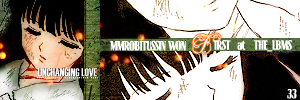
07 - Banner is not matching at all, you could have coloured in the image and flipped it. There is no need for the repetition and the placement of text is awkward, especially placing a 33 below without any detailed information. You could have added tiny text too.
07 - I dislike the way the text was used, which doesn't look like it matches the icon at all, and the fact that the week number is at the bottom corner of the icon (also, all icons are required to have the week's theme on the banner as well). I also dislike how the image wasn't colored and the way the double imaging doesn't match with the original icon.
07 - The icon itself lacks the coloring that the others had so it doesn't really appeal as much as the others do.
07 - The image is over sharpened and it needs to show more color. Also, It's really hard to read the text.
07 - The image used for the banner seems washed out and the text is difficult to read. Less of a glow would make it easier to read the typography.
07 - the is a little to blury and the font used for the f in first seems to contrast with the image a bit and the colorless image makes for the banner to be a bit laking and dull
07 - The placement of the horizontal line feels kinda out of place
07 - The repeating image doesn't work well here - not only is there no difference between images (they're both desaturated), but the concept doesn't match the icon. The text is difficult to read and the font also doesn't match the icon.
07 - The text doesn't really seem the fit in that much, it interupts the flow the banner has. The font choice and color for the "F" in "FIRST" is also bad, it really sticks out, I suggest either not stroking the letter or use the same font as the rest of the text, but make it slightly bigger.
07 - Leaving the banner uncoloured makes it look very awkward with that huge space of white there. Even simple colouring would've made it stand out a bit more.
07 - The '33' in the lower right corner seems out of place as it is the only banner text that is on the image rather than on the bar. It is also difficult to tell what that '33' is for - I only know it is the week number because it's on all of the other banners.
Comments for members choice: ^^ we all love comments.
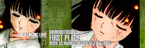
01 - I dislike how some of the text is on top of white boxes, but the creativity of the image choice and the matchng of the font/tiny text won me over.
01 - I really like how the image that was used for the rest of the banner is different from the icon's, but still carries the same 'theme' as the icon. I like how the font for 'first place' seems to match the icon's text of 'unchanging love' very well, and I really like how there's a white background behind the smaller text in the banner. It makes it more readable and I think it adds a different feel to the banner itself. I think the light ball texture right on Inu Yasha's face could've been erased or smudged away though, since it interferes with the image slightly.
01 - It's a really nice banner. I love your use of two separate images combined into one. However, the text is a bit hard to read.... and a bit boring...
01 - The use of a completely different image (or something not similar) works well, as is the abstract way of presenting the text
02 - the image and overall composition match well, as does the typography. But the text is a little difficult to read, especially the middle line.
03 - Great job at duplicating the manga colouring! I really like the typography you used as well; it looks really similar. The texture background is nicely duplicated as well. :D
03 - Great work with the coloring and matching of textures/colors.
03 - I like how your text is nice and clear, and you did well in copying the style used for the girl's face.
03 - Matching banner and good use of the texture. Nice flipping of the lips also x) Colour of the text is not matching and you might want to eyedrop the colour of the text from the icon.
04 - I really like the way the banner image is made softer and more peaceful with the white light texture. I also like the mirrored repetition of the icon's border between the two images.
05 - The coloring of the original icon was duplicated very well, as were the light textures.
05- (no reason)
05 - I think you tried to mimic the colouring of the original icon really well. The extension looks very natural and the colours flow nicely.
06 - The image used for the banner matches very nicely here. Perhaps the biggest stand out to me is that the typography is well placed and readable while still matching the icon.
06 - The manga coloring on the banner is just amazing, the continuation from the hair really fits in with the banner.
07 - Nice, very good matching, and it's got a bit of your own creativity in there as well. I like it.
Other comments:
02 - The lineart here looks kinda thick, but I really like the text.
05 - That green texture in the middle looks amazing! It doesn't look copy-pasted from the icon at all. I do think the text could've been a lot clearer, though.
05 - I like the overall composition of this banner very much, particularly placing the icon on the right side of the banner so that the images are facing toward the center of the banner. Unfortunately the text on the banner image is very difficult to read on top of her clothing, maybe a bit more/darker shadowing on the text would help.
07 - I like how different this one is, with the text across a green strip in the middle, and the doubled image. But it does look too stark uncoloured.
07 - I really like the composition of the banner; I think the image is a bit too pale to match the icon, though. The banner's missing some things such as what theme the icon won. I think it was a creative idea to divide the image into two with the text in the middle. The font of the text doesn't match the icon's too much, but it's really nice and readable.
New theme will be put up as soon as I find the stuff for it. XD
ELIMINATIONS
[7] by whitelilies22 (-9 points)
Thank you so much for participating and please don't be discouraged! Hopefully we'll see you in round 4! Please continue to vote, because we could really use it ♥
PEOPLE'S CHOICE
[3] by moon_stone787 (+3 points)
RESULTS TALLY
#01: -3 points, +4 points (+1 overall points)
#02: -0 points, +1 points (+1 overall points)
#03: -1 points, +4 points (+3 overall points)
#04: -3 points, +1 points (-2 overall points)
#05: -0 points, +2 points (+2 overall points)
#06: -1 points, +2 points, -1 for not votings (0 overall points)
#07: -10 points, +1 points, -1 for not voting (-10 overall points)
Link to voting table.
THERE IS ONE SET OF LATE VOTES THAT ARE NOT COUNTED, BUT THE CRITIQUES ARE HERE ANYWAYS. [excuse the caps]
Comments for eliminations: (remember don't take them personally, they are merely to help you grow as an icon arist)
01 - I don't like that the image on the banner part does not match the original image for the icon.
01 - The color of the image in the banner is quite off doesn't realy match the icon. Although the text used matches the icon, it can still be improved.
01 - The light green coloring on the image clashes a little with the green textures used, and the white border behind the text is distracting.
03: Love the shadow behind the icon itself. The tpography is great, as well as the black swirld. The text at the top is a little hard to read, but that's it. :) The background of the banner is really nice as well.
04 - Although the banner doesn't have the same picture as the icon, I think it still worked well. Nice coloring and the text also matches the icon.
04 - The image at the right seems a bit blurry; the colours don't really match the icon very well. There seems to be a texture-like pattern at the bottom of the right section as well, which interferes with the image quite a lot and makes it look messy. The background pattern in the middle repeats itself quite a lot, as if it was cropped and pasted repeatedly directly from the icon. The lines in between don't make it very pleasant to look at, although the pattern does make the banner seem consistant. I think the text was well done though, it's clear and can be easily read.
04 - The typographiy is good.. but the image duplication you tried doesn't really look the same as the original.. The texture background looks odd as well, very choppy.
06 - I think you could've tried another shade for light blob over the girl's face, since here it makes her look yellow instead of pink. The text, other than the winner's name, is very hard to read.
07 - Banner is not matching at all, you could have coloured in the image and flipped it. There is no need for the repetition and the placement of text is awkward, especially placing a 33 below without any detailed information. You could have added tiny text too.
07 - I dislike the way the text was used, which doesn't look like it matches the icon at all, and the fact that the week number is at the bottom corner of the icon (also, all icons are required to have the week's theme on the banner as well). I also dislike how the image wasn't colored and the way the double imaging doesn't match with the original icon.
07 - The icon itself lacks the coloring that the others had so it doesn't really appeal as much as the others do.
07 - The image is over sharpened and it needs to show more color. Also, It's really hard to read the text.
07 - The image used for the banner seems washed out and the text is difficult to read. Less of a glow would make it easier to read the typography.
07 - the is a little to blury and the font used for the f in first seems to contrast with the image a bit and the colorless image makes for the banner to be a bit laking and dull
07 - The placement of the horizontal line feels kinda out of place
07 - The repeating image doesn't work well here - not only is there no difference between images (they're both desaturated), but the concept doesn't match the icon. The text is difficult to read and the font also doesn't match the icon.
07 - The text doesn't really seem the fit in that much, it interupts the flow the banner has. The font choice and color for the "F" in "FIRST" is also bad, it really sticks out, I suggest either not stroking the letter or use the same font as the rest of the text, but make it slightly bigger.
07 - Leaving the banner uncoloured makes it look very awkward with that huge space of white there. Even simple colouring would've made it stand out a bit more.
07 - The '33' in the lower right corner seems out of place as it is the only banner text that is on the image rather than on the bar. It is also difficult to tell what that '33' is for - I only know it is the week number because it's on all of the other banners.
Comments for members choice: ^^ we all love comments.
01 - I dislike how some of the text is on top of white boxes, but the creativity of the image choice and the matchng of the font/tiny text won me over.
01 - I really like how the image that was used for the rest of the banner is different from the icon's, but still carries the same 'theme' as the icon. I like how the font for 'first place' seems to match the icon's text of 'unchanging love' very well, and I really like how there's a white background behind the smaller text in the banner. It makes it more readable and I think it adds a different feel to the banner itself. I think the light ball texture right on Inu Yasha's face could've been erased or smudged away though, since it interferes with the image slightly.
01 - It's a really nice banner. I love your use of two separate images combined into one. However, the text is a bit hard to read.... and a bit boring...
01 - The use of a completely different image (or something not similar) works well, as is the abstract way of presenting the text
02 - the image and overall composition match well, as does the typography. But the text is a little difficult to read, especially the middle line.
03 - Great job at duplicating the manga colouring! I really like the typography you used as well; it looks really similar. The texture background is nicely duplicated as well. :D
03 - Great work with the coloring and matching of textures/colors.
03 - I like how your text is nice and clear, and you did well in copying the style used for the girl's face.
03 - Matching banner and good use of the texture. Nice flipping of the lips also x) Colour of the text is not matching and you might want to eyedrop the colour of the text from the icon.
04 - I really like the way the banner image is made softer and more peaceful with the white light texture. I also like the mirrored repetition of the icon's border between the two images.
05 - The coloring of the original icon was duplicated very well, as were the light textures.
05- (no reason)
05 - I think you tried to mimic the colouring of the original icon really well. The extension looks very natural and the colours flow nicely.
06 - The image used for the banner matches very nicely here. Perhaps the biggest stand out to me is that the typography is well placed and readable while still matching the icon.
06 - The manga coloring on the banner is just amazing, the continuation from the hair really fits in with the banner.
07 - Nice, very good matching, and it's got a bit of your own creativity in there as well. I like it.
Other comments:
02 - The lineart here looks kinda thick, but I really like the text.
05 - That green texture in the middle looks amazing! It doesn't look copy-pasted from the icon at all. I do think the text could've been a lot clearer, though.
05 - I like the overall composition of this banner very much, particularly placing the icon on the right side of the banner so that the images are facing toward the center of the banner. Unfortunately the text on the banner image is very difficult to read on top of her clothing, maybe a bit more/darker shadowing on the text would help.
07 - I like how different this one is, with the text across a green strip in the middle, and the doubled image. But it does look too stark uncoloured.
07 - I really like the composition of the banner; I think the image is a bit too pale to match the icon, though. The banner's missing some things such as what theme the icon won. I think it was a creative idea to divide the image into two with the text in the middle. The font of the text doesn't match the icon's too much, but it's really nice and readable.
New theme will be put up as soon as I find the stuff for it. XD