{Round 03: Challenge 04} Eliminations
XD I got nothin' to say~
ELIMINATIONS

[#1] by moon_stone787 (-7 points)
Thank you so much for participating and please don't be discouraged! Hopefully we'll see you in round 4! Please continue to vote, because we could really use it ♥
PEOPLE'S CHOICE

[#3] by wolf_crossbreed (+3 points)
RESULTS TALLY
#01: -8 points, +2 points (-6 overall points) -1 for not voting= overall points=-7
#02: -2 points, +4 points (+2 overall points) -1 for not voting= overall points=+1
#03: -2 points, +6 points (+4 overall points) -1 for not voting= overall points=+3
Link to voting table.
Comments for eliminations: (remember don't take them personally, they are merely to help you grow as an icon arist)
01 - I don't think the bordered text works all that well in this peice.
01 - It's a nicely colored banner, but the text is a bit out of place and it doesn't capture your attention.
01 - The background is wonderful, but the black font is very harsh, particularly with the stroke.
01 - The banner flows really well but the main problem here is the text. The stroke around them looks distracting and your choice of font makes the text a little hard to read.
01 - The tower (?) provides a good backdrop for the banner, my one qualm is the choice of font.
01 - This was a lovely banner, but the font choice was horrible! The bold color is very distracting and the stroke around the text made it look unprofessional.
01 - Uh, I can't tell for sure, but I'm pretty sure you altered the original icon :X? It looks darker than the original (and I should be kinda certain, since I made it, haha 8D;). Good job with the banner though, it looks very nice with the building in the bg. I'd probably change the typography though.. The black looks way too harsh on such soft colouring.
01 - While the background to the banner is lovely, I find the white around the black text very odd and distracting from the overall feel of the banner. The black text stands out enough on it's own, though perhaps another color would blend with the banner and icon a bit better.
02- The lighting is a bit strange in your banner. The image appears more green than the icon too. Also, your text is choppy and a bit small.
02 - This was a really tough choice, but I'm going with your banner because of how awkward your lighting is. The lighting isn't very balanced and your light textures are really.. random. I do like your typography, though.
03 - The color of the picture in the banner is a bit darker than the banner. The use of light texture was very nice but the font face doesn't really match the banner.
03 - The swirl texture seems slightly overused in the rest of the banner; it also distracts attention away from the text, which is a little hard to notice to begin with. Nothing seems off in the banner, but nothing really stands out, all the same. The banner seems a little plain overall.
Comments for members choice: ^^ we all love comments.
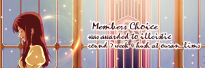
01 - I think this banner flows smoothly with the icon. The colors are really pretty and the typography was well-executed.
01 - This banner really stands out to me O: The colours are vibrant, and I really love the tower in the center of the banner; it makes the banner seem so much more fuller. The light ball texture seems really appropriate for the banner, and I really love the text. It's very clear and easy to read, and the white background for it makes it seem really organized.
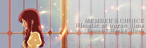
02 - Great blending and the subtle text is rather nice.
02 - I had a hard time picking a favorite, but this won me over with the use of the tower on the side. It really helped balance the colors.
02 - Mostly love it for the imagework on this icon. Although the text is a bit small and plain, you did a really nice work with the colock tower portion on the right side.
02 - Nice image continuation, and a delicate font to go with the delicate image. The tiny lights help continue the image without being repetitive.
03 - Awesome continuation of the original image on both sides of the icon. The banner matches well, down to the light flares and swirls. The text is still readable while blending in well with the rest of the coloring and overall feel.
03 - Banner flows very smoothly and nice placement of text. But the text is a little unclear, maybe adding another layer of drop shadow would help.
03 - I love the lighting in this one. Everything flows nicely and the text effects you did for your typography stand out really well.
03 - Love the continuation of the icon! As the iconmaker, I can fully appreciate how well you blended the icon and banner together. The typography is a little hard to read, but I like how it's soft to match the icon.
03 - The repeat of the lighting is a nice touch, and the font choice is great.
03- The text is lovely on this banner! Nice touch with the light textures in the back.
Other comments:
02 - While the general work is good,the placement of the text feels a bit awkward.
03 - It's very hard to actually read the text here.
ELIMINATIONS

[#1] by moon_stone787 (-7 points)
Thank you so much for participating and please don't be discouraged! Hopefully we'll see you in round 4! Please continue to vote, because we could really use it ♥
PEOPLE'S CHOICE

[#3] by wolf_crossbreed (+3 points)
RESULTS TALLY
#01: -8 points, +2 points (-6 overall points) -1 for not voting= overall points=-7
#02: -2 points, +4 points (+2 overall points) -1 for not voting= overall points=+1
#03: -2 points, +6 points (+4 overall points) -1 for not voting= overall points=+3
Link to voting table.
Comments for eliminations: (remember don't take them personally, they are merely to help you grow as an icon arist)
01 - I don't think the bordered text works all that well in this peice.
01 - It's a nicely colored banner, but the text is a bit out of place and it doesn't capture your attention.
01 - The background is wonderful, but the black font is very harsh, particularly with the stroke.
01 - The banner flows really well but the main problem here is the text. The stroke around them looks distracting and your choice of font makes the text a little hard to read.
01 - The tower (?) provides a good backdrop for the banner, my one qualm is the choice of font.
01 - This was a lovely banner, but the font choice was horrible! The bold color is very distracting and the stroke around the text made it look unprofessional.
01 - Uh, I can't tell for sure, but I'm pretty sure you altered the original icon :X? It looks darker than the original (and I should be kinda certain, since I made it, haha 8D;). Good job with the banner though, it looks very nice with the building in the bg. I'd probably change the typography though.. The black looks way too harsh on such soft colouring.
01 - While the background to the banner is lovely, I find the white around the black text very odd and distracting from the overall feel of the banner. The black text stands out enough on it's own, though perhaps another color would blend with the banner and icon a bit better.
02- The lighting is a bit strange in your banner. The image appears more green than the icon too. Also, your text is choppy and a bit small.
02 - This was a really tough choice, but I'm going with your banner because of how awkward your lighting is. The lighting isn't very balanced and your light textures are really.. random. I do like your typography, though.
03 - The color of the picture in the banner is a bit darker than the banner. The use of light texture was very nice but the font face doesn't really match the banner.
03 - The swirl texture seems slightly overused in the rest of the banner; it also distracts attention away from the text, which is a little hard to notice to begin with. Nothing seems off in the banner, but nothing really stands out, all the same. The banner seems a little plain overall.
Comments for members choice: ^^ we all love comments.
01 - I think this banner flows smoothly with the icon. The colors are really pretty and the typography was well-executed.
01 - This banner really stands out to me O: The colours are vibrant, and I really love the tower in the center of the banner; it makes the banner seem so much more fuller. The light ball texture seems really appropriate for the banner, and I really love the text. It's very clear and easy to read, and the white background for it makes it seem really organized.
02 - Great blending and the subtle text is rather nice.
02 - I had a hard time picking a favorite, but this won me over with the use of the tower on the side. It really helped balance the colors.
02 - Mostly love it for the imagework on this icon. Although the text is a bit small and plain, you did a really nice work with the colock tower portion on the right side.
02 - Nice image continuation, and a delicate font to go with the delicate image. The tiny lights help continue the image without being repetitive.
03 - Awesome continuation of the original image on both sides of the icon. The banner matches well, down to the light flares and swirls. The text is still readable while blending in well with the rest of the coloring and overall feel.
03 - Banner flows very smoothly and nice placement of text. But the text is a little unclear, maybe adding another layer of drop shadow would help.
03 - I love the lighting in this one. Everything flows nicely and the text effects you did for your typography stand out really well.
03 - Love the continuation of the icon! As the iconmaker, I can fully appreciate how well you blended the icon and banner together. The typography is a little hard to read, but I like how it's soft to match the icon.
03 - The repeat of the lighting is a nice touch, and the font choice is great.
03- The text is lovely on this banner! Nice touch with the light textures in the back.
Other comments:
02 - While the general work is good,the placement of the text feels a bit awkward.
03 - It's very hard to actually read the text here.