{Round 04: Challenge 01} Results
Yadda Yadda Yadda. Farewell to one person. ;_;
ELIMINATIONS

[#4] by greenie_cgv (-8 points)
Thank you so much for participating and please don't be discouraged! Hopefully we'll see you in round 2! Please continue to vote, because we could really use it ♥
PEOPLE'S CHOICE

[#2] by illeistic (+6 points)
RESULTS TALLY
#01: -3 points, +1 points, - 1 for not voting (-3 overall points)
#02: -0 points, +6 points (+6 overall points)
#03: -0 points, +2 points (+2 overall points)
#04: -7 points, +1 points, - 1 for not voting (-8 overall points)
Link to voting table.
Comments for eliminations: (remember don't take them personally, they are merely to help you grow as an icon arist)
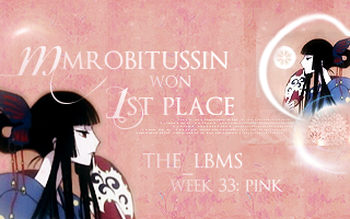
01 - I like how the icon blends in so well with the banner, but I think the use of so many textures makes the banner a bit too busy. The orange colors on the left side and the blue colors on the right side don't work too well together in this; it feels like both sides are competing for focus and this divides the balance. The text is a bit too close to the white diagonal line, and this draws attention from the text.
01 - I really like how the icon has been finished and fits with the banner, but the added textures seem a bit overpowering and the double image a bit too grainy.
01 - I really like the matching of the icon onto the main banner section (the pink part) but the blue next to it and the picture of Yuuko to the left is a little off. They're both too sharp and don't really match that much.. Also the fonts you chose don't seem to convey the same sense of 'elegance' I'm getting from this icon.. but then again that's my opinion so XD;;
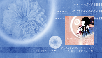
04 - Although I think it was wonderful that you used the color blue instead of pink.... it really just doesn't go with the overall icon...
04 - I think the blue coloring overpowers the icon that this banner was made for.
04 - I think this is a lovely banner stylistically, but given that the icon is mainly pink, the overwhelmingly blue banner just seems jarring. This may have worked with a smaller size banner, but because the banner is oversized, the icon looks out-of-place against all that blue.
04 - Somehow the use of blue color in the banner just didn't work for me. It kinda looked a bit awkward and did not really matched the icon. Although it did make the pink icon stand out. I think it would be better if the banner maker used pink (or even different shades of pink if the objective is to make the icon stand out) instead of blue because all the other elements were very nice.
04 - The blue really doesn't blend with the icon.
04 - The color schemeof the banner does not seem to fit well with the icon, making it stick out a bit too much.
04 - The colour of blue doesn't go too well with the icon. There is some blue in the character's outfit, but using blue in the rest of the banner really overwhelms the pink in the icon. The tiny text in the banner seems to get in the way of the original icon and the light texture surrounding the flower; I think it could've been placed better. The placement of the original icon seems to get in the way of the darker blue bar near the bottom as well, because they clash in colour. The banner looks a little too crowded to the right side overall.
Comments for members choice: ^^ we all love comments.
01 - I love the second picture of yuuko and the textures you used. However, I wish the text was larger so that I could see it better.
02 - I like how the icon seems to be a part of the banner but didn't really swallow it or overwhelm it. The use of image and textures was very nice and the typography was well-executed.
02 - Really pretty, flows well. I like it.
02 - simple in style, but very well-matched and with excellent typography.
02 - The icon flows amazingly well with the banner, as if it belongs. The image repetition was a nice choice too, as it takes great care of extra space.
02 - The icon is cleanly integrated into the banner and the effort put into decorating the banner (and making the larger image of Yuuko look much prettier) can be seen well.
02 - Very nice blending and use of the original image and text.
03 - I really like the composition of the banner; it follows the icon closely yet in a different angle. I think the font choice for the banner is really nice; it's easy to read, and the placement of it is quite nice, though it could've been moved a little more to the left. I do wish that the banner could've incorporated the flower or another element a little more, though; it does seem slightly empty to the top left. The banner's really clean and well composed overall.
03 - I think this is a very lovely banner. If you could've just integrated the icon into the banner a little more, it would've been perfect. Love the typography and the similar design of banner to layout. :3
04 - An interesting choice to make the banner a completely different color than the icon, but this brings the most attention to the icon itself (which is what a banner SHOULD do, right? ^^). The composition is well balanced and the typography is well done.
Other comments:
01 - Clearly, a lot of work went into this banner, but it doesn't hold together well. There are too many disparate elements here - the left image, the icon, the texture in full on the bottom, the texture along the right. It looks almost as though the maker is trying to fill the extra space rather than form a cohesive image, especially with the typography crammed in the middle. Pretty, but a little schizophrenic visually.
01 - The banner is pretty but there're too many things in it that it looked a bit cluttered. The font face used for 'the lbms' don't really match the icon in my opinion. Perhaps using another font face would be better?
03 - I like the contrasting textures and simple typeface, but setting the icon on top of that white line breaks up the curve and flow of the banner.
ELIMINATIONS

[#4] by greenie_cgv (-8 points)
Thank you so much for participating and please don't be discouraged! Hopefully we'll see you in round 2! Please continue to vote, because we could really use it ♥
PEOPLE'S CHOICE

[#2] by illeistic (+6 points)
RESULTS TALLY
#01: -3 points, +1 points, - 1 for not voting (-3 overall points)
#02: -0 points, +6 points (+6 overall points)
#03: -0 points, +2 points (+2 overall points)
#04: -7 points, +1 points, - 1 for not voting (-8 overall points)
Link to voting table.
Comments for eliminations: (remember don't take them personally, they are merely to help you grow as an icon arist)
01 - I like how the icon blends in so well with the banner, but I think the use of so many textures makes the banner a bit too busy. The orange colors on the left side and the blue colors on the right side don't work too well together in this; it feels like both sides are competing for focus and this divides the balance. The text is a bit too close to the white diagonal line, and this draws attention from the text.
01 - I really like how the icon has been finished and fits with the banner, but the added textures seem a bit overpowering and the double image a bit too grainy.
01 - I really like the matching of the icon onto the main banner section (the pink part) but the blue next to it and the picture of Yuuko to the left is a little off. They're both too sharp and don't really match that much.. Also the fonts you chose don't seem to convey the same sense of 'elegance' I'm getting from this icon.. but then again that's my opinion so XD;;
04 - Although I think it was wonderful that you used the color blue instead of pink.... it really just doesn't go with the overall icon...
04 - I think the blue coloring overpowers the icon that this banner was made for.
04 - I think this is a lovely banner stylistically, but given that the icon is mainly pink, the overwhelmingly blue banner just seems jarring. This may have worked with a smaller size banner, but because the banner is oversized, the icon looks out-of-place against all that blue.
04 - Somehow the use of blue color in the banner just didn't work for me. It kinda looked a bit awkward and did not really matched the icon. Although it did make the pink icon stand out. I think it would be better if the banner maker used pink (or even different shades of pink if the objective is to make the icon stand out) instead of blue because all the other elements were very nice.
04 - The blue really doesn't blend with the icon.
04 - The color schemeof the banner does not seem to fit well with the icon, making it stick out a bit too much.
04 - The colour of blue doesn't go too well with the icon. There is some blue in the character's outfit, but using blue in the rest of the banner really overwhelms the pink in the icon. The tiny text in the banner seems to get in the way of the original icon and the light texture surrounding the flower; I think it could've been placed better. The placement of the original icon seems to get in the way of the darker blue bar near the bottom as well, because they clash in colour. The banner looks a little too crowded to the right side overall.
Comments for members choice: ^^ we all love comments.
01 - I love the second picture of yuuko and the textures you used. However, I wish the text was larger so that I could see it better.
02 - I like how the icon seems to be a part of the banner but didn't really swallow it or overwhelm it. The use of image and textures was very nice and the typography was well-executed.
02 - Really pretty, flows well. I like it.
02 - simple in style, but very well-matched and with excellent typography.
02 - The icon flows amazingly well with the banner, as if it belongs. The image repetition was a nice choice too, as it takes great care of extra space.
02 - The icon is cleanly integrated into the banner and the effort put into decorating the banner (and making the larger image of Yuuko look much prettier) can be seen well.
02 - Very nice blending and use of the original image and text.
03 - I really like the composition of the banner; it follows the icon closely yet in a different angle. I think the font choice for the banner is really nice; it's easy to read, and the placement of it is quite nice, though it could've been moved a little more to the left. I do wish that the banner could've incorporated the flower or another element a little more, though; it does seem slightly empty to the top left. The banner's really clean and well composed overall.
03 - I think this is a very lovely banner. If you could've just integrated the icon into the banner a little more, it would've been perfect. Love the typography and the similar design of banner to layout. :3
04 - An interesting choice to make the banner a completely different color than the icon, but this brings the most attention to the icon itself (which is what a banner SHOULD do, right? ^^). The composition is well balanced and the typography is well done.
Other comments:
01 - Clearly, a lot of work went into this banner, but it doesn't hold together well. There are too many disparate elements here - the left image, the icon, the texture in full on the bottom, the texture along the right. It looks almost as though the maker is trying to fill the extra space rather than form a cohesive image, especially with the typography crammed in the middle. Pretty, but a little schizophrenic visually.
01 - The banner is pretty but there're too many things in it that it looked a bit cluttered. The font face used for 'the lbms' don't really match the icon in my opinion. Perhaps using another font face would be better?
03 - I like the contrasting textures and simple typeface, but setting the icon on top of that white line breaks up the curve and flow of the banner.