tutorial #1
rentsgirl asked how to do this 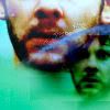
- Firstly, I decided to work with this image by lost-media.com

- I resized it and placed it on the top of a 100 x 100 empty layer
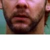
- Then, I duplicated the layer three times, and set the first two new layers to screen, opacity 100%. I set the last one on overlay, opacity 100%. Then, I merged all.
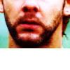
As you can see the screen layers brightened the image up, while the overlay layer added a lot of contrast and made the colours more intens.
- Now I created a new layer, filled it with #2e0f10 and set it to exclusion.

This softened the colours and gave the icon a brownish/yellowish tone.
- Now I created a new layer and dragged it to the base. I filled it with #74c9b9.

- Now I created a new color balance layer, with this settings:
shadows: 0 -13 -64
highlights: 0 0 +32
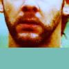
now the icon is a lot more yellow! :)
- Now, I took again the big Charlie cap form which I started and pasted it as a new layer. I resized it a lot and set it on color burn, opacity 85%
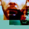
- It covers a big part of Charlie's face, so I erased the parts I didn't want from the burn layer.
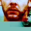
- Using the smudge tool I let some of the green layer cover the bigger Cahrlie's face, so that now the smaller Charlie has a completely green face...
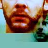
- Now I took this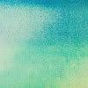
texture by exposed and pasted it as a new layer, set to color bur opacity 100%

- As you can see it doesn't look very good so I erased some parts, mostly from the big Charlie's face.
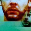
- Now I merged all and then I used the smudge tool again (you can get cool effects with it :D ) on the green part at the bottom, getting this
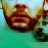
- Now I adjusted a bit the colours again, using a new colour balance level:
shadows: 0 -11 0
midtones: 0 44 0
highlights 0 0 -10

- Now what's left is that blue color splash, and here comes the difficul part, 'cause I don't remember how I did it XD That's because I usually play A LOT around with textures and brushes, changing their colours, erasing parts or resizing them. Therefore, I haven't been able to remember what exaclty I used for this icon. ANYWAY, to get a similar effect isn't hard. For example, if you take this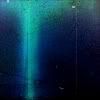
texture by tihana and set it to lighten, you get this:
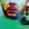
which isn't that different from what I did in the original icon, is it? :)
Well, that was long XD I really hope it helped :) More generally, my suggestion is (especially if you want to do something more creative like this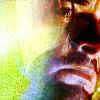
) to play around with the resources you've got, changing them until you get something you like. And speaking of that, this tutorial was of big help for me! :) try to take a look at it ;)
Ok, now I'm done XD let me know if this helped :)

- Firstly, I decided to work with this image by lost-media.com

- I resized it and placed it on the top of a 100 x 100 empty layer

- Then, I duplicated the layer three times, and set the first two new layers to screen, opacity 100%. I set the last one on overlay, opacity 100%. Then, I merged all.

As you can see the screen layers brightened the image up, while the overlay layer added a lot of contrast and made the colours more intens.
- Now I created a new layer, filled it with #2e0f10 and set it to exclusion.

This softened the colours and gave the icon a brownish/yellowish tone.
- Now I created a new layer and dragged it to the base. I filled it with #74c9b9.

- Now I created a new color balance layer, with this settings:
shadows: 0 -13 -64
highlights: 0 0 +32

now the icon is a lot more yellow! :)
- Now, I took again the big Charlie cap form which I started and pasted it as a new layer. I resized it a lot and set it on color burn, opacity 85%

- It covers a big part of Charlie's face, so I erased the parts I didn't want from the burn layer.

- Using the smudge tool I let some of the green layer cover the bigger Cahrlie's face, so that now the smaller Charlie has a completely green face...

- Now I took this

texture by exposed and pasted it as a new layer, set to color bur opacity 100%

- As you can see it doesn't look very good so I erased some parts, mostly from the big Charlie's face.

- Now I merged all and then I used the smudge tool again (you can get cool effects with it :D ) on the green part at the bottom, getting this

- Now I adjusted a bit the colours again, using a new colour balance level:
shadows: 0 -11 0
midtones: 0 44 0
highlights 0 0 -10

- Now what's left is that blue color splash, and here comes the difficul part, 'cause I don't remember how I did it XD That's because I usually play A LOT around with textures and brushes, changing their colours, erasing parts or resizing them. Therefore, I haven't been able to remember what exaclty I used for this icon. ANYWAY, to get a similar effect isn't hard. For example, if you take this

texture by tihana and set it to lighten, you get this:

which isn't that different from what I did in the original icon, is it? :)
Well, that was long XD I really hope it helped :) More generally, my suggestion is (especially if you want to do something more creative like this

) to play around with the resources you've got, changing them until you get something you like. And speaking of that, this tutorial was of big help for me! :) try to take a look at it ;)
Ok, now I'm done XD let me know if this helped :)