Twilight Tutorial.
Alrighty, well I really like the coloring results in this icon. I find most of the Twilight caps are very dark and blue so I decided to reverse the effect.
On a personal note, school is well underway and it's going good. Day two is finished and by the way things are going it looks like I may actually survive. :D
Program: Photoshop CS2
Involves: 'Smudging', Levels, Selective Coloring
Level: Easy
Example-
From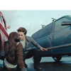
to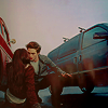
BELLA SWAN & EDWARD CULLEN TUTORIAL.
So I started with an image of Bella and Edward from the movie Twilight.
1. The cropping of my image left about 20 pixels of empty space at the top of the image. I arranged my image on a 100x100 canvas and used the 'Smudge' tool
to fill in the blank space.

to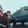
2. I copied my layers (Shift+Ctrl+C) and pasted the copied layer (Ctrl+v) I sharpened this layer (Filter - Sharpen - Sharpen) and lowered the opacity.

to
3. Next I went to the original *large* image and copied a portion of Bella's hair, I pasted it on top of my image. This was the image. I set this layer to 'Lighten'. This adds some interesting light to the image. If there are parts of the new layer you dont not want on your icon than color over that section with black.

to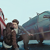
4. I added this texture made by me. I set the layer to 'Multiply' and lowered the opacity to about 52%. This layer adds soem shadow to one side of the icon, adjust as needed. If you don't like my texture you can make your own gradient. I used the colors #6f6e73 and #d7d8dd.

to
5. I added another texture made by me and set this new layer to 'Lighten'. I lowered the opacity to 64%. If you want to make your own gradient I would recommend using any dark gray and black.

to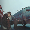
6. Create a new layer and fill it with #e5e5e5 and set the layer to 'Multiply'. I lowered the opacity to 80%. If you find your result to dark than lower the opacity.

to
7. I took this texture at set it to 'Soft Light'. This step is crucial, it will increase the yellows in your image. Make sure the yellow side of the texture covers your focul point because it brings light to that part of the image.

to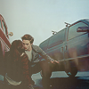
8. Create a new Levels layer (Layers - New Adjustment Layer - Levels). I used these settings.
RBG:
Input- 19, 1.06, 253
Output- 0, 255

to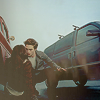
9. Create a new Brightness/Contrast layer (Layer - New Adjustment layer - Brightness/Contrast). I used the following settings.
Brightness: -6, Contrast +6

to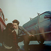
10. Create a new Selective Color layer (Layer - New Adjustment layer - Selective Color). I used these settings.
Reds: -62, +12, +9, +27
Yellows: +5, +6, +19, +24
Cyans: +100, +12, -5, 0
Whites: 0, +70, +50, -11
Neutrals: +10, +8, +6, -7
Blacks: 0, 0, 0, +6

to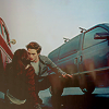
10. Create a new layer and fill it with #dfd58c and set the layer to 'Multiply'. I lowered the opacity to 35%. This layer prevents the icon from becoming to red and adds depth.

to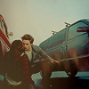
11. Create a new Selective Color layer (Layer - New Adjustment layer - Selective Color). I used these settings.
Reds: -12, +7, +11, +10
Yellows: -13, +6, -6, +12
Greens: +8, +35, -60, +1
Cyans: +100, -7, -8, +11
Blues: -6, +11, -100, +6
Whites: -14, +78, +14, -13
Neutrals: +11, +10, +1, +3
Blacks: 0, 0, 0, +5

to
Any comments/questions? Don't hesitate to post! I would love to see results.
On a personal note, school is well underway and it's going good. Day two is finished and by the way things are going it looks like I may actually survive. :D
Program: Photoshop CS2
Involves: 'Smudging', Levels, Selective Coloring
Level: Easy
Example-
From

to

BELLA SWAN & EDWARD CULLEN TUTORIAL.
So I started with an image of Bella and Edward from the movie Twilight.
1. The cropping of my image left about 20 pixels of empty space at the top of the image. I arranged my image on a 100x100 canvas and used the 'Smudge' tool

to fill in the blank space.

to

2. I copied my layers (Shift+Ctrl+C) and pasted the copied layer (Ctrl+v) I sharpened this layer (Filter - Sharpen - Sharpen) and lowered the opacity.

to

3. Next I went to the original *large* image and copied a portion of Bella's hair, I pasted it on top of my image. This was the image. I set this layer to 'Lighten'. This adds some interesting light to the image. If there are parts of the new layer you dont not want on your icon than color over that section with black.

to

4. I added this texture made by me. I set the layer to 'Multiply' and lowered the opacity to about 52%. This layer adds soem shadow to one side of the icon, adjust as needed. If you don't like my texture you can make your own gradient. I used the colors #6f6e73 and #d7d8dd.

to

5. I added another texture made by me and set this new layer to 'Lighten'. I lowered the opacity to 64%. If you want to make your own gradient I would recommend using any dark gray and black.

to

6. Create a new layer and fill it with #e5e5e5 and set the layer to 'Multiply'. I lowered the opacity to 80%. If you find your result to dark than lower the opacity.

to

7. I took this texture at set it to 'Soft Light'. This step is crucial, it will increase the yellows in your image. Make sure the yellow side of the texture covers your focul point because it brings light to that part of the image.

to

8. Create a new Levels layer (Layers - New Adjustment Layer - Levels). I used these settings.
RBG:
Input- 19, 1.06, 253
Output- 0, 255

to

9. Create a new Brightness/Contrast layer (Layer - New Adjustment layer - Brightness/Contrast). I used the following settings.
Brightness: -6, Contrast +6

to

10. Create a new Selective Color layer (Layer - New Adjustment layer - Selective Color). I used these settings.
Reds: -62, +12, +9, +27
Yellows: +5, +6, +19, +24
Cyans: +100, +12, -5, 0
Whites: 0, +70, +50, -11
Neutrals: +10, +8, +6, -7
Blacks: 0, 0, 0, +6

to

10. Create a new layer and fill it with #dfd58c and set the layer to 'Multiply'. I lowered the opacity to 35%. This layer prevents the icon from becoming to red and adds depth.

to

11. Create a new Selective Color layer (Layer - New Adjustment layer - Selective Color). I used these settings.
Reds: -12, +7, +11, +10
Yellows: -13, +6, -6, +12
Greens: +8, +35, -60, +1
Cyans: +100, -7, -8, +11
Blues: -6, +11, -100, +6
Whites: -14, +78, +14, -13
Neutrals: +11, +10, +1, +3
Blacks: 0, 0, 0, +5

to

Any comments/questions? Don't hesitate to post! I would love to see results.