111. Tutorial #2
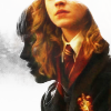
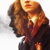
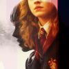
So this icon won #1 at wizard_icontest a few weeks ago, and justpinkpastel asked for me to explain how I made it. Now, being me, I obviously had to recreate it, because I don't save any PSDs. I hope it's still pretty.
Taking this and this and making this:

(while trying to recreate this)
1. Take the Ron cap and resize it and crop it.
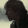
2. Now make it black and white, by putting the saturation all the way to -100.
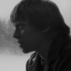
3. Add a curves layer.
I. In: 158 / Out: 220
II. In: 60 / Out: 58
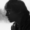
4. Now that we've got the base for our icon, let's go to the Hermione cap and work on the coloring. Dublicate your base layer three times, set the first two to screen (100% and 75% opacity respectively) and the top one to soft light (100%).
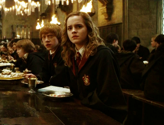
5. Now add a curves layer.
I. In: 170 / Out: 185
II. In: 63 / Out: 56
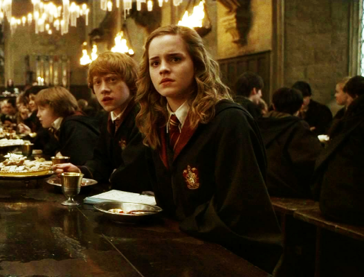
6. Go to Saturation and make it +20.
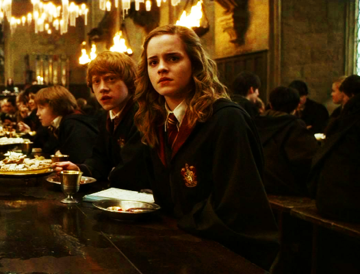
7. Resize the image to 60%.
8. Go back to your Ron icon and make a new layer on top all the others and set it to screen. Put your Hermione image on that layer and position it to your liking.
9. Erase the parts of the Hermione image that simply do not work with the icon, like the orange bits on the left.
10. Now, the coloring on Hermione does seem kind of dull. So let's add another curves layer!
I. In: 163 / Out: 217
II. In: 52 / Out: 63
11. Now I start with the textures. With some I am not sure which I used, like with this one, but it seem right.

by iconographer
Set it to Soft Light, 40%.
12. Another texture.
by soft_silk
Set it to Multiply, 100%.
13. Now, the best texture of all time! I use it wayyy to much, but it's my go-to texture when the icon is just missing something
by soft_silk as well
Set it to Screen, 100%.
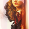
14. Now you kind of want to erase the left sides of the last two textures, and the black part on the first one by soft_silk.
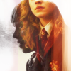
15. Also, this blue space on Ron's left side bothers me, so copy all the layers and put them in a new layer on top (in PSP: CTRL+SHIFT+C and CTRL+L). Now take a white brush or the smudge tool and make the spot white.
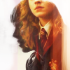
16. Now this is optional, but the original icon had some white highlight thingies, and since I couldn't find the texture I used, I just made a new layer and set it to Screen, took a round brush with 0% hardness and put it where I wanted light effects.
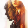
17. The icons still looks a bit cold, so make a new layer and fill it with an orange color (like #e18f01), set it to Soft Light with 30%.
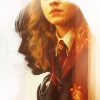
18. Onto the sharpening! Copy all your layers again and put them in a new layer on top. Sharpen it once and set the opacity to 65%.

Done!
The catch is, this blending option needs very specific images to work. As you can see in the Ron cap, the background is bright and most of his features are in the dark. It will simply not work with caps that differ too much from this description.
Coming up: Harry Potter, Game of Thrones, Doctor Who
Taking this and this and making this:

(while trying to recreate this)
1. Take the Ron cap and resize it and crop it.

2. Now make it black and white, by putting the saturation all the way to -100.

3. Add a curves layer.
I. In: 158 / Out: 220
II. In: 60 / Out: 58

4. Now that we've got the base for our icon, let's go to the Hermione cap and work on the coloring. Dublicate your base layer three times, set the first two to screen (100% and 75% opacity respectively) and the top one to soft light (100%).

5. Now add a curves layer.
I. In: 170 / Out: 185
II. In: 63 / Out: 56

6. Go to Saturation and make it +20.

7. Resize the image to 60%.
8. Go back to your Ron icon and make a new layer on top all the others and set it to screen. Put your Hermione image on that layer and position it to your liking.

9. Erase the parts of the Hermione image that simply do not work with the icon, like the orange bits on the left.

10. Now, the coloring on Hermione does seem kind of dull. So let's add another curves layer!
I. In: 163 / Out: 217
II. In: 52 / Out: 63

11. Now I start with the textures. With some I am not sure which I used, like with this one, but it seem right.

by iconographer
Set it to Soft Light, 40%.

12. Another texture.

by soft_silk
Set it to Multiply, 100%.

13. Now, the best texture of all time! I use it wayyy to much, but it's my go-to texture when the icon is just missing something

by soft_silk as well
Set it to Screen, 100%.

14. Now you kind of want to erase the left sides of the last two textures, and the black part on the first one by soft_silk.

15. Also, this blue space on Ron's left side bothers me, so copy all the layers and put them in a new layer on top (in PSP: CTRL+SHIFT+C and CTRL+L). Now take a white brush or the smudge tool and make the spot white.

16. Now this is optional, but the original icon had some white highlight thingies, and since I couldn't find the texture I used, I just made a new layer and set it to Screen, took a round brush with 0% hardness and put it where I wanted light effects.

17. The icons still looks a bit cold, so make a new layer and fill it with an orange color (like #e18f01), set it to Soft Light with 30%.

18. Onto the sharpening! Copy all your layers again and put them in a new layer on top. Sharpen it once and set the opacity to 65%.

Done!
The catch is, this blending option needs very specific images to work. As you can see in the Ron cap, the background is bright and most of his features are in the dark. It will simply not work with caps that differ too much from this description.
Coming up: Harry Potter, Game of Thrones, Doctor Who