Tutorials #01-#03 - Alicia Keys, Sophia Bush, Kristen Bell
These tutorials were posted on my personal journal, but since I'll eventually lock all (now public) entries, I'm posting them here, too.

to
or
program using: photoshop cs3
involves: selective color, levels, color balance, curves, brightness and contrast
1. Choose a picture and prepare your base (crop, resize, ...).

2. Duplicate your base, set on Screen and change the opacity (mine: 50%).


3. Duplicate your base, set on Soft light and change the opacity (mine: 20%).

4. Create a new Selective Color layer (Layer -> New Adjustment Layer -> Selective Color) and use following settings:
Yellows: 0, 0, -46, 0

5. Create a new Selective Color layer (Layer -> New Adjustment Layer -> Selective Color) and use following settings:
Reds: +100, 0, -16, 0
Yellows: +100, +14, 0, 0
Neutrals: 0, 0, -6, 0

6. Create a new Selective Color layer (Layer -> New Adjustment Layer -> Selective Color) and use following settings:
Neutrals: 0, -2, -4, 0

7. Create a new Levels layer (Layer -> New Adjustment Layer -> Levels) and use following settings:
Input: 0 - 1,14 - 255
Output: 0 - 230

8. Create a new Color Balance layer (Layer -> New Adjustment Layer -> Color Balance) and use following settings:
Midtones: 0, 0, +1
Shadows: +5, 0, +3
Highlights: 0, 0, +10

9. Create a new Curves layer (Layer -> New Adjustment Layer -> Curves) and use following settings:
Input: 97
Output: 87

10. Make a new Brightness/Contrast layer (Layer -> New adjustment layer -> Brightness/Contrast). My settings:
Brightness: -11
Contrast: -3

11. You can add text, brushes, textures, ... and you're done! :)
other icons made with similar coloring:
NOTE: It may not works on all images, so play with the settings! On some of them it'll be better if you put the duplicated base on the top (I did it with other examples) + play with the SC layers (mostly with Magenta in Neutrals).
to
program using: photoshop cs3
involves: color layers, gradient map
1. Choose a picture and prepare your base (crop, resize, ...). I picked this lovely photo of Sophia&Chad.

2. Make a fill layer (Layer -> New Fill Layer -> Solid Color) with a brown color (mine: #401306). Set to Exclusion.

3. Make another fill layer (Layer -> New Fill Layer -> Solid Color) with a pale rose color (mine: #c6a1a1). Set to Soft Light, adjust the opacity (mine: 25%).
4. Make another fill layer (Layer -> New Fill Layer -> Solid Color) with a pale blue color (mine: #a2cdc7). Set to Soft Light, adjust the opacity (mine: 15%).
5. Duplicate your base and drag it to the top. Set to Multiply, adjust the opacity (mine: 40%).

6. Duplicate your base again, drag it to the top and set to Soft Light. Adjust the opacity (mine: 20%).
7. Again, duplicate your base, drag it to the top and set to Soft Light. Desaturate it and adjust the opacity (mine: 50%).
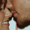
8. Make a new Gradient Map layer (Layer -> New adjustment layer -> Gradient Map). Choose a black-white gradient. Set it to Soft Light and adjust the opacity (mine: 85%).

9. You can add text, brushes, textures, ... and you're done! :)
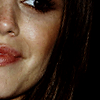
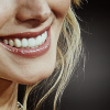
other icons made with similar coloring:


to
program using: photoshop cs3
involves: color layers, channel mixer, selective color, color balance, brightness/contrast
1. Choose a picture and prepare your base (crop, resize, ...). I picked this adorable photo of Kristen Bell.

2. Make a fill layer (Layer -> New Fill Layer -> Solid Color) with a dark brown color (mine: #180a01). Set to Exclusion.

3. Duplicate your base and drag it to the top. Set to Soft Light, adjust the opacity (mine: 100%).

4. Create a new Channel Mixer layer (Layer -> New Adjustment Layer -> Channel Mixer), use following settings and adjust the opacity (mine: 70%):
Red: +100, 0, -10, 0
Green: 0, +100, 0, 0
Blue: -5, 0, +115, 0

5. Create a new Selective Color layer (Layer -> New Adjustment Layer -> Selective Color) and use following settings:
Whites: +25, -25, -5, +15

6. Create a new Color Balance layer (Layer -> New Adjustment Layer -> Color Balance) and use following settings:
Midtones: +30, +25, +25
Shadows: +25, +15, +5
Highlights: +5, +10, +15

7. Make a fill layer (Layer -> New Fill Layer -> Solid Color) with a light grey color (mine: #f0ecec). Set to Color Burn. Adjust the opacity (mine: 100%).

8. Make a new Brightness/Contrast layer (Layer -> New adjustment layer -> Brightness/Contrast). My settings:
Brightness: -5
Contrast: +5

9. Merge all layers. At this point, the coloring is done, you can stop here.
10. Under the merged layer make a new layer and fill it with a whichever color you want. I used the dark violet color which matched the color around Kristen (#251862). Erase (or cut off) the background around the person (merged layer).

11. Light or darken some parts of the background (color layer). I used Lighten/Darken tool in PSP, in Photoshop I think you can achieve this effect with Burn and Dodge tools.


12. You can add text, brushes, textures, ... and you're done! :)
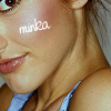
other icons made with similar coloring/method:


.PSDs available (comment to get them - read the first post)
info&rules | comment | watch

to

or

program using: photoshop cs3
involves: selective color, levels, color balance, curves, brightness and contrast
1. Choose a picture and prepare your base (crop, resize, ...).

2. Duplicate your base, set on Screen and change the opacity (mine: 50%).


3. Duplicate your base, set on Soft light and change the opacity (mine: 20%).

4. Create a new Selective Color layer (Layer -> New Adjustment Layer -> Selective Color) and use following settings:
Yellows: 0, 0, -46, 0

5. Create a new Selective Color layer (Layer -> New Adjustment Layer -> Selective Color) and use following settings:
Reds: +100, 0, -16, 0
Yellows: +100, +14, 0, 0
Neutrals: 0, 0, -6, 0

6. Create a new Selective Color layer (Layer -> New Adjustment Layer -> Selective Color) and use following settings:
Neutrals: 0, -2, -4, 0

7. Create a new Levels layer (Layer -> New Adjustment Layer -> Levels) and use following settings:
Input: 0 - 1,14 - 255
Output: 0 - 230

8. Create a new Color Balance layer (Layer -> New Adjustment Layer -> Color Balance) and use following settings:
Midtones: 0, 0, +1
Shadows: +5, 0, +3
Highlights: 0, 0, +10

9. Create a new Curves layer (Layer -> New Adjustment Layer -> Curves) and use following settings:
Input: 97
Output: 87

10. Make a new Brightness/Contrast layer (Layer -> New adjustment layer -> Brightness/Contrast). My settings:
Brightness: -11
Contrast: -3

11. You can add text, brushes, textures, ... and you're done! :)
other icons made with similar coloring:


NOTE: It may not works on all images, so play with the settings! On some of them it'll be better if you put the duplicated base on the top (I did it with other examples) + play with the SC layers (mostly with Magenta in Neutrals).

to

program using: photoshop cs3
involves: color layers, gradient map
1. Choose a picture and prepare your base (crop, resize, ...). I picked this lovely photo of Sophia&Chad.

2. Make a fill layer (Layer -> New Fill Layer -> Solid Color) with a brown color (mine: #401306). Set to Exclusion.

3. Make another fill layer (Layer -> New Fill Layer -> Solid Color) with a pale rose color (mine: #c6a1a1). Set to Soft Light, adjust the opacity (mine: 25%).

4. Make another fill layer (Layer -> New Fill Layer -> Solid Color) with a pale blue color (mine: #a2cdc7). Set to Soft Light, adjust the opacity (mine: 15%).

5. Duplicate your base and drag it to the top. Set to Multiply, adjust the opacity (mine: 40%).

6. Duplicate your base again, drag it to the top and set to Soft Light. Adjust the opacity (mine: 20%).

7. Again, duplicate your base, drag it to the top and set to Soft Light. Desaturate it and adjust the opacity (mine: 50%).

8. Make a new Gradient Map layer (Layer -> New adjustment layer -> Gradient Map). Choose a black-white gradient. Set it to Soft Light and adjust the opacity (mine: 85%).

9. You can add text, brushes, textures, ... and you're done! :)
other icons made with similar coloring:


to

program using: photoshop cs3
involves: color layers, channel mixer, selective color, color balance, brightness/contrast
1. Choose a picture and prepare your base (crop, resize, ...). I picked this adorable photo of Kristen Bell.

2. Make a fill layer (Layer -> New Fill Layer -> Solid Color) with a dark brown color (mine: #180a01). Set to Exclusion.

3. Duplicate your base and drag it to the top. Set to Soft Light, adjust the opacity (mine: 100%).

4. Create a new Channel Mixer layer (Layer -> New Adjustment Layer -> Channel Mixer), use following settings and adjust the opacity (mine: 70%):
Red: +100, 0, -10, 0
Green: 0, +100, 0, 0
Blue: -5, 0, +115, 0

5. Create a new Selective Color layer (Layer -> New Adjustment Layer -> Selective Color) and use following settings:
Whites: +25, -25, -5, +15

6. Create a new Color Balance layer (Layer -> New Adjustment Layer -> Color Balance) and use following settings:
Midtones: +30, +25, +25
Shadows: +25, +15, +5
Highlights: +5, +10, +15

7. Make a fill layer (Layer -> New Fill Layer -> Solid Color) with a light grey color (mine: #f0ecec). Set to Color Burn. Adjust the opacity (mine: 100%).

8. Make a new Brightness/Contrast layer (Layer -> New adjustment layer -> Brightness/Contrast). My settings:
Brightness: -5
Contrast: +5

9. Merge all layers. At this point, the coloring is done, you can stop here.
10. Under the merged layer make a new layer and fill it with a whichever color you want. I used the dark violet color which matched the color around Kristen (#251862). Erase (or cut off) the background around the person (merged layer).

11. Light or darken some parts of the background (color layer). I used Lighten/Darken tool in PSP, in Photoshop I think you can achieve this effect with Burn and Dodge tools.


12. You can add text, brushes, textures, ... and you're done! :)
other icons made with similar coloring/method:


.PSDs available (comment to get them - read the first post)
info&rules | comment | watch