Round 1: Challenge 4
The challenge this week is to use negative space. This means the subject(s) of your icon should take up no more than 1/2 of the icon. Examples are provided at the bottom of this post, if you have any questions or are unsure if your submission is right then feel free to drop a note in the comments
You still have the rest of today (Friday 11th September) to get your entries in for Challenge 3.
Round 1: Challenge 3
Technical challenge this week. That means I'll specify a certain technique or style that you need to be using in your icon. If you haven't tried that kind of icon before it's a good chance to experiment with something new. Open cap choice again, although some provided below the cut for you to use if you wish to.
The Technical Challenge this week is Negative Space. More Info under the cut.
Special Challenge this week is 'Best Use of Texture'
Challenge Rules
Special Category
The Special Category this challenge is 'Best Use of Texture.' You might want to think about this when making your icon however it is not compulsory.
The Theme
The challenge this week is to use negative space. This means the subject(s) of your icon should take up no more than 50% (½) of the icon. Examples:
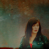


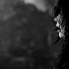
spaceflygirlseether_79marylou_grimaginary_lives
There is more information on negative space here
Caps
These caps are optional. You may choose your own. Links are provided for anyone who doesn't know where to find caps.
Click for full size


Places to get caps:
The Medusa Cascade - Torchwood gallery
Marishna's Screencaps - Torchwood Gallery
You still have the rest of today (Friday 11th September) to get your entries in for Challenge 3.
Round 1: Challenge 3
Technical challenge this week. That means I'll specify a certain technique or style that you need to be using in your icon. If you haven't tried that kind of icon before it's a good chance to experiment with something new. Open cap choice again, although some provided below the cut for you to use if you wish to.
The Technical Challenge this week is Negative Space. More Info under the cut.
Special Challenge this week is 'Best Use of Texture'
Challenge Rules
- You must be signed up, make sure you are on the list here. Sign ups for Round One are CLOSED.
- Enter 1 icon only
- You may use the caps provided or find your own
- Icons must fit with the theme. If you're unsure about your icon ask and I'll get back to you asap
- Icon must meet LJ Standards (100x100, 40kb or less, .png, .gif, or .jpg).
- No animation. All resources (brushes, textures, text, etc.) are fine
- Your icon must be new for this challenge. Please do not use old icons.
- Do not display your entry anywhere until after the voting results are posted.
- Post your icon and its URL as a comment to this post. All comments for this post will be screened.
- Entries will be due Friday, 18th September, 2009 midnight GMT.
- If you are skipping this challenge, please leave a comment letting me know. You earn a point just for participating each week, but if you skip 3 challenges in a row, you will be disqualified.
Special Category
The Special Category this challenge is 'Best Use of Texture.' You might want to think about this when making your icon however it is not compulsory.
The Theme
The challenge this week is to use negative space. This means the subject(s) of your icon should take up no more than 50% (½) of the icon. Examples:


spaceflygirlseether_79marylou_grimaginary_lives
There is more information on negative space here
Caps
These caps are optional. You may choose your own. Links are provided for anyone who doesn't know where to find caps.
Click for full size


Places to get caps:
The Medusa Cascade - Torchwood gallery
Marishna's Screencaps - Torchwood Gallery