Series 2: [CRITS] part 1
Critiques by numbers, idea once again snagged from tartankilts. Anyway, here's a basic overlook - +2 means you were first on a person's list, +1 means you were second, - means you were least favourite, G is a general comment, and [★] means mod's choice (and anything in [M] is something I specifically want to point out I said to an iconmaker, mostly those that were close for mods.)
1
2
3
4
5
6
7
8
9
10
11
12
13
14
15
1
BATTLE 1
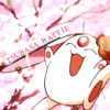
[-2] Not liking the text at all, and since the text was the challenge for this week, I'm going to have to least favorite this one. I understand the slanted effect, but I don't get why some of the text is touching the outline of Mokona while the rest is neatly behind a white background. The icon itself seems a bit bland in terms of design and effects.
[-2] The image of Mokona and the background brush/texture look like they are on separate layers, so the icon soesn't seem to function as a whole.
[G] There is nothing particularly special about this icon. Slanting the text would have been good had the text stood out more either by changing the color (to blue) or increasing the font size.
BATTLE 2
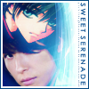
[+2] I love the blending here, it's flawless. The blue might be a bit too strong, but it's very nice regardless.
[+3] The border of this icon fits really well! Colours just flow nicely, text is also alright(though I kind of don't understand the meaning behind it) but the texture is really cool and gives off a great effect.
[+3] Love the light texture use and the way they were blended together! I only wish that the seiyuu's face were a bit more orange to match with Kamui's, though. The text feels a little random, but it looks nice, at least. XD
[+1] The use of the texture for this icon helps the two images blend together better. While the brightness on one side of it all is a little distracting, I like how it looks over the images.
[-1] The text would have looked better had it been positioned horizontally across instead of laterally.
[★] And tada! A Mods Choice. I really really liked this icon: I just love the composition of it. The text I'm not too fond of, but even then, I like the text, to. Good job.
BATTLE 3
Voting under way.
2
BATTLE 1
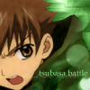
[-2] The image could have been edited a lot more than it was. Color adjustment, more textures, etc etc. It's like only that one side of the icon was edited, while Syaoran was left as he was cropped out of the picture.
[-2] Interesting composition and application of textures, but I think the image overpowers the text.
[-2] The coloring is a bit too dark, and the cap is blurry; the light bubbles are also really distracting.
[-2] This icon is very monochromatic, which isn't necessarily a bad thing, but for this icon is just seems as if everything is blending together. Nothing really stands out to the eye. More contrast between the background and the image of Syaoran might have helped and doing something to make the text stand out a bit more would have been a great addition to the icon as well.
[-2] Anime crops are always a bit more challenging to work with, in my opinion; I like the crop for this icon, but the overall text and light textures don't really work well with the image. Also, the image doesn't look like it's been changed/worked with much, aside from the initial crop (and possible cut of the background).
BATTLE 2
[+3] The implementation of both Miyano Mamoru and Kamui is just absolutely amazing - I'm surprised at how well it flows!
[-1] I almost couldn't see Kamui at first, and even when I stare, it's still hard to see him. The image is oversharpened, and the tiny text is fuzzy and distracting. The border also is too dark and doesn't fit.
[-1] You can't really see Kamui.
BATTLE 3
Voting under way.
3
BATTLE 1
[+1] no comments
[+3] Strong composition and coloring. Really clean and visually appealing.
[+1] I like the composition however, I think that it would have done better had it not followed the trends. The typography duplication does little for the overall look and it did not even standout to begin with. The orange texture clashes too much with the orange in the orange clothes - a grey one would have worked better. The tiny text is awkwardly placed as well - centralizing it in one position as you have done is highly distracting.
[-1] I really love the bright colors in this icon; however I feel like the text and tiny text is just overpowering the lower section of the icon. The repetative shadow of tsubasa battle is also distracting and doesn't really blend well with the overall feel of the icon; more importantly though, the font is rather blurry and makes the text hard to read.
BATTLE 2
[+2] I like the flow of this icon, although I feel that the space to the left of the seiyuu feels really empty and should be filled with a texture of some sort.
[+1] no comments
[G] It's just a tad too saturated, especially in terms of Sakura.
BATTLE 3
Voting under way.
4
BATTLE 1
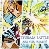
[+3] While I don't like the cluttered look, this icon obviously had a lot of work put into it. You did a great job on the coloring (though I'm not sure if it was pre-colored, but nevertheless), and the details stand out nicely. I like the extra "are you ready" subtext, especially because you have a battle scene as your feature. Nice job :D
[+2] Although I think that many aspects of the icon could have been improved--the image is really grainy, for instance--the icon very nicely embodies the concept of tsubasa_battle, and I love the layout and atmosphere.
[+1] The text is a bit blurry, but otherwise, I like the originality of using a manga battle scene.
[-2] The composition of the icon is too busy, the images and colors especially make it difficult to find a specific focus. The text gets lost in comparison to the rest of the icon.
[-1] Maybe due to too much color or confusing crops but the images are each hard to make out. The text could be crisper.
[-2] Too messy. It is obvious from the low quality of the image that little effort was made on cleaning up the base as compared to image coloring.
BATTLE 2
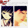
[+1] I really like the images chosen, they fit together nicely. The texture and text on top is a nice touch :)
[+1] I like the box-style here. It's rather unique among the icons here, and the flowers at the foreground give a certain grace to the icon. The tiny text compliments it well too. Nice job.
[+1] I really like the composition here, and the little branch (I'm assuming it's a Sakura branch) at the top is a nice touch, especially with the tiny text.
[+1] I love the way that they match! The texture use and tiny text are also nice. I would make the seiyuu's face less bright and more yellow to match Tomoyo's, though.
[+1] I really like the crops, and the added flower in the background. It adds a nice feel to it.
[+2] no comments
[+2] I love how both the images you chose seem to reflect the same emotions, and the composition is nice and clean :)
[+2] Because... I love Maaya Sakamoto? No? Okay well, I like the way that the icon is rather simple and the images are small, but they work really well. Normally I don't like any amount of dead space in an icon, but I think the way it was pulled off here lends to the serene feeling of the images.
BATTLE 3
Voting under way.
5
BATTLE 1

[-2] I like how you got two people facing each other into the crop unawkwardly but I'm not a big fan of the background. It seems so empty. Also the texting could use some work, as a dot font and a drop shadowed font don't seem to go too well together here.
[-2] The colouring is a bit flat, and the texture in the background doesn't seem to go smoothly with what's on the foreground-- Sakura and Syaoran really look like cutouts.
[-1] Sakura's [ink hair is more than a little distracting, but the poor font choice made it worse.
[-1] The manga coloring wasn't done particularly well here--Sakura's hair is a bit too pink, and the picture could've used more shading--and the background texture doesn't match with the foreground. The two fonts used on the text don't coordinate well.
BATTLE 2

[+2] A-DOR-ABLE. I'm digging the sepia tones and the circle crop, and the text is great as well.
[+3] no comments
[-1] The circle crop isn't pleasing to the eye, and I think the proportions are a bit off (since Sakura seems bigger the Makino). I would've loved a splash of color as well.
[G] Composition-wise, it is very bland and boring. It would have looked better too had Sakura and Makino been of the same size.
BATTLE 3
Voting under way.
6
BATTLE 1
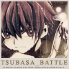
[G] I like the icon, but it doesn't paticularly stand out - the colours are flat. The grey patch under Syaoran is a good idea, but it just seems to be 'there'.
BATTLE 2
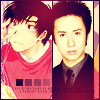
[+3] I really love the cropping of both images, it's very well done.
[G] It seems a bit overly colored in yellow. I think toning it down a little would have helped.
BATTLE 3
Voting under way.
7
BATTLE 1
[-1] I like the color scheme but the icon feels flat. Personally I like to see icons that jump out at me and aren't so flat (you can do a lot of things like up the contrast/increase shadows). Kudos for the texting though as I think it was wonderfully done.
[-1] I think this is a really busy icon. So many contrasting colours, and the font doesn't fit. I suggest you get rid of the text, and soften one of the tones a little~
BATTLE 2
[+2] The actual photoshopping isn't very well done and Sakura looks a tad faded, but I like the text choice.
BATTLE 3
Voting under way.
8
BATTLE 1
[+1] SOOOO CUTE! The orange color scheme is very nice and I love the 3D feeling I get from Mokona in this icon!
[+3] no comments
[+2] Such a cute icon, the warm colors suit the image perfectly. I love how the text is positioned, it stands out without taking over the icon.
[+1] Nice texture use and crop. The text placement is good, I think there may have been a better font choice (maybe sans-serif to give a more fun impression), but overall it's a really nice icon.
[+1] I love the bright coloring, and the background texture used is really nice, too.
[+2] The colouring is beautiful, and I like the circle crop of Mokona.
BATTLE 2
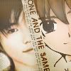
[+3] Excellent composition, everythings fits together so well! Most unique icon this week, in my opinion ♥
[+3] This is amazing. I love the crop, I love the composition, and I ESPECIALLY love the image choices! ^_^ It seems like those two pictures were meant to be paired together. I'm glad to see an icon of Syaoran done so well, because Syaoran makes me happy!
[+2] The text and the images really go well together, making the icon overall look really nice.
[+3] This one is just really cute! The composition was pulled off really well, especially with splitting the faces like that. The font is a little awkward, but it was certainly my favorite out of all the icons.
[+2] no comments
[M] MODDY LOVES YOU. :D I just adore this icon. As people have said - the images just look made for each other. They fit together so well. It's gorgeous.
BATTLE 3
Voting under way.
9
BATTLE 1
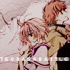
[+3] The colouring creates an undertone to the icon, and actually gives it an atmosphere of feeling. The text could be incorporated/coloured to blend with the icon a bit more, though.
[G] This icon did not go down well with me. While I can see the effort put in in coloring the base image, the subsequent coloring alterations did not do it justice as the characters do not stand out enough. A black negative space border might have helped. Also, the font used for the text is 100 pixel-ly for my taste and can hardly be read.
BATTLE 2
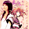
[+2] I love the text/brush placed at the back. The colours are lovely and fit Sakura and her seiyuu well. The flower texture gives a nice and gentle effect. I would like to see this icon being made with another picture of Sakura though, because it somehow doesn't fit here quite properly.
[+3] Really gorgeous, the way Sakura and Makino are positioned - it almost looks like a photoshoot.
[+3] no comments
[+1] A+ colouring, use of textures and intergretion :D! I love the positioning of Sakura and Makino Yui :3!
[+1] no comments
[M] I really liked this ever since it was entered. The effect in the background is really gorgeous.
BATTLE 3
Voting under way.
10
BATTLE 1
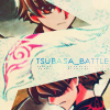
[+2] I love love love the composition of this icon, it's quite original! The soft yet dark coloring works well with the images chosen. My only crit would be the text; I don't like how part of it is faded, because it's a bit hard to read on first glance.
[+3] I really like how the split composition was pulled off for this icon. The use of the feather was a really good idea and I love the colors. The only thing that bothers me is how one Syaoran is covered more than the other.
[+3] This icon is really impressive! The strategically placed feather as a border is great and the different looks of Syaoran are awesome too!
[+3] no comments
[+2] Interesting use of shapes, but the text can hardly be read.
[+2] The design is really creative and unique; I like the way the images of the Syaorans are placed as well as the use of the feather for the background texture.
[M] Moddy wants to let you know I absolutely ADORE this icon. Even if the text is, a bit unlegible, I absolutely loved it, ever since it was submitted. The feather between the two Syaoran's is a wonderful idea, and this icon is probably my favourite here. Two thumbs up.
BATTLE 2
[+1] no comments
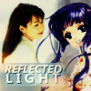
[-1] The text spoils this icon. Using a different font with more 'grace' into it might fit Tomoyo more. The little box doesn't fit the icon well, it stands out far too much. And the seiyuu doesn't seem to fit well in the picture. Could have done better in my opinion if the colours of the seiyuu's picture was close to that of the overall purple colours in the icon, and the text shrunk down.
[-1] I feel bad voting negatively for anyone on this hard of a challenge, especially based on image quality (where you probably didn't have much choice on what you could use). Still, the image quality here is low enough to be distracting. The seiyuu image is blurry, and Tomoyo is grainy/oversharpened. Together, they just don't mesh well at ALL.
[-1] The icon is a bit dark, and the image quality for Tomoyo isn't as great as it could be. I do like the text, though.
[-1] The images are both rather blurry, and the colours seem really unbalanced (like in the contrast of Junko's face with Tomoyo's hair, for example). The composition is fine otherwise.
[-1] I can't help but feel the whole icon is just very blurry, in a low-quality sort of way, rather than a dreamy way - maybe tone down on gaussian blur, if you used any? The text seems far too blocky for such a gentle looking icon as well.
[-1] Iwao's skin looks really yellow in this image. The base itself doesn't look well adjusted and edited, and then the added Tomoyo just looks like she was slapped on there. and not much was paid to blending them together better.
BATTLE 3
Voting under way.
11
BATTLE 1
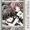
[-1] The repetitive use of thick lines overwhelms the image and becomes the focus of the icon.
12
BATTLE 1
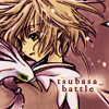
[-1] Like my other elimination vote, I don't like the text here. It's very small, and the white shadow behind is very distracting against a dark image. The actual icon seems too dark, and it's lacking color.
[-1] The image could be lightened a bit, it's rather dark. The white glow behind the text is kind of distracting.
[-1] The only part of the icon that irks me - the colouring is lovely - is the text; the placement of 'battle' under 'tsubasa_' is odd, and the hanging underscore ends the text line too abruptly. Putting the entire 'tsubasa_battle' on one line might have been smoother.
13
BATTLE 1
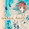
[+1] The dark text is a bit too strong against the mostly white image, but the composition of this icon helps it earn a favorite. The slight exclusion effect works nicely here, and the texture/brush off to the side is the perfect touch.
[+1] A really nice and simple composition. I like how the image is a large cropped space, but Sakura doesn't look distorted and there is minimal quality loss on the image. I like the texture and the colors, but a different font could have been used.
[+2] no comments
[+2] no comments
[+1] The colors and contrast are very good; the text is also very easy to see and yet still has an artistic edge to it.
14
BATTLE 1
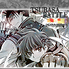
[+1] The use of greyscale compliments the image nicely. I love the little bit of color right below the text, it draws the focus upward without taking over the icon.
[-1] The grey-scale only serves to make the image busy and too complicated to look at. There are random blotches of color that don't seem to make too much sense. I like the cropping, but that's about it.
[★] I can't believe this icon was so drastically underlooked! It was one of my favourites since I saw it, and I don't think it's overly busy. I like the grayscale effect, it adds a nice touch. Good job, and congrats for mod's.
15
BATTLE 1
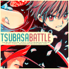
[+2] I really enjoy the color scheme for this icon. Normally I'm not too fond of the kind of 'bleeding color' look that the teal has on this icon, but it's tied in well--especially with the choice of colors for the text.
[+2] Most of the time, when I see blue and red together like that, I'd say the colors clash. However, the color scheme seems to work really nicely here. The typography's also really well done!
[+1] I think the way you outlined Syaoran is really interesting ^^
[+3] The coloring is so rich and gorgeous! The text placement is perfect.
[+2] The typography is really strong. The cyan highlights in the hair could be a little more resolved, but the coloring overall is generally really nice. Great, eye-catching composition.
[+3] I enjoy the use of complementary colors in the text, which complement the image's coloring.
[+3] I love the coloring in the icon and the way the text matches the two colors. The expression on his face also really helps embody the idea of tsubasa_battle :)
[+3] The text and overall composition flow really well together and make for a great overall effect.
[M] Really bright, really colourful! Congrats on having your icon as the community icon. :)
1
BATTLE 1

[-2] Not liking the text at all, and since the text was the challenge for this week, I'm going to have to least favorite this one. I understand the slanted effect, but I don't get why some of the text is touching the outline of Mokona while the rest is neatly behind a white background. The icon itself seems a bit bland in terms of design and effects.
[-2] The image of Mokona and the background brush/texture look like they are on separate layers, so the icon soesn't seem to function as a whole.
[G] There is nothing particularly special about this icon. Slanting the text would have been good had the text stood out more either by changing the color (to blue) or increasing the font size.
BATTLE 2

[+2] I love the blending here, it's flawless. The blue might be a bit too strong, but it's very nice regardless.
[+3] The border of this icon fits really well! Colours just flow nicely, text is also alright(though I kind of don't understand the meaning behind it) but the texture is really cool and gives off a great effect.
[+3] Love the light texture use and the way they were blended together! I only wish that the seiyuu's face were a bit more orange to match with Kamui's, though. The text feels a little random, but it looks nice, at least. XD
[+1] The use of the texture for this icon helps the two images blend together better. While the brightness on one side of it all is a little distracting, I like how it looks over the images.
[-1] The text would have looked better had it been positioned horizontally across instead of laterally.
[★] And tada! A Mods Choice. I really really liked this icon: I just love the composition of it. The text I'm not too fond of, but even then, I like the text, to. Good job.
BATTLE 3

Voting under way.
2
BATTLE 1

[-2] The image could have been edited a lot more than it was. Color adjustment, more textures, etc etc. It's like only that one side of the icon was edited, while Syaoran was left as he was cropped out of the picture.
[-2] Interesting composition and application of textures, but I think the image overpowers the text.
[-2] The coloring is a bit too dark, and the cap is blurry; the light bubbles are also really distracting.
[-2] This icon is very monochromatic, which isn't necessarily a bad thing, but for this icon is just seems as if everything is blending together. Nothing really stands out to the eye. More contrast between the background and the image of Syaoran might have helped and doing something to make the text stand out a bit more would have been a great addition to the icon as well.
[-2] Anime crops are always a bit more challenging to work with, in my opinion; I like the crop for this icon, but the overall text and light textures don't really work well with the image. Also, the image doesn't look like it's been changed/worked with much, aside from the initial crop (and possible cut of the background).
BATTLE 2

[+3] The implementation of both Miyano Mamoru and Kamui is just absolutely amazing - I'm surprised at how well it flows!
[-1] I almost couldn't see Kamui at first, and even when I stare, it's still hard to see him. The image is oversharpened, and the tiny text is fuzzy and distracting. The border also is too dark and doesn't fit.
[-1] You can't really see Kamui.
BATTLE 3

Voting under way.
3
BATTLE 1

[+1] no comments
[+3] Strong composition and coloring. Really clean and visually appealing.
[+1] I like the composition however, I think that it would have done better had it not followed the trends. The typography duplication does little for the overall look and it did not even standout to begin with. The orange texture clashes too much with the orange in the orange clothes - a grey one would have worked better. The tiny text is awkwardly placed as well - centralizing it in one position as you have done is highly distracting.
[-1] I really love the bright colors in this icon; however I feel like the text and tiny text is just overpowering the lower section of the icon. The repetative shadow of tsubasa battle is also distracting and doesn't really blend well with the overall feel of the icon; more importantly though, the font is rather blurry and makes the text hard to read.
BATTLE 2

[+2] I like the flow of this icon, although I feel that the space to the left of the seiyuu feels really empty and should be filled with a texture of some sort.
[+1] no comments
[G] It's just a tad too saturated, especially in terms of Sakura.
BATTLE 3

Voting under way.
4
BATTLE 1

[+3] While I don't like the cluttered look, this icon obviously had a lot of work put into it. You did a great job on the coloring (though I'm not sure if it was pre-colored, but nevertheless), and the details stand out nicely. I like the extra "are you ready" subtext, especially because you have a battle scene as your feature. Nice job :D
[+2] Although I think that many aspects of the icon could have been improved--the image is really grainy, for instance--the icon very nicely embodies the concept of tsubasa_battle, and I love the layout and atmosphere.
[+1] The text is a bit blurry, but otherwise, I like the originality of using a manga battle scene.
[-2] The composition of the icon is too busy, the images and colors especially make it difficult to find a specific focus. The text gets lost in comparison to the rest of the icon.
[-1] Maybe due to too much color or confusing crops but the images are each hard to make out. The text could be crisper.
[-2] Too messy. It is obvious from the low quality of the image that little effort was made on cleaning up the base as compared to image coloring.
BATTLE 2

[+1] I really like the images chosen, they fit together nicely. The texture and text on top is a nice touch :)
[+1] I like the box-style here. It's rather unique among the icons here, and the flowers at the foreground give a certain grace to the icon. The tiny text compliments it well too. Nice job.
[+1] I really like the composition here, and the little branch (I'm assuming it's a Sakura branch) at the top is a nice touch, especially with the tiny text.
[+1] I love the way that they match! The texture use and tiny text are also nice. I would make the seiyuu's face less bright and more yellow to match Tomoyo's, though.
[+1] I really like the crops, and the added flower in the background. It adds a nice feel to it.
[+2] no comments
[+2] I love how both the images you chose seem to reflect the same emotions, and the composition is nice and clean :)
[+2] Because... I love Maaya Sakamoto? No? Okay well, I like the way that the icon is rather simple and the images are small, but they work really well. Normally I don't like any amount of dead space in an icon, but I think the way it was pulled off here lends to the serene feeling of the images.
BATTLE 3

Voting under way.
5
BATTLE 1

[-2] I like how you got two people facing each other into the crop unawkwardly but I'm not a big fan of the background. It seems so empty. Also the texting could use some work, as a dot font and a drop shadowed font don't seem to go too well together here.
[-2] The colouring is a bit flat, and the texture in the background doesn't seem to go smoothly with what's on the foreground-- Sakura and Syaoran really look like cutouts.
[-1] Sakura's [ink hair is more than a little distracting, but the poor font choice made it worse.
[-1] The manga coloring wasn't done particularly well here--Sakura's hair is a bit too pink, and the picture could've used more shading--and the background texture doesn't match with the foreground. The two fonts used on the text don't coordinate well.
BATTLE 2

[+2] A-DOR-ABLE. I'm digging the sepia tones and the circle crop, and the text is great as well.
[+3] no comments
[-1] The circle crop isn't pleasing to the eye, and I think the proportions are a bit off (since Sakura seems bigger the Makino). I would've loved a splash of color as well.
[G] Composition-wise, it is very bland and boring. It would have looked better too had Sakura and Makino been of the same size.
BATTLE 3

Voting under way.
6
BATTLE 1

[G] I like the icon, but it doesn't paticularly stand out - the colours are flat. The grey patch under Syaoran is a good idea, but it just seems to be 'there'.
BATTLE 2

[+3] I really love the cropping of both images, it's very well done.
[G] It seems a bit overly colored in yellow. I think toning it down a little would have helped.
BATTLE 3

Voting under way.
7
BATTLE 1

[-1] I like the color scheme but the icon feels flat. Personally I like to see icons that jump out at me and aren't so flat (you can do a lot of things like up the contrast/increase shadows). Kudos for the texting though as I think it was wonderfully done.
[-1] I think this is a really busy icon. So many contrasting colours, and the font doesn't fit. I suggest you get rid of the text, and soften one of the tones a little~
BATTLE 2

[+2] The actual photoshopping isn't very well done and Sakura looks a tad faded, but I like the text choice.
BATTLE 3

Voting under way.
8
BATTLE 1

[+1] SOOOO CUTE! The orange color scheme is very nice and I love the 3D feeling I get from Mokona in this icon!
[+3] no comments
[+2] Such a cute icon, the warm colors suit the image perfectly. I love how the text is positioned, it stands out without taking over the icon.
[+1] Nice texture use and crop. The text placement is good, I think there may have been a better font choice (maybe sans-serif to give a more fun impression), but overall it's a really nice icon.
[+1] I love the bright coloring, and the background texture used is really nice, too.
[+2] The colouring is beautiful, and I like the circle crop of Mokona.
BATTLE 2

[+3] Excellent composition, everythings fits together so well! Most unique icon this week, in my opinion ♥
[+3] This is amazing. I love the crop, I love the composition, and I ESPECIALLY love the image choices! ^_^ It seems like those two pictures were meant to be paired together. I'm glad to see an icon of Syaoran done so well, because Syaoran makes me happy!
[+2] The text and the images really go well together, making the icon overall look really nice.
[+3] This one is just really cute! The composition was pulled off really well, especially with splitting the faces like that. The font is a little awkward, but it was certainly my favorite out of all the icons.
[+2] no comments
[M] MODDY LOVES YOU. :D I just adore this icon. As people have said - the images just look made for each other. They fit together so well. It's gorgeous.
BATTLE 3

Voting under way.
9
BATTLE 1

[+3] The colouring creates an undertone to the icon, and actually gives it an atmosphere of feeling. The text could be incorporated/coloured to blend with the icon a bit more, though.
[G] This icon did not go down well with me. While I can see the effort put in in coloring the base image, the subsequent coloring alterations did not do it justice as the characters do not stand out enough. A black negative space border might have helped. Also, the font used for the text is 100 pixel-ly for my taste and can hardly be read.
BATTLE 2

[+2] I love the text/brush placed at the back. The colours are lovely and fit Sakura and her seiyuu well. The flower texture gives a nice and gentle effect. I would like to see this icon being made with another picture of Sakura though, because it somehow doesn't fit here quite properly.
[+3] Really gorgeous, the way Sakura and Makino are positioned - it almost looks like a photoshoot.
[+3] no comments
[+1] A+ colouring, use of textures and intergretion :D! I love the positioning of Sakura and Makino Yui :3!
[+1] no comments
[M] I really liked this ever since it was entered. The effect in the background is really gorgeous.
BATTLE 3

Voting under way.
10
BATTLE 1

[+2] I love love love the composition of this icon, it's quite original! The soft yet dark coloring works well with the images chosen. My only crit would be the text; I don't like how part of it is faded, because it's a bit hard to read on first glance.
[+3] I really like how the split composition was pulled off for this icon. The use of the feather was a really good idea and I love the colors. The only thing that bothers me is how one Syaoran is covered more than the other.
[+3] This icon is really impressive! The strategically placed feather as a border is great and the different looks of Syaoran are awesome too!
[+3] no comments
[+2] Interesting use of shapes, but the text can hardly be read.
[+2] The design is really creative and unique; I like the way the images of the Syaorans are placed as well as the use of the feather for the background texture.
[M] Moddy wants to let you know I absolutely ADORE this icon. Even if the text is, a bit unlegible, I absolutely loved it, ever since it was submitted. The feather between the two Syaoran's is a wonderful idea, and this icon is probably my favourite here. Two thumbs up.
BATTLE 2

[+1] no comments
[-1] The text spoils this icon. Using a different font with more 'grace' into it might fit Tomoyo more. The little box doesn't fit the icon well, it stands out far too much. And the seiyuu doesn't seem to fit well in the picture. Could have done better in my opinion if the colours of the seiyuu's picture was close to that of the overall purple colours in the icon, and the text shrunk down.
[-1] I feel bad voting negatively for anyone on this hard of a challenge, especially based on image quality (where you probably didn't have much choice on what you could use). Still, the image quality here is low enough to be distracting. The seiyuu image is blurry, and Tomoyo is grainy/oversharpened. Together, they just don't mesh well at ALL.
[-1] The icon is a bit dark, and the image quality for Tomoyo isn't as great as it could be. I do like the text, though.
[-1] The images are both rather blurry, and the colours seem really unbalanced (like in the contrast of Junko's face with Tomoyo's hair, for example). The composition is fine otherwise.
[-1] I can't help but feel the whole icon is just very blurry, in a low-quality sort of way, rather than a dreamy way - maybe tone down on gaussian blur, if you used any? The text seems far too blocky for such a gentle looking icon as well.
[-1] Iwao's skin looks really yellow in this image. The base itself doesn't look well adjusted and edited, and then the added Tomoyo just looks like she was slapped on there. and not much was paid to blending them together better.
BATTLE 3

Voting under way.
11
BATTLE 1

[-1] The repetitive use of thick lines overwhelms the image and becomes the focus of the icon.
12
BATTLE 1

[-1] Like my other elimination vote, I don't like the text here. It's very small, and the white shadow behind is very distracting against a dark image. The actual icon seems too dark, and it's lacking color.
[-1] The image could be lightened a bit, it's rather dark. The white glow behind the text is kind of distracting.
[-1] The only part of the icon that irks me - the colouring is lovely - is the text; the placement of 'battle' under 'tsubasa_' is odd, and the hanging underscore ends the text line too abruptly. Putting the entire 'tsubasa_battle' on one line might have been smoother.
13
BATTLE 1

[+1] The dark text is a bit too strong against the mostly white image, but the composition of this icon helps it earn a favorite. The slight exclusion effect works nicely here, and the texture/brush off to the side is the perfect touch.
[+1] A really nice and simple composition. I like how the image is a large cropped space, but Sakura doesn't look distorted and there is minimal quality loss on the image. I like the texture and the colors, but a different font could have been used.
[+2] no comments
[+2] no comments
[+1] The colors and contrast are very good; the text is also very easy to see and yet still has an artistic edge to it.
14
BATTLE 1

[+1] The use of greyscale compliments the image nicely. I love the little bit of color right below the text, it draws the focus upward without taking over the icon.
[-1] The grey-scale only serves to make the image busy and too complicated to look at. There are random blotches of color that don't seem to make too much sense. I like the cropping, but that's about it.
[★] I can't believe this icon was so drastically underlooked! It was one of my favourites since I saw it, and I don't think it's overly busy. I like the grayscale effect, it adds a nice touch. Good job, and congrats for mod's.
15
BATTLE 1

[+2] I really enjoy the color scheme for this icon. Normally I'm not too fond of the kind of 'bleeding color' look that the teal has on this icon, but it's tied in well--especially with the choice of colors for the text.
[+2] Most of the time, when I see blue and red together like that, I'd say the colors clash. However, the color scheme seems to work really nicely here. The typography's also really well done!
[+1] I think the way you outlined Syaoran is really interesting ^^
[+3] The coloring is so rich and gorgeous! The text placement is perfect.
[+2] The typography is really strong. The cyan highlights in the hair could be a little more resolved, but the coloring overall is generally really nice. Great, eye-catching composition.
[+3] I enjoy the use of complementary colors in the text, which complement the image's coloring.
[+3] I love the coloring in the icon and the way the text matches the two colors. The expression on his face also really helps embody the idea of tsubasa_battle :)
[+3] The text and overall composition flow really well together and make for a great overall effect.
[M] Really bright, really colourful! Congrats on having your icon as the community icon. :)