Round 3 - Challenge 01 - Results
ROUND 3 - CHALLENGE 01 - RESULTS
1ST PLACE [5 points]:

erzsebet with +8 votes.
2ND PLACE [4 points]:

giulsss with +7 votes.
3RD PLACE [3 points]:
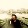
julie_izumi with +6 votes (and more first place votes).
BEST CINEMATOGRAPHY [2 points]:

erzsebet with +3 votes.
MODS CHOICE [1 point]:
[absolutelybatty]

dudette_in_town
[Gorgeous coloring, gorgeous focus on the scenery, gorgeous everything.]
[raiindust]
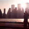
gribouille
[I love the colours of this show. I think there's a wonderfully subtle red/magenta hue that really creates a 'feel' for the icon as a whole. The crop is also wonderful, how it situates characters within the icon but allows the focus to be entirely the scenery.]
TABLE KEY:
+++ = 1st Place Vote
++ = 2nd Place Vote
+ = 3rd Place Vote | Beginning of a new comment.
Note: Votes are not weighted in this round. Meaning a 1st, 2nd or 3rd vote will only give you 1 point when tallying the votes. Except in the case of a tie - then the icon with the most 1st place votes will be given first.
ICON VOTES
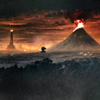
lwena11POSITIVE VOTES
++ I like the simplicity of this icon and the way negative space is used.
BEST INTERPRETATION OF THEME
+ No reason given.
CONSTRUCTIVE VOTES
+ The crop is good because it captures the key elements of Mordor; Mt. Doom, the Eye and even the fell beast. Try to bring the focus more into the top half of icon by playing with the contrast.
+ The crop here is great, it leads my eye right to the mountain in the background. The icon looks a tad dark and under-contrasted though, it's such a dramatic scene, so more contrast would help emphasize that. Duplicate the base and set this layer to soft light or overlay. Use brightness and contrast, curves levels or even color balance to increase the contrast and colors.
ADDITIONAL VOTES
NONE.

giulsssPOSITIVE VOTES
+++ Gorgeous coloring and crop, it's really effective and eye catching.
+++ I love the coloring on this. The colors are just bright enough to be eye catching, but the red undertones to the shadows give it an almost muted undertone that sets it apart. The cropping is also excellent, I love how all the space is being used without drawing attention from the subject.
++ The crop is absolutely exquisite. The negative space really draws your attention to the subject, and just the right amount of each part of the background - the bushes, the maze, the clouds - are included. The colors are vibrant without being overpowering, and the overall effect is almost mystical.
++ The colouring is bright and clear, and the saturation suits the movie and isn't overwhelming.
+ Beautiful + surreal coloring. The crop is gorgeous!
+ This crop is a wonderful interpretation of the theme, giving the viewer a sense of the outdoors with the sky in the backdrop. I think a bit more contrast would complete the overall look of this icon.
+ The coloring is a bit weird, but in a positive way. Actually, I think it fits the image you chose brilliantly. Alice is about to go to Wonderland, after all, so the weird coloring matches the mood of the scene. Love the bright cyan of the sky and the vibrant green of the path!
BEST INTERPRETATION OF THEME
+ No reason given.
+ No reason given.
+ No reason given.
CONSTRUCTIVE VOTES
+ Pretty colouring but I think it needs more contrast. The dark areas and the light areas don't stand out very well.
ADDITIONAL VOTES
+ I love the crop in your icon; there's a really nice split between the hedge and the sky, but the colouring feels a bit flat to me. If you tried for more contrast between the colours, I think there would be a greater feeling that Alice was running in to the maze, instead of just at it. I almost voted for your icon, but it just looks a bit too flat to me. Really good job, though.

fulminant8POSITIVE VOTES
+++ The soft & dreamy effect that was achieved here really suits the icon. The frame is excellent, really drawing attention to the center without seeming out of place. The colours are perfect, and it's a very warm icon, which really suits it.
+++ the composition of the icon is absolutely brilliant, it allows to focus on the "location" while creating a very nice image, which is helped by the colouring : great use of warm colours which makes the icon lovely to watch.
+ I like how you've used a fairly neutral border to frame your icon, but pulled the whole look together with the colouring. Though I might like to see more depth to the colours in the sky, it's very well executed overall.
+ the pastel colors work well for the icon, it looks both soft and vibrant
+ the the composition is very interesting, I like how the colours work so well together.
BEST INTERPRETATION OF THEME
NONE.
CONSTRUCTIVE VOTES
+ It's a great choice of cap for the theme, but I think the texture overpower the icon.
+ I really love the composition of this icon: it's a very beautiful framing, and it's almost as if the maker was recreating a window to look out onto the scene. Very beautiful. That said, there's not a lot of contrast with the colors and, as such, the icon just seems to get lost in the soft pink shades. I would suggest, for this icon, to change the coloring a bit, maybe around the edge. It could really pop with contrasting colors, and maybe changing the outermost border would help the interesting composition shine through as well.
+ The composition is very nice but for me, the coloring seems to wash out a bit the whole icon.
+ The composition is intriguing, but the icon looks a tad too bright on my monitor. Had the yellow been toned down a little, the coloring would have looked a little more balanced, in my opinion.
ADDITIONAL VOTES
NONE.

midnightisclosePOSITIVE VOTES
NONE.
BEST INTERPRETATION OF THEME
NONE.
CONSTRUCTIVE VOTES
+ This icon appears a bit over-sharpened to me, which actually obscures the figures. I have a hard time telling the characters farther back from the background. I really like the color scheme, however, with the dominant blue fading into green at the side. Maybe playing that up would make the icon pop more.
+ A bit oversharpened, especially the edges of the characters.
+ The crop is interesting, but the icon looks a little pixelated on my monitor. The edges of the subjects and of the scenery are a bit too harsh, especially. Sometimes, it helps to duplicate the picture, blur it (Gaussian Blur with a 6-7px radius should do the trick) and lower the opacity or set it to Soft Light.
+ The coloring is done well because it doesn't overwhelm the eyes. Based on the subjects' shadows in the crop, the light source is from the top right where the buildings are. I think a light texture at a reduced opacity can define that area and finish off this icon.
ADDITIONAL VOTES
+ Your icon has some great perspective going on because of the background of your cap, but I think you could work with the lighting to highlight that even more - maybe making the street darker as it goes back further would help to highlight that, and give your icon even more depth. I don't know that what I suggested would be the right answer, but playing with the lighting in general would benefit this piece, I think.
+ I like he dark and kinda mysterious coloring in this, the crop is also nice, but the whole icon looks very over-sharpened to me. It's very visible in the edges around the people, in the building to the left and also a little in the background.

dudette_in_townPOSITIVE VOTES
+++ i genuinely adore the colouring in this (the bold contrast of black/green/blue works for me), plus the location is the most prominent theme within the icon, as it should be! If i were to suggest something I'd increase the contrast on her hair, so the outline stands out a little more.
+++ I think it was very creative to go with a cap where the character is still in scene, just blurry. It helps make sure the scenery is the focus, something the crop helps with as well. The coloring, also, is beautiful.
++ I really like the soft feel of this, the green is fresh and I love it against the blue in the background.
++ Very nice cropping and colouring, the character seems to merge with the landscape and it looks great.
+ The cap chosen for this is just right. The crop draws the attention to the scenery - which is lovely and striking - without taking the focus away from the subject. The colors are natural, but wonderfully vibrant, and the softness of the icon works well with the general mood.
+ Really nice colors and layout with the character in the front.
BEST INTERPRETATION OF THEME
+ clearly shows the location
+ The focus is definitely on the scenery, even with the character in the icon as well. The use of 'interesting' scenery also helps keep the focus of the theme.
CONSTRUCTIVE VOTES
+ the coloring is very appropriate as also the choice of the image, but in my opinion the overall icon is too much blurred!
+ The coloring feels a bit over-saturated. Especially since there is that dominant black section in the righthand corner. I think maybe sharpening the background and adding a light blob, or just lighten the background a bit would help enhance the icon.
ADDITIONAL VOTES
+ What confuses me, is the green thing at the bottom on her back, it kinda looks like part of the green mountains. I don't know if it's a part of the original cap (I'm not familiar with the image) It makes it look like the black on the left is her arm, but if you look closer, it can't be that either, so it leave me a little confused, what purpose the green thing has.

gribouillePOSITIVE VOTES
NONE.
BEST INTERPRETATION OF THEME
NONE.
CONSTRUCTIVE VOTES
+ I enjoy the cropping + how it relates to the theme, but it looks like hardly anything was done (and it's hard to make out the subjects). It doesn't necessarily need a ton of layers to change the coloring, but at the very least, a curves or levels layer to make the subjects clearer.
+ I like how much of this icon is in silhouette, but when that is combined with the lack of color the icon loses visual interest. Maybe if the crop was more centered or there were a few hints of other colors thrown in, it would liven up the icon and draw the eye more to the couple.
ADDITIONAL VOTES
+ the icon is very nice, but i think it's empty. a use of texture to decorate it could have made the work more intresting :)
+ The purple is so lovely, but I would love if the saturation/vibrance was increased in this, so the colors popped more.
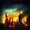
fireinmybonessPOSITIVE VOTES
++ The coloring makes this icon work. The burning red, orange and yellow are great contrasts to the green sky, which creates the perfect chaotic atmosphere of this crop.
BEST INTERPRETATION OF THEME
+ The coloring here is unusual and there is a sense of blurriness to the icon, but I think it all really works with creating a larger than life sense of the castle on fire.
CONSTRUCTIVE VOTES
+ This appears a bit blurry to me, perhaps lighting it a bit and sharpening some points would make it more detailed and eye catching.
+ I'm having difficulties determining what this is of. At first it looks like some towers and houses on fire, but I can't be sure. It looks a tad too blurry and undefined also. I like the colors and the amount of contrast in the yellow/red.
+ While I really like the bright colours you have going on here, the fuzziness of the image makes it a little difficult to tell what is going on.
ADDITIONAL VOTES
+ Due to my familiarity with the image, I can tell this is Hogwarts on fire - however, the way it's cropped makes it hard to tell what's going on in the image. A wider crop, showing more of the image & utilizing negative space, might have benefited this icon. In addition, it seems a bit oversaturated - a desaturated layer on soft light or overlay might help that.

alice_tripPOSITIVE VOTES
+++ The coloring here is really great, I like the bright greens, yellows and blues - really enhances the chosen screencap and the crop. The crop is also great - very balanced and doesn't pull to one side to much. Overall the composition is excellent and very eye catching.
++ The coloring and cropping of this is gorgeous! It's very bright, and they did a good job making the focus still the background and my eye goes directly to the van.
++ Beautifully vibrant coloring. Also, really great cropping.
++ The play between the foreground and background here is fantastic! I love how this is cropped, there is such a sense of scale to the icon. The coloring is also lovely, and that bar along the top adds interest rather than taking anything away.
BEST INTERPRETATION OF THEME
+ Love the colors and the crop here, the coloring is slightly muted and soft, but still vivid enough.
CONSTRUCTIVE VOTES
+ The crop for this is really perfect - showing both the bus and the man without drawing attention away from either - the coloring is a bit off around the man. His hair, instead of being black or brown, is sort of a flat dark red color. In addition, both subjects - the bus & the man - are oversharpened around the edges.
ADDITIONAL VOTES
+ I love the colours in your icon. They're absolutely stunning. However, I think the darks (as in, the hair of your subject) have gotten a bit too dark and lost contrast, so it's kind of hard to figure out what's going on in your icon. Next time, maybe try using layer masks with your colouring to prevent your darks from just becoming all black, so we can still tell what's going on.
+ very nice use of colour for the whole icon, it looks very colourful without being oversaturated.

julie_izumiPOSITIVE VOTES
+++ The crop is dead-on. With Sherlock centered, the viewer has a good grasp of what's happening in the foreground in relation to the sinking ship in the background. The glow on the bottom left is nice touch to softly add light to the bottom half of the icon.
+++ i really like the coloring used in this icon and the idea of creating a central negative space with the location on the background is very original! in addition, the light on the left corner is perfect, just the place where it should be!
+++ The colouring is lovely, with a good amount of contrast, and the figures faces are still visible without being over-sharpened or grainy.
++ Great job on this piece - it's nice and clean, but has great atmosphere. I love the little cloudy bit in the front, as it kind of pulls the background of the icon into the foreground and makes the whole thing work without getting in the way.
+ The coloring is nice and soft, not overpowering the overall cap which is ideal. The crop is great and allows the atmosphere from the movie really shine through.
+ The sense of perspective in this is great, the center crop fits very well and I like the dark and slightly muted coloring.
BEST INTERPRETATION OF THEME
+ No reason given.
CONSTRUCTIVE VOTES
+ the cropping and colouring tend to make Sherlock Holmes the focus of the icon (as he is in the center and darker than the rest), which does not correspond to the theme. Otherwise it's a very nice icon, it just does not seem to fit the theme for this round.
ADDITIONAL VOTES
NONE.

enrianaPOSITIVE VOTES
NONE.
BEST INTERPRETATION OF THEME
+ No reason given.
CONSTRUCTIVE VOTES
+ I think the crop here is really interesting, but the subjects seem a bit blurry. Some sharpness and contrast would add a lot.
+ The duplication is interesting, but at first I wasn't sure if the image was duplicated or if that was how the scene originally was (somehow). As well, the colouring seems a little dark and I wish it was a little more saturated (especially the blue sky).
+ The duplication in your icon really throws me off a bit; I don't get why it's done. Because the scene is pretty simplistic, I'm guessing that maybe you did it to make the icon more exciting, but it doesn't really add anything to the icon, in my opinion. Also, it looks like the girl on the left side has had part of her back cut off where it meets the cap from the left. There's an awkward sort of line that isn't quite there, but I think the eye fills it in, and that makes the icon seem like it's in two separate pieces.
+ the composition is good, but a copy of the base set to screen would have made the lighting so much better
+ I think this icon would have worked better if the image wasn't duplicated but put more simply at the center with a nice negative space.
+ I really love the idea, but I think the coloring is a bit too dark.
ADDITIONAL VOTES
+ if i were you, i would have given a little bit more of brightness to the icon! nothing more, because the composition works very well on its own! ;)
+ i like the idea of the icon, but i would've made the two girls a little brighter, so that they are clearer, and possibly just had them as little images, so that the location is the focal point.
+ I think the character focusing in this icon is a bit distracting with the way it's cropped. One thing to put the smaller character cropping in the middle of the icon, and split the larger one to create sidebars to the other crop. This would help define the focus a bit more, without losing any of the current icon. Also I want to say I like how seamless they made the blending: I can't tell at all where the clouds and grass split.
+ Nice composition, duplicating the characters was a very good idea, especially with that use of light.

rocketgirl2POSITIVE VOTES
+++ The colouring in this icon is stunning and the sharpening is perfect.
++ I think the colouring in this icon stands out the most from all of the ones submitted, and in a good way, of course! I really like how you've created a more dramatic background and scene of location within this.
+ the colouring and sharpening makes the sky look as if it was made of paint, which gives the icon a great and pretty original look.
+ Definitely one of the more creative icons of this image, and it definitely works. I love the stormy, darker appearance that they added to the icon: it feels very natural.
BEST INTERPRETATION OF THEME
NONE.
CONSTRUCTIVE VOTES
+ While the cap chosen for this is quite fitting and really lovely, it could've benefited from a closer crop. The two subjects in the back are a bit too blurry, and the subject in the forefront is oversharpened.
+ while the crop and color are quite nice, the icon looks oversharped, which spoils the whole impression
+ the crop is very intresting, but the icon is oversharpened in some point (two guys on the background)
ADDITIONAL VOTES
+ I love the coloring but it's tough to make out the subject's faces, and it almost seems oversharpened to me. If it was a little less sharp (even in the grass & sky), it'd be really great.

erzsebetPOSITIVE VOTES
+++ I love the composition of this icon - the split makes it so your work is thematic, but also gives us a great view of your subject's face. I also love the softness of the piece and the overall greenish cast. It pulls the icon together without sacrificing colouring/contrast, and gives the whole thing a magical sort of look. Great job.
+++ The green-blue colouring gives a nice feel to the icon.
+++ The coloring of this icon is absolutely stunning. I also love the composition -- especially the fact that the up-close cap isn't touching the bottom of the icon. It's a small thing, but makes the whole icon more interesting!
++ Use of cropping and coloring here work well to keep the composition balanced yet not too simple that it wouldn't stand out amongst the other icons.
++ the full body/closeup blending always looks flattering, and this icon is no exception. The green and blue colors create dramatic and a bit gloomy atmosphere, which appeals to Robby's face expression and makes the icon deeper and meaningful.
+ The green coloring is gorgeous and fits the mood of the image perfectly. I also like the effect you created with the duplication, the far crop and the closer crop work very well together.
+ I love the the duplication of the image and stunning green coloring.
+ empathic environment! lovely composition of the images, eventhough it's a little bit awkward the coloring of character's face
BEST INTERPRETATION OF THEME
+ No reason given.
+ No reason given.
+ No reason given.
CONSTRUCTIVE VOTES
NONE.
ADDITIONAL VOTES
+ I like your use of duplication here, it is very effective.
+ i love the cropping and colouring in this! I think that it works well with the theme.
+ I really love the use of multiple caps. The green and blue is nice, but his face at the bottom looks too dark and kinda muddy, the details are washed out. I would like to see this with more contrast and definition.

wildalyssPOSITIVE VOTES
++ Such pretty color and composition.
BEST INTERPRETATION OF THEME
+ No reason given.
+ No reason given.
CONSTRUCTIVE VOTES
+ I do like the icon, and moreover the film but i wish you'd either made the gate pink or Alice. I think you might've put a texture on top of the image, and using that washed her out slightly. So I'd be careful with that! :)
+ You have a really nice crop going on here, but I think the colouring sort of lets the subject down - because the gate is super dark, everything else looks really light, and on my monitor, Alice looks pretty washed out. I'd try a multiply layer or a black fill layer on overlay with masks to darken up Alice a bit against the sky.
+ it is difficult to see what the icon is about at first sight. The colouring is nice, but maybe a larger cropping would help grasping what is really going on.
ADDITIONAL VOTES
+ Gorgeous colouring!
+ First things first: I really do love the crop of this icon. I think the coloring is also gorgeous, but it's difficult to make out the subject. I think if the background objects were made a tad lighter, and there was more contrast on the face/upper body, it'd be amazing!
+ I like the simplicity here.

collsPOSITIVE VOTES
+++ the negative space and its color really compliments the icon, while the "land" part nicely contrasts to the teal sky. The violet, in the meantimes, serves as a bridge between the colors, making the contrast less sharp.
++ Great colouring.
++ i can't explain why exactly i chose this icon, but i cought my eye. maybe it's the positioning of elements, the building on the left is helpful to focus the view on the horizon. i also adore the blue on the shadows.
BEST INTERPRETATION OF THEME
+ No reason given.
CONSTRUCTIVE VOTES
+ I think that the icon looks a little flat to me, just because you've either made the colours too dull or simply felt like it didn't need that much contrast, I'd be a little more aware of making the people look blue!
+ While the coloring on this icons is great (I love how it feels like a desert with the bright, warm colors), I think the cropping could use a little more defining. With the current crop, my eye keeps getting distracted by the sandcrawler to the left. Because it's so big and has an orange-ish coloring, it really pops against the blue sky - and also because of that, it's distracting to the eye. I would suggest either moving the cropping more to the left until the sandcrawler is gone, or even using the smudge tool to remove it from the current crop.
+ Coloring is very pretty, I like how the bright cyan of the sky compliment the warm yellow of the sand. The crop, however, looks a little bit awkward: it's difficult to find a focal point, and the far crop makes it difficult to understand what's going on. My attention is constantly drawn to the building on the left side. Maybe, a closer crop could have worked better here.
ADDITIONAL VOTES
+ It is difficult to see what the icon is about, but the soft colouring looks very nice.

arctic_flowerPOSITIVE VOTES
+++ Love the light, yet crisp and nicely contrasted coloring. The crop is great.
++ I love how the crop draws the attention to the figure in the background first, and then back to the characters in the foreground. Plus, the bright, vibrant coloring adds a dreamy quality to the icon.
+ I think the cropping of this icon is fabulous! You've done a great job with the sky/ people contrast in this as well! I'd be careful of the middle being so white though... however this is a personal preference as it does work.
+ The cropping here works so well to make the viewer a part of the scene. The colored are so bright and fun while the figures are all still so clear and crisp.
BEST INTERPRETATION OF THEME
+ No reason given.
CONSTRUCTIVE VOTES
NONE.
ADDITIONAL VOTES
+ Love the contrast & coloring!
+ I love the crop on this one! I usually love bright icons, but for some reason this one's a bit too bright for my taste. Regardless, it's still quite pretty.
Please feel free to share any alternates you made for this challenge only in the comments below. You may also share any icons that you tweak after receiving concrit.
Updated Scoring Spreadsheet
1ST PLACE [5 points]:

erzsebet with +8 votes.
2ND PLACE [4 points]:

giulsss with +7 votes.
3RD PLACE [3 points]:

julie_izumi with +6 votes (and more first place votes).
BEST CINEMATOGRAPHY [2 points]:

erzsebet with +3 votes.
MODS CHOICE [1 point]:
[absolutelybatty]

dudette_in_town
[Gorgeous coloring, gorgeous focus on the scenery, gorgeous everything.]
[raiindust]
gribouille
[I love the colours of this show. I think there's a wonderfully subtle red/magenta hue that really creates a 'feel' for the icon as a whole. The crop is also wonderful, how it situates characters within the icon but allows the focus to be entirely the scenery.]
TABLE KEY:
+++ = 1st Place Vote
++ = 2nd Place Vote
+ = 3rd Place Vote | Beginning of a new comment.
Note: Votes are not weighted in this round. Meaning a 1st, 2nd or 3rd vote will only give you 1 point when tallying the votes. Except in the case of a tie - then the icon with the most 1st place votes will be given first.
ICON VOTES

lwena11POSITIVE VOTES
++ I like the simplicity of this icon and the way negative space is used.
BEST INTERPRETATION OF THEME
+ No reason given.
CONSTRUCTIVE VOTES
+ The crop is good because it captures the key elements of Mordor; Mt. Doom, the Eye and even the fell beast. Try to bring the focus more into the top half of icon by playing with the contrast.
+ The crop here is great, it leads my eye right to the mountain in the background. The icon looks a tad dark and under-contrasted though, it's such a dramatic scene, so more contrast would help emphasize that. Duplicate the base and set this layer to soft light or overlay. Use brightness and contrast, curves levels or even color balance to increase the contrast and colors.
ADDITIONAL VOTES
NONE.

giulsssPOSITIVE VOTES
+++ Gorgeous coloring and crop, it's really effective and eye catching.
+++ I love the coloring on this. The colors are just bright enough to be eye catching, but the red undertones to the shadows give it an almost muted undertone that sets it apart. The cropping is also excellent, I love how all the space is being used without drawing attention from the subject.
++ The crop is absolutely exquisite. The negative space really draws your attention to the subject, and just the right amount of each part of the background - the bushes, the maze, the clouds - are included. The colors are vibrant without being overpowering, and the overall effect is almost mystical.
++ The colouring is bright and clear, and the saturation suits the movie and isn't overwhelming.
+ Beautiful + surreal coloring. The crop is gorgeous!
+ This crop is a wonderful interpretation of the theme, giving the viewer a sense of the outdoors with the sky in the backdrop. I think a bit more contrast would complete the overall look of this icon.
+ The coloring is a bit weird, but in a positive way. Actually, I think it fits the image you chose brilliantly. Alice is about to go to Wonderland, after all, so the weird coloring matches the mood of the scene. Love the bright cyan of the sky and the vibrant green of the path!
BEST INTERPRETATION OF THEME
+ No reason given.
+ No reason given.
+ No reason given.
CONSTRUCTIVE VOTES
+ Pretty colouring but I think it needs more contrast. The dark areas and the light areas don't stand out very well.
ADDITIONAL VOTES
+ I love the crop in your icon; there's a really nice split between the hedge and the sky, but the colouring feels a bit flat to me. If you tried for more contrast between the colours, I think there would be a greater feeling that Alice was running in to the maze, instead of just at it. I almost voted for your icon, but it just looks a bit too flat to me. Really good job, though.

fulminant8POSITIVE VOTES
+++ The soft & dreamy effect that was achieved here really suits the icon. The frame is excellent, really drawing attention to the center without seeming out of place. The colours are perfect, and it's a very warm icon, which really suits it.
+++ the composition of the icon is absolutely brilliant, it allows to focus on the "location" while creating a very nice image, which is helped by the colouring : great use of warm colours which makes the icon lovely to watch.
+ I like how you've used a fairly neutral border to frame your icon, but pulled the whole look together with the colouring. Though I might like to see more depth to the colours in the sky, it's very well executed overall.
+ the pastel colors work well for the icon, it looks both soft and vibrant
+ the the composition is very interesting, I like how the colours work so well together.
BEST INTERPRETATION OF THEME
NONE.
CONSTRUCTIVE VOTES
+ It's a great choice of cap for the theme, but I think the texture overpower the icon.
+ I really love the composition of this icon: it's a very beautiful framing, and it's almost as if the maker was recreating a window to look out onto the scene. Very beautiful. That said, there's not a lot of contrast with the colors and, as such, the icon just seems to get lost in the soft pink shades. I would suggest, for this icon, to change the coloring a bit, maybe around the edge. It could really pop with contrasting colors, and maybe changing the outermost border would help the interesting composition shine through as well.
+ The composition is very nice but for me, the coloring seems to wash out a bit the whole icon.
+ The composition is intriguing, but the icon looks a tad too bright on my monitor. Had the yellow been toned down a little, the coloring would have looked a little more balanced, in my opinion.
ADDITIONAL VOTES
NONE.

midnightisclosePOSITIVE VOTES
NONE.
BEST INTERPRETATION OF THEME
NONE.
CONSTRUCTIVE VOTES
+ This icon appears a bit over-sharpened to me, which actually obscures the figures. I have a hard time telling the characters farther back from the background. I really like the color scheme, however, with the dominant blue fading into green at the side. Maybe playing that up would make the icon pop more.
+ A bit oversharpened, especially the edges of the characters.
+ The crop is interesting, but the icon looks a little pixelated on my monitor. The edges of the subjects and of the scenery are a bit too harsh, especially. Sometimes, it helps to duplicate the picture, blur it (Gaussian Blur with a 6-7px radius should do the trick) and lower the opacity or set it to Soft Light.
+ The coloring is done well because it doesn't overwhelm the eyes. Based on the subjects' shadows in the crop, the light source is from the top right where the buildings are. I think a light texture at a reduced opacity can define that area and finish off this icon.
ADDITIONAL VOTES
+ Your icon has some great perspective going on because of the background of your cap, but I think you could work with the lighting to highlight that even more - maybe making the street darker as it goes back further would help to highlight that, and give your icon even more depth. I don't know that what I suggested would be the right answer, but playing with the lighting in general would benefit this piece, I think.
+ I like he dark and kinda mysterious coloring in this, the crop is also nice, but the whole icon looks very over-sharpened to me. It's very visible in the edges around the people, in the building to the left and also a little in the background.

dudette_in_townPOSITIVE VOTES
+++ i genuinely adore the colouring in this (the bold contrast of black/green/blue works for me), plus the location is the most prominent theme within the icon, as it should be! If i were to suggest something I'd increase the contrast on her hair, so the outline stands out a little more.
+++ I think it was very creative to go with a cap where the character is still in scene, just blurry. It helps make sure the scenery is the focus, something the crop helps with as well. The coloring, also, is beautiful.
++ I really like the soft feel of this, the green is fresh and I love it against the blue in the background.
++ Very nice cropping and colouring, the character seems to merge with the landscape and it looks great.
+ The cap chosen for this is just right. The crop draws the attention to the scenery - which is lovely and striking - without taking the focus away from the subject. The colors are natural, but wonderfully vibrant, and the softness of the icon works well with the general mood.
+ Really nice colors and layout with the character in the front.
BEST INTERPRETATION OF THEME
+ clearly shows the location
+ The focus is definitely on the scenery, even with the character in the icon as well. The use of 'interesting' scenery also helps keep the focus of the theme.
CONSTRUCTIVE VOTES
+ the coloring is very appropriate as also the choice of the image, but in my opinion the overall icon is too much blurred!
+ The coloring feels a bit over-saturated. Especially since there is that dominant black section in the righthand corner. I think maybe sharpening the background and adding a light blob, or just lighten the background a bit would help enhance the icon.
ADDITIONAL VOTES
+ What confuses me, is the green thing at the bottom on her back, it kinda looks like part of the green mountains. I don't know if it's a part of the original cap (I'm not familiar with the image) It makes it look like the black on the left is her arm, but if you look closer, it can't be that either, so it leave me a little confused, what purpose the green thing has.
gribouillePOSITIVE VOTES
NONE.
BEST INTERPRETATION OF THEME
NONE.
CONSTRUCTIVE VOTES
+ I enjoy the cropping + how it relates to the theme, but it looks like hardly anything was done (and it's hard to make out the subjects). It doesn't necessarily need a ton of layers to change the coloring, but at the very least, a curves or levels layer to make the subjects clearer.
+ I like how much of this icon is in silhouette, but when that is combined with the lack of color the icon loses visual interest. Maybe if the crop was more centered or there were a few hints of other colors thrown in, it would liven up the icon and draw the eye more to the couple.
ADDITIONAL VOTES
+ the icon is very nice, but i think it's empty. a use of texture to decorate it could have made the work more intresting :)
+ The purple is so lovely, but I would love if the saturation/vibrance was increased in this, so the colors popped more.

fireinmybonessPOSITIVE VOTES
++ The coloring makes this icon work. The burning red, orange and yellow are great contrasts to the green sky, which creates the perfect chaotic atmosphere of this crop.
BEST INTERPRETATION OF THEME
+ The coloring here is unusual and there is a sense of blurriness to the icon, but I think it all really works with creating a larger than life sense of the castle on fire.
CONSTRUCTIVE VOTES
+ This appears a bit blurry to me, perhaps lighting it a bit and sharpening some points would make it more detailed and eye catching.
+ I'm having difficulties determining what this is of. At first it looks like some towers and houses on fire, but I can't be sure. It looks a tad too blurry and undefined also. I like the colors and the amount of contrast in the yellow/red.
+ While I really like the bright colours you have going on here, the fuzziness of the image makes it a little difficult to tell what is going on.
ADDITIONAL VOTES
+ Due to my familiarity with the image, I can tell this is Hogwarts on fire - however, the way it's cropped makes it hard to tell what's going on in the image. A wider crop, showing more of the image & utilizing negative space, might have benefited this icon. In addition, it seems a bit oversaturated - a desaturated layer on soft light or overlay might help that.

alice_tripPOSITIVE VOTES
+++ The coloring here is really great, I like the bright greens, yellows and blues - really enhances the chosen screencap and the crop. The crop is also great - very balanced and doesn't pull to one side to much. Overall the composition is excellent and very eye catching.
++ The coloring and cropping of this is gorgeous! It's very bright, and they did a good job making the focus still the background and my eye goes directly to the van.
++ Beautifully vibrant coloring. Also, really great cropping.
++ The play between the foreground and background here is fantastic! I love how this is cropped, there is such a sense of scale to the icon. The coloring is also lovely, and that bar along the top adds interest rather than taking anything away.
BEST INTERPRETATION OF THEME
+ Love the colors and the crop here, the coloring is slightly muted and soft, but still vivid enough.
CONSTRUCTIVE VOTES
+ The crop for this is really perfect - showing both the bus and the man without drawing attention away from either - the coloring is a bit off around the man. His hair, instead of being black or brown, is sort of a flat dark red color. In addition, both subjects - the bus & the man - are oversharpened around the edges.
ADDITIONAL VOTES
+ I love the colours in your icon. They're absolutely stunning. However, I think the darks (as in, the hair of your subject) have gotten a bit too dark and lost contrast, so it's kind of hard to figure out what's going on in your icon. Next time, maybe try using layer masks with your colouring to prevent your darks from just becoming all black, so we can still tell what's going on.
+ very nice use of colour for the whole icon, it looks very colourful without being oversaturated.

julie_izumiPOSITIVE VOTES
+++ The crop is dead-on. With Sherlock centered, the viewer has a good grasp of what's happening in the foreground in relation to the sinking ship in the background. The glow on the bottom left is nice touch to softly add light to the bottom half of the icon.
+++ i really like the coloring used in this icon and the idea of creating a central negative space with the location on the background is very original! in addition, the light on the left corner is perfect, just the place where it should be!
+++ The colouring is lovely, with a good amount of contrast, and the figures faces are still visible without being over-sharpened or grainy.
++ Great job on this piece - it's nice and clean, but has great atmosphere. I love the little cloudy bit in the front, as it kind of pulls the background of the icon into the foreground and makes the whole thing work without getting in the way.
+ The coloring is nice and soft, not overpowering the overall cap which is ideal. The crop is great and allows the atmosphere from the movie really shine through.
+ The sense of perspective in this is great, the center crop fits very well and I like the dark and slightly muted coloring.
BEST INTERPRETATION OF THEME
+ No reason given.
CONSTRUCTIVE VOTES
+ the cropping and colouring tend to make Sherlock Holmes the focus of the icon (as he is in the center and darker than the rest), which does not correspond to the theme. Otherwise it's a very nice icon, it just does not seem to fit the theme for this round.
ADDITIONAL VOTES
NONE.

enrianaPOSITIVE VOTES
NONE.
BEST INTERPRETATION OF THEME
+ No reason given.
CONSTRUCTIVE VOTES
+ I think the crop here is really interesting, but the subjects seem a bit blurry. Some sharpness and contrast would add a lot.
+ The duplication is interesting, but at first I wasn't sure if the image was duplicated or if that was how the scene originally was (somehow). As well, the colouring seems a little dark and I wish it was a little more saturated (especially the blue sky).
+ The duplication in your icon really throws me off a bit; I don't get why it's done. Because the scene is pretty simplistic, I'm guessing that maybe you did it to make the icon more exciting, but it doesn't really add anything to the icon, in my opinion. Also, it looks like the girl on the left side has had part of her back cut off where it meets the cap from the left. There's an awkward sort of line that isn't quite there, but I think the eye fills it in, and that makes the icon seem like it's in two separate pieces.
+ the composition is good, but a copy of the base set to screen would have made the lighting so much better
+ I think this icon would have worked better if the image wasn't duplicated but put more simply at the center with a nice negative space.
+ I really love the idea, but I think the coloring is a bit too dark.
ADDITIONAL VOTES
+ if i were you, i would have given a little bit more of brightness to the icon! nothing more, because the composition works very well on its own! ;)
+ i like the idea of the icon, but i would've made the two girls a little brighter, so that they are clearer, and possibly just had them as little images, so that the location is the focal point.
+ I think the character focusing in this icon is a bit distracting with the way it's cropped. One thing to put the smaller character cropping in the middle of the icon, and split the larger one to create sidebars to the other crop. This would help define the focus a bit more, without losing any of the current icon. Also I want to say I like how seamless they made the blending: I can't tell at all where the clouds and grass split.
+ Nice composition, duplicating the characters was a very good idea, especially with that use of light.

rocketgirl2POSITIVE VOTES
+++ The colouring in this icon is stunning and the sharpening is perfect.
++ I think the colouring in this icon stands out the most from all of the ones submitted, and in a good way, of course! I really like how you've created a more dramatic background and scene of location within this.
+ the colouring and sharpening makes the sky look as if it was made of paint, which gives the icon a great and pretty original look.
+ Definitely one of the more creative icons of this image, and it definitely works. I love the stormy, darker appearance that they added to the icon: it feels very natural.
BEST INTERPRETATION OF THEME
NONE.
CONSTRUCTIVE VOTES
+ While the cap chosen for this is quite fitting and really lovely, it could've benefited from a closer crop. The two subjects in the back are a bit too blurry, and the subject in the forefront is oversharpened.
+ while the crop and color are quite nice, the icon looks oversharped, which spoils the whole impression
+ the crop is very intresting, but the icon is oversharpened in some point (two guys on the background)
ADDITIONAL VOTES
+ I love the coloring but it's tough to make out the subject's faces, and it almost seems oversharpened to me. If it was a little less sharp (even in the grass & sky), it'd be really great.

erzsebetPOSITIVE VOTES
+++ I love the composition of this icon - the split makes it so your work is thematic, but also gives us a great view of your subject's face. I also love the softness of the piece and the overall greenish cast. It pulls the icon together without sacrificing colouring/contrast, and gives the whole thing a magical sort of look. Great job.
+++ The green-blue colouring gives a nice feel to the icon.
+++ The coloring of this icon is absolutely stunning. I also love the composition -- especially the fact that the up-close cap isn't touching the bottom of the icon. It's a small thing, but makes the whole icon more interesting!
++ Use of cropping and coloring here work well to keep the composition balanced yet not too simple that it wouldn't stand out amongst the other icons.
++ the full body/closeup blending always looks flattering, and this icon is no exception. The green and blue colors create dramatic and a bit gloomy atmosphere, which appeals to Robby's face expression and makes the icon deeper and meaningful.
+ The green coloring is gorgeous and fits the mood of the image perfectly. I also like the effect you created with the duplication, the far crop and the closer crop work very well together.
+ I love the the duplication of the image and stunning green coloring.
+ empathic environment! lovely composition of the images, eventhough it's a little bit awkward the coloring of character's face
BEST INTERPRETATION OF THEME
+ No reason given.
+ No reason given.
+ No reason given.
CONSTRUCTIVE VOTES
NONE.
ADDITIONAL VOTES
+ I like your use of duplication here, it is very effective.
+ i love the cropping and colouring in this! I think that it works well with the theme.
+ I really love the use of multiple caps. The green and blue is nice, but his face at the bottom looks too dark and kinda muddy, the details are washed out. I would like to see this with more contrast and definition.

wildalyssPOSITIVE VOTES
++ Such pretty color and composition.
BEST INTERPRETATION OF THEME
+ No reason given.
+ No reason given.
CONSTRUCTIVE VOTES
+ I do like the icon, and moreover the film but i wish you'd either made the gate pink or Alice. I think you might've put a texture on top of the image, and using that washed her out slightly. So I'd be careful with that! :)
+ You have a really nice crop going on here, but I think the colouring sort of lets the subject down - because the gate is super dark, everything else looks really light, and on my monitor, Alice looks pretty washed out. I'd try a multiply layer or a black fill layer on overlay with masks to darken up Alice a bit against the sky.
+ it is difficult to see what the icon is about at first sight. The colouring is nice, but maybe a larger cropping would help grasping what is really going on.
ADDITIONAL VOTES
+ Gorgeous colouring!
+ First things first: I really do love the crop of this icon. I think the coloring is also gorgeous, but it's difficult to make out the subject. I think if the background objects were made a tad lighter, and there was more contrast on the face/upper body, it'd be amazing!
+ I like the simplicity here.

collsPOSITIVE VOTES
+++ the negative space and its color really compliments the icon, while the "land" part nicely contrasts to the teal sky. The violet, in the meantimes, serves as a bridge between the colors, making the contrast less sharp.
++ Great colouring.
++ i can't explain why exactly i chose this icon, but i cought my eye. maybe it's the positioning of elements, the building on the left is helpful to focus the view on the horizon. i also adore the blue on the shadows.
BEST INTERPRETATION OF THEME
+ No reason given.
CONSTRUCTIVE VOTES
+ I think that the icon looks a little flat to me, just because you've either made the colours too dull or simply felt like it didn't need that much contrast, I'd be a little more aware of making the people look blue!
+ While the coloring on this icons is great (I love how it feels like a desert with the bright, warm colors), I think the cropping could use a little more defining. With the current crop, my eye keeps getting distracted by the sandcrawler to the left. Because it's so big and has an orange-ish coloring, it really pops against the blue sky - and also because of that, it's distracting to the eye. I would suggest either moving the cropping more to the left until the sandcrawler is gone, or even using the smudge tool to remove it from the current crop.
+ Coloring is very pretty, I like how the bright cyan of the sky compliment the warm yellow of the sand. The crop, however, looks a little bit awkward: it's difficult to find a focal point, and the far crop makes it difficult to understand what's going on. My attention is constantly drawn to the building on the left side. Maybe, a closer crop could have worked better here.
ADDITIONAL VOTES
+ It is difficult to see what the icon is about, but the soft colouring looks very nice.

arctic_flowerPOSITIVE VOTES
+++ Love the light, yet crisp and nicely contrasted coloring. The crop is great.
++ I love how the crop draws the attention to the figure in the background first, and then back to the characters in the foreground. Plus, the bright, vibrant coloring adds a dreamy quality to the icon.
+ I think the cropping of this icon is fabulous! You've done a great job with the sky/ people contrast in this as well! I'd be careful of the middle being so white though... however this is a personal preference as it does work.
+ The cropping here works so well to make the viewer a part of the scene. The colored are so bright and fun while the figures are all still so clear and crisp.
BEST INTERPRETATION OF THEME
+ No reason given.
CONSTRUCTIVE VOTES
NONE.
ADDITIONAL VOTES
+ Love the contrast & coloring!
+ I love the crop on this one! I usually love bright icons, but for some reason this one's a bit too bright for my taste. Regardless, it's still quite pretty.
Please feel free to share any alternates you made for this challenge only in the comments below. You may also share any icons that you tweak after receiving concrit.
Updated Scoring Spreadsheet