Round 3 - Challenge 4 - Voting
ROUND 3 - CHALLENGE 4 VOTING - MUSICAL
Just a reminder that participants are required to provide constructive criticism along with their vote. A couple of votes have leaned heavily towards the criticism side without providing much of the constructive side. There is a critiquing guide here (also linked in the voting) if you are unsure of what counts as constructive.
VOTING RULES:
+ Please vote for your TOP 3 icons. Reasons must be included.
+ Please vote for 1 Best Art Direction [Most Creative] icon. Reason may be included.
+ Please give CONSTRUCTIVE CRITICISM for 2 icons. Information on how to give appropriate concrit has been listed below.
+ In addition to voting for the icons above, we are giving voters an option to add further comments on other icons - should they be constructive critique or praise. You do not have to include additional comments either. This is simply an option for people who would like to give some more constructive critique to their fellow icon makers.
+ Please do not vote for yourself, or ask others to vote for you. If you do this, you will be automatically eliminated.
+ Voting is mandatory for all participants. If you do not vote for 3 ROUNDS [They do not have to be consecutive], you will be given 2 NEGATIVE POINTS. This is to encourage as much participation in the Voting Rounds and avoid delays in the voting schedule.
+ You have 24 hours to vote. Results will be posted once voting has closed.
+ Please vote with the following format:
TOP 3
1st - ## - REASON
2nd - ## - REASON
3rd - ## - REASON
BEST ART DIRECTION
## - REASON OPTIONAL
CONSTRUCTIVE CRITICISM
## - REASON
## - REASON
ADDITIONAL COMMENTS
## - REASON
## - REASON
## - REASON
VOTING HOW TO:
Each vote requires a reason to back it up. The reason doesn't have to be long or detailed (although, the more detailed you are, the more it benefits the maker), but it must be based on the technical aspects of the icon. We understand that personal preference plays a big part in choosing your favorites; however, we would like for all votes to stick to the technical side of things. The technical aspects of an icon address how the icon was made.
These technical aspects can include, but are not limited to: cropping, coloring, composition, text, blending and texture use. You can find a more detailed guide here on how to critique each of these techniques individually.
Votes that will be disqualified:
- I like this icon because [insert subject] is shown.
- I'm voting for this icon because it is the only movie/show/etc I'm familiar with.
- I like this icon because it is pink, and pink is my favorite color!
- The color is a bit off.
Votes that are acceptable:
- I really like the use of color.
- The blending looks really great.
- The texture use really compliments the theme.
- The text use is really nifty.
Votes that are acceptable AND helpful:
(Examples drawn from Round 1 Voting)
- Really lovely composition with Alpha and Echo overlapping each other here. Fantastic job with coloring and using the black background here was a really smart choice. I like how simple and uncluttered this icon is, it draws your focus right to the focal point!
- This icon is so clever. I love the text and how it fits perfectly within the icon - it stands out just enough to be legible, but feels like a natural part of the image. I also love the coloring, red is a perfect bg choice to correspond with the image colors...there's just enough contrast between the two. And the cutting out of the Master is expertly executed.
- Good job cropping Arwen out from her original background and finding a colouring that works well with the texture. The only suggestion I have is to increase the contrast on her face (or reduce the highlights) since the features on the right side of her face are washed out.
- Lovely crop on this icon, however the texture use is slightly intense. It overwhelms the icon a little bit, and draws Rose into the background, rather than working to highlight her as the focal point. I think a softer opacity, or some masking of the texture layer might have helped to stop this.
- Overall, the composition is very nice. The positioning of Ursula, Ariel, and the circular texture are all perfect. However, the lined texture forming odd angles across the icon distracts from this composition and I think the icon would be better without it. I would suggest keeping in mind how a texture will mesh with the overall composition when looking for textures to add to an icon.
- Something about this crop is really eye-catching. The positioning of the subject within the composition of the icon and the way she almost fades into the background is just really well done. I do feel like it looks as if her feet may be cut off a bit at the bottom, but I can't tell for sure. If they are, I would suggest avoiding that in the future.
CHALLENGE 4: MUSICAL
01.
02.
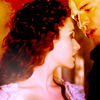
03.
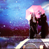
04.
05.
06.
07.
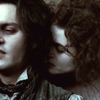
08.
09.
10.
11.
12.
13.
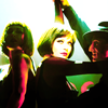
14.
15.
YOU HAVE THIS LONG TO VOTE
Just a reminder that participants are required to provide constructive criticism along with their vote. A couple of votes have leaned heavily towards the criticism side without providing much of the constructive side. There is a critiquing guide here (also linked in the voting) if you are unsure of what counts as constructive.
VOTING RULES:
+ Please vote for your TOP 3 icons. Reasons must be included.
+ Please vote for 1 Best Art Direction [Most Creative] icon. Reason may be included.
+ Please give CONSTRUCTIVE CRITICISM for 2 icons. Information on how to give appropriate concrit has been listed below.
+ In addition to voting for the icons above, we are giving voters an option to add further comments on other icons - should they be constructive critique or praise. You do not have to include additional comments either. This is simply an option for people who would like to give some more constructive critique to their fellow icon makers.
+ Please do not vote for yourself, or ask others to vote for you. If you do this, you will be automatically eliminated.
+ Voting is mandatory for all participants. If you do not vote for 3 ROUNDS [They do not have to be consecutive], you will be given 2 NEGATIVE POINTS. This is to encourage as much participation in the Voting Rounds and avoid delays in the voting schedule.
+ You have 24 hours to vote. Results will be posted once voting has closed.
+ Please vote with the following format:
TOP 3
1st - ## - REASON
2nd - ## - REASON
3rd - ## - REASON
BEST ART DIRECTION
## - REASON OPTIONAL
CONSTRUCTIVE CRITICISM
## - REASON
## - REASON
ADDITIONAL COMMENTS
## - REASON
## - REASON
## - REASON
VOTING HOW TO:
Each vote requires a reason to back it up. The reason doesn't have to be long or detailed (although, the more detailed you are, the more it benefits the maker), but it must be based on the technical aspects of the icon. We understand that personal preference plays a big part in choosing your favorites; however, we would like for all votes to stick to the technical side of things. The technical aspects of an icon address how the icon was made.
These technical aspects can include, but are not limited to: cropping, coloring, composition, text, blending and texture use. You can find a more detailed guide here on how to critique each of these techniques individually.
Votes that will be disqualified:
- I like this icon because [insert subject] is shown.
- I'm voting for this icon because it is the only movie/show/etc I'm familiar with.
- I like this icon because it is pink, and pink is my favorite color!
- The color is a bit off.
Votes that are acceptable:
- I really like the use of color.
- The blending looks really great.
- The texture use really compliments the theme.
- The text use is really nifty.
Votes that are acceptable AND helpful:
(Examples drawn from Round 1 Voting)
- Really lovely composition with Alpha and Echo overlapping each other here. Fantastic job with coloring and using the black background here was a really smart choice. I like how simple and uncluttered this icon is, it draws your focus right to the focal point!
- This icon is so clever. I love the text and how it fits perfectly within the icon - it stands out just enough to be legible, but feels like a natural part of the image. I also love the coloring, red is a perfect bg choice to correspond with the image colors...there's just enough contrast between the two. And the cutting out of the Master is expertly executed.
- Good job cropping Arwen out from her original background and finding a colouring that works well with the texture. The only suggestion I have is to increase the contrast on her face (or reduce the highlights) since the features on the right side of her face are washed out.
- Lovely crop on this icon, however the texture use is slightly intense. It overwhelms the icon a little bit, and draws Rose into the background, rather than working to highlight her as the focal point. I think a softer opacity, or some masking of the texture layer might have helped to stop this.
- Overall, the composition is very nice. The positioning of Ursula, Ariel, and the circular texture are all perfect. However, the lined texture forming odd angles across the icon distracts from this composition and I think the icon would be better without it. I would suggest keeping in mind how a texture will mesh with the overall composition when looking for textures to add to an icon.
- Something about this crop is really eye-catching. The positioning of the subject within the composition of the icon and the way she almost fades into the background is just really well done. I do feel like it looks as if her feet may be cut off a bit at the bottom, but I can't tell for sure. If they are, I would suggest avoiding that in the future.
CHALLENGE 4: MUSICAL
01.

02.

03.

04.

05.

06.

07.

08.
09.

10.

11.

12.

13.

14.

15.

YOU HAVE THIS LONG TO VOTE