Round 3 - Challenge 07 - Results
ROUND 3 - CHALLENGE 7 - RESULTS
1ST PLACE [5 points]:

giulsss with +5 votes [And the most first place votes].
2ND PLACE [4 points]:
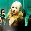
julie_izumi with +5 votes [And the next most first place votes].
3RD PLACE [3 points]:

fulminant8 with +5 votes [And the next most first place votes].
BEST CINEMATOGRAPHY [2 points]:

alice_trip with +3 votes.
MODS CHOICE [1 point]:
[absolutelybatty]

arctic_flower
Lovely use of cold blue tones to create a mood. Love the half and half effect the light creates as well. A very dynamic icon despite the straight forward theme.
[raiindust]

rocketgirl2
I love everything about this icon, from the amazing darkness of the colours that truly represent Snape (the greens and the blacks are wonderful) to the screencap that perfectly represents the theme.
TABLE KEY:
+++ = 1st Place Vote
++ = 2nd Place Vote
+ = 3rd Place Vote | Beginning of a new comment.
Note: Votes are not weighted in this round. Meaning a 1st, 2nd or 3rd vote will only give you 1 point when tallying the votes. Except in the case of a tie - then the icon with the most 1st place votes will be given first.
ICON VOTES

arctic_flowerPOSITIVE VOTES
+ nice soft colouring.
+ I love the coloring on this icon. The gradient used is so dramatic, but I think it works. I love it!
+ The dark to light gradient effect is gorgeous! and the blue colouring gives it a sad sort of mood so that's cool too.
+++ The composition here is great. A nice balance in both crop and coloring. Nice use of dark and light, very eye-catching.
BEST INTERPRETATION OF THEME
+ No reason left.
+ very expressive, great crop, the shadows and hightlights are lovely as well. i feel strongly the blues are a bit overstated though and detract in this intensity from the overall icon.
CONSTRUCTIVE VOTES
NONE.
ADDITIONAL VOTES
+ I like the blue tones used and the transitioning from dark to light (left to right)
giulsssPOSITIVE VOTES
+++ I love the composition of this icon, the way that you've devided it into 3, is complimentary to the theme. Plus the unnatural colouring really works as it contrasts nicely throughout the image.
+++ This is one of those icons that is so gorgeous I can't stop staring at it. The coloring, cropping, composition, slight blur -- all perfection.
+++ I like the way that you decided to play with this challenge a bit and make a more complicated icon; it works well here, and I think still fits the challenge! The colouring is gorgeous and while I'm not usually a fan of this type of softness in icons, I think it works well with this particular image.
+++ This icon is beautiful! It has such a unique colouring and composition.
+ The composition of this icon is really interesting! I really like the bright vivid colors in this icon.
BEST INTERPRETATION OF THEME
+ Amazing composition !
CONSTRUCTIVE VOTES
+ The composition is creative. I think making the front panel sharper would be a good contrast to the blurry background instead.
+ I love the coloring on your icon, but the blurriness kind of throws me a bit. I think a little blur goes with the colouring to give a sort of magical feel, but here it just seems like too much to me, especially because Alice is pretty much an HBIC and the blur seems to go against that. Also, I like the idea of duplication in the background, but the way it is right now makes the icon seem unbalanced - the right side has Alice's face, but the left side just has negative space, and with the block in the center, the icon can't really pull that off.
ADDITIONAL VOTES
NONE.
midnightisclosePOSITIVE VOTES
NONE.
BEST INTERPRETATION OF THEME
NONE.
CONSTRUCTIVE VOTES
+ I don't quite see the point of the blue brush on and over his head. It does create a nice effect, it's just the position that bugs me. Maybe extending it to the whole icon would fix that ?
+ The texture over your subject's face seems to detract from the icon, in my opinion - it does set his face apart and give us a focal point, but it also really washes out the colours.
+ It seems that the blue lighting effect serves to highlight his expression - which is effective - but perhaps setting it to a lower opacity might work a bit better
+ I like the colouring but the blue light blob seems too overpowering, maybe if you lowered the opacity of it it'd be more complimentary.
+ The combination of the blue glow and off-center crop make this overall composition a bit lopsided. It overwhelms the icon a little, I think either repositioning the subject or the blue glow would help balance out the composition
+ the choice of the screencaps is very original, it's always hard for me choosing it! but i think that positioning the character on the right side tooks away balance from the work; the blue light is very odd too, because the main color is a dark pinkish :/
ADDITIONAL VOTES
NONE.
collsPOSITIVE VOTES
NONE.
BEST INTERPRETATION OF THEME
NONE.
CONSTRUCTIVE VOTES
+ nice crop. this icon would catch my attention more if the color range included more colors. i think this more earthy palette (sp?) takes away from the icon rather than makes it.
ADDITIONAL VOTES
+ I really like this icon, the colours are great. I just don't think it fits this theme, and it looks odd amongst all the other icons created for this challenge : here you have two characters on the focus instead of one, and neither of them are looking towards us... otherwise, it is a very nice icon.
+ very cute icon, but i can't see the link with the theme "Talking Heads"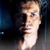
lwena11POSITIVE VOTES
+++ Good placement of the light texture without washing out the lighting on his skin.
++ Really nice crop. Your icon has great mood.
+++ a very emotive clip of the capt from firefly/serenity. great crop and level of contrast and brightness.
BEST INTERPRETATION OF THEME
+ No reason left.
CONSTRUCTIVE VOTES
NONE.
ADDITIONAL VOTES
+ Beautifully simple, and I love the lighting in the bottom right.
wildalyssPOSITIVE VOTES
+ I really like the brightness of the icon, however i;d avoid having the hairline looking so dark as it flattens the image, and creates less of an impact on the face.
++ Beautiful icon. The coloring is really nice; I also like the crop and the emotion in the cap used.
++ I like the green background, it's a very lovely colour and I like how it's sort of dispersed throughout the icon, it makes it all work together.
BEST INTERPRETATION OF THEME
NONE.
CONSTRUCTIVE VOTES
+ While I do like the coloring and the icon, I think a closer crop on her face would capture her expression more.
ADDITIONAL VOTES
+ very bright and colorful and the features are well defined
fulminant8POSITIVE VOTES
++ Lovely colouring, and nice choice of cap, is expression is great.
+ I like the bold choice of magenta and yellow coloring.
+ Love your coloring on this! I usually don't go for icons with this sort of coloring, but you rocked it.
++ Really love the muted coloring here. I think it adds to the chosen screencap. The cropping is also good here, cuts off at the right points that it doesn't make the subject look stretched or shrunk. Great job!
++ The focused close crop works really well there. The monochromatic colours helps too and the lighting and contrast are really nice.
BEST INTERPRETATION OF THEME
NONE.
CONSTRUCTIVE VOTES
+ I like the crop a lot, but I think the color scheme (purple/yellow) is a little weird. It also seems like there's an exclusion layer that's on too high of an opacity. If you lowered the opacity or the fill of that layer, I think it would look a lot nicer.
ADDITIONAL VOTES
+ this is contrasted very well and I like the coloring
alice_tripPOSITIVE VOTES
+ this choice of screencaps seems to say "ehy, i'm a little doll and i need to be saved!:(" and this is also thanks to the coloration! in my opinion an icon which says something is a very special icon
BEST INTERPRETATION OF THEME
+ I like the closeness of her face, and the colouring compliments the theme.
+ No reason left.
+ No reason left.
CONSTRUCTIVE VOTES
NONE.
ADDITIONAL VOTES
+ The colouring seems a bit odd to me, there seems to be too much pink in that icon. Otherwise, the crop is intriguing.
+ At first glance, I didn't like this icon. Now I love it! I think it's truly beautiful (and I would kill to know how you did it!). The colors are so gorgeous and the crop is fantastic. It's a tad sharp, mostly in her hair on the left, but everything else makes up for it!
dudette_in_townPOSITIVE VOTES
+ the expression on the face of the subject is what really makes this icon. great cropping and image choice.
BEST INTERPRETATION OF THEME
NONE.
CONSTRUCTIVE VOTES
+ I like the image, but maybe consider sharpening the face a little more, so that theres more of a line defining his features.
ADDITIONAL VOTES
+ I love the way that this icon really highlights the light/shadows going on in this scene! My only criticism is that this icon is a little fuzzy/blurry - a little sharpening would help bring his features into focus.
erzsebetPOSITIVE VOTES
+++ I love how the black background enhance her expression, it's very well done.
++ The contrast is perfect because it highlights the key aspects of her expression.
++ I like the crop and how well the shadow falls across her face. It is also contrasted nicely
BEST INTERPRETATION OF THEME
+ I like the fact that she actually does seem to be talking in this icon (though not recognizing the screencap, she might not be).
+ No reason left.
CONSTRUCTIVE VOTES
NONE.
ADDITIONAL VOTES
+ technically i like the natural colouring and the cropping of the image, but i wish there was more of a definition on the left of her face.
+ good quality image. good crop. perhaps the darkness on the left should be a little less.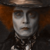
gribouillePOSITIVE VOTES
NONE.
BEST INTERPRETATION OF THEME
+ Definitely a straight-on and centered image. :)
CONSTRUCTIVE VOTES
+ I love the image you've picked, but i wish you used a little more colouring in the image. For example consider highlighting the hatter's hair and exposing the image a little more so that theres a little more impact.
+ This icon needs to be a bit sharper. It's also very dark. Playing around with levels to add some contrast and brightness would help a lot.
+ This is a good crop and the sharpness is just right, but the image is really dark on my screen, which makes it difficult to really make out the icon.
+ The icon is a bit dark overall and blurry. Adding some light to the icon would give the icon some focus.
+ a bit more brightness in this icon might work better. love the clip and crop. the expression would make the icon with a bit more lightness. imho, anyway.
+ i ADORE the crop, really. but this work seems to be empty :/ there's no coloring or texture and it seems more a base to work on!
ADDITIONAL VOTES
NONE.
rocketgirl2POSITIVE VOTES
++ I really like the colours in this icon! the green compliment's Snape's pale completion. I'd avoid having the face in such a ourple/pink hue though, maybe try and whiten or nuden it a little more so that the green stands out more.
+ I love the colouring you used here - the green fits Snape perfectly and the blackness of the shadows is great. My only issue is that this icon is a tad dark.
++ very dark icon which transmits very dark feelings! it seems to me that i'm looking my self at the mirror, which is extremly weird but in the meantime it's very original
BEST INTERPRETATION OF THEME
+ No reason left.
CONSTRUCTIVE VOTES
+ I like how it looks like Snape is looking directly at you, and the green colours in the background are nice and fitting. The only problem is that this icon appears very, very dark on my screen, especially Snape's hair and clothes, it might be good idea to make it look a bit brighter.
+ I really like the bold colored background, but think the icon could be lightened just a tad
+ I think the icon is a bit too dark. I didn't notice the smaller square until I stared at it for a bit. Perhaps a screen layer or playing with the brightness/contrast option would help bring out the composition better.
ADDITIONAL VOTES
+ At first I wasn't sure if I liked how dark this icon is, but I think it's appropriate for the subject. I love the cropping here. The coloring is also very nice. My only complaint is that it looks a bit grainy -- like perhaps there's a saturation or vibrance layer that's a little too high.
+ the darkness works well here for the icon. love the background. it seems to me more softness in the face (not a whole lot) would work well for the icon. what i mean is over the top most layer, paste another image layer then soften it and they increase the transparency. i think the subtle (very subtle) softness work work better with the background.
enrianaPOSITIVE VOTES
+++ The coloring is good and the icon is nice and bright.
++ very good image selection for this theme. exellent image quality.
BEST INTERPRETATION OF THEME
NONE.
CONSTRUCTIVE VOTES
NONE.
ADDITIONAL VOTES
NONE.
julie_izumiPOSITIVE VOTES
++ I love the colouring that you've used here, and the subtle use of light at the bottom of the icon.
+++ I love your coloring on this! Great job.
+ I like the inclusion of background figures and the coloring and lighting is nicely done, as is that lighted smudge at the bottom
+ The crop is well suited for this screencap. Nice use of muted tones - they don't overwhelm the icon with color. Also good use of the white light blob, helps draw in the eye.
+++ The simpleness of the icon makes it really stand out and the colouring is gorgeous.
BEST INTERPRETATION OF THEME
+ No reason left.
CONSTRUCTIVE VOTES
NONE.
ADDITIONAL VOTES
+ Though the image is nice, i wish that you'd zoom a little more into her face, as for the theme i feel like the face should be the focal point, wheras my eye is looking at the background!
+ though this icon is perfect the way it is (coloring-> awesome; crop-> awesome; lights-> awesome!), i think that it doesn't fit the theme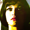
fireinmybonessPOSITIVE VOTES
+++ COLORATION IS STUNNING. and this face which fits all the icon is perfect :D
BEST INTERPRETATION OF THEME
NONE.
CONSTRUCTIVE VOTES
+ I really like the contrast between light and dark in this icon, and the way that half of her face is in shadows, but the bright side of her face is overwhelming on my screen. Maybe toning down the highlights will help make her features a little more clear.
+ I like the colour scheme here but I don't like how it's incorporated. The high contrast makes it look odd, like half of her face is black, the other is white and then you got the yellow on the bottom and it makes it look quite choppy that way.
+ It may be my monitor, but the icon looks over-saturated and over-sharpened.
ADDITIONAL VOTES
+ love the way the darkness of the hair overlaps the lightness of the background. the yellow seems to me to be working against the icon instead of for it. perhas a lower intensity.
Updated Scoring Spreadsheet
1ST PLACE [5 points]:

giulsss with +5 votes [And the most first place votes].
2ND PLACE [4 points]:

julie_izumi with +5 votes [And the next most first place votes].
3RD PLACE [3 points]:

fulminant8 with +5 votes [And the next most first place votes].
BEST CINEMATOGRAPHY [2 points]:

alice_trip with +3 votes.
MODS CHOICE [1 point]:
[absolutelybatty]

arctic_flower
Lovely use of cold blue tones to create a mood. Love the half and half effect the light creates as well. A very dynamic icon despite the straight forward theme.
[raiindust]

rocketgirl2
I love everything about this icon, from the amazing darkness of the colours that truly represent Snape (the greens and the blacks are wonderful) to the screencap that perfectly represents the theme.
TABLE KEY:
+++ = 1st Place Vote
++ = 2nd Place Vote
+ = 3rd Place Vote | Beginning of a new comment.
Note: Votes are not weighted in this round. Meaning a 1st, 2nd or 3rd vote will only give you 1 point when tallying the votes. Except in the case of a tie - then the icon with the most 1st place votes will be given first.
ICON VOTES

arctic_flowerPOSITIVE VOTES
+ nice soft colouring.
+ I love the coloring on this icon. The gradient used is so dramatic, but I think it works. I love it!
+ The dark to light gradient effect is gorgeous! and the blue colouring gives it a sad sort of mood so that's cool too.
+++ The composition here is great. A nice balance in both crop and coloring. Nice use of dark and light, very eye-catching.
BEST INTERPRETATION OF THEME
+ No reason left.
+ very expressive, great crop, the shadows and hightlights are lovely as well. i feel strongly the blues are a bit overstated though and detract in this intensity from the overall icon.
CONSTRUCTIVE VOTES
NONE.
ADDITIONAL VOTES
+ I like the blue tones used and the transitioning from dark to light (left to right)

giulsssPOSITIVE VOTES
+++ I love the composition of this icon, the way that you've devided it into 3, is complimentary to the theme. Plus the unnatural colouring really works as it contrasts nicely throughout the image.
+++ This is one of those icons that is so gorgeous I can't stop staring at it. The coloring, cropping, composition, slight blur -- all perfection.
+++ I like the way that you decided to play with this challenge a bit and make a more complicated icon; it works well here, and I think still fits the challenge! The colouring is gorgeous and while I'm not usually a fan of this type of softness in icons, I think it works well with this particular image.
+++ This icon is beautiful! It has such a unique colouring and composition.
+ The composition of this icon is really interesting! I really like the bright vivid colors in this icon.
BEST INTERPRETATION OF THEME
+ Amazing composition !
CONSTRUCTIVE VOTES
+ The composition is creative. I think making the front panel sharper would be a good contrast to the blurry background instead.
+ I love the coloring on your icon, but the blurriness kind of throws me a bit. I think a little blur goes with the colouring to give a sort of magical feel, but here it just seems like too much to me, especially because Alice is pretty much an HBIC and the blur seems to go against that. Also, I like the idea of duplication in the background, but the way it is right now makes the icon seem unbalanced - the right side has Alice's face, but the left side just has negative space, and with the block in the center, the icon can't really pull that off.
ADDITIONAL VOTES
NONE.

midnightisclosePOSITIVE VOTES
NONE.
BEST INTERPRETATION OF THEME
NONE.
CONSTRUCTIVE VOTES
+ I don't quite see the point of the blue brush on and over his head. It does create a nice effect, it's just the position that bugs me. Maybe extending it to the whole icon would fix that ?
+ The texture over your subject's face seems to detract from the icon, in my opinion - it does set his face apart and give us a focal point, but it also really washes out the colours.
+ It seems that the blue lighting effect serves to highlight his expression - which is effective - but perhaps setting it to a lower opacity might work a bit better
+ I like the colouring but the blue light blob seems too overpowering, maybe if you lowered the opacity of it it'd be more complimentary.
+ The combination of the blue glow and off-center crop make this overall composition a bit lopsided. It overwhelms the icon a little, I think either repositioning the subject or the blue glow would help balance out the composition
+ the choice of the screencaps is very original, it's always hard for me choosing it! but i think that positioning the character on the right side tooks away balance from the work; the blue light is very odd too, because the main color is a dark pinkish :/
ADDITIONAL VOTES
NONE.

collsPOSITIVE VOTES
NONE.
BEST INTERPRETATION OF THEME
NONE.
CONSTRUCTIVE VOTES
+ nice crop. this icon would catch my attention more if the color range included more colors. i think this more earthy palette (sp?) takes away from the icon rather than makes it.
ADDITIONAL VOTES
+ I really like this icon, the colours are great. I just don't think it fits this theme, and it looks odd amongst all the other icons created for this challenge : here you have two characters on the focus instead of one, and neither of them are looking towards us... otherwise, it is a very nice icon.
+ very cute icon, but i can't see the link with the theme "Talking Heads"

lwena11POSITIVE VOTES
+++ Good placement of the light texture without washing out the lighting on his skin.
++ Really nice crop. Your icon has great mood.
+++ a very emotive clip of the capt from firefly/serenity. great crop and level of contrast and brightness.
BEST INTERPRETATION OF THEME
+ No reason left.
CONSTRUCTIVE VOTES
NONE.
ADDITIONAL VOTES
+ Beautifully simple, and I love the lighting in the bottom right.

wildalyssPOSITIVE VOTES
+ I really like the brightness of the icon, however i;d avoid having the hairline looking so dark as it flattens the image, and creates less of an impact on the face.
++ Beautiful icon. The coloring is really nice; I also like the crop and the emotion in the cap used.
++ I like the green background, it's a very lovely colour and I like how it's sort of dispersed throughout the icon, it makes it all work together.
BEST INTERPRETATION OF THEME
NONE.
CONSTRUCTIVE VOTES
+ While I do like the coloring and the icon, I think a closer crop on her face would capture her expression more.
ADDITIONAL VOTES
+ very bright and colorful and the features are well defined

fulminant8POSITIVE VOTES
++ Lovely colouring, and nice choice of cap, is expression is great.
+ I like the bold choice of magenta and yellow coloring.
+ Love your coloring on this! I usually don't go for icons with this sort of coloring, but you rocked it.
++ Really love the muted coloring here. I think it adds to the chosen screencap. The cropping is also good here, cuts off at the right points that it doesn't make the subject look stretched or shrunk. Great job!
++ The focused close crop works really well there. The monochromatic colours helps too and the lighting and contrast are really nice.
BEST INTERPRETATION OF THEME
NONE.
CONSTRUCTIVE VOTES
+ I like the crop a lot, but I think the color scheme (purple/yellow) is a little weird. It also seems like there's an exclusion layer that's on too high of an opacity. If you lowered the opacity or the fill of that layer, I think it would look a lot nicer.
ADDITIONAL VOTES
+ this is contrasted very well and I like the coloring

alice_tripPOSITIVE VOTES
+ this choice of screencaps seems to say "ehy, i'm a little doll and i need to be saved!:(" and this is also thanks to the coloration! in my opinion an icon which says something is a very special icon
BEST INTERPRETATION OF THEME
+ I like the closeness of her face, and the colouring compliments the theme.
+ No reason left.
+ No reason left.
CONSTRUCTIVE VOTES
NONE.
ADDITIONAL VOTES
+ The colouring seems a bit odd to me, there seems to be too much pink in that icon. Otherwise, the crop is intriguing.
+ At first glance, I didn't like this icon. Now I love it! I think it's truly beautiful (and I would kill to know how you did it!). The colors are so gorgeous and the crop is fantastic. It's a tad sharp, mostly in her hair on the left, but everything else makes up for it!

dudette_in_townPOSITIVE VOTES
+ the expression on the face of the subject is what really makes this icon. great cropping and image choice.
BEST INTERPRETATION OF THEME
NONE.
CONSTRUCTIVE VOTES
+ I like the image, but maybe consider sharpening the face a little more, so that theres more of a line defining his features.
ADDITIONAL VOTES
+ I love the way that this icon really highlights the light/shadows going on in this scene! My only criticism is that this icon is a little fuzzy/blurry - a little sharpening would help bring his features into focus.

erzsebetPOSITIVE VOTES
+++ I love how the black background enhance her expression, it's very well done.
++ The contrast is perfect because it highlights the key aspects of her expression.
++ I like the crop and how well the shadow falls across her face. It is also contrasted nicely
BEST INTERPRETATION OF THEME
+ I like the fact that she actually does seem to be talking in this icon (though not recognizing the screencap, she might not be).
+ No reason left.
CONSTRUCTIVE VOTES
NONE.
ADDITIONAL VOTES
+ technically i like the natural colouring and the cropping of the image, but i wish there was more of a definition on the left of her face.
+ good quality image. good crop. perhaps the darkness on the left should be a little less.
gribouillePOSITIVE VOTES
NONE.
BEST INTERPRETATION OF THEME
+ Definitely a straight-on and centered image. :)
CONSTRUCTIVE VOTES
+ I love the image you've picked, but i wish you used a little more colouring in the image. For example consider highlighting the hatter's hair and exposing the image a little more so that theres a little more impact.
+ This icon needs to be a bit sharper. It's also very dark. Playing around with levels to add some contrast and brightness would help a lot.
+ This is a good crop and the sharpness is just right, but the image is really dark on my screen, which makes it difficult to really make out the icon.
+ The icon is a bit dark overall and blurry. Adding some light to the icon would give the icon some focus.
+ a bit more brightness in this icon might work better. love the clip and crop. the expression would make the icon with a bit more lightness. imho, anyway.
+ i ADORE the crop, really. but this work seems to be empty :/ there's no coloring or texture and it seems more a base to work on!
ADDITIONAL VOTES
NONE.

rocketgirl2POSITIVE VOTES
++ I really like the colours in this icon! the green compliment's Snape's pale completion. I'd avoid having the face in such a ourple/pink hue though, maybe try and whiten or nuden it a little more so that the green stands out more.
+ I love the colouring you used here - the green fits Snape perfectly and the blackness of the shadows is great. My only issue is that this icon is a tad dark.
++ very dark icon which transmits very dark feelings! it seems to me that i'm looking my self at the mirror, which is extremly weird but in the meantime it's very original
BEST INTERPRETATION OF THEME
+ No reason left.
CONSTRUCTIVE VOTES
+ I like how it looks like Snape is looking directly at you, and the green colours in the background are nice and fitting. The only problem is that this icon appears very, very dark on my screen, especially Snape's hair and clothes, it might be good idea to make it look a bit brighter.
+ I really like the bold colored background, but think the icon could be lightened just a tad
+ I think the icon is a bit too dark. I didn't notice the smaller square until I stared at it for a bit. Perhaps a screen layer or playing with the brightness/contrast option would help bring out the composition better.
ADDITIONAL VOTES
+ At first I wasn't sure if I liked how dark this icon is, but I think it's appropriate for the subject. I love the cropping here. The coloring is also very nice. My only complaint is that it looks a bit grainy -- like perhaps there's a saturation or vibrance layer that's a little too high.
+ the darkness works well here for the icon. love the background. it seems to me more softness in the face (not a whole lot) would work well for the icon. what i mean is over the top most layer, paste another image layer then soften it and they increase the transparency. i think the subtle (very subtle) softness work work better with the background.

enrianaPOSITIVE VOTES
+++ The coloring is good and the icon is nice and bright.
++ very good image selection for this theme. exellent image quality.
BEST INTERPRETATION OF THEME
NONE.
CONSTRUCTIVE VOTES
NONE.
ADDITIONAL VOTES
NONE.

julie_izumiPOSITIVE VOTES
++ I love the colouring that you've used here, and the subtle use of light at the bottom of the icon.
+++ I love your coloring on this! Great job.
+ I like the inclusion of background figures and the coloring and lighting is nicely done, as is that lighted smudge at the bottom
+ The crop is well suited for this screencap. Nice use of muted tones - they don't overwhelm the icon with color. Also good use of the white light blob, helps draw in the eye.
+++ The simpleness of the icon makes it really stand out and the colouring is gorgeous.
BEST INTERPRETATION OF THEME
+ No reason left.
CONSTRUCTIVE VOTES
NONE.
ADDITIONAL VOTES
+ Though the image is nice, i wish that you'd zoom a little more into her face, as for the theme i feel like the face should be the focal point, wheras my eye is looking at the background!
+ though this icon is perfect the way it is (coloring-> awesome; crop-> awesome; lights-> awesome!), i think that it doesn't fit the theme

fireinmybonessPOSITIVE VOTES
+++ COLORATION IS STUNNING. and this face which fits all the icon is perfect :D
BEST INTERPRETATION OF THEME
NONE.
CONSTRUCTIVE VOTES
+ I really like the contrast between light and dark in this icon, and the way that half of her face is in shadows, but the bright side of her face is overwhelming on my screen. Maybe toning down the highlights will help make her features a little more clear.
+ I like the colour scheme here but I don't like how it's incorporated. The high contrast makes it look odd, like half of her face is black, the other is white and then you got the yellow on the bottom and it makes it look quite choppy that way.
+ It may be my monitor, but the icon looks over-saturated and over-sharpened.
ADDITIONAL VOTES
+ love the way the darkness of the hair overlaps the lightness of the background. the yellow seems to me to be working against the icon instead of for it. perhas a lower intensity.
Updated Scoring Spreadsheet