Round 3 - Challenge 09 - Results
ROUND 3 - CHALLENGE 09 - RESULTS
1ST PLACE [5 points]:

fulminant8 with +8 votes.
2ND PLACE [4 points]:

alice_trip with +6 votes.
3RD PLACE [3 points]:

wildalyss with +3 votes.
BEST ART DIRECTION [2 points]:

&
fulminant8 & erzsebet with +3 votes.
MODS CHOICE [1 point]:
[absolutelybatty]
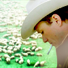
julie_izumi
[Very daring compositionally with so much going on in the background, but I really love the intense focus on the subject never the less. It is very 'lone ranger' which works very well with the theme.]
[raiindust]

colls
[I love the simplicity of this icon, I think it actually drives home the theme really well. The natural colours (tan/brown) also really help to highlight the theme, and the cropping is great. Overall a really great icon!]
TABLE KEY:
+++ = 1st Place Vote
++ = 2nd Place Vote
+ = 3rd Place Vote | Beginning of a new comment.
Note: Votes are not weighted in this round. Meaning a 1st, 2nd or 3rd vote will only give you 1 point when tallying the votes. Except in the case of a tie - then the icon with the most 1st place votes will be given first.
ICON VOTES

arctic_flowerPOSITIVE VOTES
None.
BEST INTERPRETATION OF THEME
None.
CONSTRUCTIVE VOTES
+ While I do love the three box crop, if feels too busy for this icon. The bottom section is cropped fine, but the two with the Potato heads appears a little busy and a bit over saturated compared to the bottom section. I think zooming out on the top two parts, and toning down the red saturation would really help balance out the crop and composition.
+ There is a bit too much going on on this icon in my opinion. The bottom image is fine, but I don't see the point of the repetition of the top image. Finally, I think a softer colouring would suit this icon better.
+ While I really like the colouring you've used for this icon, the duplicated images are a little distracting (I'm not really sure where to focus my gaze - I find myself looking at the top half of the icon, where I suspect I should be focusing on the bottom half, since the theme is western). Maybe shrinking the duplicated images and moving them either further up or to the bottom of the icon might make them less distracting.
ADDITIONAL VOTES
None.

giulsssPOSITIVE VOTES
None.
BEST INTERPRETATION OF THEME
+ No reason given.
+ No reason given.
CONSTRUCTIVE VOTES
+ The color scheme is very pretty and the text placement is perfect but it's kinda hard to see Alice. Maybe if you cropped it closer or increased the contrast it'd be clearer.
ADDITIONAL VOTES
+ I like the idea and the colouring, it's too bad that Alice appears too blurry on the image. Maybe a closer crop could help focus more on her and less on the text ?

midnightisclosePOSITIVE VOTES
++ I love the grittiness in this icon. It adds a definite old west feel. The cropping/cap choice also adds a great focus without losing the character too much.
+ this icon so western! at the first sight i wasn't sure about that, but now... wow! this gun on focus and the face outfocus is very "the bag or the life", and the coloring is so rude (in a positive way, of course! LOL).
BEST INTERPRETATION OF THEME
None.
CONSTRUCTIVE VOTES
+ The problem is that the cropping is unflattering, as the gun seems to "eat" the greatest part of the character's face, it looks as if he had no cheek on the left side, which seems odd. Plus, the focus is constantly shifting, in my opinion, between the gun and the face.
ADDITIONAL VOTES
None.

collsPOSITIVE VOTES
+ The texture use is absolutely lovely, and the mood of the icon is very fitting.
BEST INTERPRETATION OF THEME
None.
CONSTRUCTIVE VOTES
None.
ADDITIONAL VOTES
None.
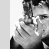
lwena11POSITIVE VOTES
++ I like the black and white effect, as well as the texture used on the left.
BEST INTERPRETATION OF THEME
None.
CONSTRUCTIVE VOTES
+ I like the crop and the b/w makes it very dramatic, but the gray bar on the right looks off. I'd suggest making it white instead and smudging the corner of his shirt so that it won't be cut off.
+ I love the use of the sidebar, it makes the cropping stand out. Unfortunately, because the sidebar is a solid, crisp gray, it makes the pixelation and grittiness in the image more apparent (especially on the forehead and cheek, and on the hand around the knuckles).
+ The composition is a bit lopsided. The grey bar on the left is very distracting. I think if you center Mal a bit more and add the grey bar to the bottom or even top, the composition would level out.
ADDITIONAL VOTES
+ I like the crop of your icon, but the gray border on the left seems a bit out of place. It doesn't seem to serve any purpose or add anything to the composition of the icon and it draws my eye because it's the same shade as your subject - thereby giving the icon a split focus. Maybe blurring the original background over into that area would help the icon to stay more unified.

wildalyssPOSITIVE VOTES
+++ Gorgeous colouring (I especially love how vibrant everything is), use of negative space, and text. This icon comes together wonderfully!
++ I really like the motion feel to this icon, and the colours for the text stand out but blend in at the same time.
++ Great use of text. The font color is a bit harsh because it is sitting on a blue-green sky. Perhaps a brighter shade of yellow would be better.
BEST INTERPRETATION OF THEME
None.
CONSTRUCTIVE VOTES
+ The choice of cap is good & so is the crop, but the area around the ship is oversharpened. Going over it with a blur brush on a low opacity might help. In addition, the colors of the text don't meld well with the colors of the sky - I'd try using more neutral colors, like the grey of the ship, or using colors from the sky itself.
+ I came so close to voting for your icon, because the colours are absolutely gorgeous. However, especially against the blurriness of the sky, Serenity looks oversharp. A bit of work with a blur brush would really help her to mesh with the background more and would pull you icon together.
ADDITIONAL VOTES
+ I really love the idea and the use of text. The font used is very nice as well, and the colours are great. A closer crop on Serenity, as it is difficult to make out what it is at first glance, might be nice.
+ very smart the comparing between the sharpened part at the bottom and the blurred part on the top :)

fulminant8POSITIVE VOTES
+++ The blending is well done and the texture use is lovely.
+++ Lovely composition and great colouring, I love the tones you used.
+++ perfect blending of two images! thus, coloring is very "western" type and jake is pure awesomeness! LOL
+++ I love the coloring in this icon. That, along with the blending and texture use, definitely have the feeling of those old John Wayne posters. I think the only improvement/concrit I could give this icon is, because of all the black, making the icon appear almost uneven: maybe if that top image was smaller it would create more balance.
+++ The blending, coloring and cropping are phenomenal here. Both images work extremely well together and the coloring helps enhance the blend. Excellent job all around, fantastic composition.
++ The blending works well in this icon, the composition is lovely and the colors are very fitting.
++ I love your blend here. It's very creatively done.
+ This brownish/yellowish colouring works really well with this icon, and the blending is well done. My only complaint is that the line above the horse, going across his chin, is a little distracting.
BEST INTERPRETATION OF THEME
+ No reason given.
+ No reason given.
+ No reason given.
CONSTRUCTIVE VOTES
+ The blending is creative and color works with the western theme. I think this icon only needs a little more contrast.
ADDITIONAL VOTES
None.

alice_tripPOSITIVE VOTES
+++ Beautiful coloring and lighting.
++ lovely use of lights, expecially if these create a mixture of different colors :) the only thing that i dare to criticize is that the subject is a bit oversharpened, but that's all.
++ I like your use of colour and the subtle use of texture, here. Lovely icon!
+ The coloring is fantastic. The blue light blob in the middle doesn't distract, but draw the eye in to Daniel Craig in the center. The background is nice and smooth helping draw more attention to the subject. Nice job!
+ I like how the background is slightly blurred behind your subject, and everything is the same hue except the blue - it really gives the eye a great focal point.
+ The bits of colour around the icon look fantastic, the vibrance of it all looks amazing.
BEST INTERPRETATION OF THEME
+ nice use of texture.
CONSTRUCTIVE VOTES
None.
ADDITIONAL VOTES
None.

dudette_in_townPOSITIVE VOTES
+++ I love the vibrant colour and slight blur to your icon - it gives it a sort of magical look and makes it really pop. Great job!
+ The coloring in this icon is great, I love it! I like that it looks like the maker used blurring effects to help strengthen the movement in the icon.
BEST INTERPRETATION OF THEME
None.
CONSTRUCTIVE VOTES
None.
ADDITIONAL VOTES
+ This is spectacular colouring - I love how bright and vibrant it is! However, your icon is a little blurry on my screen, so maybe sharpening it would make it appear crisper.

erzsebetPOSITIVE VOTES
+++ Showing different perspectives in the duplication works well for the icon, the colors are vivid but not too saturated, the use of light & texture is excellent.
BEST INTERPRETATION OF THEME
+ No reason given.
+ Good use of levels.
+ The three panels highlight the grittiness (no pun intended) of this character.
CONSTRUCTIVE VOTES
None.
ADDITIONAL VOTES
None.

gribouillePOSITIVE VOTES
None.
BEST INTERPRETATION OF THEME
None.
CONSTRUCTIVE VOTES
+ what impressed me about this icon is the cut. HOW LOVELY IS IT?! perfect :D but the coloring doesn't convince me :/ maybe a lighter one would have worked better because it would have lightened sheriff's face.
+ I like this icon's crop. I feel that coloring could be more vibrant or the white could be lighter to add more dynamism to the icon.
+ I love your crop on this, but because the sky is so much lighter than your subject, I find my eye drawn to it instead of his face. Some work with the lighting, as with gradient layers set to overlay, would help to illuminate your subject's face and draw the viewer's eye to it.
+ While the crop is lovely, the brightness/contrast leaves something to be desired. I would try playing with Vibrance, Levels, Curves, and other tools to lend more "oomph" to the icon.
ADDITIONAL VOTES
+ Great crop!

rocketgirl2POSITIVE VOTES
None.
BEST INTERPRETATION OF THEME
None.
CONSTRUCTIVE VOTES
+ I love the brightness and amount of contrast in this icon, but the pink/yellow colouring strikes me as a little strange. If the grass/rocks in the background were made more brown/greenish (and you masked out what the colour changes did to Zoe and Wash) or removed the red, I think that the colouring would feel a little more natural.
ADDITIONAL VOTES
None.

enrianaPOSITIVE VOTES
+ I like how the crop seems to capture the emotion on this icon. Very nice colouring on top of that.
BEST INTERPRETATION OF THEME
None.
CONSTRUCTIVE VOTES
None.
ADDITIONAL VOTES
+ I love your crop here, but the colouring seems a little flat. River's face is almost completely white and therefore looks washed out. Pulling in some more reds and then building a contrast between the warmer colours of River and the blue in the background would help give the colouring on this one more depth.

julie_izumiPOSITIVE VOTES
None.
BEST INTERPRETATION OF THEME
None.
CONSTRUCTIVE VOTES
None.
ADDITIONAL VOTES
None.
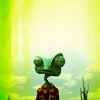
fireinmybonessPOSITIVE VOTES
++ The colors here work very well to help pull Rango out. I love the center crop, very nicely used here. Really nice soft composition and very eye-catching.
+ I love texture use of this icon but I think it ends too abruptly. I think it would be better if the texture is brought down to cover the entire icon.
BEST INTERPRETATION OF THEME
None.
CONSTRUCTIVE VOTES
+ I like that there is creativity here with the texture use, and there's a lot of great negative space here as well. However, I think the that in it's current form the icon looks a bit 'flat' (as in, lacking contrast) and the heavy green texture is only heightening that. I think if the contrast were to be improved (for example, using a curves layer, or light textures on soft light or screen) it would help the texture and image mesh more.
+ so cute! :) the negative space works very well, but i would have used a cloudy texture to complete top of the icon, with a lightblue tone.
ADDITIONAL VOTES
+ nice idea and colouring, but the texture seems unnecessary in my opinion. I love the use of negative space on this icon, and it does not need the texture to look great.
Updated Scoring Spreadsheet
1ST PLACE [5 points]:

fulminant8 with +8 votes.
2ND PLACE [4 points]:

alice_trip with +6 votes.
3RD PLACE [3 points]:

wildalyss with +3 votes.
BEST ART DIRECTION [2 points]:

&

fulminant8 & erzsebet with +3 votes.
MODS CHOICE [1 point]:
[absolutelybatty]

julie_izumi
[Very daring compositionally with so much going on in the background, but I really love the intense focus on the subject never the less. It is very 'lone ranger' which works very well with the theme.]
[raiindust]

colls
[I love the simplicity of this icon, I think it actually drives home the theme really well. The natural colours (tan/brown) also really help to highlight the theme, and the cropping is great. Overall a really great icon!]
TABLE KEY:
+++ = 1st Place Vote
++ = 2nd Place Vote
+ = 3rd Place Vote | Beginning of a new comment.
Note: Votes are not weighted in this round. Meaning a 1st, 2nd or 3rd vote will only give you 1 point when tallying the votes. Except in the case of a tie - then the icon with the most 1st place votes will be given first.
ICON VOTES

arctic_flowerPOSITIVE VOTES
None.
BEST INTERPRETATION OF THEME
None.
CONSTRUCTIVE VOTES
+ While I do love the three box crop, if feels too busy for this icon. The bottom section is cropped fine, but the two with the Potato heads appears a little busy and a bit over saturated compared to the bottom section. I think zooming out on the top two parts, and toning down the red saturation would really help balance out the crop and composition.
+ There is a bit too much going on on this icon in my opinion. The bottom image is fine, but I don't see the point of the repetition of the top image. Finally, I think a softer colouring would suit this icon better.
+ While I really like the colouring you've used for this icon, the duplicated images are a little distracting (I'm not really sure where to focus my gaze - I find myself looking at the top half of the icon, where I suspect I should be focusing on the bottom half, since the theme is western). Maybe shrinking the duplicated images and moving them either further up or to the bottom of the icon might make them less distracting.
ADDITIONAL VOTES
None.

giulsssPOSITIVE VOTES
None.
BEST INTERPRETATION OF THEME
+ No reason given.
+ No reason given.
CONSTRUCTIVE VOTES
+ The color scheme is very pretty and the text placement is perfect but it's kinda hard to see Alice. Maybe if you cropped it closer or increased the contrast it'd be clearer.
ADDITIONAL VOTES
+ I like the idea and the colouring, it's too bad that Alice appears too blurry on the image. Maybe a closer crop could help focus more on her and less on the text ?

midnightisclosePOSITIVE VOTES
++ I love the grittiness in this icon. It adds a definite old west feel. The cropping/cap choice also adds a great focus without losing the character too much.
+ this icon so western! at the first sight i wasn't sure about that, but now... wow! this gun on focus and the face outfocus is very "the bag or the life", and the coloring is so rude (in a positive way, of course! LOL).
BEST INTERPRETATION OF THEME
None.
CONSTRUCTIVE VOTES
+ The problem is that the cropping is unflattering, as the gun seems to "eat" the greatest part of the character's face, it looks as if he had no cheek on the left side, which seems odd. Plus, the focus is constantly shifting, in my opinion, between the gun and the face.
ADDITIONAL VOTES
None.

collsPOSITIVE VOTES
+ The texture use is absolutely lovely, and the mood of the icon is very fitting.
BEST INTERPRETATION OF THEME
None.
CONSTRUCTIVE VOTES
None.
ADDITIONAL VOTES
None.

lwena11POSITIVE VOTES
++ I like the black and white effect, as well as the texture used on the left.
BEST INTERPRETATION OF THEME
None.
CONSTRUCTIVE VOTES
+ I like the crop and the b/w makes it very dramatic, but the gray bar on the right looks off. I'd suggest making it white instead and smudging the corner of his shirt so that it won't be cut off.
+ I love the use of the sidebar, it makes the cropping stand out. Unfortunately, because the sidebar is a solid, crisp gray, it makes the pixelation and grittiness in the image more apparent (especially on the forehead and cheek, and on the hand around the knuckles).
+ The composition is a bit lopsided. The grey bar on the left is very distracting. I think if you center Mal a bit more and add the grey bar to the bottom or even top, the composition would level out.
ADDITIONAL VOTES
+ I like the crop of your icon, but the gray border on the left seems a bit out of place. It doesn't seem to serve any purpose or add anything to the composition of the icon and it draws my eye because it's the same shade as your subject - thereby giving the icon a split focus. Maybe blurring the original background over into that area would help the icon to stay more unified.

wildalyssPOSITIVE VOTES
+++ Gorgeous colouring (I especially love how vibrant everything is), use of negative space, and text. This icon comes together wonderfully!
++ I really like the motion feel to this icon, and the colours for the text stand out but blend in at the same time.
++ Great use of text. The font color is a bit harsh because it is sitting on a blue-green sky. Perhaps a brighter shade of yellow would be better.
BEST INTERPRETATION OF THEME
None.
CONSTRUCTIVE VOTES
+ The choice of cap is good & so is the crop, but the area around the ship is oversharpened. Going over it with a blur brush on a low opacity might help. In addition, the colors of the text don't meld well with the colors of the sky - I'd try using more neutral colors, like the grey of the ship, or using colors from the sky itself.
+ I came so close to voting for your icon, because the colours are absolutely gorgeous. However, especially against the blurriness of the sky, Serenity looks oversharp. A bit of work with a blur brush would really help her to mesh with the background more and would pull you icon together.
ADDITIONAL VOTES
+ I really love the idea and the use of text. The font used is very nice as well, and the colours are great. A closer crop on Serenity, as it is difficult to make out what it is at first glance, might be nice.
+ very smart the comparing between the sharpened part at the bottom and the blurred part on the top :)

fulminant8POSITIVE VOTES
+++ The blending is well done and the texture use is lovely.
+++ Lovely composition and great colouring, I love the tones you used.
+++ perfect blending of two images! thus, coloring is very "western" type and jake is pure awesomeness! LOL
+++ I love the coloring in this icon. That, along with the blending and texture use, definitely have the feeling of those old John Wayne posters. I think the only improvement/concrit I could give this icon is, because of all the black, making the icon appear almost uneven: maybe if that top image was smaller it would create more balance.
+++ The blending, coloring and cropping are phenomenal here. Both images work extremely well together and the coloring helps enhance the blend. Excellent job all around, fantastic composition.
++ The blending works well in this icon, the composition is lovely and the colors are very fitting.
++ I love your blend here. It's very creatively done.
+ This brownish/yellowish colouring works really well with this icon, and the blending is well done. My only complaint is that the line above the horse, going across his chin, is a little distracting.
BEST INTERPRETATION OF THEME
+ No reason given.
+ No reason given.
+ No reason given.
CONSTRUCTIVE VOTES
+ The blending is creative and color works with the western theme. I think this icon only needs a little more contrast.
ADDITIONAL VOTES
None.

alice_tripPOSITIVE VOTES
+++ Beautiful coloring and lighting.
++ lovely use of lights, expecially if these create a mixture of different colors :) the only thing that i dare to criticize is that the subject is a bit oversharpened, but that's all.
++ I like your use of colour and the subtle use of texture, here. Lovely icon!
+ The coloring is fantastic. The blue light blob in the middle doesn't distract, but draw the eye in to Daniel Craig in the center. The background is nice and smooth helping draw more attention to the subject. Nice job!
+ I like how the background is slightly blurred behind your subject, and everything is the same hue except the blue - it really gives the eye a great focal point.
+ The bits of colour around the icon look fantastic, the vibrance of it all looks amazing.
BEST INTERPRETATION OF THEME
+ nice use of texture.
CONSTRUCTIVE VOTES
None.
ADDITIONAL VOTES
None.

dudette_in_townPOSITIVE VOTES
+++ I love the vibrant colour and slight blur to your icon - it gives it a sort of magical look and makes it really pop. Great job!
+ The coloring in this icon is great, I love it! I like that it looks like the maker used blurring effects to help strengthen the movement in the icon.
BEST INTERPRETATION OF THEME
None.
CONSTRUCTIVE VOTES
None.
ADDITIONAL VOTES
+ This is spectacular colouring - I love how bright and vibrant it is! However, your icon is a little blurry on my screen, so maybe sharpening it would make it appear crisper.

erzsebetPOSITIVE VOTES
+++ Showing different perspectives in the duplication works well for the icon, the colors are vivid but not too saturated, the use of light & texture is excellent.
BEST INTERPRETATION OF THEME
+ No reason given.
+ Good use of levels.
+ The three panels highlight the grittiness (no pun intended) of this character.
CONSTRUCTIVE VOTES
None.
ADDITIONAL VOTES
None.
gribouillePOSITIVE VOTES
None.
BEST INTERPRETATION OF THEME
None.
CONSTRUCTIVE VOTES
+ what impressed me about this icon is the cut. HOW LOVELY IS IT?! perfect :D but the coloring doesn't convince me :/ maybe a lighter one would have worked better because it would have lightened sheriff's face.
+ I like this icon's crop. I feel that coloring could be more vibrant or the white could be lighter to add more dynamism to the icon.
+ I love your crop on this, but because the sky is so much lighter than your subject, I find my eye drawn to it instead of his face. Some work with the lighting, as with gradient layers set to overlay, would help to illuminate your subject's face and draw the viewer's eye to it.
+ While the crop is lovely, the brightness/contrast leaves something to be desired. I would try playing with Vibrance, Levels, Curves, and other tools to lend more "oomph" to the icon.
ADDITIONAL VOTES
+ Great crop!

rocketgirl2POSITIVE VOTES
None.
BEST INTERPRETATION OF THEME
None.
CONSTRUCTIVE VOTES
+ I love the brightness and amount of contrast in this icon, but the pink/yellow colouring strikes me as a little strange. If the grass/rocks in the background were made more brown/greenish (and you masked out what the colour changes did to Zoe and Wash) or removed the red, I think that the colouring would feel a little more natural.
ADDITIONAL VOTES
None.

enrianaPOSITIVE VOTES
+ I like how the crop seems to capture the emotion on this icon. Very nice colouring on top of that.
BEST INTERPRETATION OF THEME
None.
CONSTRUCTIVE VOTES
None.
ADDITIONAL VOTES
+ I love your crop here, but the colouring seems a little flat. River's face is almost completely white and therefore looks washed out. Pulling in some more reds and then building a contrast between the warmer colours of River and the blue in the background would help give the colouring on this one more depth.

julie_izumiPOSITIVE VOTES
None.
BEST INTERPRETATION OF THEME
None.
CONSTRUCTIVE VOTES
None.
ADDITIONAL VOTES
None.

fireinmybonessPOSITIVE VOTES
++ The colors here work very well to help pull Rango out. I love the center crop, very nicely used here. Really nice soft composition and very eye-catching.
+ I love texture use of this icon but I think it ends too abruptly. I think it would be better if the texture is brought down to cover the entire icon.
BEST INTERPRETATION OF THEME
None.
CONSTRUCTIVE VOTES
+ I like that there is creativity here with the texture use, and there's a lot of great negative space here as well. However, I think the that in it's current form the icon looks a bit 'flat' (as in, lacking contrast) and the heavy green texture is only heightening that. I think if the contrast were to be improved (for example, using a curves layer, or light textures on soft light or screen) it would help the texture and image mesh more.
+ so cute! :) the negative space works very well, but i would have used a cloudy texture to complete top of the icon, with a lightblue tone.
ADDITIONAL VOTES
+ nice idea and colouring, but the texture seems unnecessary in my opinion. I love the use of negative space on this icon, and it does not need the texture to look great.
Updated Scoring Spreadsheet