Round 3 - Challenge 11 - Results
ROUND 3 - CHALLENGE 11 - RESULTS
1ST PLACE [5 points]:

fulminant8 with +4 votes.
2ND PLACE [4 points]:

giulsss with +3 votes.
3RD PLACE [3 points]:

arctic_flower with +2 votes (and all first place votes).
BEST CINEMATOGRAPHY [2 points]:
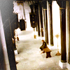
lwena11 with +3 votes.
MODS CHOICE [1 point]:
[absolutelybatty]

wildalyss
[Lovely icon. The black and white looks really nice, and I love the grainy effect. It is like an old timey photograph. Very creative and it stood out!]
[raiindust]
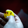
gribouille
[I really love the image choice here. To me, it's incredibly strong in it's message, and really represents the theme. I love that the yellow stands out as well.]
TABLE KEY:
+++ = 1st Place Vote
++ = 2nd Place Vote
+ = 3rd Place Vote | Beginning of a new comment.
Note: Votes are not weighted in this round. Meaning a 1st, 2nd or 3rd vote will only give you 1 point when tallying the votes. Except in the case of a tie - then the icon with the most 1st place votes will be given first.
ICON VOTES

arctic_flowerPOSITIVE VOTES
+++ The colouring is gorgeous in the coloured strip, and the black and white is well contrasted as well. I like that the coloured strip really focuses me on the subjects.
+++ I love the composition, the use of black and white vs. colour, it's very creative.
BEST INTERPRETATION OF THEME
+ In this icon, we're really coming down on Sweeney and Lovett from above and a distance; definitely an aerial shot.
CONSTRUCTIVE VOTES
+ I like the idea of 'color splash', however icon looks a bit oversharpened in the colored part.
+ I really like the use of the black and white to create the focus on the main characters, in a shot where they would otherwise maybe get lost among the extras. I think though, that this icon is a bit over-sharpened. Because of that, the scene loses its dreaminess, and the black and white bits especially look pixelated.
ADDITIONAL VOTES
+ very smart the idea of this splash of color on the two main character :D

giulsssPOSITIVE VOTES
+++ Love the way you've made this icon soft without losing any of the details in it.
++ This icon stands out for how bright and white it is. I love the use of negative space here as well.
+ I like the composition and use of b&w here.
BEST INTERPRETATION OF THEME
None.
CONSTRUCTIVE VOTES
+ I like the choice of crop. This icon has a load of potential. Because there is so much white, I think there needs to be more contrast, particularly with the black parts. The white washes out most of the icon and it becomes difficult to make out the rest of the icon apart from the Queen's face.
ADDITIONAL VOTES
+ Nice us of black and white, but some areas might need some contrast, especially on the left of the icon. Making the dark parts darker around her dress might help.

midnightisclosePOSITIVE VOTES
None.
BEST INTERPRETATION OF THEME
None.
CONSTRUCTIVE VOTES
+ At first, I wasn't quite sure what I was looking at because Serenity is a little oversharpened compared to the soft background. Maybe reducing the sharpness (by using fade sharpen or an unsharpen mask instead) might help with that. :) I like your take on this theme, though!
ADDITIONAL VOTES
None.

collsPOSITIVE VOTES
+ great cropping which fits the theme perfectly, and I like the colouring as well, especially the use of blue.
BEST INTERPRETATION OF THEME
None.
CONSTRUCTIVE VOTES
None.
ADDITIONAL VOTES
None.

lwena11POSITIVE VOTES
+++ Perfect interpretation of the theme in my opinion, and the colouring is very creative.
++ Lovely use of soft coloring. It complements the dry coloring of Minas Tirith.
BEST INTERPRETATION OF THEME
+ No reason given.
+ There's just such a loneliness with this icon that I think goes great with the theme. The icon itself is beautiful as well, with nice contrast, color, and use of natural negative space to add focus.
+ Perfect interpretation of the theme in my opinion, and the colouring is very creative.
CONSTRUCTIVE VOTES
None.
ADDITIONAL VOTES
None.

wildalyssPOSITIVE VOTES
++ Lovely use of black and white - it adds a lot of gravity to your icon.
+ Good contrast and use of texture! I find the figures a little dark, but overall this is a nice icon.
BEST INTERPRETATION OF THEME
None.
CONSTRUCTIVE VOTES
+ I like composition/crop but the grunge texture in the background makes the icon look a bit oversharpened.
+ I like the crop and the choice of black and white. I think the white parts could have been more distinct. Overall lovely icon.
ADDITIONAL VOTES
+ eventhough i can't understand what the people are doing, i adore the use of textures and the b/w coloration :)

fulminant8POSITIVE VOTES
+++ The textures are brilliantly used in this icon. The sort-of gradient inwards helps set Hermione as the focus, and gives the icon a dreamy feel that fits well with the scene.
++ the colouring is absolutely stunning !
++ this seems to be much like "i'm going to face my destiny", and with lateral warm lights is a very scenic icon! adorable :)
+ Good use of texture on the sides of the icon, though I think they might be a touch on the bright side. Good amount of contrast, too.
BEST INTERPRETATION OF THEME
None.
CONSTRUCTIVE VOTES
None.
ADDITIONAL VOTES
None.

alice_tripPOSITIVE VOTES
+ So I'm not entirely sure what's going on here since I don't recognize what it's from, but it looks great! I love the use of the different textures and colors to add more interest.
BEST INTERPRETATION OF THEME
None.
CONSTRUCTIVE VOTES
+ I must admit I have no idea what the icon is about (all I can see is some sort of symbol), though I really like the colours. It looks a bit grainy, maybe solving that and adding a larger crop might help ?
ADDITIONAL VOTES
None.

dudette_in_townPOSITIVE VOTES
+++ I love coloring and shadows/contrast work perfectly here
BEST INTERPRETATION OF THEME
None.
CONSTRUCTIVE VOTES
+ while the cropping is nice the icon appears a bit dark and too greenish on my screen. Balancing it with other colours might solve that ?
ADDITIONAL VOTES
None.

erzsebetPOSITIVE VOTES
++ great use of negative space here.
+ The crop is perfect for this simple icon. I like the understated coloring, allowing the viewer to solely focus on the yellow smiley.
BEST INTERPRETATION OF THEME
+ No reason given.
CONSTRUCTIVE VOTES
+ I really like the bright colouring of this icon! However, with the figure cut off at the bottom the crop feels a little awkward (maybe move her a little further up in the icon, if that's not also where the cap cuts her?), and at the top where you've extended the image, I can see the "seam" between the original image and a duplication, especially where the grass is dark.
+ I like the negative space in your icon, but the duplication at the top (presumably to extend the background?) kind of throws me. I think if you'd moved the duplicated part down a bit, the colors of both caps would have been more similar and easier to blend together smoothly, rather than leaving a line there. As is, the dark spot that's very suddenly cut off keeps drawing my attention, where I should be looking at the person at the bottom.
ADDITIONAL VOTES
None.

gribouillePOSITIVE VOTES
None.
BEST INTERPRETATION OF THEME
None.
CONSTRUCTIVE VOTES
None.
ADDITIONAL VOTES
None.

rocketgirl2POSITIVE VOTES
+++ While the text is not my cup of tea, I think it works because it doesn't interfere with the caps. The blending of the repeated image is absolutely brilliant. Good work on preserving the clarity while getting a crisp blend.
BEST INTERPRETATION OF THEME
+ No reason given.
CONSTRUCTIVE VOTES
+ in my opinion the idea of playing with lights and shadow was very good, but i also think that this icon is too dark :/ i can't see if there are 3 same faces or they are different! thus, i would have used a different font for the text or maybe if you really like that you could have blurred it :) although, the gradient on it is very appropriate fot the rest of the work! also the coloration fits perfectly because it is very misterious and this is a positive point for your icon!
ADDITIONAL VOTES
+ The composition is very creative, and the text well chosen, though a bit difficult to read on my screen, maybe because it is so compact. Also Harry's face appears a bit blurry on all the images.
+ I love the use of blending here, and the colors are dark but fitting for the scene. The text, however, I think stands out a bit too much and doesn't fully fit. Maybe if the text was a deeper blue (like the teal from Harry's shirt perhaps) it may blend in better with the rest of the icon, instead of looking like a separate icon as it does now.

enrianaPOSITIVE VOTES
None.
BEST INTERPRETATION OF THEME
None.
CONSTRUCTIVE VOTES
+ lateral crop is very creative, but this icon seems to be a little bit caotic! it takes me a minute to undestand exactly what the characters are doing. maybe a less darker coloration would have worked good for bella's face and body
ADDITIONAL VOTES
None.
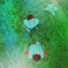
julie_izumiPOSITIVE VOTES
+ perfect interpretation of the theme! and very creative use of texture and coloration
BEST INTERPRETATION OF THEME
+ No reason given.
CONSTRUCTIVE VOTES
+ I like the cap choice, though I think the textures are a bit overpowering. The white/blue blob on the bottom left, for example, stands out more than the characters and is distracting from them.
ADDITIONAL VOTES
+ Nice use of texture and colouring, though you might want to brighten the characters a bit so that they blend less in the background.
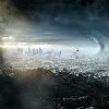
fireinmybonessPOSITIVE VOTES
None.
BEST INTERPRETATION OF THEME
None.
CONSTRUCTIVE VOTES
+ Because your icon has so much negative space, it's hard for me to tell what's going on in it. Also, on my monitor, your icon looks a bit oversharp.
ADDITIONAL VOTES
None.
Updated Scoring Spreadsheet
1ST PLACE [5 points]:

fulminant8 with +4 votes.
2ND PLACE [4 points]:

giulsss with +3 votes.
3RD PLACE [3 points]:

arctic_flower with +2 votes (and all first place votes).
BEST CINEMATOGRAPHY [2 points]:

lwena11 with +3 votes.
MODS CHOICE [1 point]:
[absolutelybatty]

wildalyss
[Lovely icon. The black and white looks really nice, and I love the grainy effect. It is like an old timey photograph. Very creative and it stood out!]
[raiindust]
gribouille
[I really love the image choice here. To me, it's incredibly strong in it's message, and really represents the theme. I love that the yellow stands out as well.]
TABLE KEY:
+++ = 1st Place Vote
++ = 2nd Place Vote
+ = 3rd Place Vote | Beginning of a new comment.
Note: Votes are not weighted in this round. Meaning a 1st, 2nd or 3rd vote will only give you 1 point when tallying the votes. Except in the case of a tie - then the icon with the most 1st place votes will be given first.
ICON VOTES

arctic_flowerPOSITIVE VOTES
+++ The colouring is gorgeous in the coloured strip, and the black and white is well contrasted as well. I like that the coloured strip really focuses me on the subjects.
+++ I love the composition, the use of black and white vs. colour, it's very creative.
BEST INTERPRETATION OF THEME
+ In this icon, we're really coming down on Sweeney and Lovett from above and a distance; definitely an aerial shot.
CONSTRUCTIVE VOTES
+ I like the idea of 'color splash', however icon looks a bit oversharpened in the colored part.
+ I really like the use of the black and white to create the focus on the main characters, in a shot where they would otherwise maybe get lost among the extras. I think though, that this icon is a bit over-sharpened. Because of that, the scene loses its dreaminess, and the black and white bits especially look pixelated.
ADDITIONAL VOTES
+ very smart the idea of this splash of color on the two main character :D

giulsssPOSITIVE VOTES
+++ Love the way you've made this icon soft without losing any of the details in it.
++ This icon stands out for how bright and white it is. I love the use of negative space here as well.
+ I like the composition and use of b&w here.
BEST INTERPRETATION OF THEME
None.
CONSTRUCTIVE VOTES
+ I like the choice of crop. This icon has a load of potential. Because there is so much white, I think there needs to be more contrast, particularly with the black parts. The white washes out most of the icon and it becomes difficult to make out the rest of the icon apart from the Queen's face.
ADDITIONAL VOTES
+ Nice us of black and white, but some areas might need some contrast, especially on the left of the icon. Making the dark parts darker around her dress might help.

midnightisclosePOSITIVE VOTES
None.
BEST INTERPRETATION OF THEME
None.
CONSTRUCTIVE VOTES
+ At first, I wasn't quite sure what I was looking at because Serenity is a little oversharpened compared to the soft background. Maybe reducing the sharpness (by using fade sharpen or an unsharpen mask instead) might help with that. :) I like your take on this theme, though!
ADDITIONAL VOTES
None.

collsPOSITIVE VOTES
+ great cropping which fits the theme perfectly, and I like the colouring as well, especially the use of blue.
BEST INTERPRETATION OF THEME
None.
CONSTRUCTIVE VOTES
None.
ADDITIONAL VOTES
None.

lwena11POSITIVE VOTES
+++ Perfect interpretation of the theme in my opinion, and the colouring is very creative.
++ Lovely use of soft coloring. It complements the dry coloring of Minas Tirith.
BEST INTERPRETATION OF THEME
+ No reason given.
+ There's just such a loneliness with this icon that I think goes great with the theme. The icon itself is beautiful as well, with nice contrast, color, and use of natural negative space to add focus.
+ Perfect interpretation of the theme in my opinion, and the colouring is very creative.
CONSTRUCTIVE VOTES
None.
ADDITIONAL VOTES
None.

wildalyssPOSITIVE VOTES
++ Lovely use of black and white - it adds a lot of gravity to your icon.
+ Good contrast and use of texture! I find the figures a little dark, but overall this is a nice icon.
BEST INTERPRETATION OF THEME
None.
CONSTRUCTIVE VOTES
+ I like composition/crop but the grunge texture in the background makes the icon look a bit oversharpened.
+ I like the crop and the choice of black and white. I think the white parts could have been more distinct. Overall lovely icon.
ADDITIONAL VOTES
+ eventhough i can't understand what the people are doing, i adore the use of textures and the b/w coloration :)

fulminant8POSITIVE VOTES
+++ The textures are brilliantly used in this icon. The sort-of gradient inwards helps set Hermione as the focus, and gives the icon a dreamy feel that fits well with the scene.
++ the colouring is absolutely stunning !
++ this seems to be much like "i'm going to face my destiny", and with lateral warm lights is a very scenic icon! adorable :)
+ Good use of texture on the sides of the icon, though I think they might be a touch on the bright side. Good amount of contrast, too.
BEST INTERPRETATION OF THEME
None.
CONSTRUCTIVE VOTES
None.
ADDITIONAL VOTES
None.

alice_tripPOSITIVE VOTES
+ So I'm not entirely sure what's going on here since I don't recognize what it's from, but it looks great! I love the use of the different textures and colors to add more interest.
BEST INTERPRETATION OF THEME
None.
CONSTRUCTIVE VOTES
+ I must admit I have no idea what the icon is about (all I can see is some sort of symbol), though I really like the colours. It looks a bit grainy, maybe solving that and adding a larger crop might help ?
ADDITIONAL VOTES
None.

dudette_in_townPOSITIVE VOTES
+++ I love coloring and shadows/contrast work perfectly here
BEST INTERPRETATION OF THEME
None.
CONSTRUCTIVE VOTES
+ while the cropping is nice the icon appears a bit dark and too greenish on my screen. Balancing it with other colours might solve that ?
ADDITIONAL VOTES
None.

erzsebetPOSITIVE VOTES
++ great use of negative space here.
+ The crop is perfect for this simple icon. I like the understated coloring, allowing the viewer to solely focus on the yellow smiley.
BEST INTERPRETATION OF THEME
+ No reason given.
CONSTRUCTIVE VOTES
+ I really like the bright colouring of this icon! However, with the figure cut off at the bottom the crop feels a little awkward (maybe move her a little further up in the icon, if that's not also where the cap cuts her?), and at the top where you've extended the image, I can see the "seam" between the original image and a duplication, especially where the grass is dark.
+ I like the negative space in your icon, but the duplication at the top (presumably to extend the background?) kind of throws me. I think if you'd moved the duplicated part down a bit, the colors of both caps would have been more similar and easier to blend together smoothly, rather than leaving a line there. As is, the dark spot that's very suddenly cut off keeps drawing my attention, where I should be looking at the person at the bottom.
ADDITIONAL VOTES
None.
gribouillePOSITIVE VOTES
None.
BEST INTERPRETATION OF THEME
None.
CONSTRUCTIVE VOTES
None.
ADDITIONAL VOTES
None.

rocketgirl2POSITIVE VOTES
+++ While the text is not my cup of tea, I think it works because it doesn't interfere with the caps. The blending of the repeated image is absolutely brilliant. Good work on preserving the clarity while getting a crisp blend.
BEST INTERPRETATION OF THEME
+ No reason given.
CONSTRUCTIVE VOTES
+ in my opinion the idea of playing with lights and shadow was very good, but i also think that this icon is too dark :/ i can't see if there are 3 same faces or they are different! thus, i would have used a different font for the text or maybe if you really like that you could have blurred it :) although, the gradient on it is very appropriate fot the rest of the work! also the coloration fits perfectly because it is very misterious and this is a positive point for your icon!
ADDITIONAL VOTES
+ The composition is very creative, and the text well chosen, though a bit difficult to read on my screen, maybe because it is so compact. Also Harry's face appears a bit blurry on all the images.
+ I love the use of blending here, and the colors are dark but fitting for the scene. The text, however, I think stands out a bit too much and doesn't fully fit. Maybe if the text was a deeper blue (like the teal from Harry's shirt perhaps) it may blend in better with the rest of the icon, instead of looking like a separate icon as it does now.

enrianaPOSITIVE VOTES
None.
BEST INTERPRETATION OF THEME
None.
CONSTRUCTIVE VOTES
+ lateral crop is very creative, but this icon seems to be a little bit caotic! it takes me a minute to undestand exactly what the characters are doing. maybe a less darker coloration would have worked good for bella's face and body
ADDITIONAL VOTES
None.

julie_izumiPOSITIVE VOTES
+ perfect interpretation of the theme! and very creative use of texture and coloration
BEST INTERPRETATION OF THEME
+ No reason given.
CONSTRUCTIVE VOTES
+ I like the cap choice, though I think the textures are a bit overpowering. The white/blue blob on the bottom left, for example, stands out more than the characters and is distracting from them.
ADDITIONAL VOTES
+ Nice use of texture and colouring, though you might want to brighten the characters a bit so that they blend less in the background.

fireinmybonessPOSITIVE VOTES
None.
BEST INTERPRETATION OF THEME
None.
CONSTRUCTIVE VOTES
+ Because your icon has so much negative space, it's hard for me to tell what's going on in it. Also, on my monitor, your icon looks a bit oversharp.
ADDITIONAL VOTES
None.
Updated Scoring Spreadsheet