Round 3 - Challenge 12 - Results
ROUND 3 - CHALLENGE 12 - RESULTS
1ST PLACE [5 points]:

alice_trip with +5 votes.
2ND PLACE [4 points]:

arctic_flower with +4 votes.
3RD PLACE [3 points]:
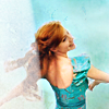
lwena11 with +3 votes [And more first place votes].
BEST CINEMATOGRAPHY [2 points]:

alice_trip with +3 votes.
MODS CHOICE [1 point]:
[absolutelybatty]

midnightisclose
Love the choice of texture here. It seems to match the sense of wonderment in her expression.
[raiindust]

dudette_in_town
There's a lovely softness to this icon that I really enjoy. The neutral colour scheme is beautiful as well.
TABLE KEY:
+++ = 1st Place Vote
++ = 2nd Place Vote
+ = 3rd Place Vote | Beginning of a new comment.
Note: Votes are not weighted in this round. Meaning a 1st, 2nd or 3rd vote will only give you 1 point when tallying the votes. Except in the case of a tie - then the icon with the most 1st place votes will be given first.
ICON VOTES
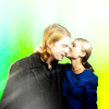
julie_izumiPOSITIVE VOTES
NONE.
BEST INTERPRETATION OF THEME
NONE.
CONSTRUCTIVE VOTES
+ I really do love the coloring of the subjects but I feel the yellow-green background doesn't match them. Its too light and vibrant, also the fading of white light to color kind of unbalances the icons. Perhaps a darker texture, with more blues to match Fleurs coat and tie it in.
ADDITIONAL VOTES
NONE.
arctic_flowerPOSITIVE VOTES
+ The yellow background here is suited very nicely. The balances of light to darker yellow enhance the composition and help pull out the subject from the icon. Very nice cleaning up the edges! Overall great job :)
++ Great job removing the background and wonderful colouring on Gimli (bright and natural). The background is interesting without being distracting and fits with the rest of the icon.
++ very cute negative space and use of texture; yellow matches very well with characters personality!
+++ Lovely cut out, and the choice of texture is great!
BEST INTERPRETATION OF THEME
NONE.
CONSTRUCTIVE VOTES
NONE.
ADDITIONAL VOTES
+ I like the background you added in, and the colors are nice. My only complaint is that his face looks a tad too sharp and a tad too vibrant. If you lowered those settings just a bit, it'd be perfect!
dudette_in_townPOSITIVE VOTES
++ I love the simple composition, the background color is nice and solid and really makes the subject the complete focus of the icon. The coloring isn't too strong so you distinguish her facial features, which is nice.
BEST INTERPRETATION OF THEME
NONE.
CONSTRUCTIVE VOTES
+ I love the colouring you've achieved on your subject here, but the background is a little plain (it looks like it needs to have some texture added, and maybe to be made a little lighter to brighten up the icon as a whole).
+ your cutting the screencpa is PERFECT, really.. but the background is very flat and faded! i would have used warm coloured textures set to softlight in order to give many shades to the orange, and b/w textures set to screen to provide lights effects :)
+ the character appears a bit dark on my screen, maybe playing with the levels might solve that. Moreover, the background seems a bit empty, adding a few brushes might be nice.
ADDITIONAL VOTES
NONE.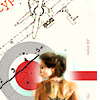
fireinmybonessPOSITIVE VOTES
+ I like the brushes you used, and the composition is brilliant.
BEST INTERPRETATION OF THEME
NONE.
CONSTRUCTIVE VOTES
+ The choice of image and the choice of background here are really well thought out. However, the actual merging of the two seems a bit unfinished. The cut out of the woman isn't clear. You can see traces of the original screencap, and in other places the texture overlaps parts of the screencap. It seems as though she was added as an afterthought instead of deliberately. In order to clean this up a bit, I would first recommend making her just a little bigger so she stands out a little more. Then, since it seems as though you've used a layer mask, I would recommend using the magnifying tool and a smaller brush so you can really mask away the details. You want your cut out lines to be very clear and precise so that the overall icon looks clean.
ADDITIONAL VOTES
NONE.
fulminant8POSITIVE VOTES
NONE.
BEST INTERPRETATION OF THEME
NONE.
CONSTRUCTIVE VOTES
+ It's really difficult to see Ariadne's face. I think there's a texture here, on some setting (screen, maybe?) that's making her look purplish in some areas and too pink in her face; the white texture is also a little too overpowering. Putting those texture layers on a lower opacity and/or fill would do wonders! I also think you may have accidentally removed part of the top of her head.
ADDITIONAL VOTES
NONE.
rocketgirl2POSITIVE VOTES
++ I love the warm vivid coloring here. I think the faded background effect is perfect because it doesn't overwhelm Ron.
BEST INTERPRETATION OF THEME
+ No reason left.
CONSTRUCTIVE VOTES
+ though the use of texture is very nice, Ron appears very dark (especially his hair) on my screen, you might want to use levels to solve that problem.
ADDITIONAL VOTES
+ I like the background and vibrancy of colors but it looks like there was some quality loss. It's a little hard to see Ron's face, which I think might be caused by vibrance. If you took a low-opacity eraser brush to his face you'd keep some of that but I think it'd look a lot clearer.
+ i just want to say a tinytiny thing about this beautiful icon: the black of ron's sweater stands out a lot compared to the rest. nevermind, this is just a minimalistic thing :P

giulsssPOSITIVE VOTES
+ this icon is fascinating, I love the composition, the background you chose, the use of colours and the brush you added. Well done !
BEST INTERPRETATION OF THEME
+ The background removal is well done here and while I find the floating head a little disconcerting (where's her body?) overall the icon works well!
CONSTRUCTIVE VOTES
NONE.
ADDITIONAL VOTES
NONE.
wildalyssPOSITIVE VOTES
+ Lovely composition and a good choice of using a simple green backdrop to match the character.
+++ The background you've used as the replacement in this image is gorgeous, and fits in with the colouring you've used perfectly. I also like the way that you've repeated to get a close up on Kick-Ass' face.
+ The colors here are really beautiful and I like the composition!
BEST INTERPRETATION OF THEME
NONE.
CONSTRUCTIVE VOTES
NONE.
ADDITIONAL VOTES
+ Nice colouring and great use of rotation ! I just think the light brush on the right image is unnecessary, it just makes his head appear a bit too bright.
alice_tripPOSITIVE VOTES
+++ The coloring, cropping and overal composition of this icon is fantastic! The way the baby is positioned on the apple, and just the apple in general, are great. The coloring and light use in the background doesn't overpower the icon. All of these components make it really unique and eye-catching.
+++ While fake, wacky backdrops always leave me uneasy, I absolutely love the texture you used. It's youthful and very fitting with the subject without being distracting. The light texture is also a wonderful touch in focusing the icon on the subject.
+ I like the way that you've replaced the background with another symbol, rather than just using a solid colour or a little bit of texture (since I'm not familiar with the original source, I'm also assuming that the apple also means something? Maybe not :) ). The white light textures also work well here.
++ This icon is so beautifully vibrant. I like the background you added, although I'm not totally sure of the significance. I also really love the whiteish texture you added, it's lovely!
+ eventhough baby's shape doesn't blend perfectly with the background and it's a little bit oversharpened, colouring and texture using is adorable! expecially apple :)
+ Technically, a very sound icon, and I love the choice of background: very creative!
BEST INTERPRETATION OF THEME
+ No reason left.
+ No reason left.
+ No reason left.
CONSTRUCTIVE VOTES
NONE.
ADDITIONAL VOTES
NONE.
enrianaPOSITIVE VOTES
NONE.
BEST INTERPRETATION OF THEME
+ Lovely colouring and nice use of duplicate and texture.
CONSTRUCTIVE VOTES
+ you have chosen a perfect texture for the background which repeats the hermione's skin/dress/hair colours, but the overall effect is a little bit opaque. maybe a more vibrant and brighten colouring would have given to the icon what it needs to stand out among the others :)
ADDITIONAL VOTES
NONE.
erzsebetPOSITIVE VOTES
+++ I love the coloring here. It's so vibrant and pretty. Also, great use of text!
++ The subjects are cut out very clearly, and the blending is flawless. Love the color scheme as well.
BEST INTERPRETATION OF THEME
NONE.
CONSTRUCTIVE VOTES
+ I really enjoy the composition as a whole; lighting and blending are spot on. I think the text placement is a bit odd that is makes 2/3 of the icon look too busy. It could be higher above Charles' head or been excluded altogether.
ADDITIONAL VOTES
+ I love the composition of this icon, the background, the very bright colouring. The text though seems unnecessary, especially since it's a bit too close to Xavier's head in my opinion. I think the icon would be fine without that text.
collsPOSITIVE VOTES
NONE.
BEST INTERPRETATION OF THEME
NONE.
CONSTRUCTIVE VOTES
NONE.
ADDITIONAL VOTES
NONE.
midnightisclosePOSITIVE VOTES
NONE.
BEST INTERPRETATION OF THEME
NONE.
CONSTRUCTIVE VOTES
+ I like the texture and lighting. I think the edges of Ariadne is a bit sharp and it could be smoother.
+ The texture choice is lovely, but the overall icon seems quite sharp on my monitor especially in the lines at the top of her head. Using the blur tool and/or one of the blur options available to you, I would blur these lines a little, or fade whatever method of sharpening you used so that these lines weren't quite so jagged.
ADDITIONAL VOTES
+ I love the background you created. The only thing you could add in my opinion would be to make the character a bit more colourful, for instance enhancing the red of her jacket.
gribouillePOSITIVE VOTES
NONE.
BEST INTERPRETATION OF THEME
NONE.
CONSTRUCTIVE VOTES
+ The double image here is very distraction, because there is such a noticeable distinction. Perhaps moving the black and white one so that it is more under the original image, maybe more like a shadow? To help balance out the composition.
+ I like the way that you duplicated your subject - it's a really interesting idea! However, the coloured version is a little on the dark side, especially with such a dark background, and the background feels really disconnected from the subject of your icon. Maybe using a more coloured background might tie the icon together better.
+ I like the idea, but I'm not sure it really works here. Removing the background around that much of a person can be tricky, especially with hair, and I don't think this photo works best for this technique. Her face also seems a little blurry; just a bit of sharpening would help. Lastly, I think there needs to be more contrast so you can see her face better. Either Levels or Curves will fix it!
ADDITIONAL VOTES
NONE.
lwena11POSITIVE VOTES
+++ perfect cutting of the image and lovely combo between orange and turquoise! very apt the texture on the left, too
+ The movement in this icon is wonderful. The choice of texture is great as well!
+++ great choic of texture for the background, the colouring is very nice as well, very vibrant.
BEST INTERPRETATION OF THEME
NONE.
CONSTRUCTIVE VOTES
NONE.
ADDITIONAL VOTES
+ I like the coloring here, but I think the white texture takes away from the icon. Maybe if you added a layer mask and removed it from her hair and arm it'd look a lot better, and you'd still have it underneath her.
Updated Scoring Spreadsheet
1ST PLACE [5 points]:

alice_trip with +5 votes.
2ND PLACE [4 points]:

arctic_flower with +4 votes.
3RD PLACE [3 points]:

lwena11 with +3 votes [And more first place votes].
BEST CINEMATOGRAPHY [2 points]:

alice_trip with +3 votes.
MODS CHOICE [1 point]:
[absolutelybatty]

midnightisclose
Love the choice of texture here. It seems to match the sense of wonderment in her expression.
[raiindust]

dudette_in_town
There's a lovely softness to this icon that I really enjoy. The neutral colour scheme is beautiful as well.
TABLE KEY:
+++ = 1st Place Vote
++ = 2nd Place Vote
+ = 3rd Place Vote | Beginning of a new comment.
Note: Votes are not weighted in this round. Meaning a 1st, 2nd or 3rd vote will only give you 1 point when tallying the votes. Except in the case of a tie - then the icon with the most 1st place votes will be given first.
ICON VOTES

julie_izumiPOSITIVE VOTES
NONE.
BEST INTERPRETATION OF THEME
NONE.
CONSTRUCTIVE VOTES
+ I really do love the coloring of the subjects but I feel the yellow-green background doesn't match them. Its too light and vibrant, also the fading of white light to color kind of unbalances the icons. Perhaps a darker texture, with more blues to match Fleurs coat and tie it in.
ADDITIONAL VOTES
NONE.

arctic_flowerPOSITIVE VOTES
+ The yellow background here is suited very nicely. The balances of light to darker yellow enhance the composition and help pull out the subject from the icon. Very nice cleaning up the edges! Overall great job :)
++ Great job removing the background and wonderful colouring on Gimli (bright and natural). The background is interesting without being distracting and fits with the rest of the icon.
++ very cute negative space and use of texture; yellow matches very well with characters personality!
+++ Lovely cut out, and the choice of texture is great!
BEST INTERPRETATION OF THEME
NONE.
CONSTRUCTIVE VOTES
NONE.
ADDITIONAL VOTES
+ I like the background you added in, and the colors are nice. My only complaint is that his face looks a tad too sharp and a tad too vibrant. If you lowered those settings just a bit, it'd be perfect!

dudette_in_townPOSITIVE VOTES
++ I love the simple composition, the background color is nice and solid and really makes the subject the complete focus of the icon. The coloring isn't too strong so you distinguish her facial features, which is nice.
BEST INTERPRETATION OF THEME
NONE.
CONSTRUCTIVE VOTES
+ I love the colouring you've achieved on your subject here, but the background is a little plain (it looks like it needs to have some texture added, and maybe to be made a little lighter to brighten up the icon as a whole).
+ your cutting the screencpa is PERFECT, really.. but the background is very flat and faded! i would have used warm coloured textures set to softlight in order to give many shades to the orange, and b/w textures set to screen to provide lights effects :)
+ the character appears a bit dark on my screen, maybe playing with the levels might solve that. Moreover, the background seems a bit empty, adding a few brushes might be nice.
ADDITIONAL VOTES
NONE.

fireinmybonessPOSITIVE VOTES
+ I like the brushes you used, and the composition is brilliant.
BEST INTERPRETATION OF THEME
NONE.
CONSTRUCTIVE VOTES
+ The choice of image and the choice of background here are really well thought out. However, the actual merging of the two seems a bit unfinished. The cut out of the woman isn't clear. You can see traces of the original screencap, and in other places the texture overlaps parts of the screencap. It seems as though she was added as an afterthought instead of deliberately. In order to clean this up a bit, I would first recommend making her just a little bigger so she stands out a little more. Then, since it seems as though you've used a layer mask, I would recommend using the magnifying tool and a smaller brush so you can really mask away the details. You want your cut out lines to be very clear and precise so that the overall icon looks clean.
ADDITIONAL VOTES
NONE.

fulminant8POSITIVE VOTES
NONE.
BEST INTERPRETATION OF THEME
NONE.
CONSTRUCTIVE VOTES
+ It's really difficult to see Ariadne's face. I think there's a texture here, on some setting (screen, maybe?) that's making her look purplish in some areas and too pink in her face; the white texture is also a little too overpowering. Putting those texture layers on a lower opacity and/or fill would do wonders! I also think you may have accidentally removed part of the top of her head.
ADDITIONAL VOTES
NONE.

rocketgirl2POSITIVE VOTES
++ I love the warm vivid coloring here. I think the faded background effect is perfect because it doesn't overwhelm Ron.
BEST INTERPRETATION OF THEME
+ No reason left.
CONSTRUCTIVE VOTES
+ though the use of texture is very nice, Ron appears very dark (especially his hair) on my screen, you might want to use levels to solve that problem.
ADDITIONAL VOTES
+ I like the background and vibrancy of colors but it looks like there was some quality loss. It's a little hard to see Ron's face, which I think might be caused by vibrance. If you took a low-opacity eraser brush to his face you'd keep some of that but I think it'd look a lot clearer.
+ i just want to say a tinytiny thing about this beautiful icon: the black of ron's sweater stands out a lot compared to the rest. nevermind, this is just a minimalistic thing :P

giulsssPOSITIVE VOTES
+ this icon is fascinating, I love the composition, the background you chose, the use of colours and the brush you added. Well done !
BEST INTERPRETATION OF THEME
+ The background removal is well done here and while I find the floating head a little disconcerting (where's her body?) overall the icon works well!
CONSTRUCTIVE VOTES
NONE.
ADDITIONAL VOTES
NONE.

wildalyssPOSITIVE VOTES
+ Lovely composition and a good choice of using a simple green backdrop to match the character.
+++ The background you've used as the replacement in this image is gorgeous, and fits in with the colouring you've used perfectly. I also like the way that you've repeated to get a close up on Kick-Ass' face.
+ The colors here are really beautiful and I like the composition!
BEST INTERPRETATION OF THEME
NONE.
CONSTRUCTIVE VOTES
NONE.
ADDITIONAL VOTES
+ Nice colouring and great use of rotation ! I just think the light brush on the right image is unnecessary, it just makes his head appear a bit too bright.

alice_tripPOSITIVE VOTES
+++ The coloring, cropping and overal composition of this icon is fantastic! The way the baby is positioned on the apple, and just the apple in general, are great. The coloring and light use in the background doesn't overpower the icon. All of these components make it really unique and eye-catching.
+++ While fake, wacky backdrops always leave me uneasy, I absolutely love the texture you used. It's youthful and very fitting with the subject without being distracting. The light texture is also a wonderful touch in focusing the icon on the subject.
+ I like the way that you've replaced the background with another symbol, rather than just using a solid colour or a little bit of texture (since I'm not familiar with the original source, I'm also assuming that the apple also means something? Maybe not :) ). The white light textures also work well here.
++ This icon is so beautifully vibrant. I like the background you added, although I'm not totally sure of the significance. I also really love the whiteish texture you added, it's lovely!
+ eventhough baby's shape doesn't blend perfectly with the background and it's a little bit oversharpened, colouring and texture using is adorable! expecially apple :)
+ Technically, a very sound icon, and I love the choice of background: very creative!
BEST INTERPRETATION OF THEME
+ No reason left.
+ No reason left.
+ No reason left.
CONSTRUCTIVE VOTES
NONE.
ADDITIONAL VOTES
NONE.

enrianaPOSITIVE VOTES
NONE.
BEST INTERPRETATION OF THEME
+ Lovely colouring and nice use of duplicate and texture.
CONSTRUCTIVE VOTES
+ you have chosen a perfect texture for the background which repeats the hermione's skin/dress/hair colours, but the overall effect is a little bit opaque. maybe a more vibrant and brighten colouring would have given to the icon what it needs to stand out among the others :)
ADDITIONAL VOTES
NONE.

erzsebetPOSITIVE VOTES
+++ I love the coloring here. It's so vibrant and pretty. Also, great use of text!
++ The subjects are cut out very clearly, and the blending is flawless. Love the color scheme as well.
BEST INTERPRETATION OF THEME
NONE.
CONSTRUCTIVE VOTES
+ I really enjoy the composition as a whole; lighting and blending are spot on. I think the text placement is a bit odd that is makes 2/3 of the icon look too busy. It could be higher above Charles' head or been excluded altogether.
ADDITIONAL VOTES
+ I love the composition of this icon, the background, the very bright colouring. The text though seems unnecessary, especially since it's a bit too close to Xavier's head in my opinion. I think the icon would be fine without that text.

collsPOSITIVE VOTES
NONE.
BEST INTERPRETATION OF THEME
NONE.
CONSTRUCTIVE VOTES
NONE.
ADDITIONAL VOTES
NONE.

midnightisclosePOSITIVE VOTES
NONE.
BEST INTERPRETATION OF THEME
NONE.
CONSTRUCTIVE VOTES
+ I like the texture and lighting. I think the edges of Ariadne is a bit sharp and it could be smoother.
+ The texture choice is lovely, but the overall icon seems quite sharp on my monitor especially in the lines at the top of her head. Using the blur tool and/or one of the blur options available to you, I would blur these lines a little, or fade whatever method of sharpening you used so that these lines weren't quite so jagged.
ADDITIONAL VOTES
+ I love the background you created. The only thing you could add in my opinion would be to make the character a bit more colourful, for instance enhancing the red of her jacket.
gribouillePOSITIVE VOTES
NONE.
BEST INTERPRETATION OF THEME
NONE.
CONSTRUCTIVE VOTES
+ The double image here is very distraction, because there is such a noticeable distinction. Perhaps moving the black and white one so that it is more under the original image, maybe more like a shadow? To help balance out the composition.
+ I like the way that you duplicated your subject - it's a really interesting idea! However, the coloured version is a little on the dark side, especially with such a dark background, and the background feels really disconnected from the subject of your icon. Maybe using a more coloured background might tie the icon together better.
+ I like the idea, but I'm not sure it really works here. Removing the background around that much of a person can be tricky, especially with hair, and I don't think this photo works best for this technique. Her face also seems a little blurry; just a bit of sharpening would help. Lastly, I think there needs to be more contrast so you can see her face better. Either Levels or Curves will fix it!
ADDITIONAL VOTES
NONE.

lwena11POSITIVE VOTES
+++ perfect cutting of the image and lovely combo between orange and turquoise! very apt the texture on the left, too
+ The movement in this icon is wonderful. The choice of texture is great as well!
+++ great choic of texture for the background, the colouring is very nice as well, very vibrant.
BEST INTERPRETATION OF THEME
NONE.
CONSTRUCTIVE VOTES
NONE.
ADDITIONAL VOTES
+ I like the coloring here, but I think the white texture takes away from the icon. Maybe if you added a layer mask and removed it from her hair and arm it'd look a lot better, and you'd still have it underneath her.
Updated Scoring Spreadsheet