Round 9 - Challenge 08 - Results
ROUND 9 - CHALLENGE 08 - RESULTS
1ST PLACE [5 points]:

12feethigh with +7 votes.
2ND PLACE [4 points]:

margerydaw_s2 with +4 votes.
3RD PLACE [3 points]:

&
angelamaria & rocketgirl2 with +3 votes (with an equal number of votes and the most first place votes).
BEST INTERPRETATION [2 points]:

regis with +3 votes.
MODS CHOICE [1 point]:
absolutelybatty
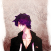
kayable
[This is a gorgeous icon! I love the texture work, and the coloring is really wonderful as well.]
raiindust

marcasite
[Stunning use of lighting here, and the negative space is particularly well used as well.]
TABLE KEY:
+++ = 1st Place Vote
++ = 2nd Place Vote
+ = 3rd Place Vote | Beginning of a new comment.
Note: Votes are not weighted in this round. Meaning a 1st, 2nd or 3rd vote will only give you 1 point when tallying the votes. Except in the case of a tie - then the icon with the most 1st place votes will be given first.
ICON VOTES

mm3butterflyPOSITIVE VOTES
+++ The use of monochrome coloring on this icon is stunning, it looks like an ancient Greek statue! I love the crop as well, together with the coloring it gives the icon a very elegant feel.
++ Love the simplicity and crop.
BEST INTERPRETATION
None.
CONSTRUCTIVE VOTES
+ The brightness of this icon is really, really pretty and her expression is gorgeous. I think that the maker needs to adjust her sharpen layer or work on manual smudging because some parts (the shadows and her eyelashes) appear over pixelated on my monitor.
+ Her features (especially the right eye) look very oversharpened which is distracting, especially since the rest of the icon is so bright and a bit blurry. I'd add a few blacks here and there (black blobs + soft light layer for instance ?) to make the face stand out a tiny bit more, and lower the opacity of your sharpened layer. Other than that the colouring is nice.
+ I like the simplicity of your icon, but your subject blends into the background a little bit because everything is very much the same color. I think either darkening or lightening the background just a smidge to set her apart would do wonders for your icon!
+ Lovely crop! I really love the crop chosen, but I feel the monochrome scheme is not doing the icon any favors. It feels a little "flat", not enough shadows or contrast, and the loveliness of her hair feels a bit "drab" though I can see some really lovely shadow/contrast work can be done out of it. Sepia/muted doesn't mean lack of contrast, maybe build up some shadows via a black brush set on soft light along places where shadow would be, and/or a b/w gradient set on soft light?
ADDITIONAL VOTES
None.

val_valeriePOSITIVE VOTES
+ I really like this icon a lot. The crop, the border, it all works really well. The grungy texture seems a tad too overpowering, but that's just my opinion.
BEST INTERPRETATION
+ Such a clever choice of cap! This cap of Snow suits the challenge really well and I love the frame :) Concrit wise, the sharpening along her jaw and the neckline of he clothes seems a bit strong. Alternatively, the skin on her face seems a bit too smooth. Maybe check your sharpen/blur layers to rectify that.
CONSTRUCTIVE VOTES
+ The icon appears a bit too grainy which makes it look LQ, also the bright pink bow is very distracting. I think the grainy aspect would be ok if it weren't for the frame that looks a little overboard. Without the frame you'd get a simpler, grungy looking icon. Also lower the opacity of the pink colouring so that it's not so distracting - especially since the rest of the colouring is very nice.
+ I think this icon has great potential, but there are a few issues that need to be fixed first. The textures are a bit too strong here, especially the grungy one(s) - they make the icon look rather LQ, toning them down would help a lot. Also, her hair blends with the background, especially on the right side; either the hair or the background could be a touch darker/brighter.
+ Great colouring on this icon overall but I feel like the left side of her face is a tad to bright to fit the overall colours. It stands out too much and makes her head look a bit alien. maybe try to lower the brightness there.
ADDITIONAL VOTES
None.

vampire_sessahPOSITIVE VOTES
+ I really like what you've done with this icon, the colouring and the two borders are lovely.
+ Good use of texture for the background, and the soft colouring is vry nice.
+ I love your coloring and texture use. I think either matching the colors of the cap more closely to the texture to make everything fit together or differentiating colors more could make your icon stand out a bit more, though.
BEST INTERPRETATION
None.
CONSTRUCTIVE VOTES
None.
ADDITIONAL VOTES
None.

marcasitePOSITIVE VOTES
+ Love the negative space scop and the tone and lighting.
BEST INTERPRETATION
None.
CONSTRUCTIVE VOTES
None.
ADDITIONAL VOTES
+ I really love the simple look of the icon and the use of negative space, I'd just lower the opacity of the brushes/light on the characters so that they stand out a bit more against the white background.

12feethighPOSITIVE VOTES
+++ I adore the shadows and the monochrome colouring! It fits the theme really well! I also love the complexity you added to the icon via the composition!
+++ Great composition, it's complex but you can still see everything that's going on, well done.
+++ The texture use and composition here are stunning. I love this piece.
++ The composition here is lovely, and the dark coloring works well with the image and the mood of the icon. The typography is great too, but I wish I could read the smaller text.
++ I love the composition of this icon (although her top right part of her head is a slight bit over contrasted).
+ composition is interesting and I like the text use.
+ The composition is stellar and I love the font however bits of the icon, some of the curls of her hair and the text seem a bit sharp on my monitor.
BEST INTERPRETATION
+ No reason given.
CONSTRUCTIVE VOTES
None.
ADDITIONAL VOTES
None.

sheekapPOSITIVE VOTES
None.
BEST INTERPRETATION
None.
CONSTRUCTIVE VOTES
+ The masking and/or cutting out is really wonderful in here, but I don't think it fits too much with the background texture. Perhaps if the subject was brighter, or if the texture was darker, the icon will be much better.
+ I love the texture work in the background but the image itself looks a little lq to me.
+ the cutout is amazingly well done but the character seems to look like she doesn't really belong there, stands apart from the background. Perhaps lightening the character a little bit will help blend the character and the background.
+ Right now your subject is almost darkest part of your icon, and is kind of...overwhelmed, I guess by the lightness of the background. Lightening her up a bit would make her stand out more, and also probably make her fit in better with the rest of the piece.
ADDITIONAL VOTES
+ Nice use of texture for the background, it fits the theme well, but the character appears a bit too dark and bland against it, you might want to make her colours pop up a bit more or make her look brighter to arrange it. Even a simple duplicated layer + Screen (with varied opacity to make sure the face doesn't appear washed out) would surely do the trick.

kayablePOSITIVE VOTES
++ Nice use of texture and negative space, and I love the colouring !
BEST INTERPRETATION
None.
CONSTRUCTIVE VOTES
+ I love the splash of his purple hair against the sepia background but I think that the white border on both sides is distracting me a little. If the maker really wanted a border then maybe a dark brown picked from the icon would have worked better?
ADDITIONAL VOTES
+ I love the purple of his hair! I think the icon would look better without the white texture on the sides, the pattern on the back is awesome.

regisPOSITIVE VOTES
+++ Oh man. SO CREATIVE. I love how the maker has turned it into a photo stuck inside a book, like memories. The coloring is also to die for. Fantastic work.
+ I like the slight rotation of Arthur in this and also the muted, brown-ish colouring. It really fits the cap and the insertion of the book serving as a frame it very creative.
BEST INTERPRETATION
+ No reason given.
+ Hands down the most interesting icon I've seen so far from this round.
+ Very creative interpretation of the theme !
CONSTRUCTIVE VOTES
None.
ADDITIONAL VOTES
None.

angelamariaPOSITIVE VOTES
+++ creativity is amazing.
+++ I love the broken mirror effect you've used in this, it's just a gorgeous icon!
++ This icon is so damn creative! I love that you added the broken mirror effect to it because it makes the icon stand out. I also really like the overall vintage feel which you nailed perfectly via colouring, textures and composition.
BEST INTERPRETATION
+ No reason given.
+ No reason given.
CONSTRUCTIVE VOTES
None.
ADDITIONAL VOTES
None.

margerydaw_s2POSITIVE VOTES
++ I really like the pale colours in this, it looks beautiful.
++ The muted coloring, the crop, the shadow/light play--really, really well done. I love how crisp and in focus her face is. Flawless icon!
++ Really unusual coloring for this fandom. I think the brown/sepia monotone suits her expression really well and the only critique I can give is that the texture over the right cheek, and the bits of her hair on the right and to the left of her face below her ear could possible be masked out a bit because they're giving the icon a blurry look. That's really just me nitpicking though and this is a beautiful icon.
++ I love the simplicity of this icon, and it has great lighting!
BEST INTERPRETATION
+ No reason given.
CONSTRUCTIVE VOTES
None.
ADDITIONAL VOTES
+ Very nice close crop and colouring ! You could just maker her pop up a bit more by adding a few dark tones around her neck for instance.

rocketgirl2POSITIVE VOTES
+++ I love the colouring, the close crop and the icon seems so soft yet crisp in all the right places.
+++ I love the lighting on this icon and the grunge textures are used and placed beautifully! I also really love how the author managed to get that perfect mixture of grunge and vibrancy. Great job!
+ I love the coloring here - the vibrant tones really make this icon stand out. The texture use is very good as well, though I'd suggest erasing the rectangular bits on the upper left and bottom right corners.
BEST INTERPRETATION
None.
CONSTRUCTIVE VOTES
None.
ADDITIONAL VOTES
None.
ellaangelusPOSITIVE VOTES
None.
BEST INTERPRETATION
None.
CONSTRUCTIVE VOTES
None.
ADDITIONAL VOTES
None.
gribouillePOSITIVE VOTES
None.
BEST INTERPRETATION
None.
CONSTRUCTIVE VOTES
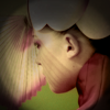
+ I like the crop of this icon a lot but the black border that becomes very blurry on the inner edges makes the icon appear really muddy and takes away from the subject.
+ I think this icon will look much better if the dark borders around it weren't there. It just makes it a bit too obscure.
+ I think the different elements that you've placed together makes this icon too muddled especially with the black border which might be better on soft light or a lower opacity.
+ Interesting crop, but I think the texture over her face is detracting from the icon, sadly. Or at least I think that's a texture? I'm not exactly sure what the pink stripy bit is. The way the black portions of the icon--circling the subject also looks a little...unfinished, somehow. If it was meant to feel like the viewer is looking through a telescope, maybe extra light work might help in reinforcing that, to provide a harsher contrast between the "border" of the telescope and the subject the viewer can see through the lens.
+ one of my favorite caps from the movie, the texture darkens the icon a little too much and if i did not know the movie, the lines on her face would seem out of place. Maybe just a tad brightness with contrast in the icon could make the mood stand out.
+ At first glance it's a bit hard to see what's on this icon the woman's face and the umbrella (?) blend together, especially since there's a stripey shadow on her face that resembles the pattern of the umbrella. The round border texture darkens the icon unnecessarily, removing it would brighter and more vibrant.
ADDITIONAL VOTES
None.

scoobyatemysnaxPOSITIVE VOTES
None.
BEST INTERPRETATION
+ No reason given.
CONSTRUCTIVE VOTES
None.
ADDITIONAL VOTES
None.
Updated Scoring Spreadsheet
1ST PLACE [5 points]:

12feethigh with +7 votes.
2ND PLACE [4 points]:

margerydaw_s2 with +4 votes.
3RD PLACE [3 points]:

&

angelamaria & rocketgirl2 with +3 votes (with an equal number of votes and the most first place votes).
BEST INTERPRETATION [2 points]:

regis with +3 votes.
MODS CHOICE [1 point]:
absolutelybatty

kayable
[This is a gorgeous icon! I love the texture work, and the coloring is really wonderful as well.]
raiindust

marcasite
[Stunning use of lighting here, and the negative space is particularly well used as well.]
TABLE KEY:
+++ = 1st Place Vote
++ = 2nd Place Vote
+ = 3rd Place Vote | Beginning of a new comment.
Note: Votes are not weighted in this round. Meaning a 1st, 2nd or 3rd vote will only give you 1 point when tallying the votes. Except in the case of a tie - then the icon with the most 1st place votes will be given first.
ICON VOTES

mm3butterflyPOSITIVE VOTES
+++ The use of monochrome coloring on this icon is stunning, it looks like an ancient Greek statue! I love the crop as well, together with the coloring it gives the icon a very elegant feel.
++ Love the simplicity and crop.
BEST INTERPRETATION
None.
CONSTRUCTIVE VOTES
+ The brightness of this icon is really, really pretty and her expression is gorgeous. I think that the maker needs to adjust her sharpen layer or work on manual smudging because some parts (the shadows and her eyelashes) appear over pixelated on my monitor.
+ Her features (especially the right eye) look very oversharpened which is distracting, especially since the rest of the icon is so bright and a bit blurry. I'd add a few blacks here and there (black blobs + soft light layer for instance ?) to make the face stand out a tiny bit more, and lower the opacity of your sharpened layer. Other than that the colouring is nice.
+ I like the simplicity of your icon, but your subject blends into the background a little bit because everything is very much the same color. I think either darkening or lightening the background just a smidge to set her apart would do wonders for your icon!
+ Lovely crop! I really love the crop chosen, but I feel the monochrome scheme is not doing the icon any favors. It feels a little "flat", not enough shadows or contrast, and the loveliness of her hair feels a bit "drab" though I can see some really lovely shadow/contrast work can be done out of it. Sepia/muted doesn't mean lack of contrast, maybe build up some shadows via a black brush set on soft light along places where shadow would be, and/or a b/w gradient set on soft light?
ADDITIONAL VOTES
None.

val_valeriePOSITIVE VOTES
+ I really like this icon a lot. The crop, the border, it all works really well. The grungy texture seems a tad too overpowering, but that's just my opinion.
BEST INTERPRETATION
+ Such a clever choice of cap! This cap of Snow suits the challenge really well and I love the frame :) Concrit wise, the sharpening along her jaw and the neckline of he clothes seems a bit strong. Alternatively, the skin on her face seems a bit too smooth. Maybe check your sharpen/blur layers to rectify that.
CONSTRUCTIVE VOTES
+ The icon appears a bit too grainy which makes it look LQ, also the bright pink bow is very distracting. I think the grainy aspect would be ok if it weren't for the frame that looks a little overboard. Without the frame you'd get a simpler, grungy looking icon. Also lower the opacity of the pink colouring so that it's not so distracting - especially since the rest of the colouring is very nice.
+ I think this icon has great potential, but there are a few issues that need to be fixed first. The textures are a bit too strong here, especially the grungy one(s) - they make the icon look rather LQ, toning them down would help a lot. Also, her hair blends with the background, especially on the right side; either the hair or the background could be a touch darker/brighter.
+ Great colouring on this icon overall but I feel like the left side of her face is a tad to bright to fit the overall colours. It stands out too much and makes her head look a bit alien. maybe try to lower the brightness there.
ADDITIONAL VOTES
None.

vampire_sessahPOSITIVE VOTES
+ I really like what you've done with this icon, the colouring and the two borders are lovely.
+ Good use of texture for the background, and the soft colouring is vry nice.
+ I love your coloring and texture use. I think either matching the colors of the cap more closely to the texture to make everything fit together or differentiating colors more could make your icon stand out a bit more, though.
BEST INTERPRETATION
None.
CONSTRUCTIVE VOTES
None.
ADDITIONAL VOTES
None.

marcasitePOSITIVE VOTES
+ Love the negative space scop and the tone and lighting.
BEST INTERPRETATION
None.
CONSTRUCTIVE VOTES
None.
ADDITIONAL VOTES
+ I really love the simple look of the icon and the use of negative space, I'd just lower the opacity of the brushes/light on the characters so that they stand out a bit more against the white background.

12feethighPOSITIVE VOTES
+++ I adore the shadows and the monochrome colouring! It fits the theme really well! I also love the complexity you added to the icon via the composition!
+++ Great composition, it's complex but you can still see everything that's going on, well done.
+++ The texture use and composition here are stunning. I love this piece.
++ The composition here is lovely, and the dark coloring works well with the image and the mood of the icon. The typography is great too, but I wish I could read the smaller text.
++ I love the composition of this icon (although her top right part of her head is a slight bit over contrasted).
+ composition is interesting and I like the text use.
+ The composition is stellar and I love the font however bits of the icon, some of the curls of her hair and the text seem a bit sharp on my monitor.
BEST INTERPRETATION
+ No reason given.
CONSTRUCTIVE VOTES
None.
ADDITIONAL VOTES
None.

sheekapPOSITIVE VOTES
None.
BEST INTERPRETATION
None.
CONSTRUCTIVE VOTES
+ The masking and/or cutting out is really wonderful in here, but I don't think it fits too much with the background texture. Perhaps if the subject was brighter, or if the texture was darker, the icon will be much better.
+ I love the texture work in the background but the image itself looks a little lq to me.
+ the cutout is amazingly well done but the character seems to look like she doesn't really belong there, stands apart from the background. Perhaps lightening the character a little bit will help blend the character and the background.
+ Right now your subject is almost darkest part of your icon, and is kind of...overwhelmed, I guess by the lightness of the background. Lightening her up a bit would make her stand out more, and also probably make her fit in better with the rest of the piece.
ADDITIONAL VOTES
+ Nice use of texture for the background, it fits the theme well, but the character appears a bit too dark and bland against it, you might want to make her colours pop up a bit more or make her look brighter to arrange it. Even a simple duplicated layer + Screen (with varied opacity to make sure the face doesn't appear washed out) would surely do the trick.

kayablePOSITIVE VOTES
++ Nice use of texture and negative space, and I love the colouring !
BEST INTERPRETATION
None.
CONSTRUCTIVE VOTES
+ I love the splash of his purple hair against the sepia background but I think that the white border on both sides is distracting me a little. If the maker really wanted a border then maybe a dark brown picked from the icon would have worked better?
ADDITIONAL VOTES
+ I love the purple of his hair! I think the icon would look better without the white texture on the sides, the pattern on the back is awesome.

regisPOSITIVE VOTES
+++ Oh man. SO CREATIVE. I love how the maker has turned it into a photo stuck inside a book, like memories. The coloring is also to die for. Fantastic work.
+ I like the slight rotation of Arthur in this and also the muted, brown-ish colouring. It really fits the cap and the insertion of the book serving as a frame it very creative.
BEST INTERPRETATION
+ No reason given.
+ Hands down the most interesting icon I've seen so far from this round.
+ Very creative interpretation of the theme !
CONSTRUCTIVE VOTES
None.
ADDITIONAL VOTES
None.

angelamariaPOSITIVE VOTES
+++ creativity is amazing.
+++ I love the broken mirror effect you've used in this, it's just a gorgeous icon!
++ This icon is so damn creative! I love that you added the broken mirror effect to it because it makes the icon stand out. I also really like the overall vintage feel which you nailed perfectly via colouring, textures and composition.
BEST INTERPRETATION
+ No reason given.
+ No reason given.
CONSTRUCTIVE VOTES
None.
ADDITIONAL VOTES
None.

margerydaw_s2POSITIVE VOTES
++ I really like the pale colours in this, it looks beautiful.
++ The muted coloring, the crop, the shadow/light play--really, really well done. I love how crisp and in focus her face is. Flawless icon!
++ Really unusual coloring for this fandom. I think the brown/sepia monotone suits her expression really well and the only critique I can give is that the texture over the right cheek, and the bits of her hair on the right and to the left of her face below her ear could possible be masked out a bit because they're giving the icon a blurry look. That's really just me nitpicking though and this is a beautiful icon.
++ I love the simplicity of this icon, and it has great lighting!
BEST INTERPRETATION
+ No reason given.
CONSTRUCTIVE VOTES
None.
ADDITIONAL VOTES
+ Very nice close crop and colouring ! You could just maker her pop up a bit more by adding a few dark tones around her neck for instance.

rocketgirl2POSITIVE VOTES
+++ I love the colouring, the close crop and the icon seems so soft yet crisp in all the right places.
+++ I love the lighting on this icon and the grunge textures are used and placed beautifully! I also really love how the author managed to get that perfect mixture of grunge and vibrancy. Great job!
+ I love the coloring here - the vibrant tones really make this icon stand out. The texture use is very good as well, though I'd suggest erasing the rectangular bits on the upper left and bottom right corners.
BEST INTERPRETATION
None.
CONSTRUCTIVE VOTES
None.
ADDITIONAL VOTES
None.

ellaangelusPOSITIVE VOTES
None.
BEST INTERPRETATION
None.
CONSTRUCTIVE VOTES
None.
ADDITIONAL VOTES
None.
gribouillePOSITIVE VOTES
None.
BEST INTERPRETATION
None.
CONSTRUCTIVE VOTES
+ I like the crop of this icon a lot but the black border that becomes very blurry on the inner edges makes the icon appear really muddy and takes away from the subject.
+ I think this icon will look much better if the dark borders around it weren't there. It just makes it a bit too obscure.
+ I think the different elements that you've placed together makes this icon too muddled especially with the black border which might be better on soft light or a lower opacity.
+ Interesting crop, but I think the texture over her face is detracting from the icon, sadly. Or at least I think that's a texture? I'm not exactly sure what the pink stripy bit is. The way the black portions of the icon--circling the subject also looks a little...unfinished, somehow. If it was meant to feel like the viewer is looking through a telescope, maybe extra light work might help in reinforcing that, to provide a harsher contrast between the "border" of the telescope and the subject the viewer can see through the lens.
+ one of my favorite caps from the movie, the texture darkens the icon a little too much and if i did not know the movie, the lines on her face would seem out of place. Maybe just a tad brightness with contrast in the icon could make the mood stand out.
+ At first glance it's a bit hard to see what's on this icon the woman's face and the umbrella (?) blend together, especially since there's a stripey shadow on her face that resembles the pattern of the umbrella. The round border texture darkens the icon unnecessarily, removing it would brighter and more vibrant.
ADDITIONAL VOTES
None.

scoobyatemysnaxPOSITIVE VOTES
None.
BEST INTERPRETATION
+ No reason given.
CONSTRUCTIVE VOTES
None.
ADDITIONAL VOTES
None.
Updated Scoring Spreadsheet